by abduzeedo
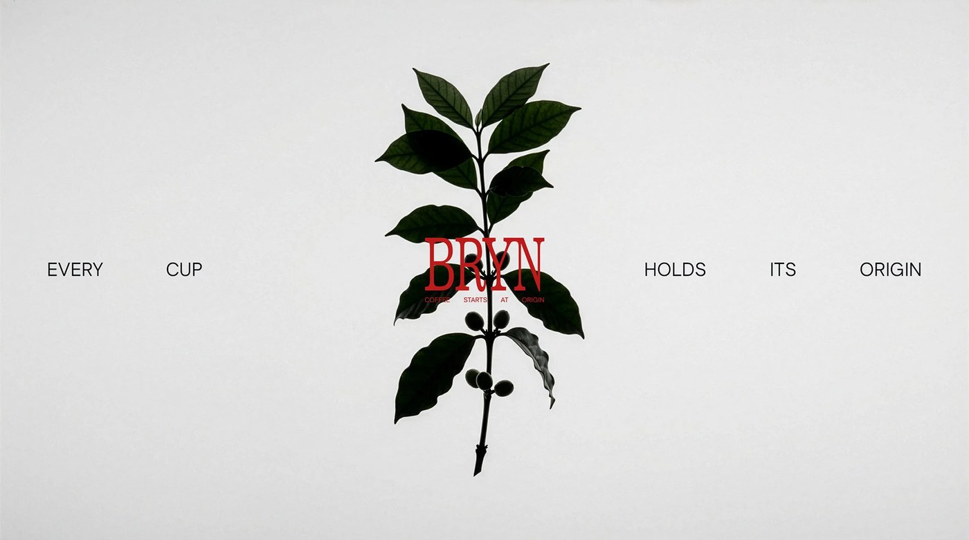
BRYN coffee house brand identity by OHDUDI: deep red and slab serif at extreme scale anchor a complete naming and visual system built from the ground up.
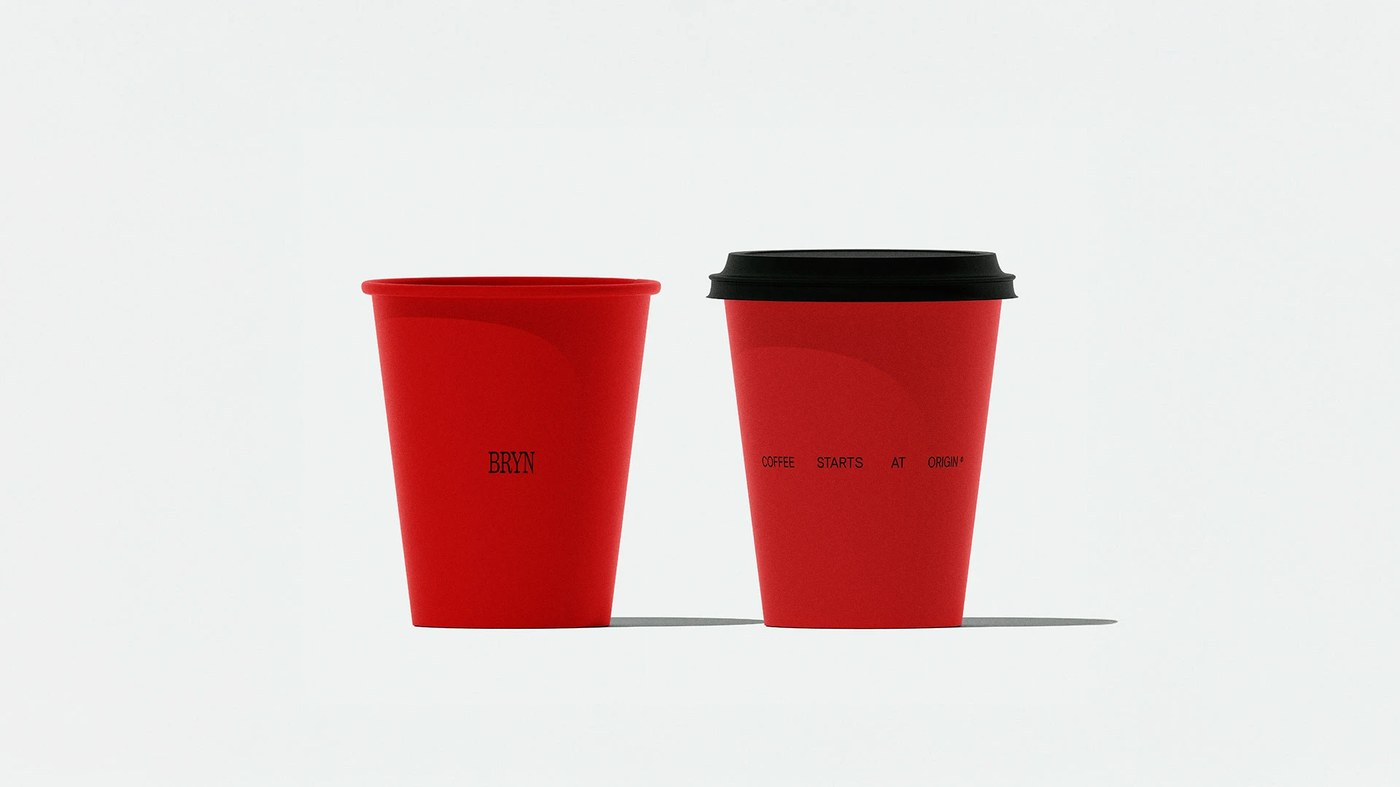
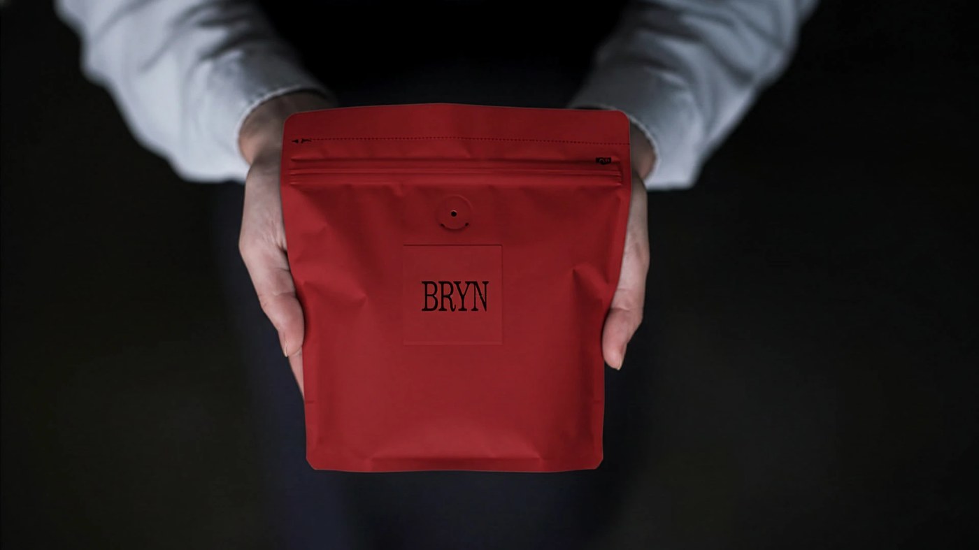
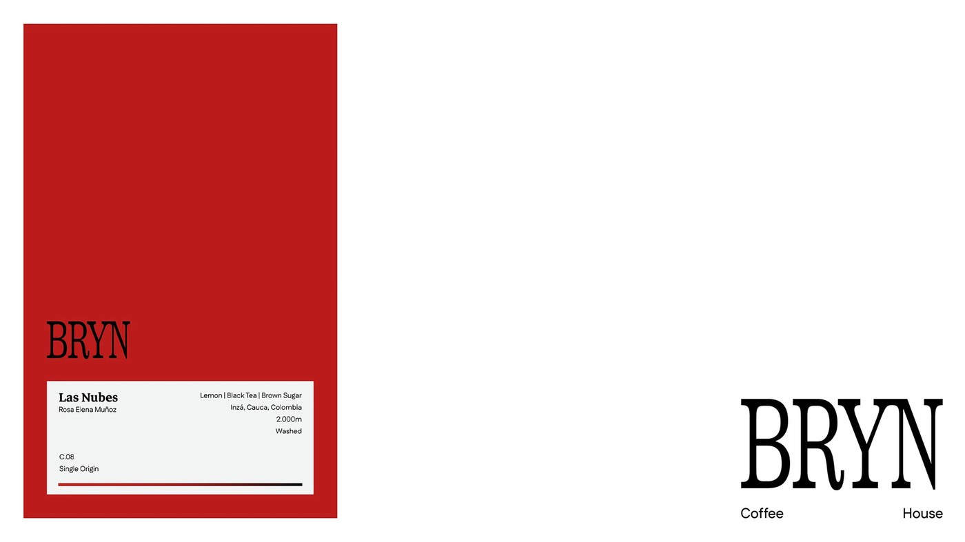
Red is a calculated bet in a coffee house brand identity. In a café category dominated by beige, oat, and fog, OHDUDI chose #C41010 — not as accent but as field. The BRYN wordmark sits at roughly 200pt in a high-contrast slab serif, with the tagline "COFFEE STARTS AT ORIGIN" threading through the counter space of the letters. On the label system, that same wordmark runs to 400pt, pure black on white — so large it stops reading as text and becomes a structural element. A coffee house brand identity built on this kind of typographic confidence is rare. Packaging carries origin coordinates down to the farm: "Las Nubes / Rosa Elena Muñoz / C.08 / Single Origin." Red cups on neutral grey, typography restrained and low on the vessel, nothing competing.
The Brand Identity Logic Behind BRYN Coffee House
What OHDUDI built is a complete coffee house brand identity — one that refuses a single neutral. The red is deliberate all the way down — symbolic in the Middle Eastern context, perceptually loud in the café landscape, and consistent from poster to packaging to cup. Naming, strategy, and visual direction came from the same studio. The coffee house brand identity holds because the logic was set before the type was chosen.
See the full project by OHDUDI | Brand Studio on Behance.