by abduzeedo
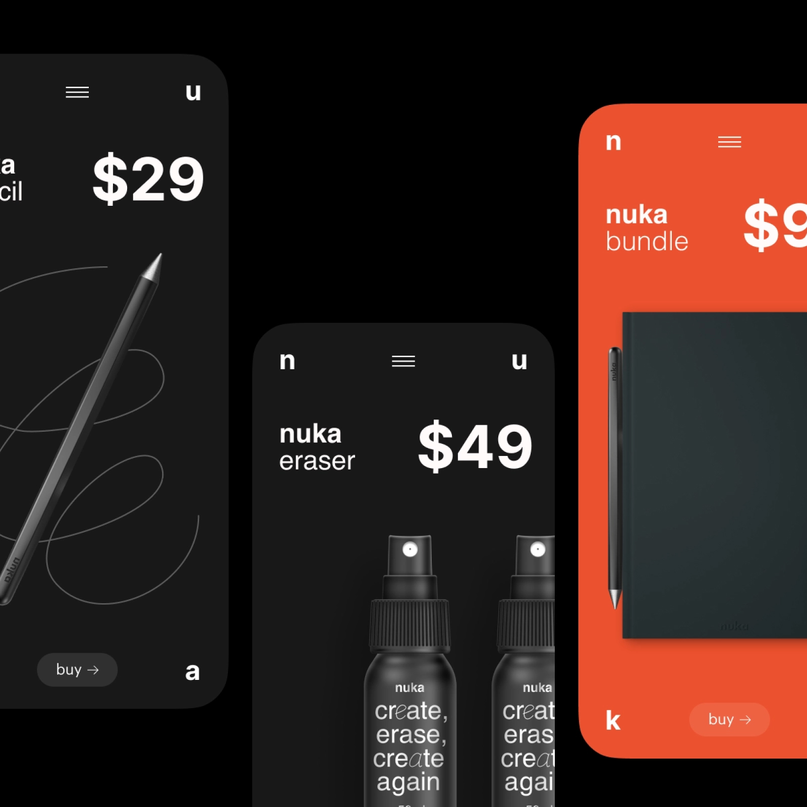
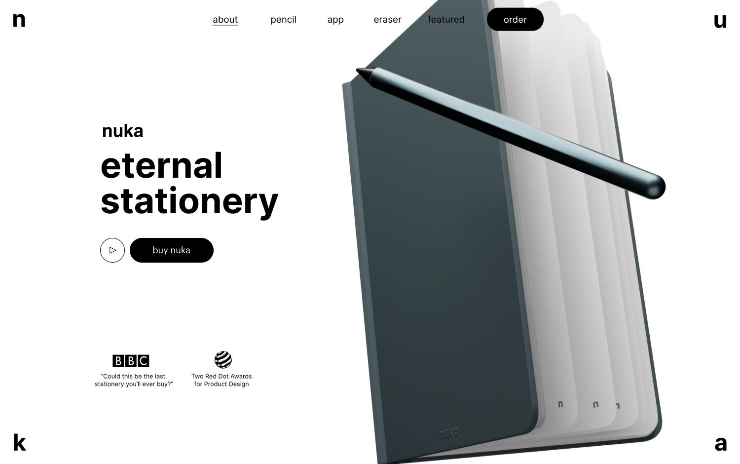
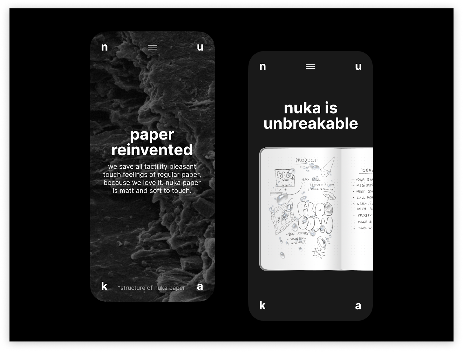
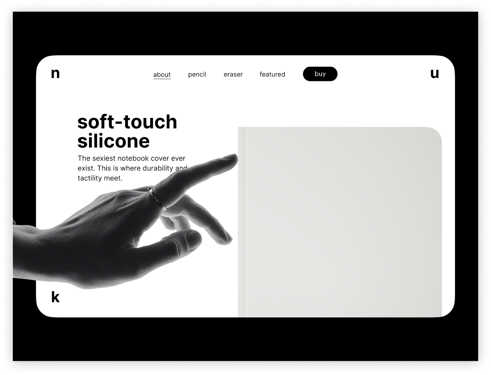
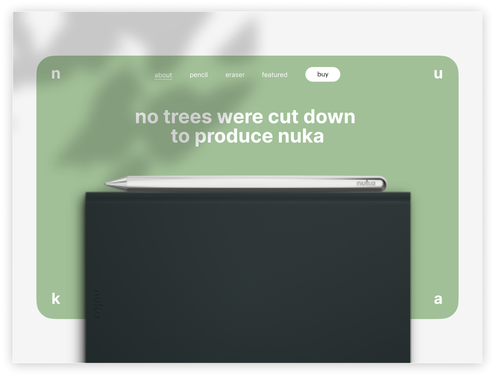
Less is more. Especially with eternal stationery. nuka gives you a notebook and a pen that both last forever. Put your notes in, take a picture, clear them up, repeat. Conscious consumption is the heart of the brand and O0 mirrors that in visual identity and website.
Design
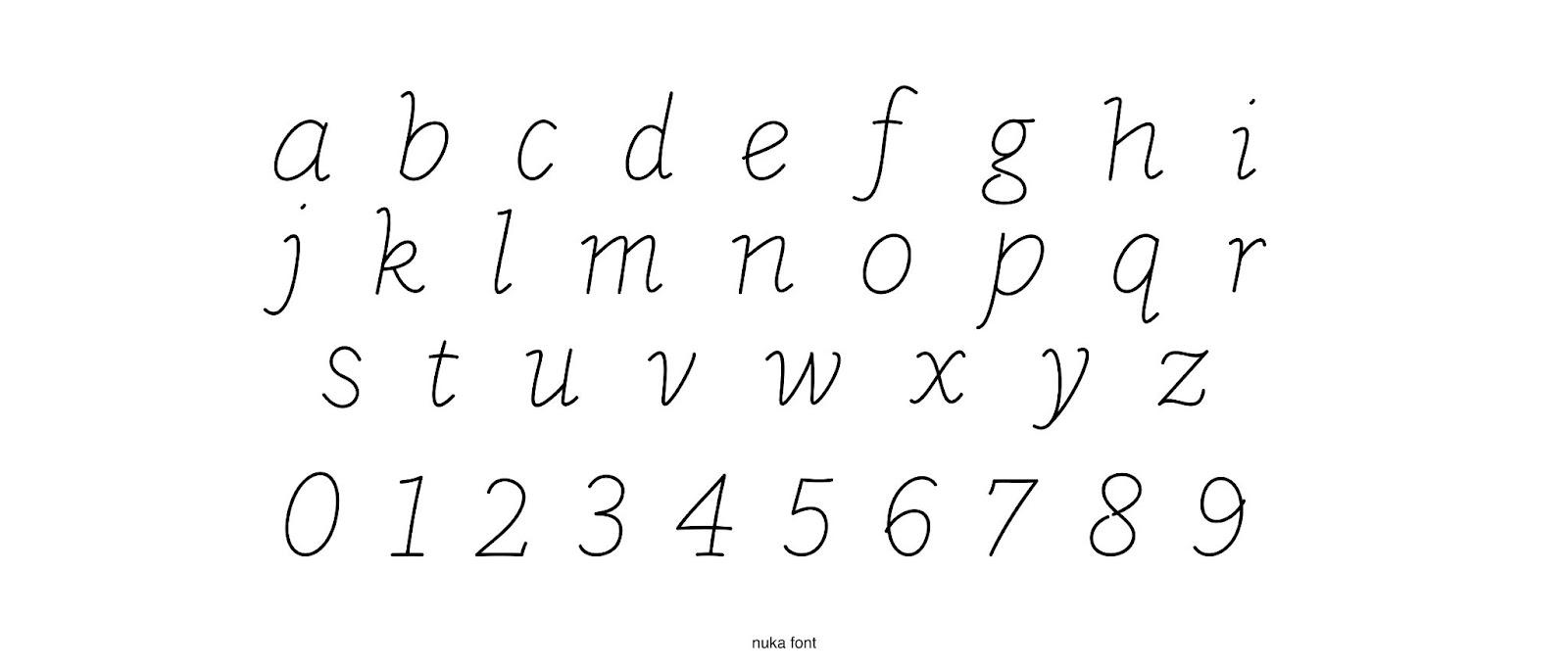
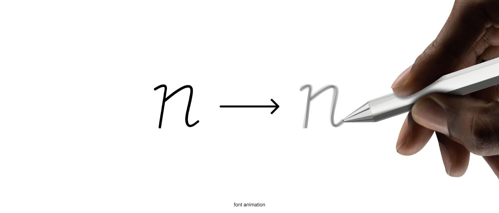
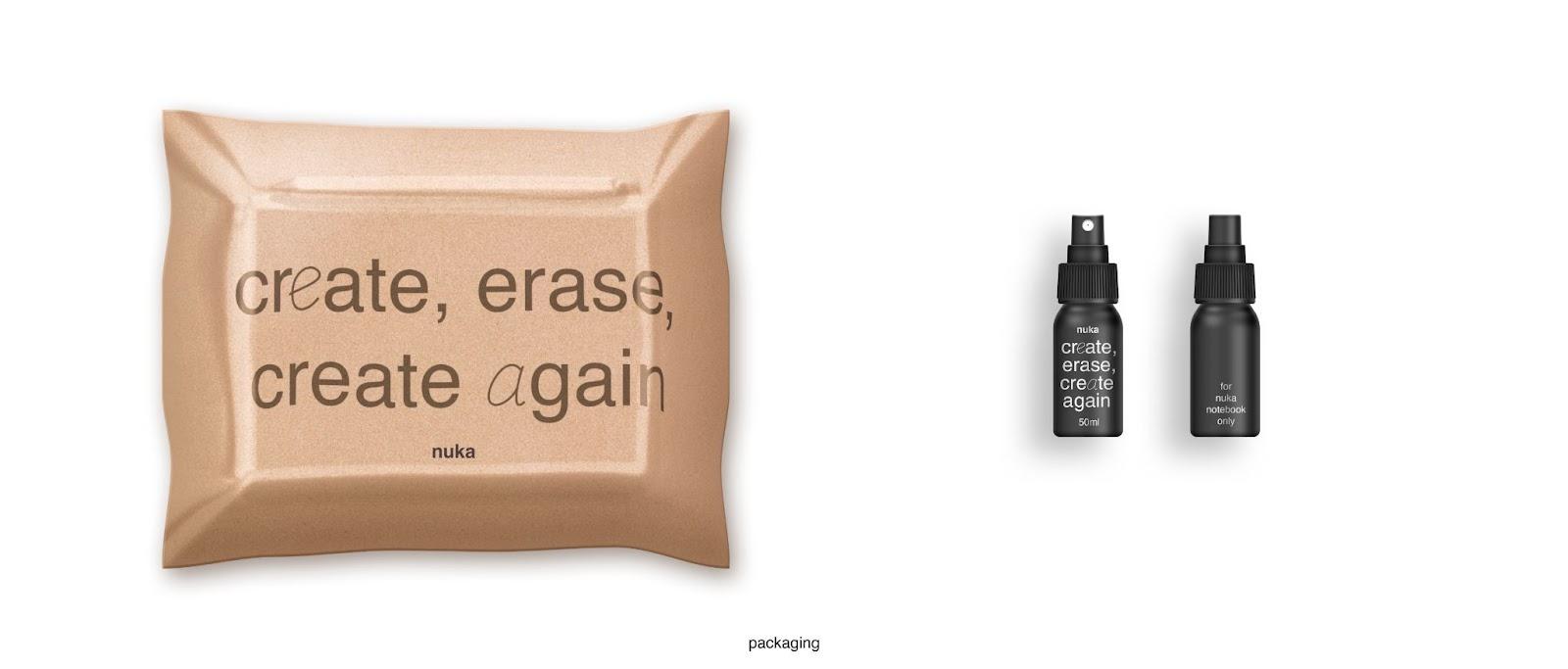
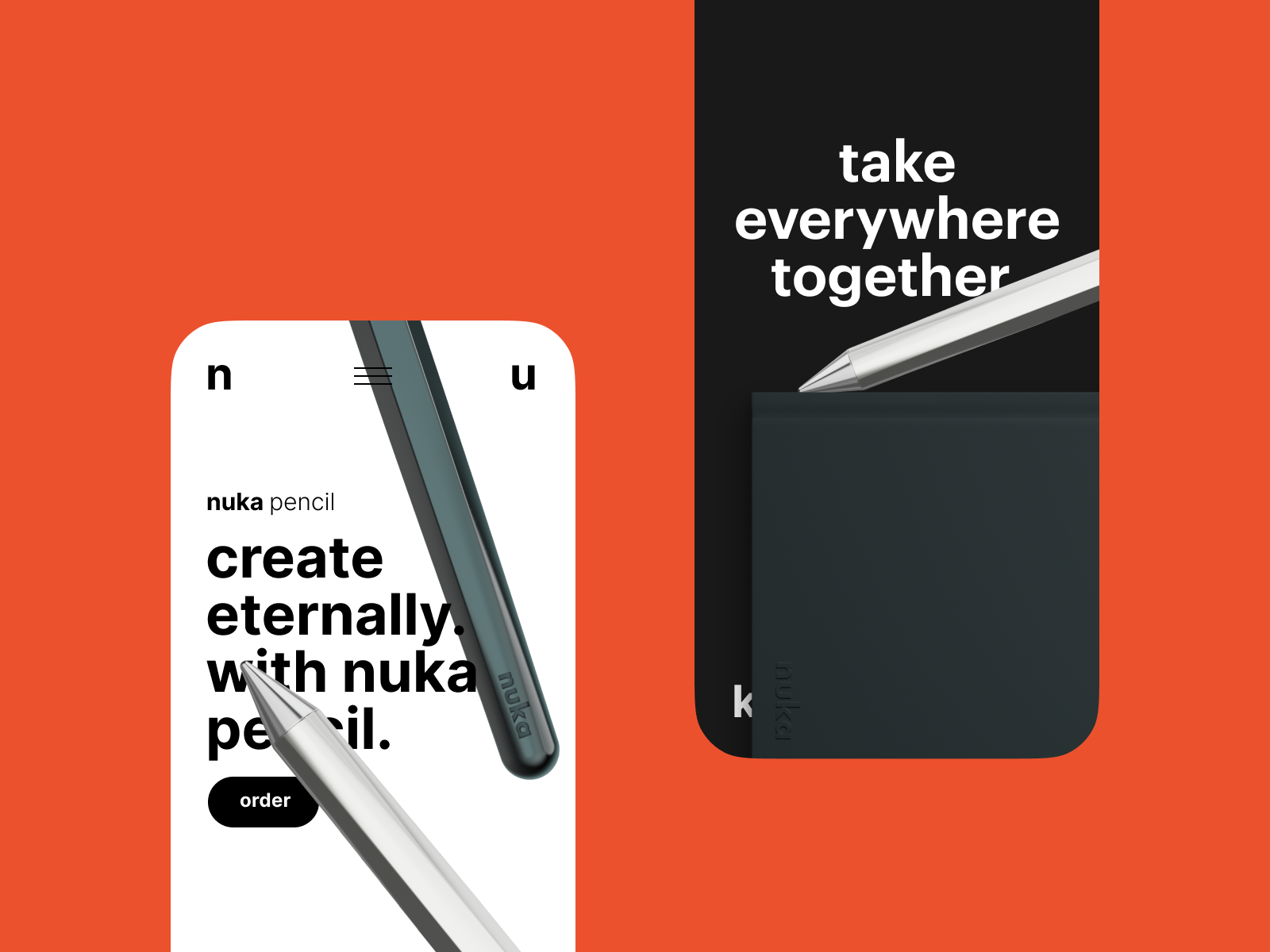
It's one font, one doodle. Super utilitarian, not to distract from yourself. The real focus is on what you can draw, write, or scribble. It's your story, and Nuka gives you the tools to tell it.
Handwritten font draws a very straight line with that purpose, being both the message and the form. Nuka's brand is three co-s: collaborative, conscious, coherent. It's minimalistic to a point you can't really see it. Because it's not the center of the story. You are.

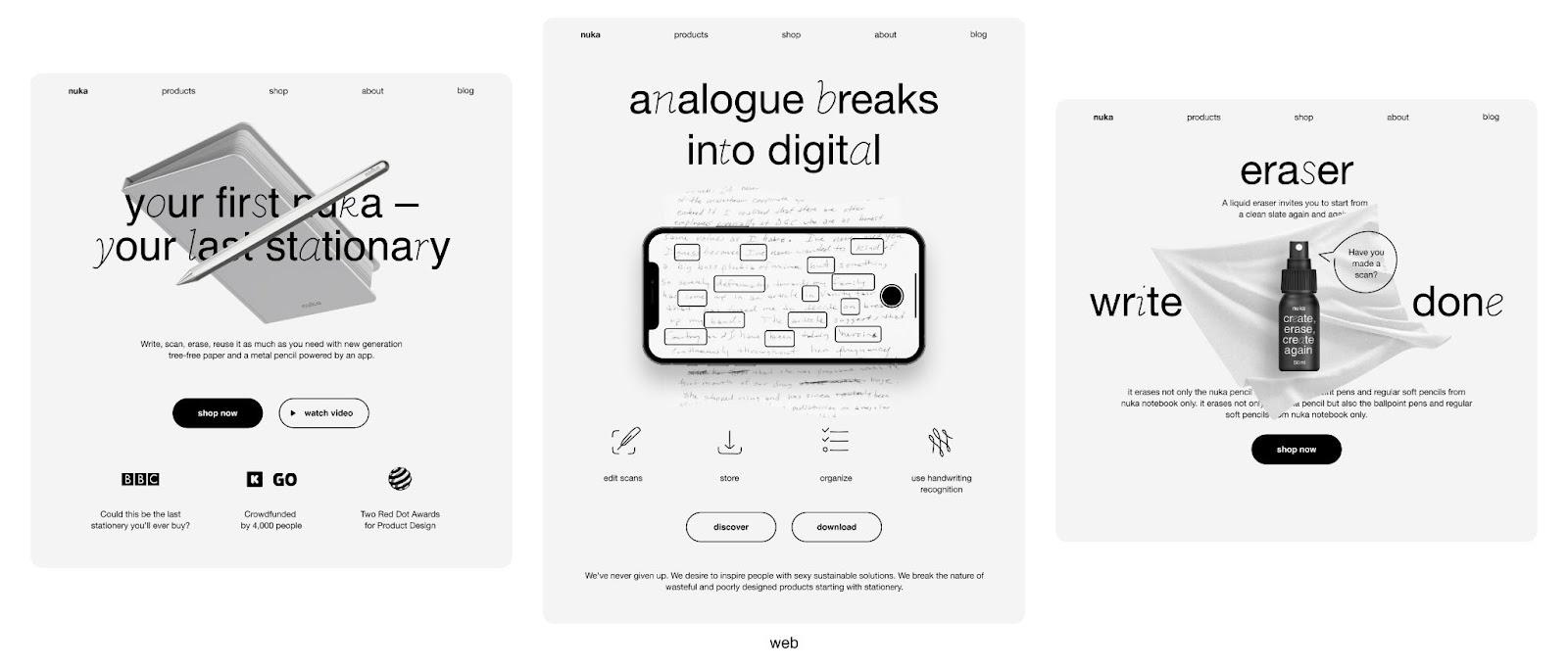
Website
O0 ensured that digital home for eternal stationery supports its visual identity. nuka's website is clear, deliberately simple, and utilitarian. It allows nuka to constantly remind you that the real focus is on your content.
Awards
- nuka's branding brought O0 the fifth Red Dot award in total and the first Red Dot in Brands & Communication Design.
- nuka’s website got a Website of the Day Award, won B est UI Design, Best UX Design and Best Innovation from CSSDA, Honorable Mention by Awwwards.
For more information make sure to check out Kate Nizhegorodova and O0 Design via ozero.design


