by AoiroStudio
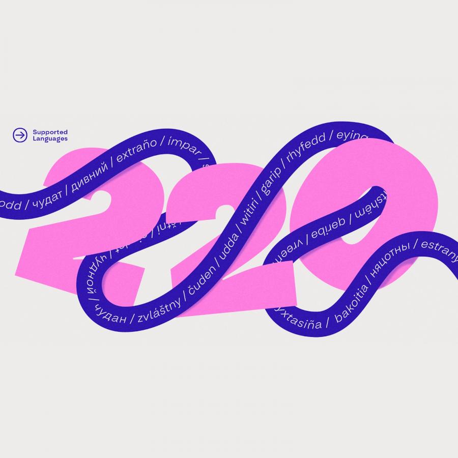
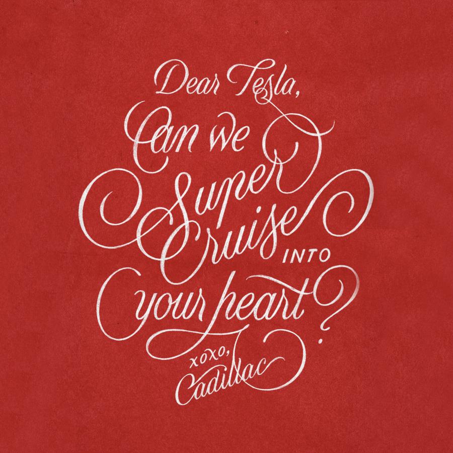
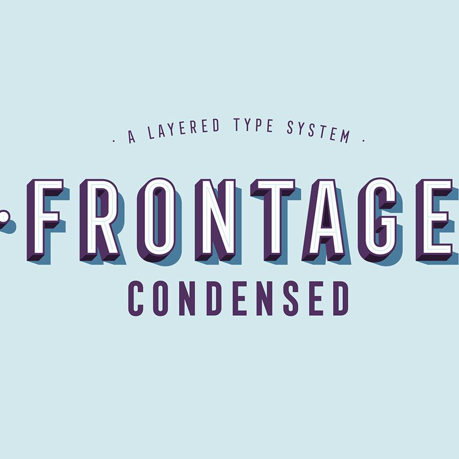
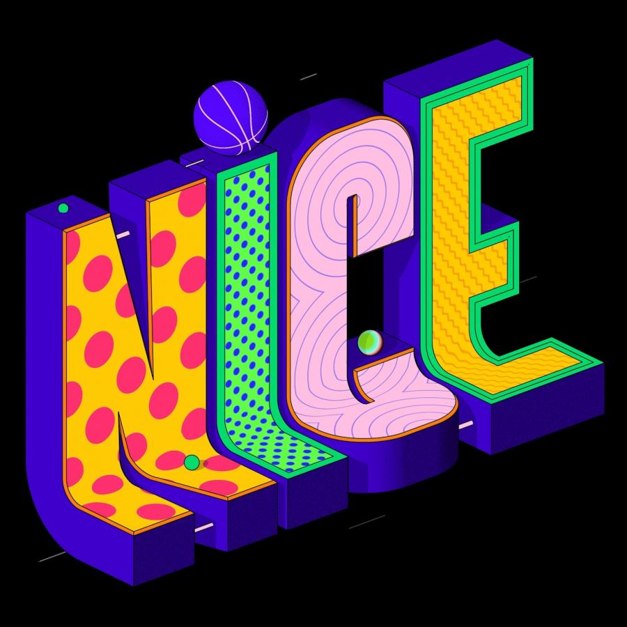
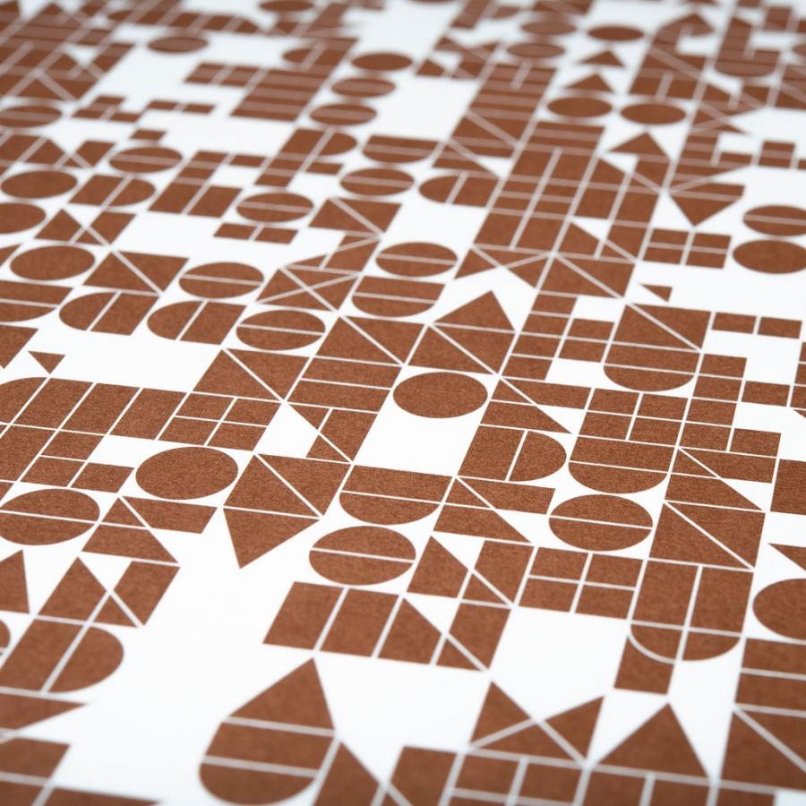
It's Friday, happy Friday all. As a tradition to the good old days, I wanted to pay homage to fonts. More particularly to our series Friday Fresh Free Fonts, we used to publish every Friday, what we called the FFFF which were pretty popular back in the days. Let's keep the momentum for today and share about this yet interesting and cool collection of lettering works created for clients and personal projects by Rafael Serra. Titled 'Lettering Series XXI', this collection is filled with 'lengthy' typographic treatments, they are quite tall and create this cool effect especially on the scrolling. I am sure if this is intentional but it's righteously cool.
Links

