by abduzeedo
makebardo shared a branding and visual identity project for Mountain Club and company that was born out of a desire to redefine the meaning of a day at the office. It’s possible to work from anywhere. But is it possible to balance work, play and community? That’s the question that led them to create a space in Queenstown, New Zealand that supports the full flexibility of today’s tech enabled work style and the needs of a vibrant, creative and engaged community.
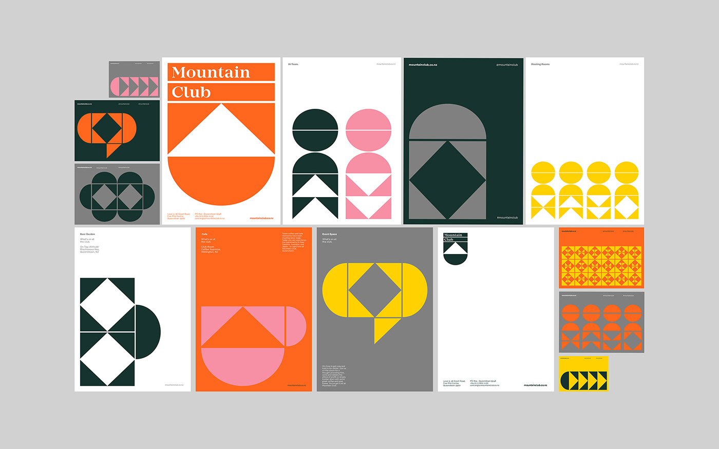
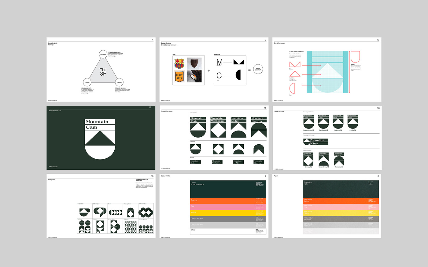
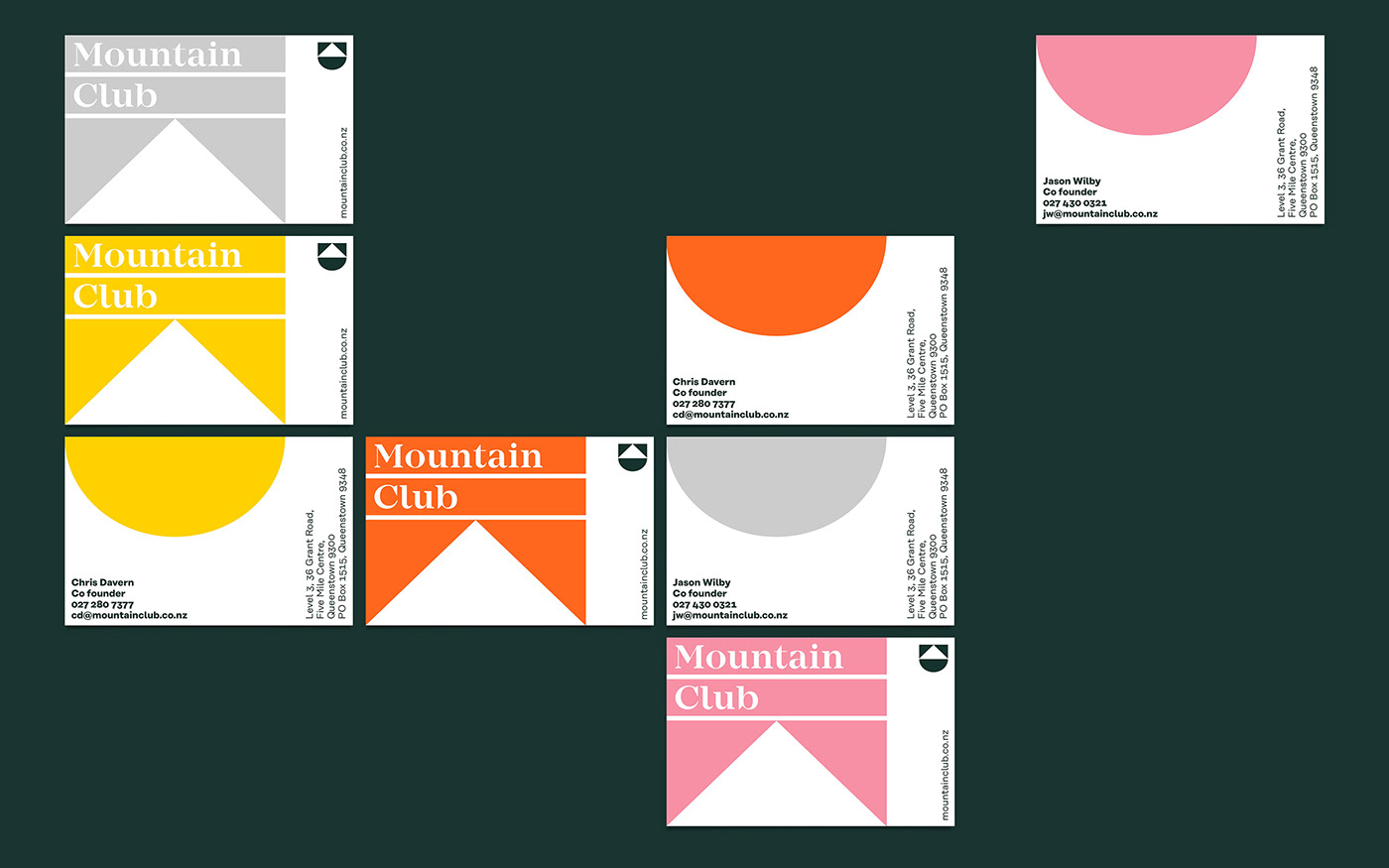
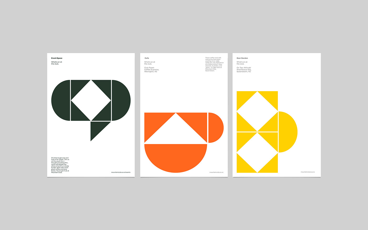
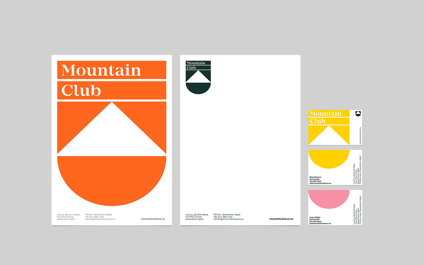
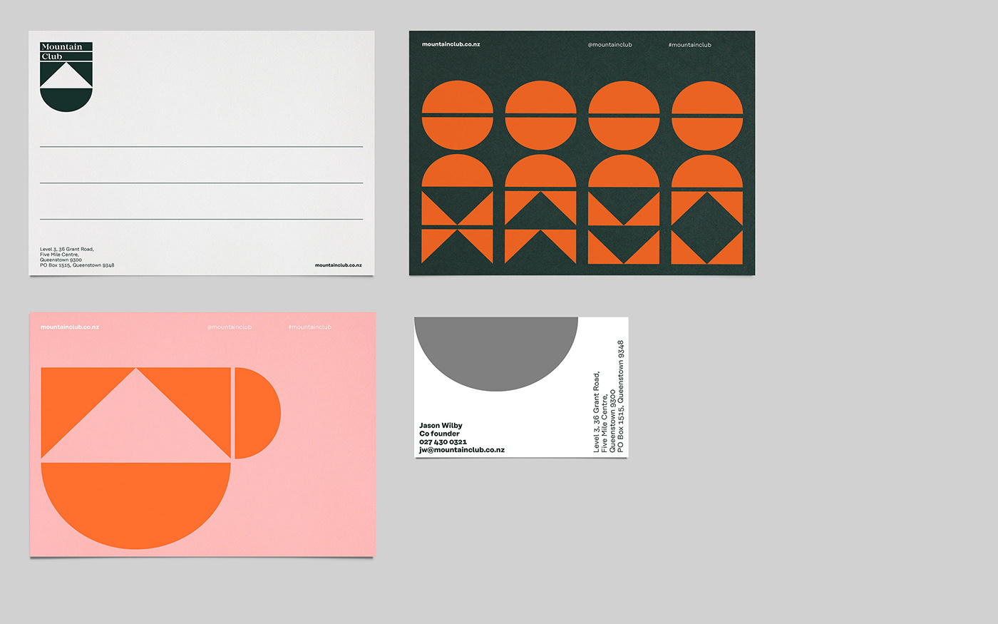
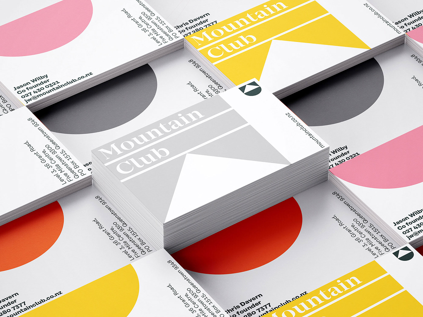
With a shield style logo we wanted to evoke the feeling of belonging, and the idea that members feel part of a team. The shapes of the shield geometrically construct the letters M and C of Mountain Club.
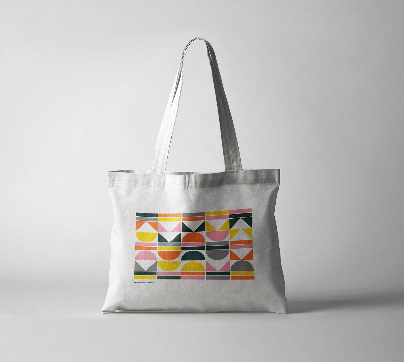
As the brand has multiple services our challenge was to create a strong visual identity for a wide audience without losing visual consistency but having enough flexibility to be attractive, functional and unique.
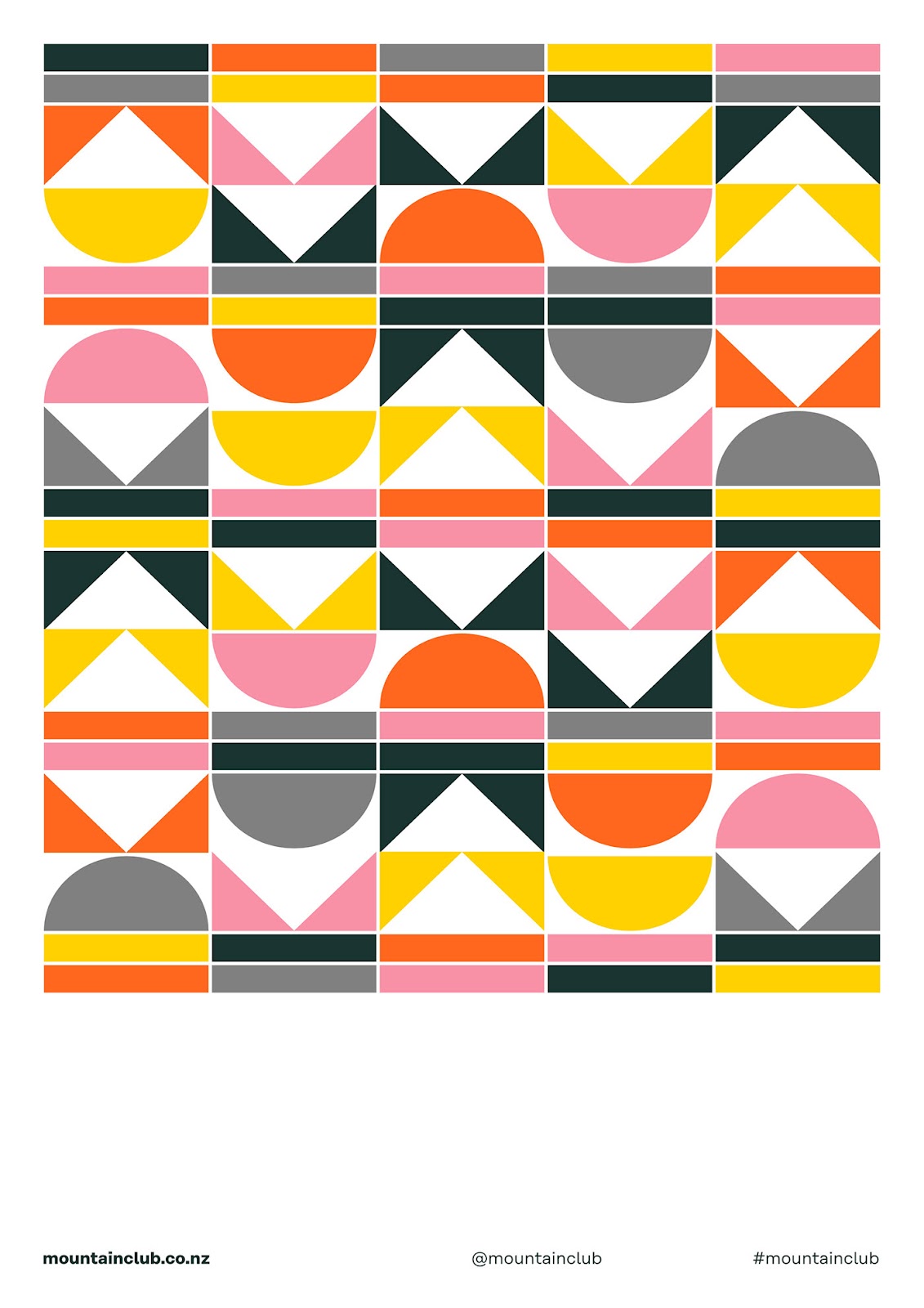
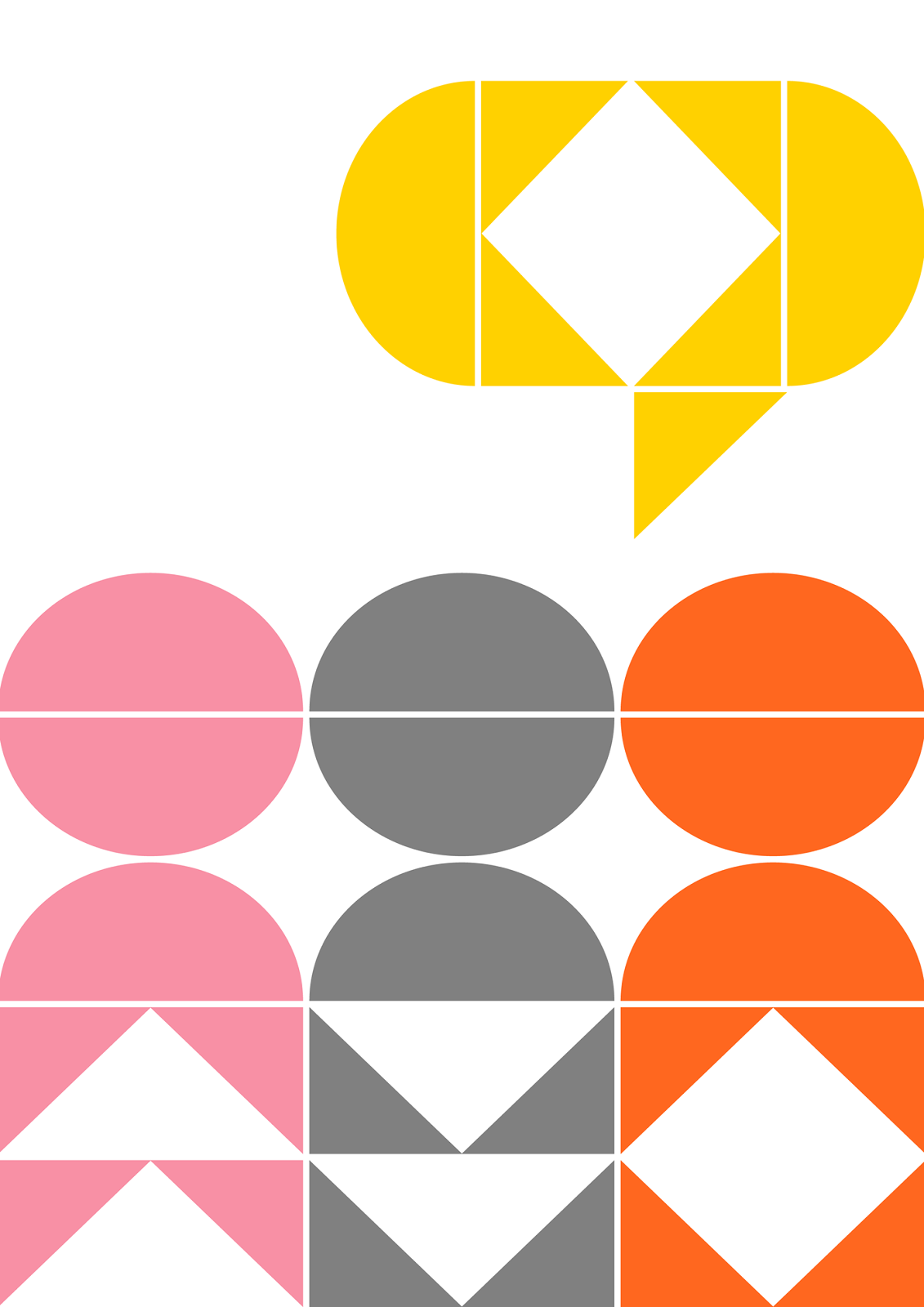
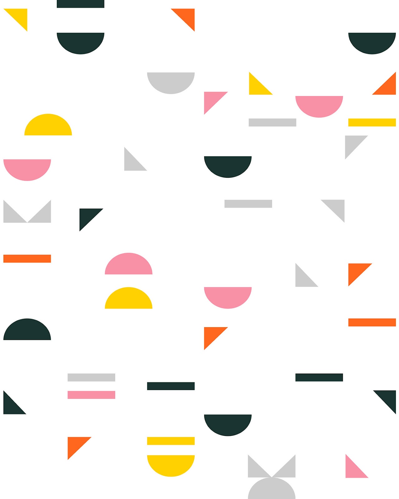
To build the visual identity, paradoxically we have deconstructed the brand. This decision gave us plenty of room to play with different tones of voice, from the modern and playful, to the professional and mature. To achieve this versatility it was also essential to provide the visual identity with a wide range of colours. The colour palette is cheerful and vibrant. Bright colours such as yellow, pink and orange give the brand necessary freshness and warmth. In contrast, grey and dark green give it that maturity and sophistication that the brand must also represent. Returning to the forms of the brand, we developed a set of icons for the way-finding system. To finish defining the visual identity, we worked with types that give a strong attitude to the brand, these types were developed by the type designer René Bieder.
Credits
- Client: Mountain Club
- Location: Queenstown, New Zealand
- Industry: Hospitality
For more information make sure to visit www.mountainclub.co.nz or check out Makebardo’s website at http://www.makebardo.com/


