by abduzeedo
Explore how Návore's unique branding and visual identity combines sumi-e inspirations with modern design, enhancing local produce sales in Southern California.
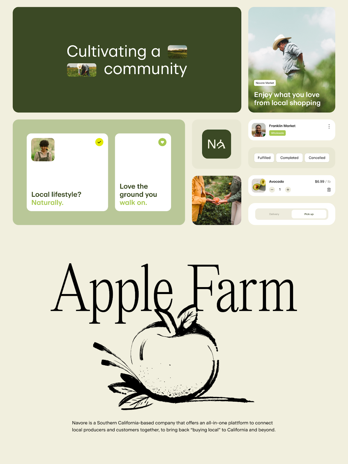
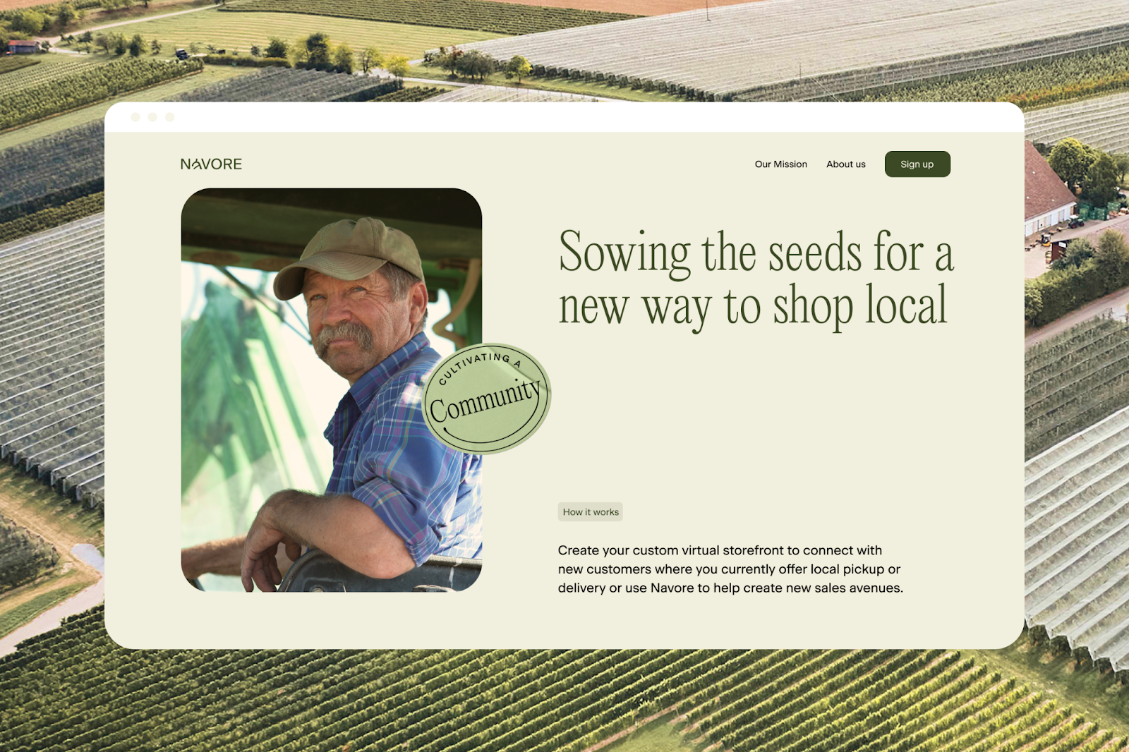
In the world of branding and visual identity, Návore stands out as a paragon of innovation and community-centered design. Mubien Brands, renowned for their creative prowess, has crafted an identity for Návore that resonates with the ethos of Southern California's local produce market. Návore, an all-in-one platform, not only simplifies buying and selling of local produce but also fosters a community spirit, promoting a sustainable lifestyle enriched by local support and compassion.
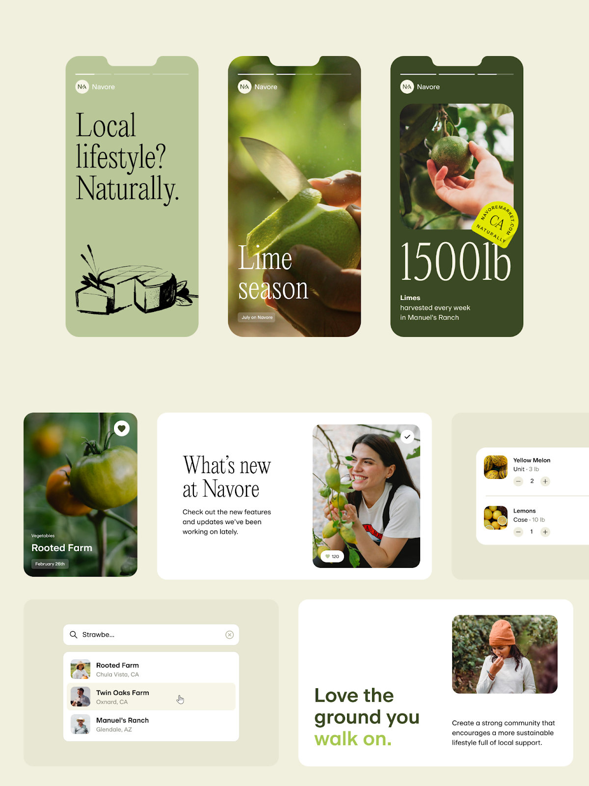
The essence of Návore’s visual identity is deeply rooted in the concept of sumi-e paintings and the philosophy of living in harmony. This approach is brilliantly reflected in the typography, logotype, and illustration style of the brand. The design transcends mere aesthetics, echoing the lifestyle of the producers — simple, healthy, and in deep respect for the environment.
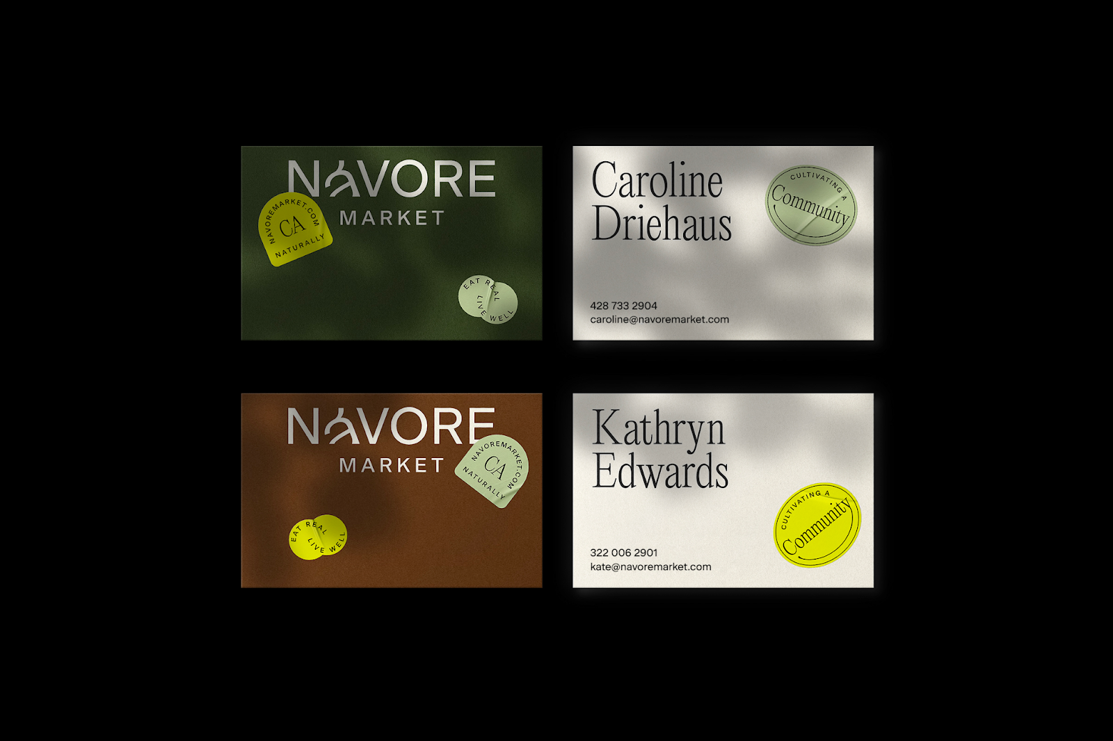
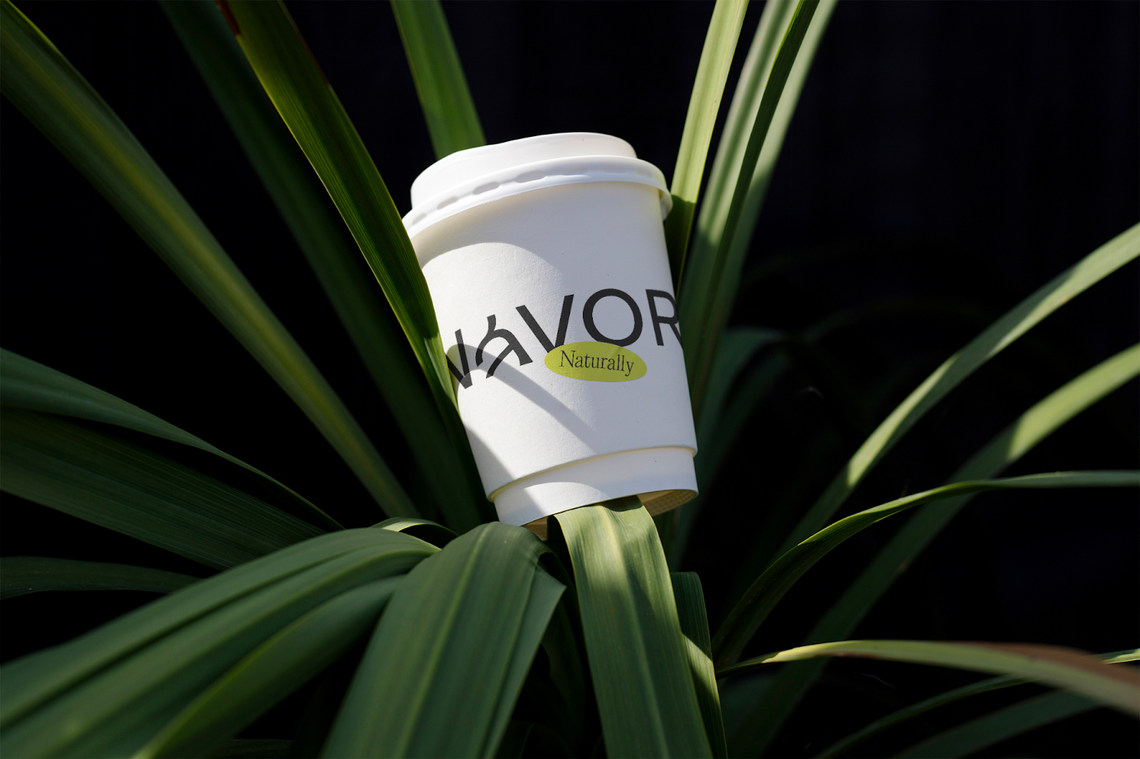
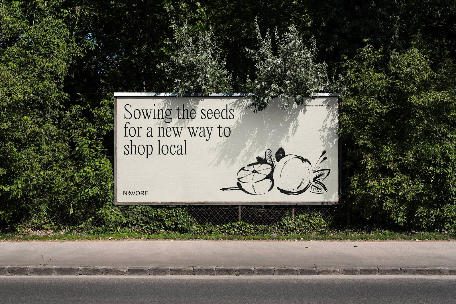
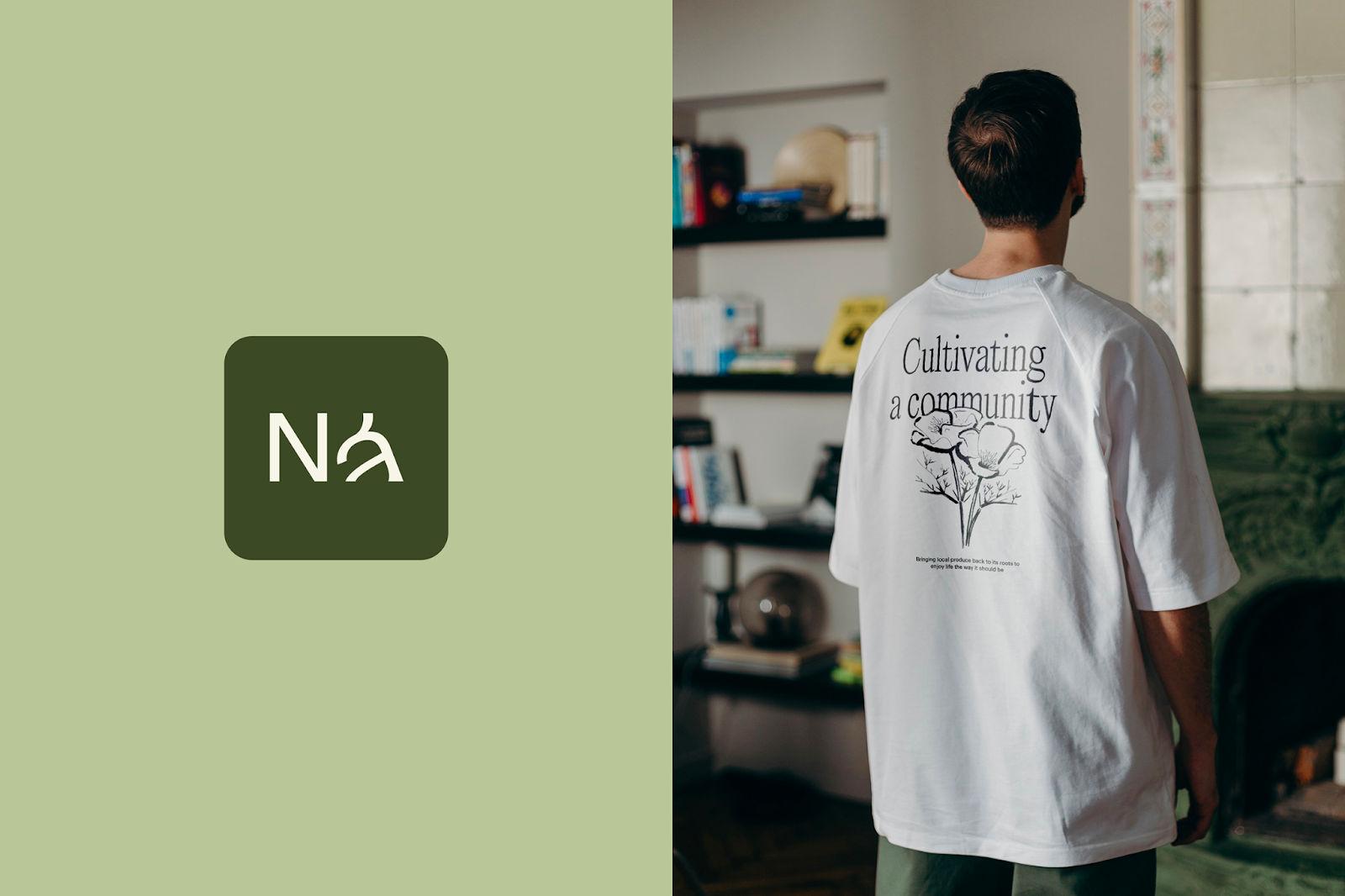
Breaking away from the conventional leaf-themed symbols prevalent in many contemporary brands, Návore’s wordmark is a breath of fresh air. The highlight is the “á” in the logotype, ingeniously crafted to resemble a sprout emerging from the ground — a metaphor for growth and organic origins. This symbolization is not only a nod to the agricultural roots of the platform but also a testament to the brand's commitment to growth and sustainability.
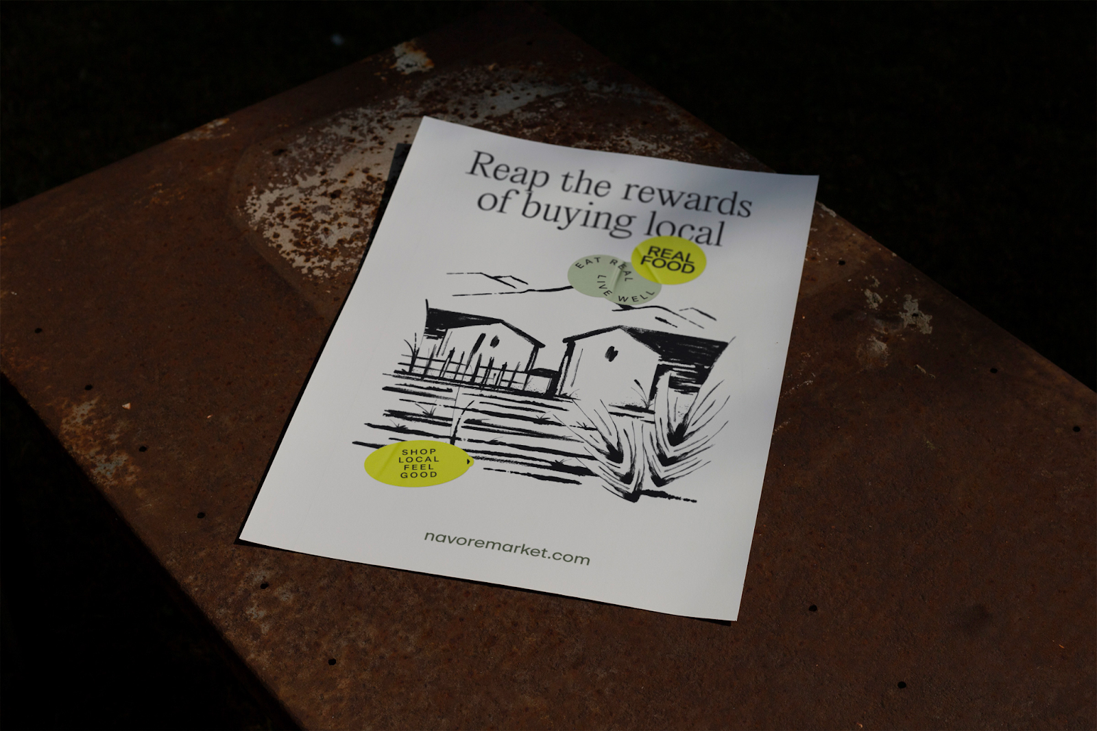
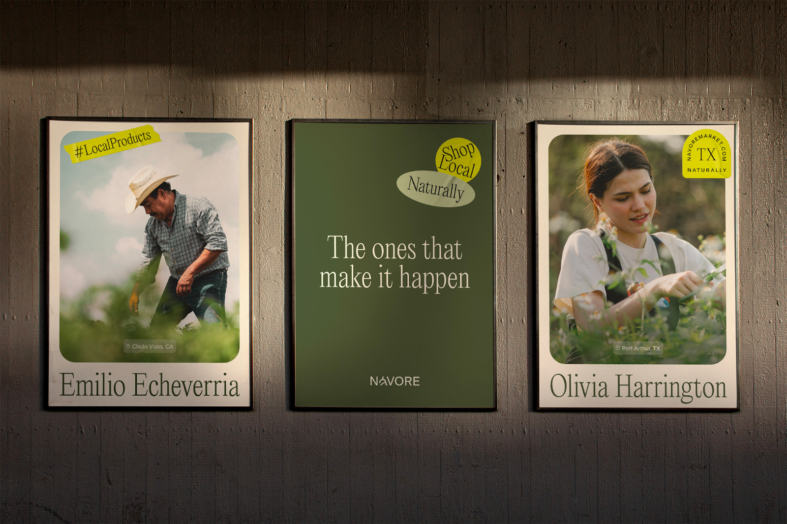
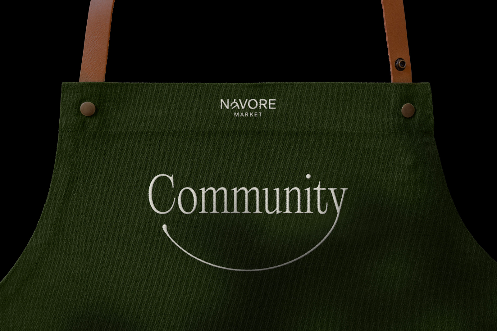
Complementing the logotype are custom, vibrant stickers, reminiscent of the labels found on fresh fruits. These stickers do more than just add a visual appeal; they carry motivational messages, encouraging a connection with the food we consume. This element of the design brings a sense of spontaneity and aligns perfectly with the brand’s mission of fostering a community around local produce.
In summary, Návore’s branding and visual identity, designed by Mubien Brands, is a stellar example of how thoughtful design can elevate a brand’s message. It not only captures the essence of the Southern Californian spirit but also paves the way for a more connected, sustainable lifestyle. This project is a testament to the power of branding in creating not just a visual identity, but a movement.
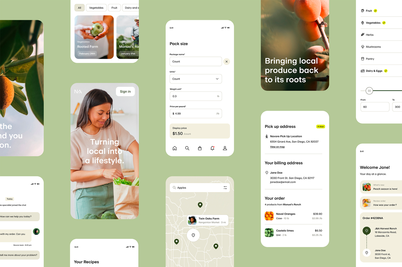
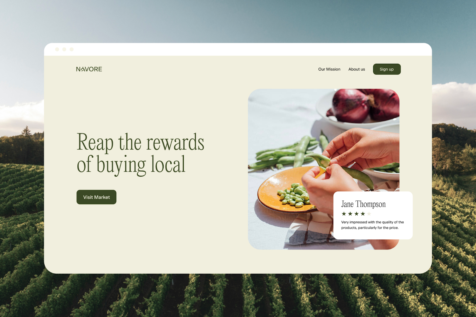
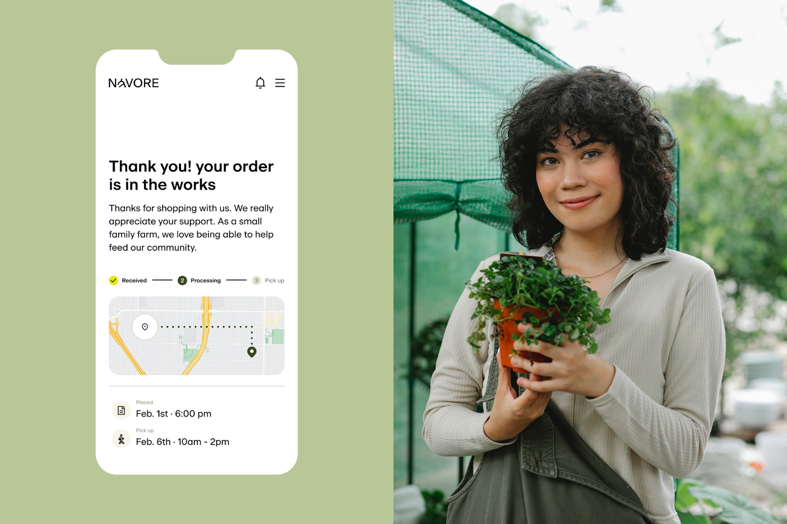
Branding and visual identity artifacts

Credits
- Agency: Mubien Brands
- Account Management: Victor Mubien
- Creative Direction: David Mubien
- Motion: Daniel Iglesias
- Art Direction: Daniel Iglesias, Javier Ochoa, Patri Orden, Carlos Almagro, Luana Laso
- UX/UI: Javier Ochoa, Patri Orden, Luana Laso