by AoiroStudio
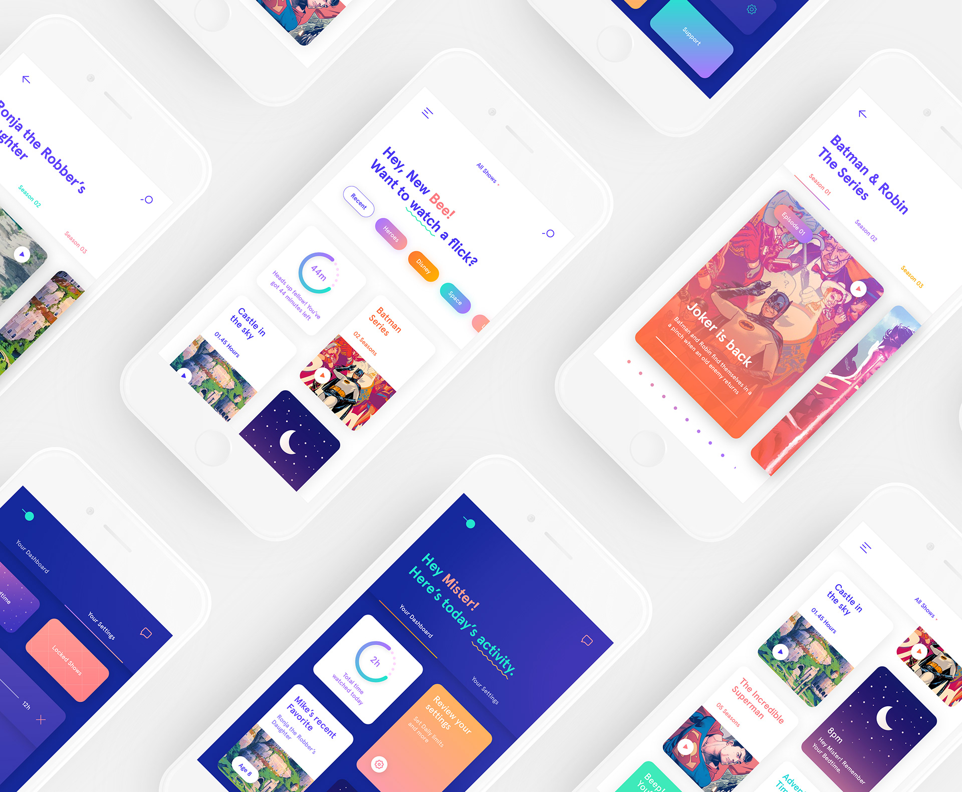
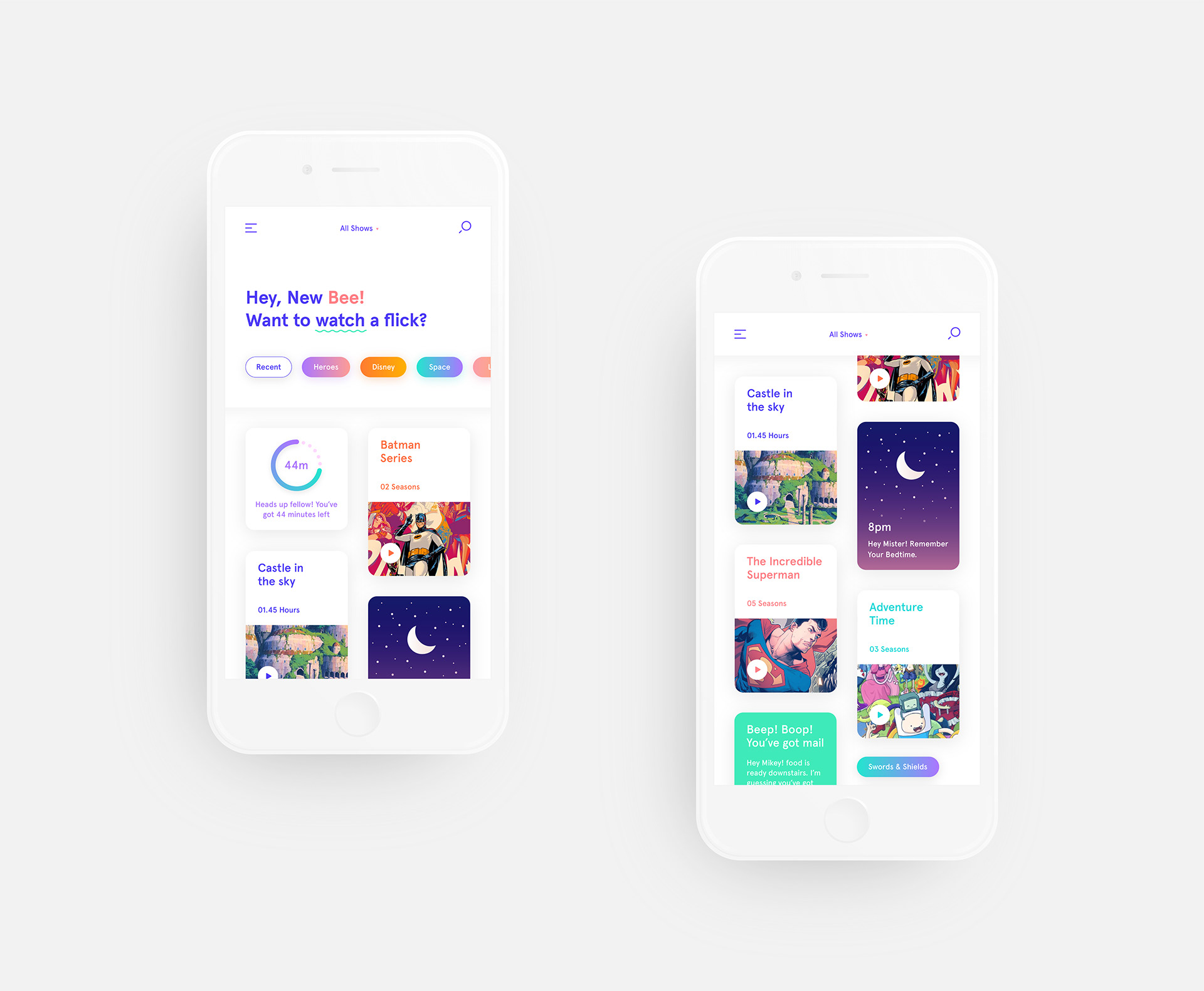
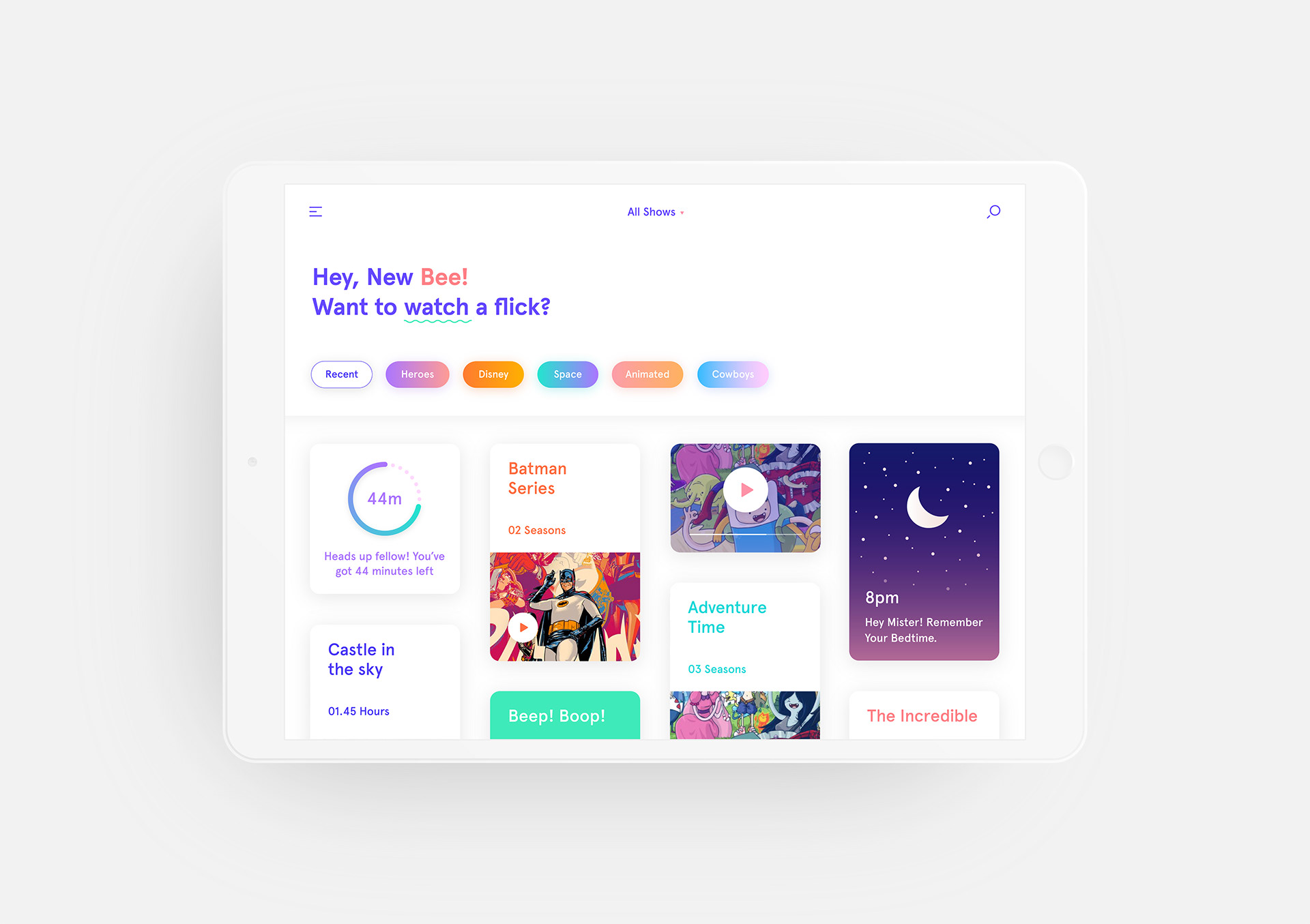
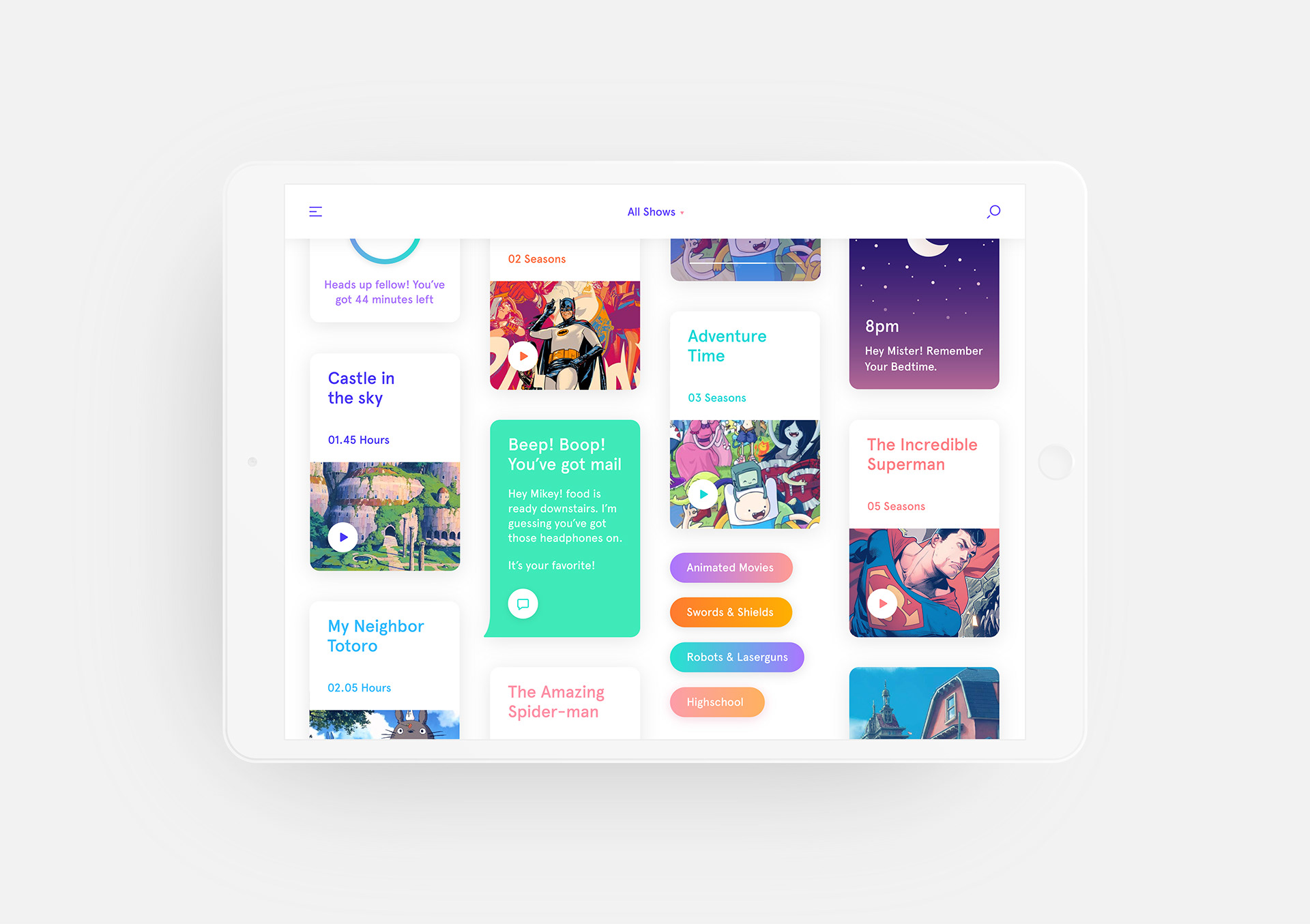
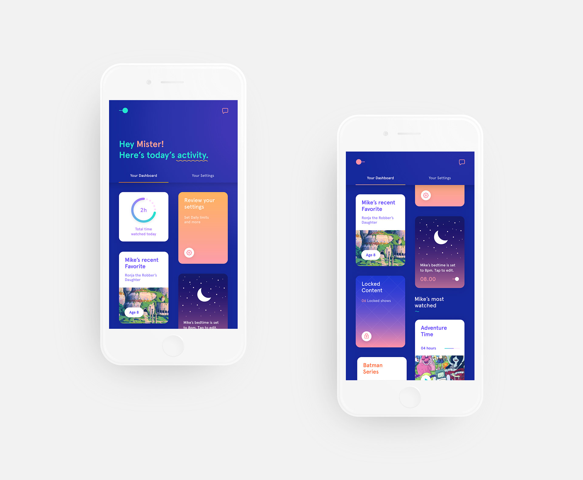
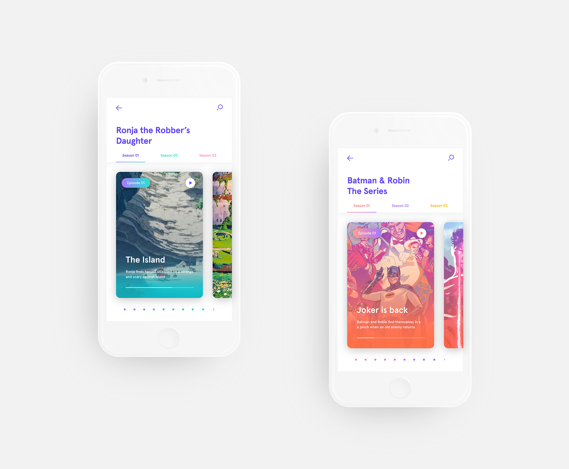
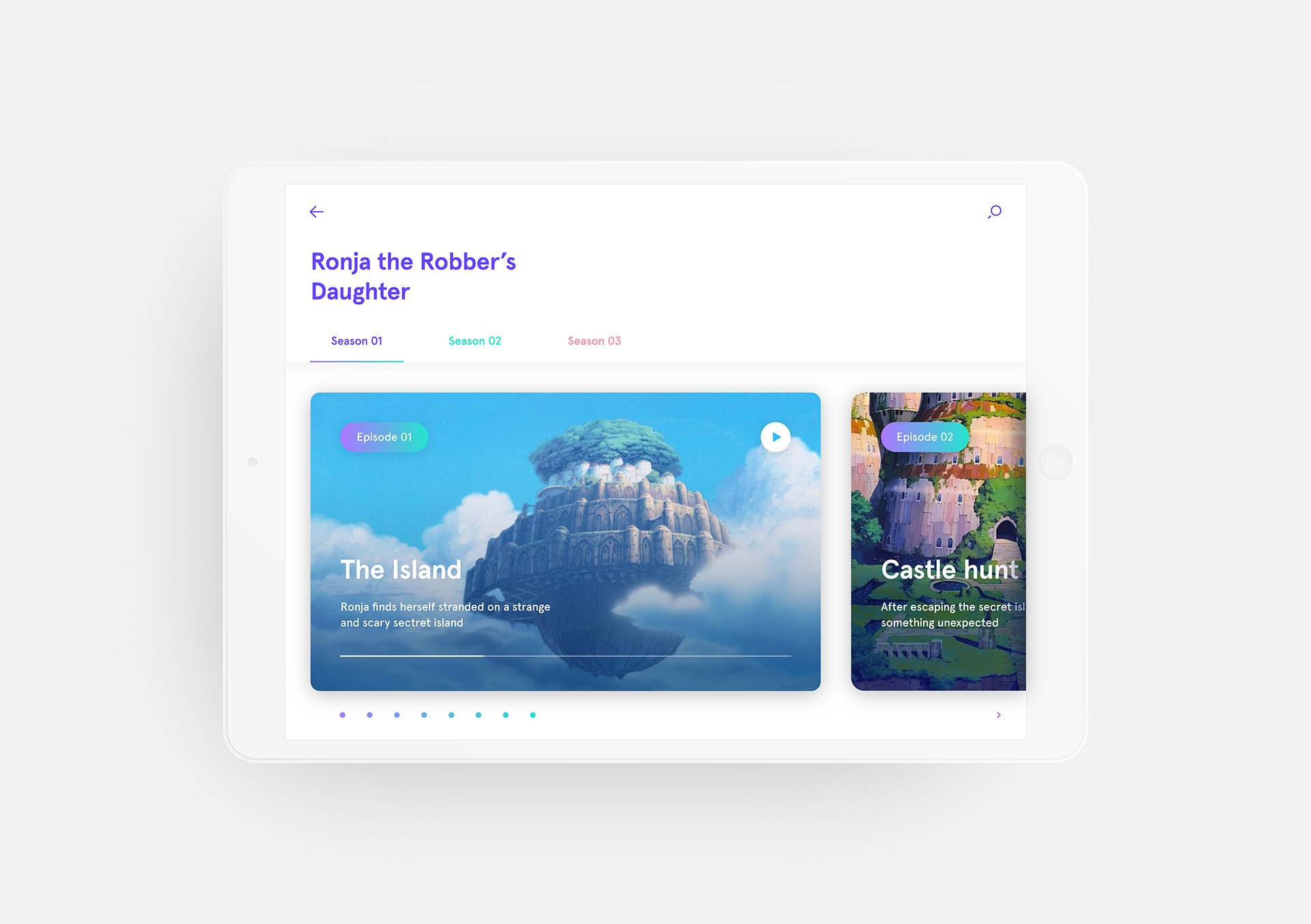
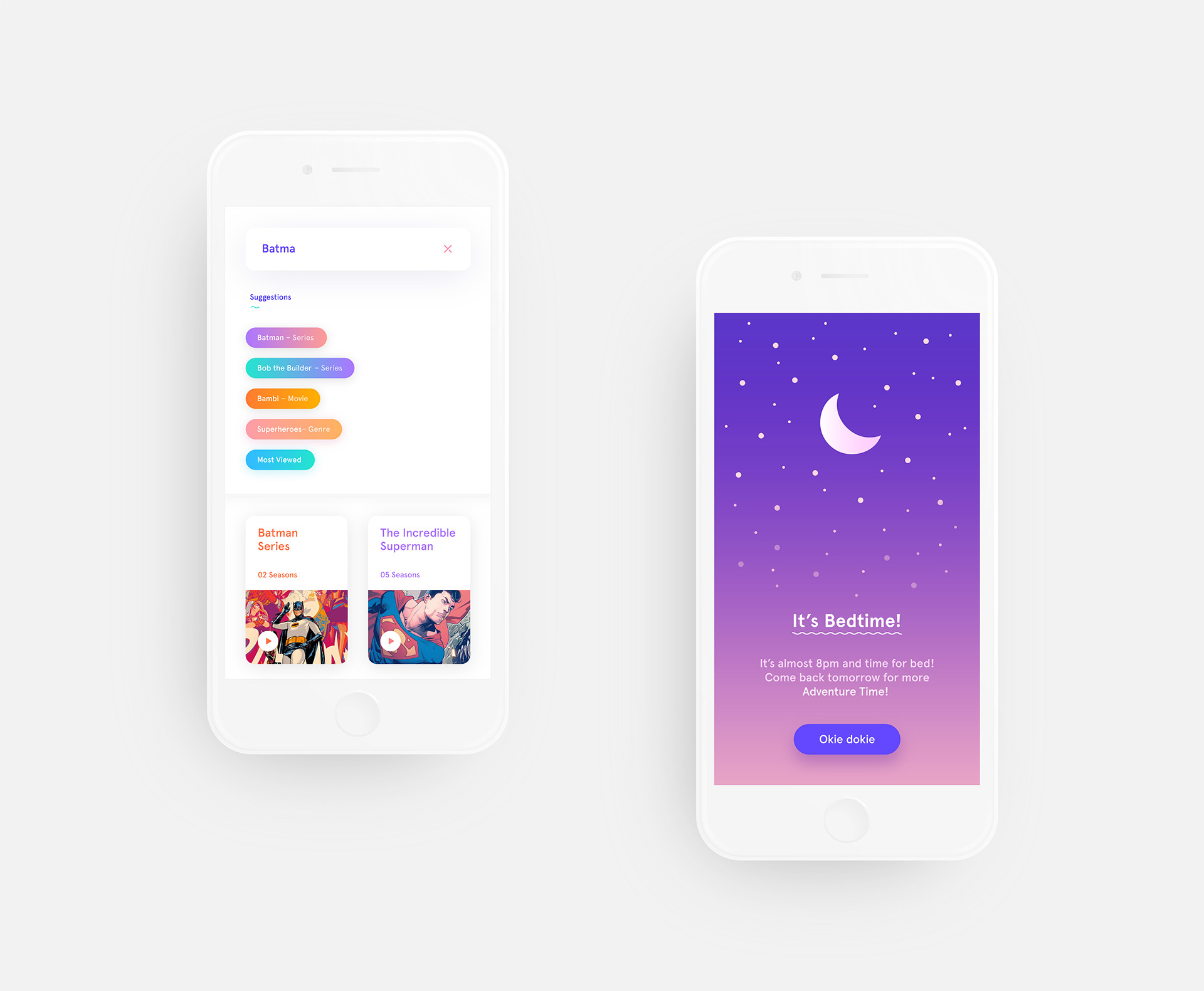
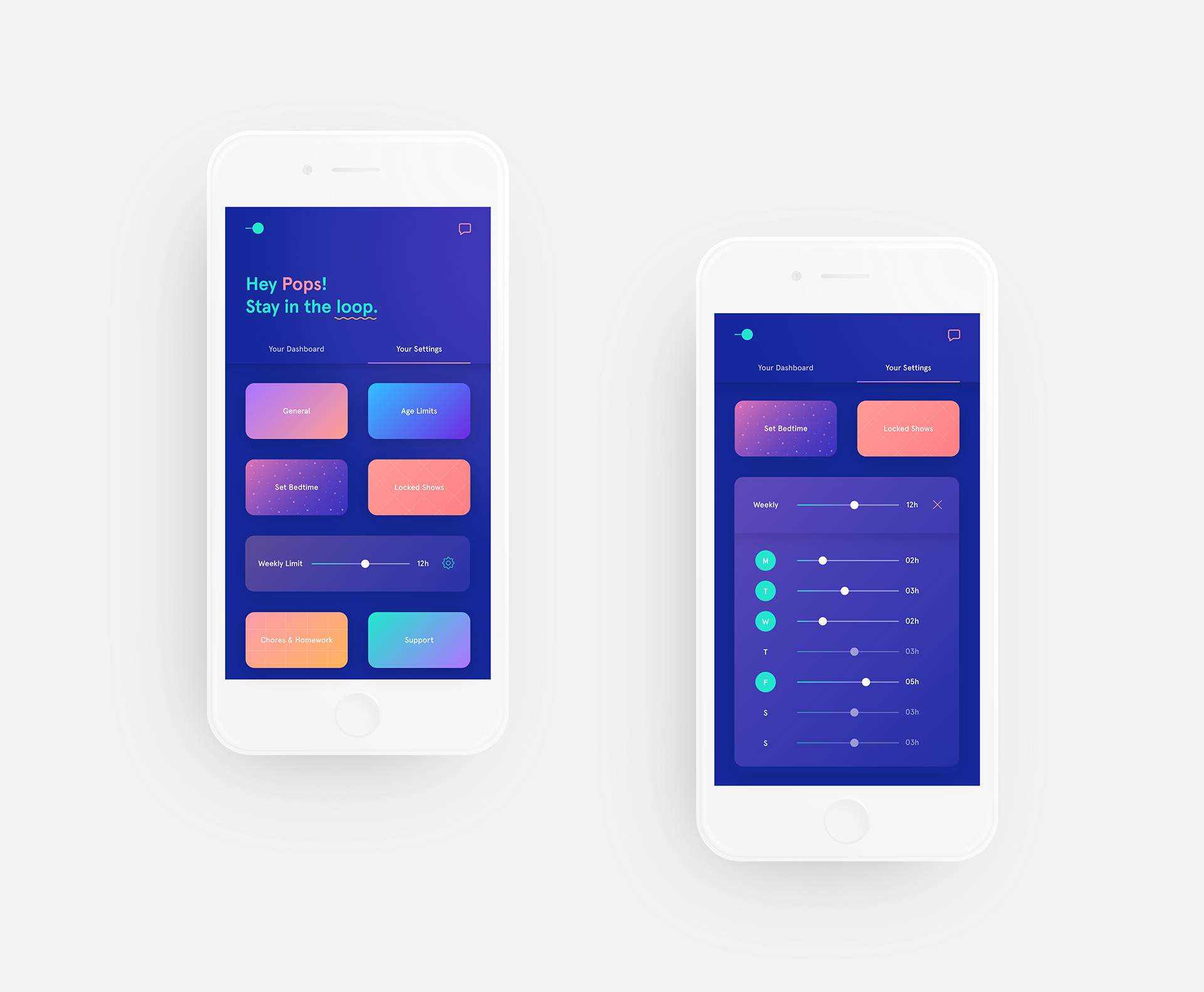
Hannes Ahremark shared an interesting UI/UX case study about 'KiddOs', a streaming app for kids and features for parents like 'parental lock'. I wish there was more exploration on that end, but overall it's a very refreshing take. I do appreciate the colors used on this design, and there seem to have a 'dark theme' version too. But one thing I needed to share is the 'over-use' of the gradients and they are everywhere (noted!). I will be curious what was the demographic audience for this app design, knowingly they aren't too familiar with the different common patterns only known to adults.
UI and UX for Kiddo's streaming application for kids. The app features a parental lock and is totally geared towards creating a safe and easy way for kids and parents to enjoy movies and series.
Interaction Design & UI/UX
About Hannes Ahremark
Hannes is a designer based in the beautiful city of Gothenburg, Sweden. His studio has for main goal to create sophisticated design solutions with conceptual depth and contemporary visuals.
 Designed by