by abduzeedo
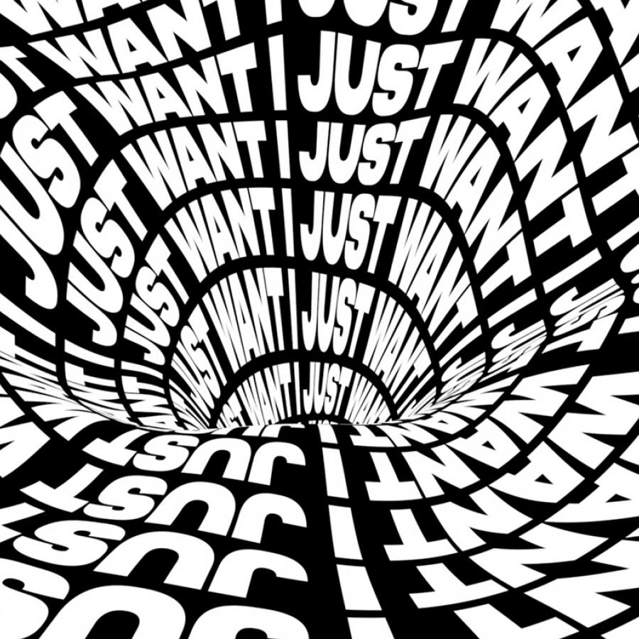
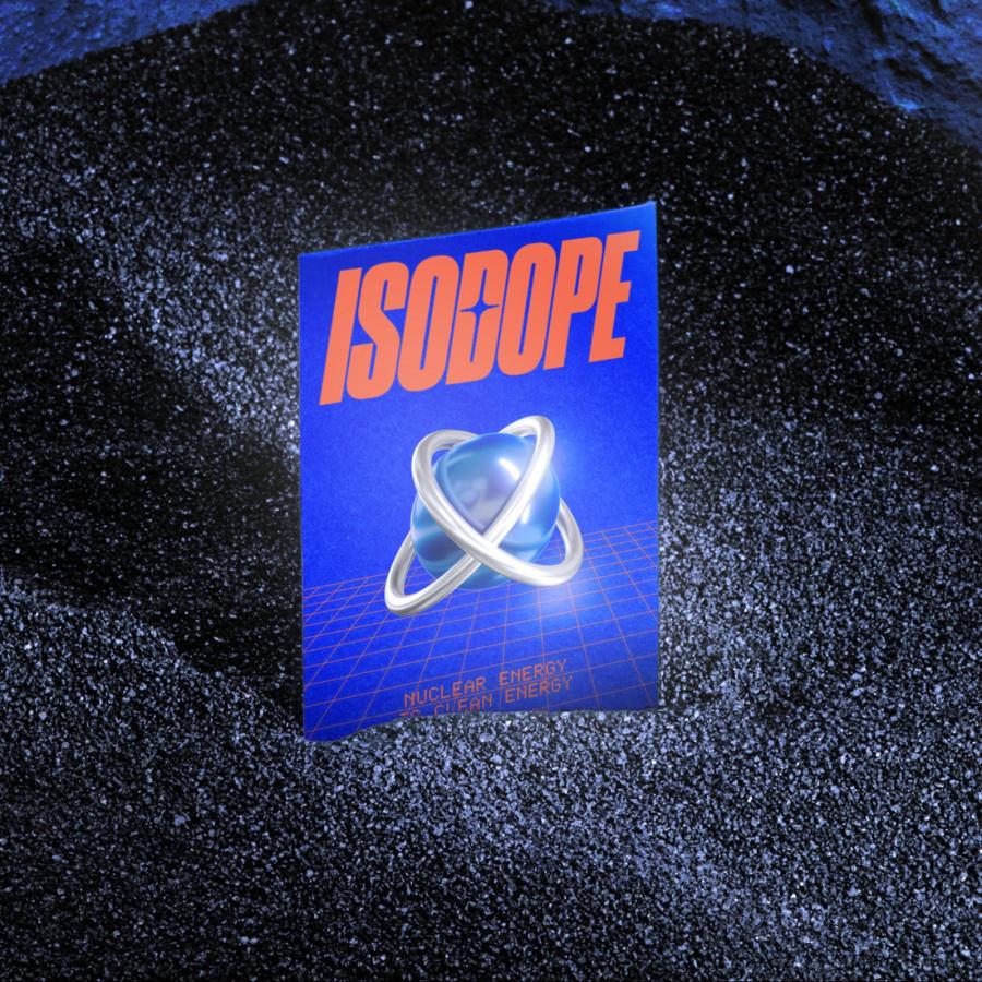
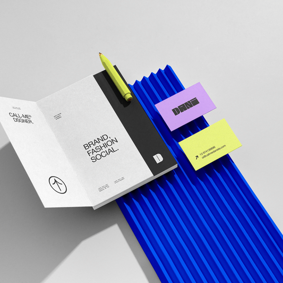
It’s been quite a while since the last time I posted about my favorite decade in graphic design. Yes, I am talking about the 90s and the series of posts we have been publishing titled “that 90s graphic design look is coming back” - I think that’s the name. So for this post I would love to share the editorial workshop work that Margaux LALLART created for the Pitchfork Music Festival. As you can see below, all the major characteristics of the 90s are there. Almost illegible text with tight leading, all cases, different orientations, textures. The result is truly beautiful.
