by abduzeedo
Explore Boltra's journey in branding and visual identity, where innovation meets aesthetic brilliance. Dive into a world where design transcends time.
The world of branding and visual identity is constantly evolving, and the recent project of Boltra, crafted by the talented Rahid Rehman, stands as a testament to this dynamic field. This article delves into the fascinating journey of Boltra's branding, showcasing how it blends modern aesthetics with timeless simplicity.
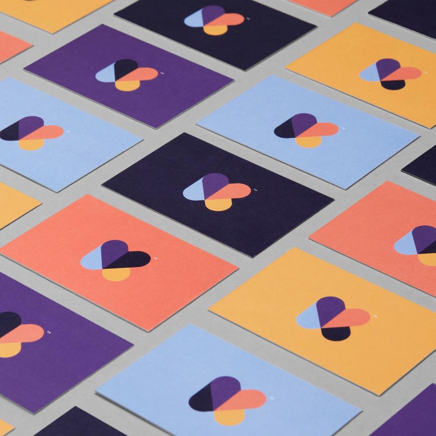
At the heart of Boltra's identity lies a logo that speaks volumes. It's not just a mere symbol; it is the embodiment of the brand's ethos. The logo's design strikes a balance between contemporary flair and classic elegance, making it a visual anchor for the brand. Rahid Rehman’s approach in this project exemplifies strategic design thinking, ensuring that every curve and color choice in the logo isn't just aesthetically pleasing but also narratively compelling.
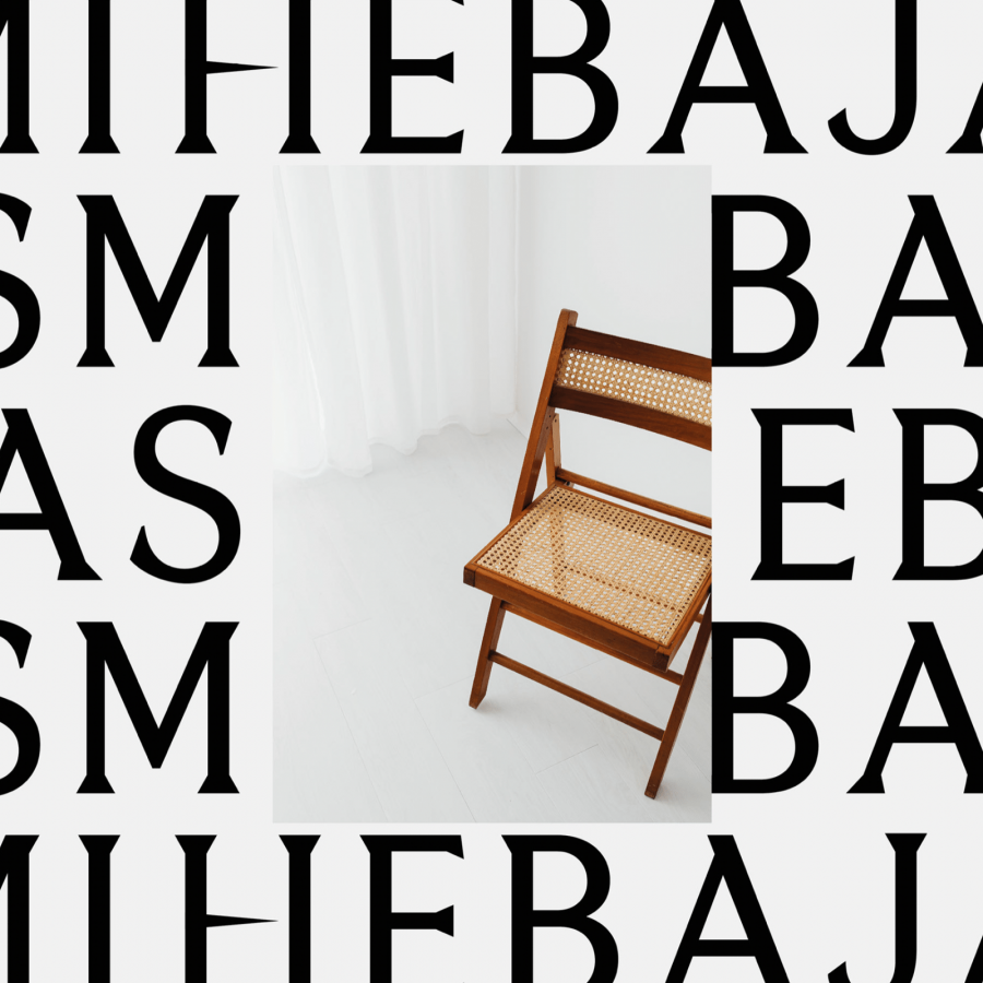
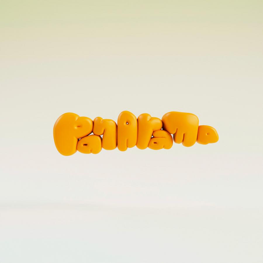
Typography plays a crucial role in Boltra's visual identity. The choice of typeface, its spacing, and integration with the logo reflect a meticulous attention to detail. This precision in typography enhances the brand's message, making it resonate with its audience. The color palette employed in the branding journey is equally thoughtful. It’s not just about choosing attractive colors; it's about selecting hues that reflect the brand's character and aspirations.
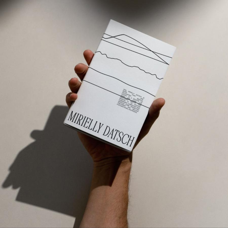
An intriguing aspect of Boltra's branding journey is its focus on brand consistency. From the initial sketches to the final application on various collaterals, there's a clear thread of consistency. This coherence is vital in the world of branding, as it builds recognition and trust among the target audience.
What sets Boltra apart is its ability to transcend trends. In a rapidly changing world, the project demonstrates how a well-crafted visual identity can remain relevant and impactful over time. Boltra's branding isn't just about creating a logo; it's about forging an identity that resonates with people and stands the test of time.
This project is a shining example for designers and brands alike, illustrating the power of cohesive branding and strategic design. It’s a journey where every detail is meticulously crafted, not just to create a brand, but to create an experience – an experience that leaves a lasting impression.
Branding and visual identity artifacts
Credits
- Creative Director: Rahid Rehman
Follow Rahid Rehman on Instagram and Dribbble.
