by abduzeedo
Explore the intersection of branding and visual identity in the Forte Whey project, a case study in modern, health-focused brand creation.
In the competitive landscape of health and nutrition, the Forte Whey project by Daniel Medeiros stands as a testament to innovative branding. This project showcases how a brand can offer a compromise between health and taste, challenging the notion that nutritious snacks must sacrifice flavor for benefits. Forte Whey, designed for those committed to a healthy lifestyle without compromising on the joy of eating, embodies strength not just in physical form but as an attitude and determination.
The crux of developing Forte Whey's brand identity was to navigate the common misconception that healthy snacks are dull. The challenge was to create a visual language that communicates modernity, passion, and innovation while distinguishing the brand in a crowded marketplace. The solution? A bold typographic logo that symbolizes strength and contemporary aesthetics, complemented by a vibrant color palette of neon, black, and beige. These elements work in harmony to not only promise a healthy lifestyle but also a bold statement against the mundane.
Forte Whey's design strategy is a blend of art and science. The typography is not merely letters but a representation of the brand's core values. The color scheme is carefully chosen to evoke a sense of innovation and boldness, appealing to consumers seeking both health benefits and taste. The cohesive design elements ensure the brand stands out, making a significant impact at the point of sale.
This project exemplifies how thoughtful design can transform brand perception, making it an excellent study for those interested in the intersection of branding and visual identity. By focusing on the essence of the brand and its promise to consumers, Daniel Medeiros has crafted a visual identity that truly differentiates Forte Whey in the market. This case study not only inspires designers but also brands looking to make a mark in their respective industries.
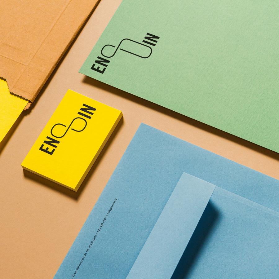
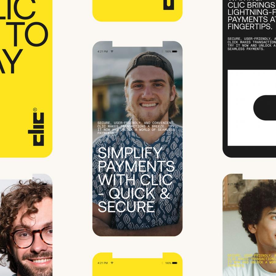
Branding and visual identity artifacts
For more information make sure to check out Daniel on Behance and LinkedIn.
