by abduzeedo
Discover how MESURA, led by Kirill Kozyrev and German Zhevmerev, redefines web design, UI/UX, and minimalism, setting new standards for digital elegance.
In the digital age, where screens are the windows to the world's knowledge, MESURA's latest design project stands out as a testament to the power of minimalist web design. Guided by the skilled hands of Kirill Kozyrev and German Zhevmerev, this concept merges functionality with artistry, demonstrating that less truly can be more.
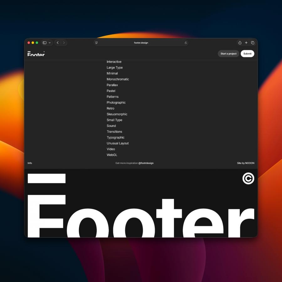
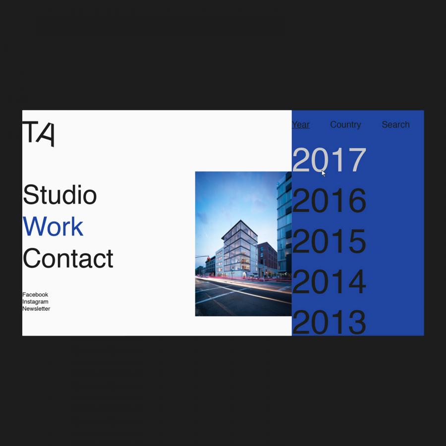
At the heart of MESURA’s project lies a commitment to simplicity and elegance. This approach is brilliantly showcased through their use of typography. By choosing simple yet elegant fonts, the designers ensure that the content speaks for itself, free from the distractions of overly decorative elements. This choice not only improves readability but also enhances the user's engagement with the content.
Another key aspect of MESURA’s design philosophy is the use of a grid system and an editorial design look. This methodical approach to layout brings an order and clarity that is often missing in more complex designs. The black and white color scheme further emphasizes this clarity, using contrast to guide the viewer's eye and highlight the importance of the images within the design. This strategic use of color accentuates the visual impact of the project, ensuring that it remains memorable and effective.
What sets MESURA’s work apart is not just their aesthetic choices but their underlying philosophy. Designing for the unknown, as they describe their mission, is about embracing humility and openness. It's about listening — truly listening — to people, communities, and environments. This philosophy is evident in every aspect of their design, which seeks not just to capture attention but to engage and inspire.
For those in the field of web design, UI/UX, and minimalism, MESURA’s project serves as a beacon of inspiration. It exemplifies how designers can create impactful, beautiful work without succumbing to complexity. In a world cluttered with information and distraction, the elegance of MESURA’s design reminds us that sometimes, the most profound statements are made quietly, with grace and simplicity.
Web design and UI/UX artifacts
For more information make sure to check out Kirill Kozyrev behance.net/kirillkozyrev and German Zhevmerev behance.net/notbadsgn
