Visual identity and UX for TADAO ANDO Architect & Associates

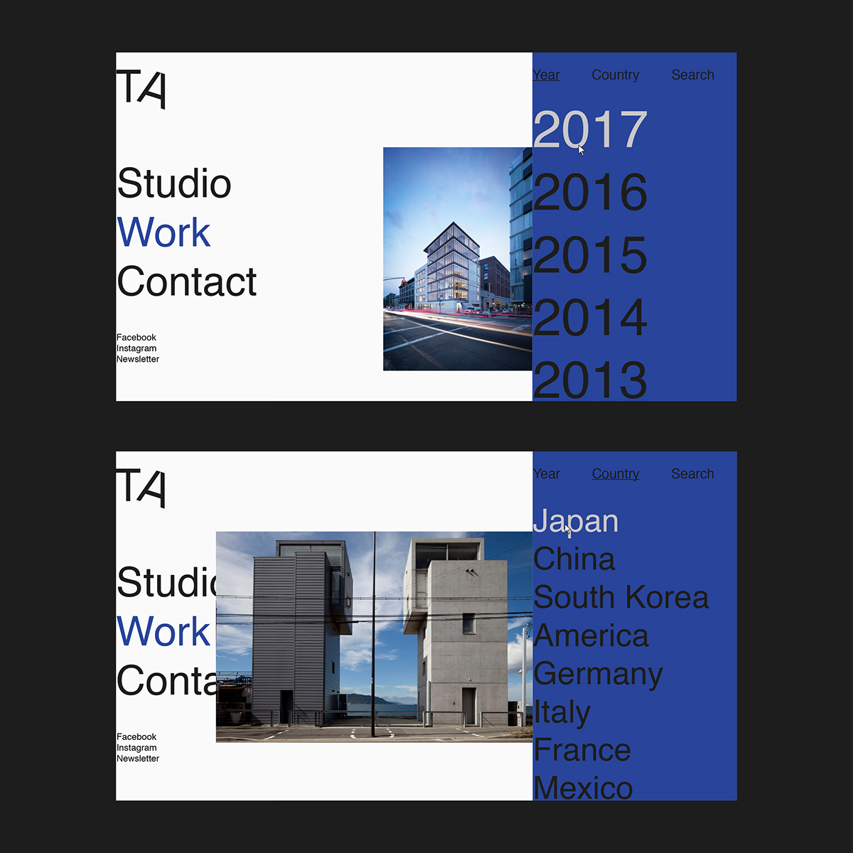
Tadao Ando is one of the most famous current architects, and one of Théo Poyer favorites. Heavily inspired by Le Corbusier, Tadao Ando started his work in 1973. By using concrete in a modern way, his work is easily recognizable. Dragging both asian and European influences, he created his own language by drawing the line between industrial materials and natural environment by highlighting the whole context of the architectural creation.

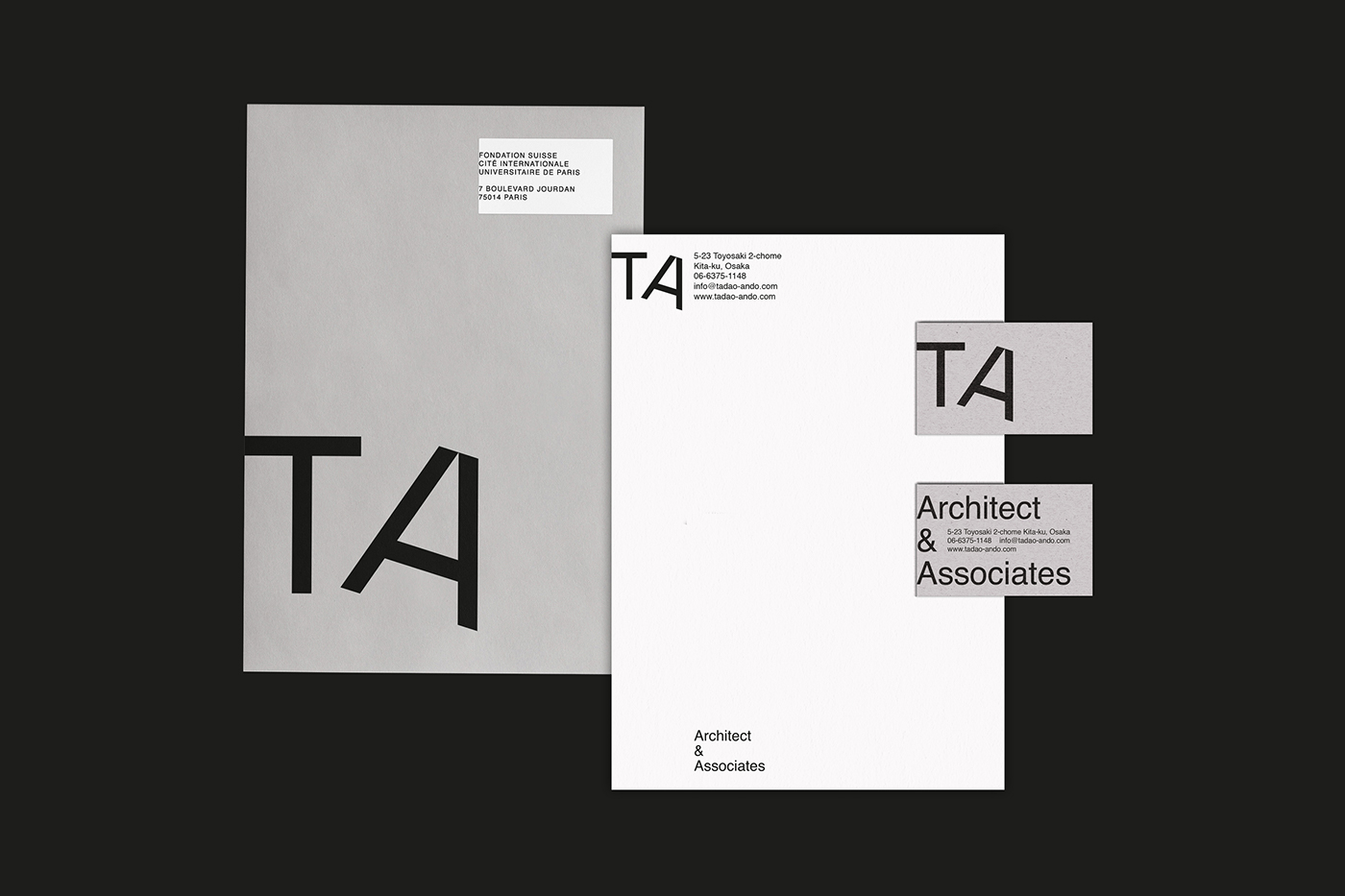
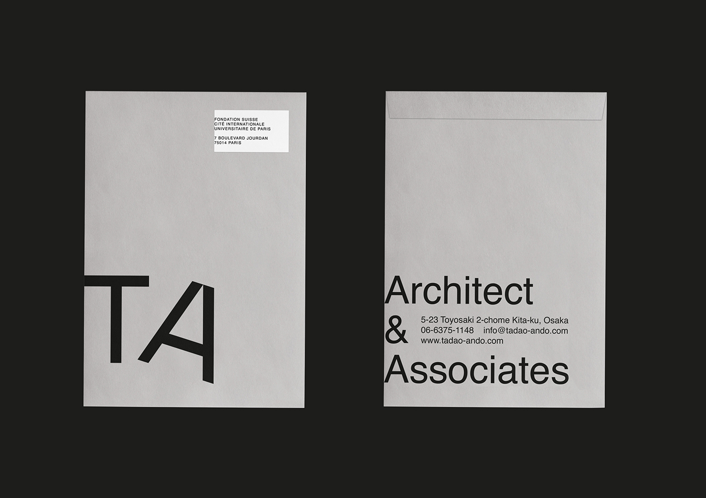
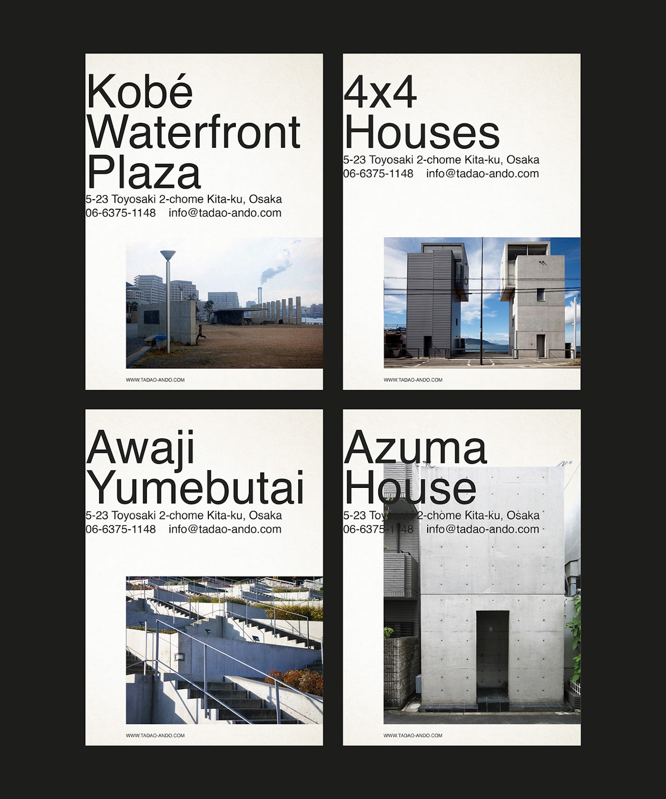
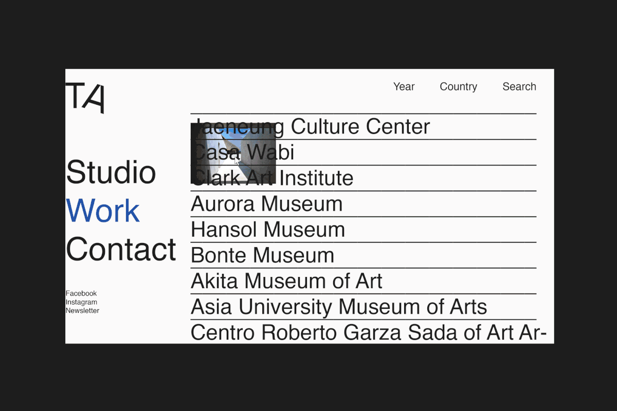
For this work, I decided to design his own visual identity, starting with a logotype and the all-branding package, with visit card, letters, web-design etc.  

Tadao Ando architecture branding  identity Website card logo typography   designTadao Ando architecture branding  identity Website card logo typography   designTadao Ando architecture branding  identity Website card logo typography   designTadao Ando architecture branding  identity Website card logo typography   designTadao Ando architecture branding  identity Website card logo typography   designTadao Ando architecture branding  identity Website card logo typography   designTadao Ando architecture branding  identity Website card logo typography   designTadao Ando architecture branding  identity Website card logo typography   designTadao Ando architecture branding  identity Website card logo typography   designTadao Ando architecture branding  identity Website card logo typography   designTadao Ando architecture branding  identity Website card logo typography   designTadao Ando architecture branding  identity Website card logo typography   designTadao Ando architecture branding  identity Website card logo typography   design

For more information make sure to check out Theo on:

Brought to you by