by abduzeedo
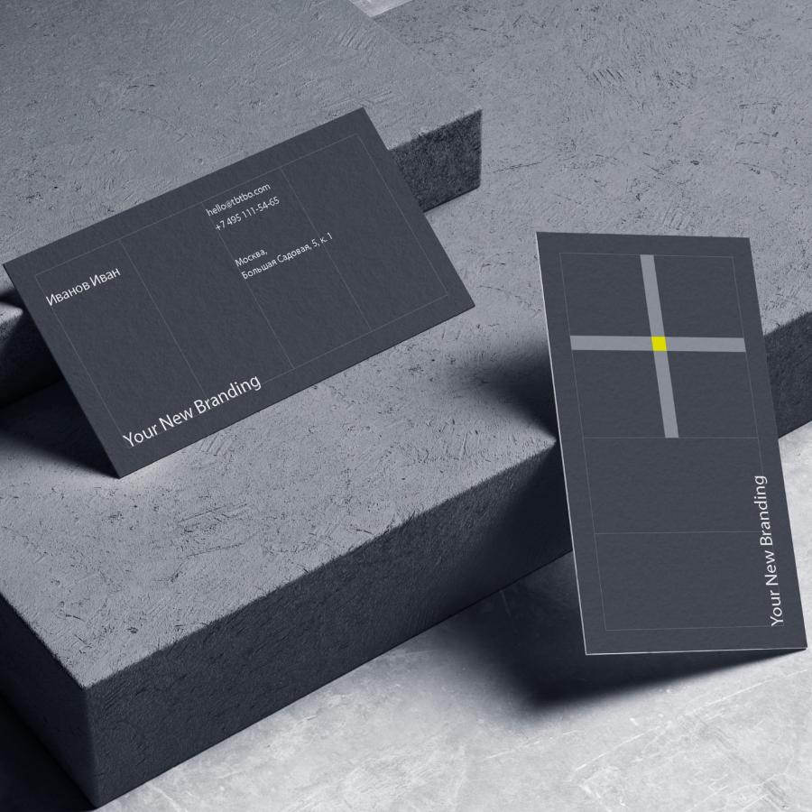
Studio Fabio Biesel shared a super elegant branding and visual identity project for ORG-YOU, an organization application for small and medium-sized companies. The folks over at Studio Fabio Biesel had the great task to support ORG-YOU creatively from the beginning. They have developed a corporate design, interface designs for web applications, apps and also the website.
The most important values are simplicity, sympathy and openness. For these values, corresponding and strong symbols were created, which together form the ORG-YOU logo. ORG-YOU also stands for playful simplicity at the same time. This was also graphically translated into the logo by reminding of the game tic tac toe. As another idea, the process of ordering was visualized. The single forms of the logo can be used fragmentary, variable and found always into a fixed form at the end.
The most important values are simplicity, sympathy and openness. For these values, corresponding and strong symbols were created, which together form the ORG-YOU logo.
Credits
- Design and Creative Direction: Studio Fabio Biesel
- Animation: Studio Fabio Biesel
- Code and Development: Lars Bergelt
- Text and Wording: Studio Fabio Biesel, Bettina Stähle
- Client: ORG-YOU
For more information make sure to check out ORG-YOU.COM and STUDIOFABIOBIESEL.COM

