by abduzeedo
The packaging for The Stock Merchant Provisions’ collection is the work of Sydney-based creative studio, The Offices, specialists in food and beverage branding and packaging. The Offices are longtime collaborators of the team behind The Stock Merchant Provisions.
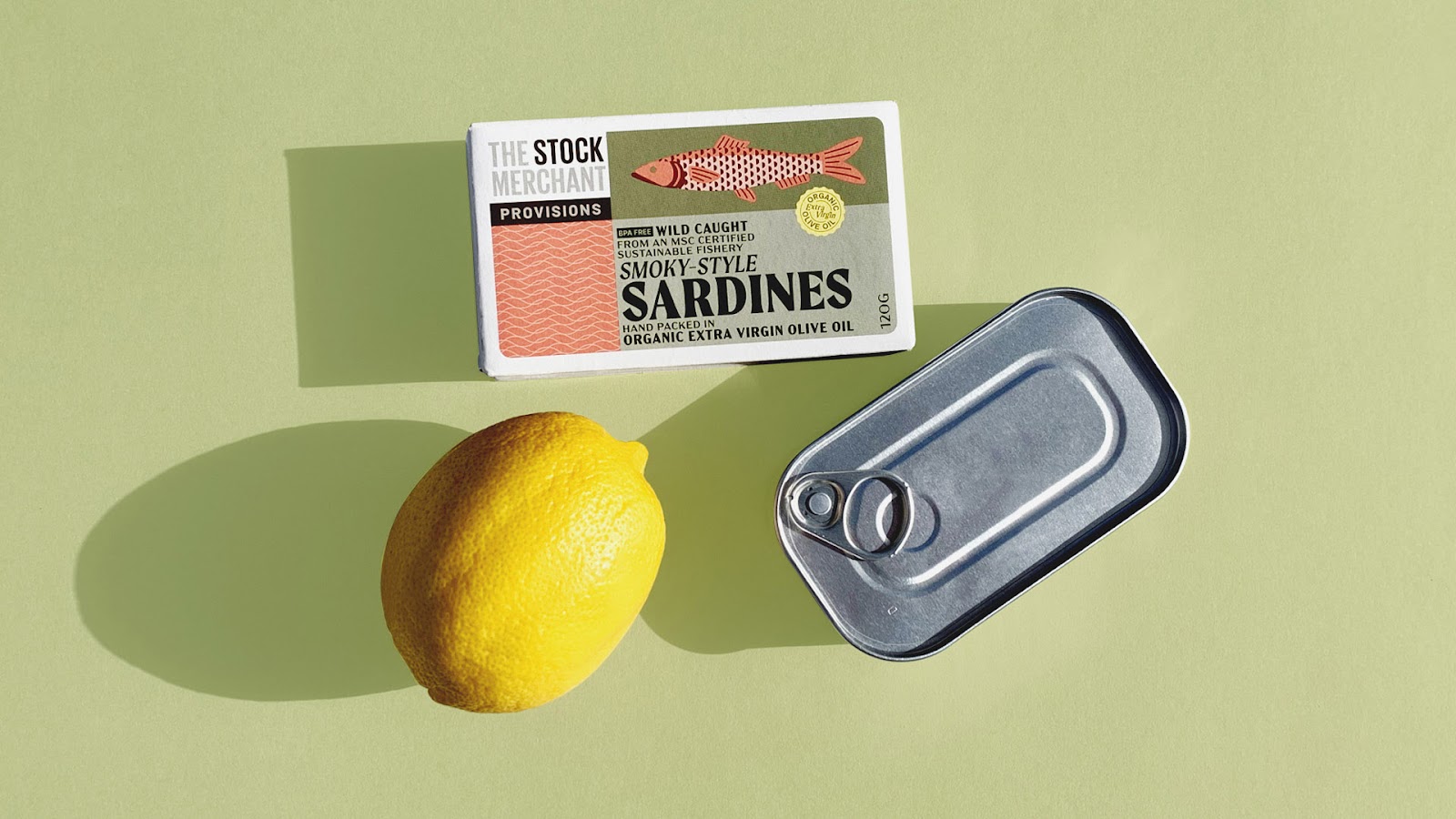
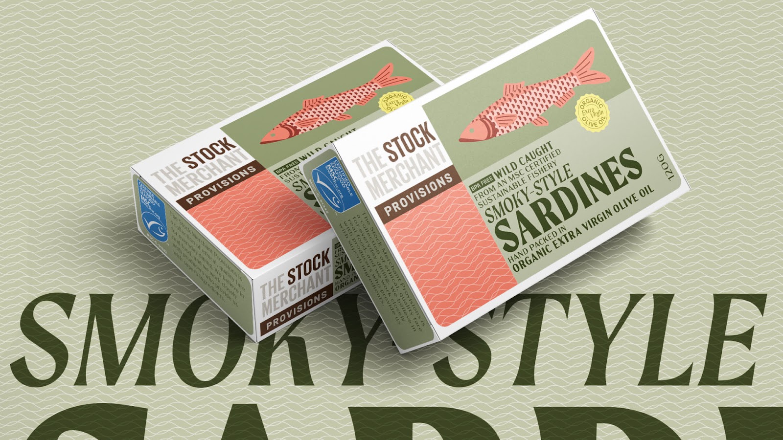
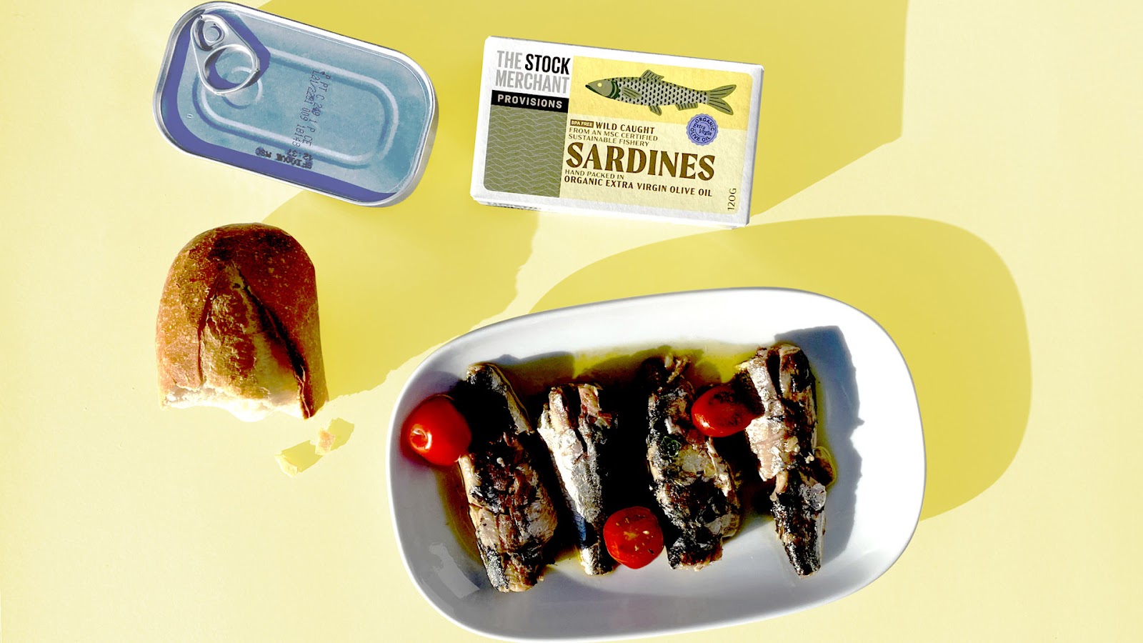
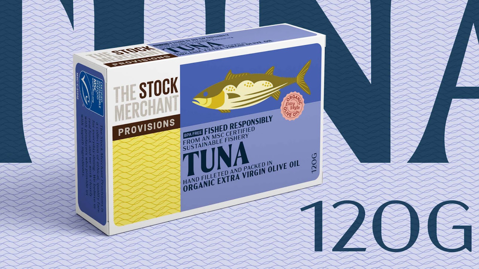
Their brief was to reference the Mediterranean traditions of tinned seafood, while ensuring a modern feel and strong messaging around the product’s clean, ethical attributes. The Offices’ imagery derives its warm, lustrous colors from traditional Spanish and Portuguese crafts.
The product also had to align with the simple graphic concept of parent brand, The Stock Merchant (of stocks and sauces fame). A final consideration was shelf presence, and retailers have already commented that the distinctive graphic concept is helping the collection to differentiate in their stores.
“We poured over hundreds of gorgeous cans from the past 100 years, looking to get that nice balance of familiar and modern elements. Our final ideas were then matched to criteria that we know to be successful in retail. We’re chuffed to hear the products are already so well received in the market,” — The Offices Creative Director, Jeffrey Oley
The packaging has met with an overwhelmingly positive response from retailers, according to The Stock Merchant Provisions management. More products are being fast-tracked for release in the collection as a result of this success.

Based in Sydney, The Offices specializes in creating brands of distinction, and has particular expertise in food and beverage branding, packaging, websites and content creation.


