by abduzeedo
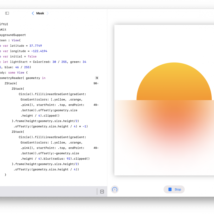
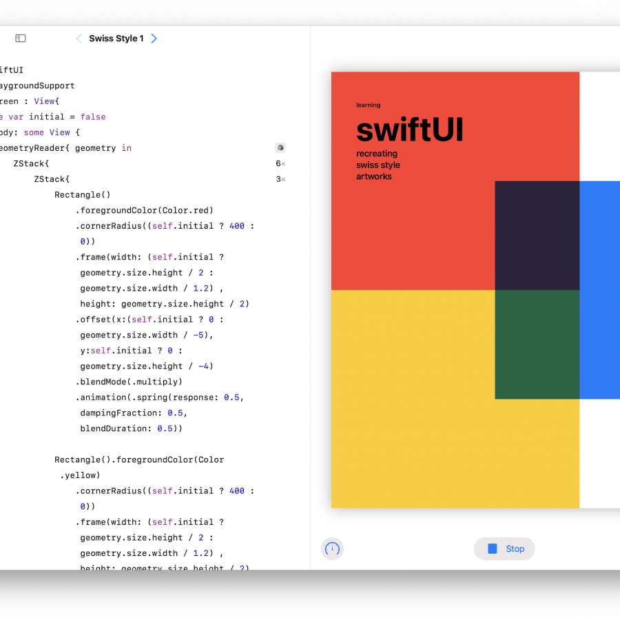
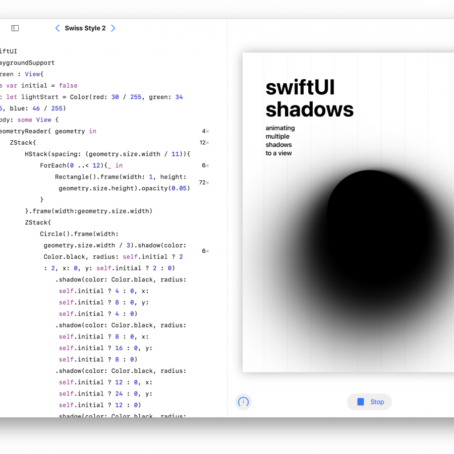
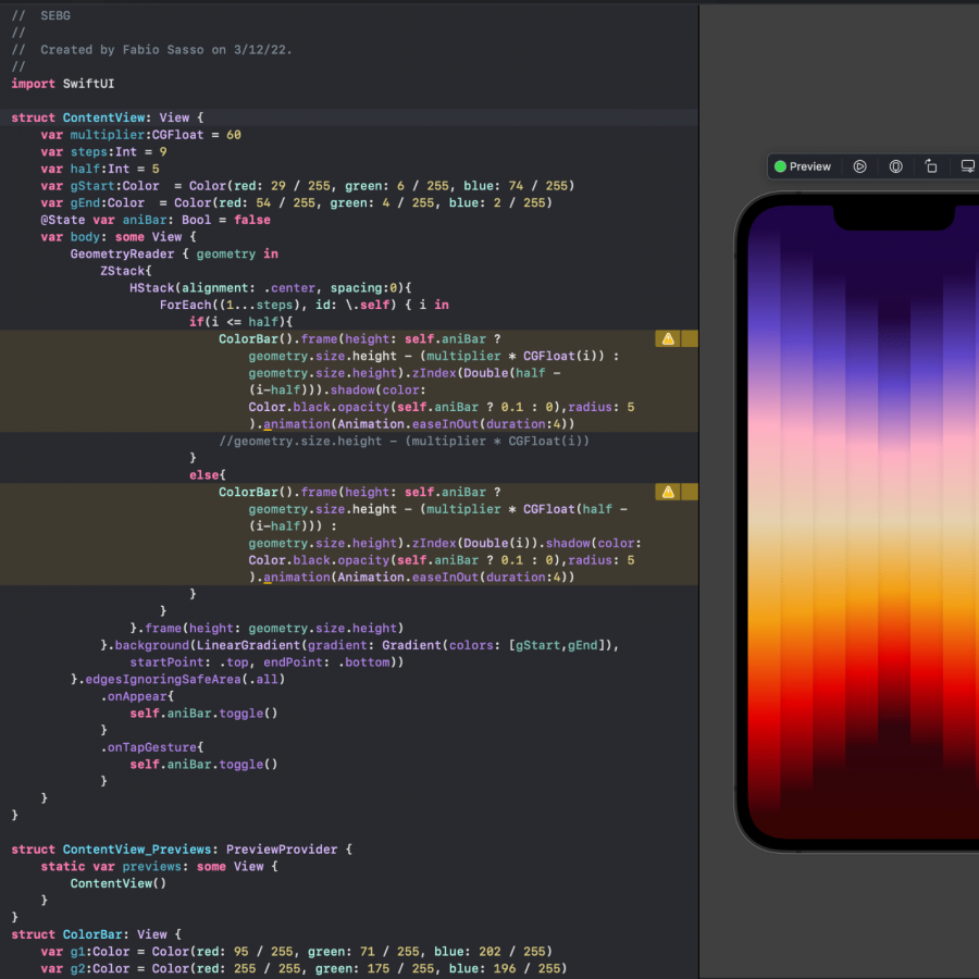
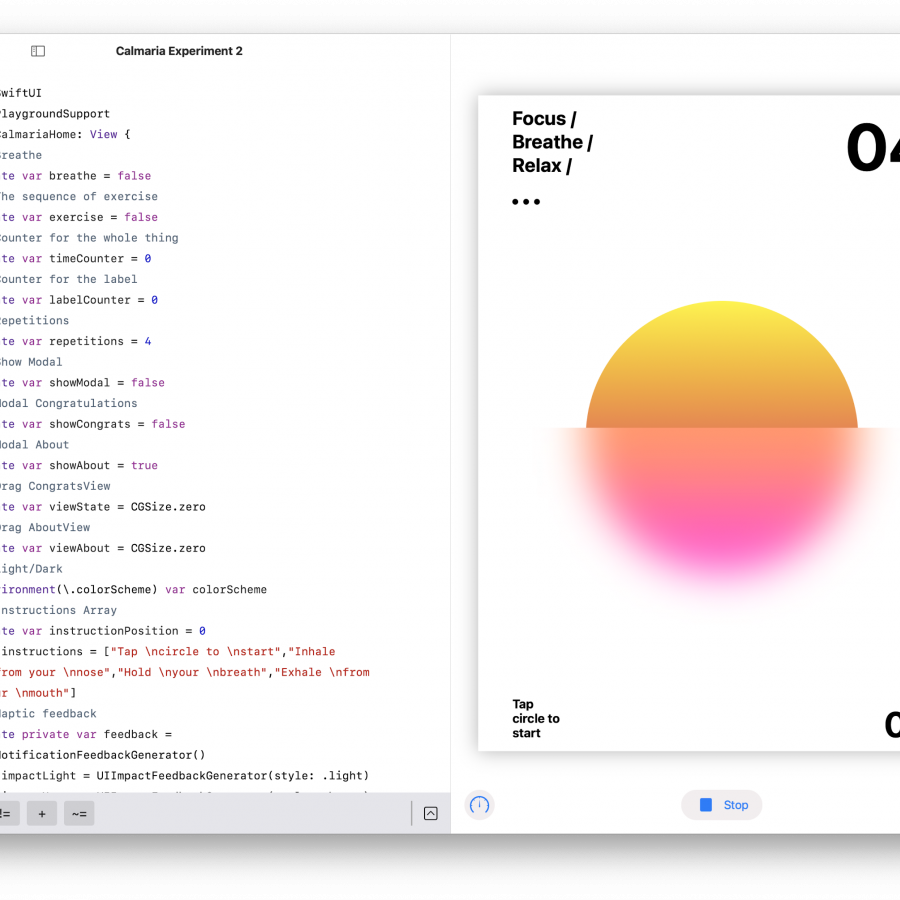
This was the most recent SwiftUI experiment. Nothing fancy just trying to understand how to work with shadows. I’ve done similar effects using CSS if you remember here on the blog. But as I am learning this new language, I thought it would be fun to try to design a poster like image using typography and shadows. It was also useful to learn how things animate using states.
As usual you can download the code on GitHub
