by jeff
Studio Arch's brand identity translates Birmingham's Digbeth railway arches into a monochromatic, grid-based visual system built on industrial restraint.
The studio's history runs deeper than the rebrand. Studio Arch grew from Lab11's in-house design team, founded in 2016, then evolved into Circle Media in 2020. The 2024 relaunch as Studio Arch marks a deliberate shift — moving beyond nightlife into a broader offering that serves startups, established companies, and organisations. The new brand identity needed to carry that weight without the noise.
What grounds it is the location. Digbeth's railway arches are a constant presence in Birmingham's creative quarter — heavy, industrial, and quietly iconic. Studio Arch translated that physical fact directly into a visual language, pulling from the arch form for its logomark and from industrial materials for its palette.
How Studio Arch Built Its Brand Identity
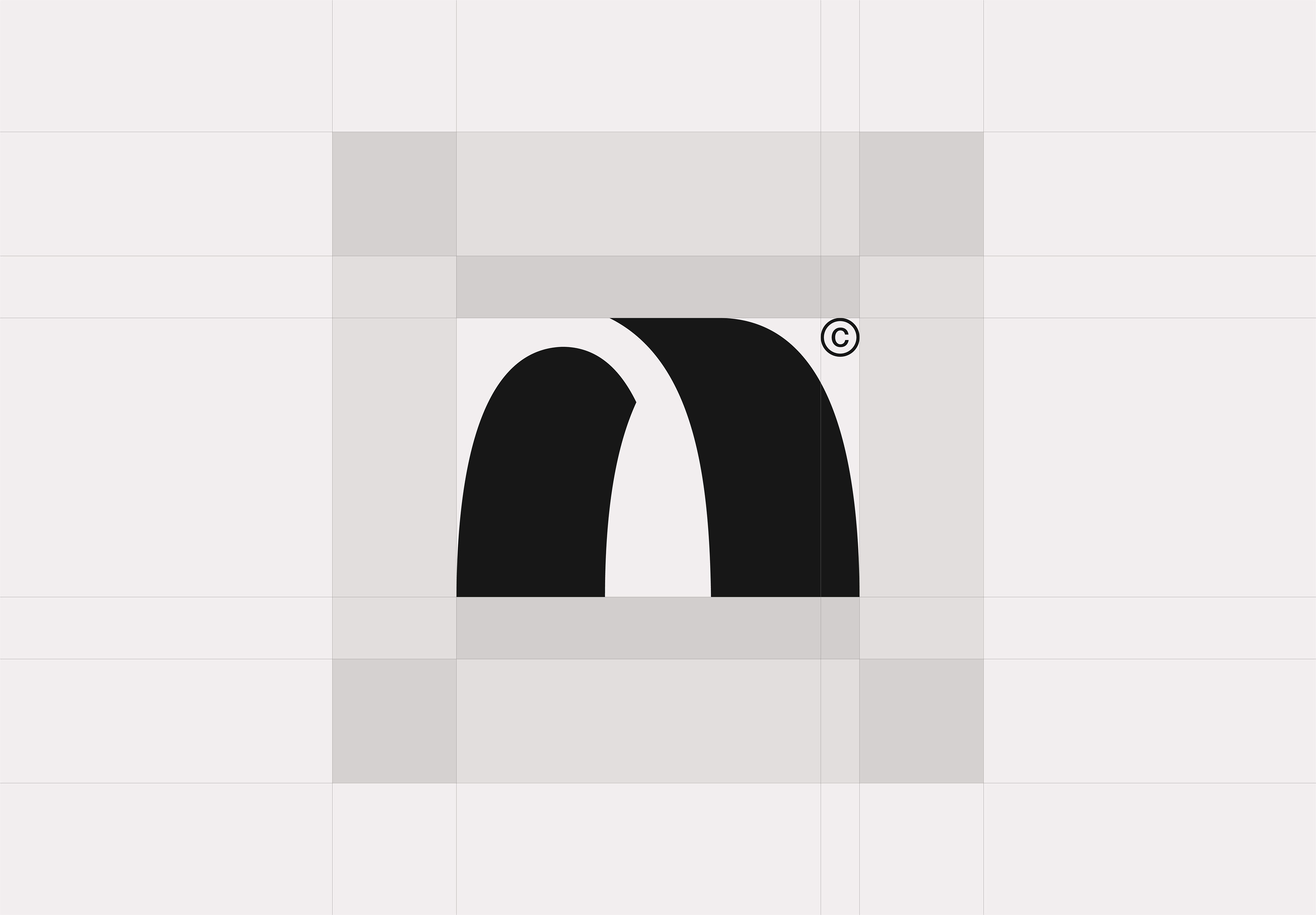
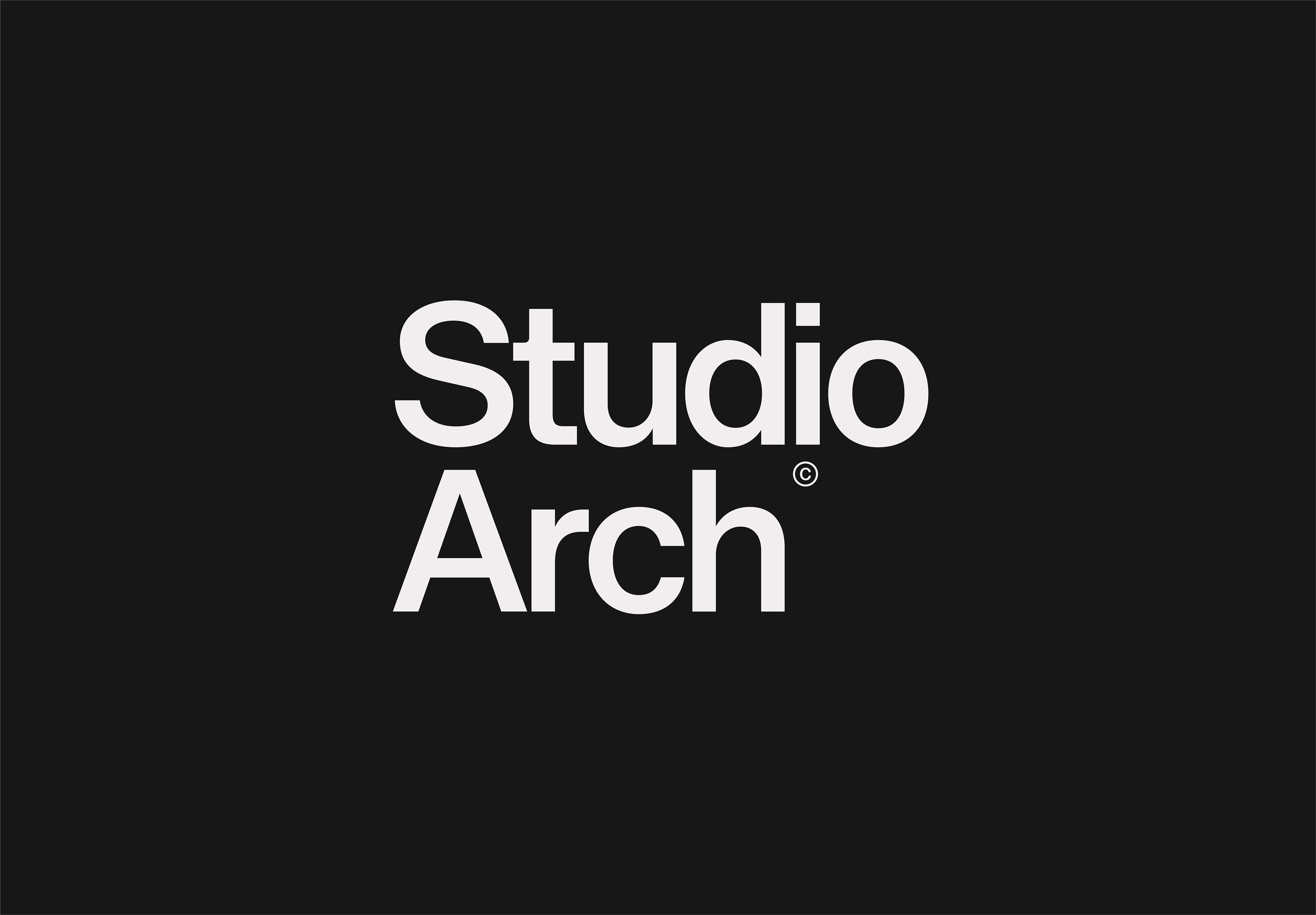
The logomark itself is a geometric arch shape — bold, open at the base, with a subtle diagonal cut across the crown that splits the top mass into two. It reads simultaneously as an architectural gateway, a lowercase "n," and a stylized "a." The proportions were worked out on a strict modular grid, which the studio shows openly in its grid construction sheet. Nothing is arbitrary.
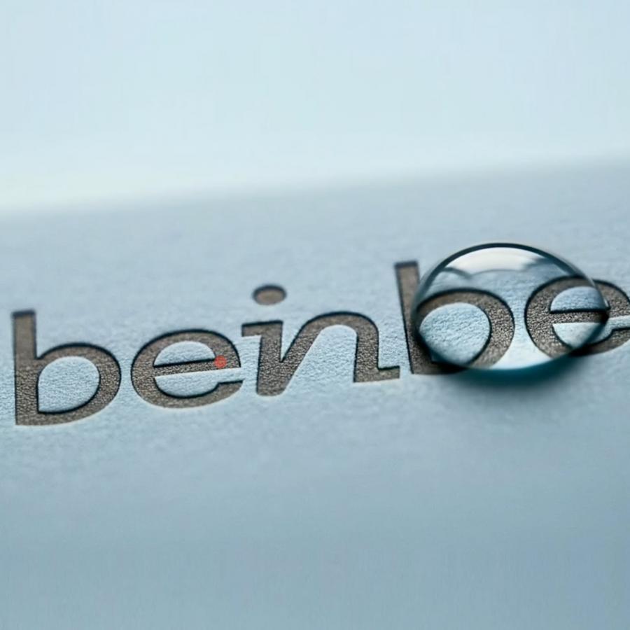
The palette is black, white, and gray. No accent colors appear anywhere across any application. The warmth in the off-white wordmark and the near-black backgrounds carries just enough temperature to feel considered rather than clinical. The wordmark itself uses a geometric grotesque with a flat-topped "A" — a detail that echoes the truncated arch form and gives the type a quiet architectural logic.
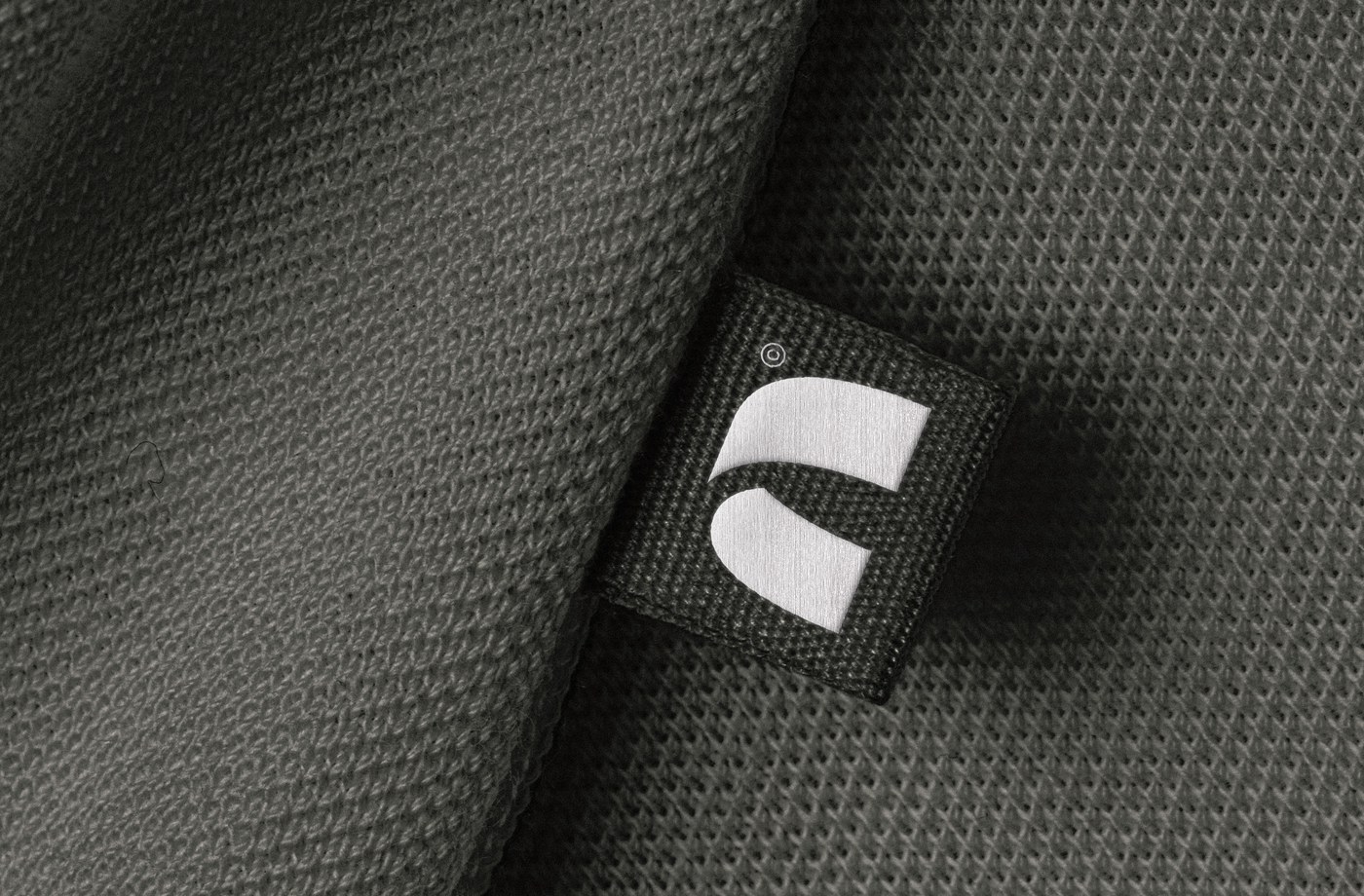
The brand identity appears on a woven clothing label stitched onto an olive-toned knit fabric — not a business card, not a letterhead. That choice signals something about the studio's creative appetite. Shot in close-up macro with soft directional light, the woven tag reads as a fashion or interiors brand, not a traditional agency.
One detail runs consistently through every single touchpoint: the copyright symbol. Rather than a legal footnote, Studio Arch treats the © mark as a visual signature — embedded in the logo, superscripted after the wordmark, woven into the fabric tag. It appears as part of the brand's character, repeating like a stamp of authorship across every application.
Studio Arch Brand Identity in Real-World Applications
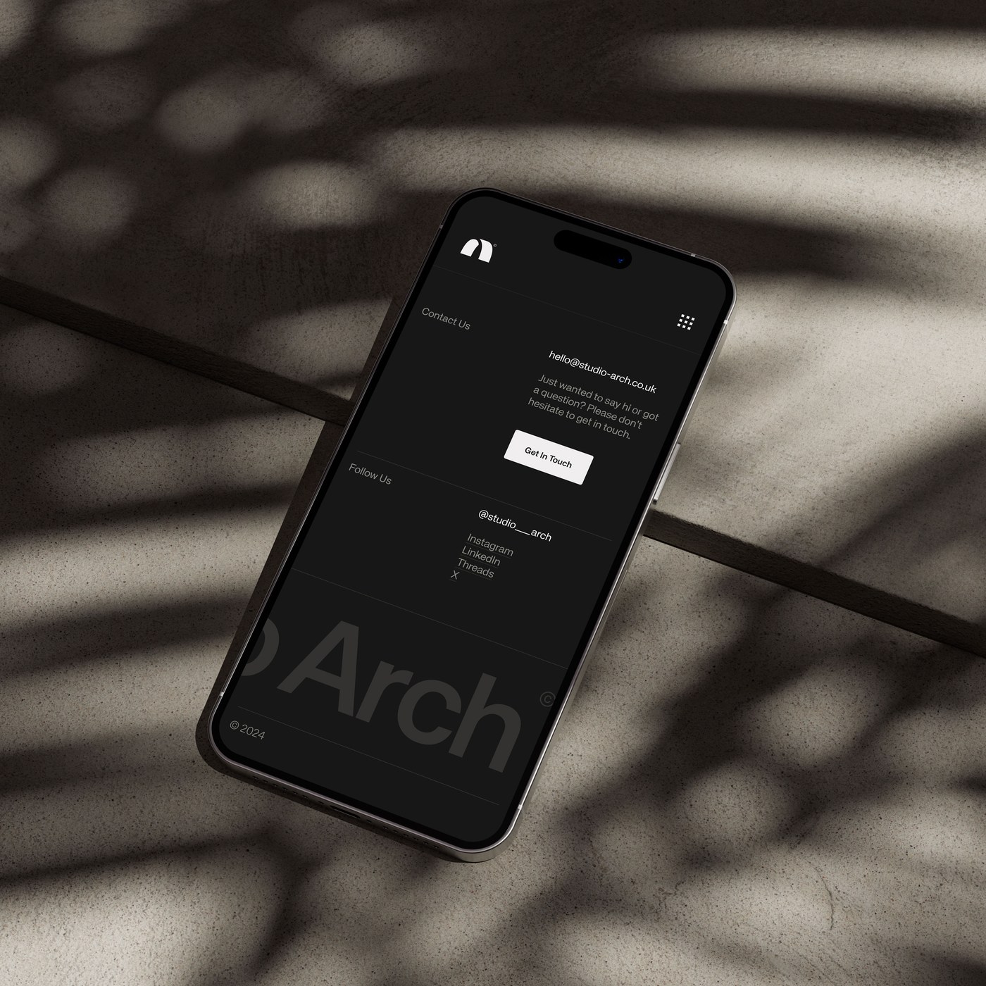
The mobile website mockup continues the restraint. Shot on natural light with concrete surfaces, wooden strips, and dappled leaf shadows, the scene aligns with contemporary architectural and Japandi aesthetics. The screen shows the studio's contact section — dark mode, black background, white text — with a subtle dark-on-dark "Arch" watermark fading into the background. The whole composition reads as one material-conscious decision after another.
Studio Arch is based in Digbeth, Birmingham. The brand identity work shown here demonstrates how a studio can use its own address as creative brief — finding a visual system in the physical fabric of the neighbourhood rather than importing a borrowed aesthetic. The grid, the arch, the palette: all of it comes from a specific place.