by abduzeedo
In the bustling world of design, few manage to strike the harmonious balance between tradition and innovation quite as effectively as Min Hui Hu from China. Enter BlueBeat – not just another music center, but a revolution in the realm of drum training. Abduzeedo.com is elated to delve into the visual and conceptual genius behind this distinctive brand.
At its core, BlueBeat breaks the shackles of traditional drum teaching methodologies. Through its avant-garde instructional materials, it promises a swift mastery of drumming skills. The emphasis here is not merely on teaching but on imbibing professionalism and pragmatism, catering to drum enthusiasts across the spectrum of expertise. Yet, what truly sets BlueBeat apart is not just its groundbreaking teaching approach but its impeccable design aesthetics.
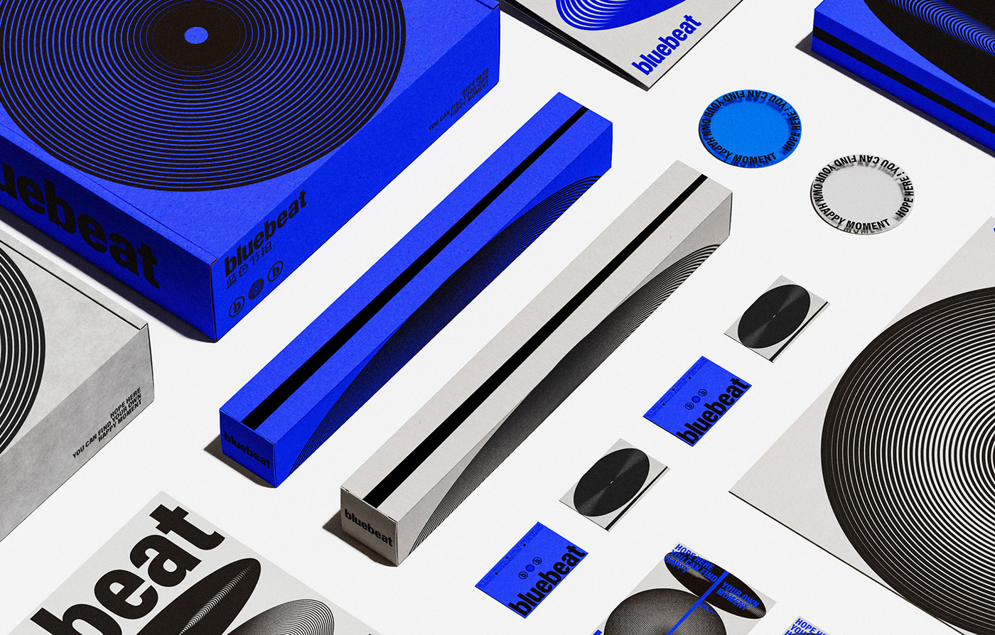
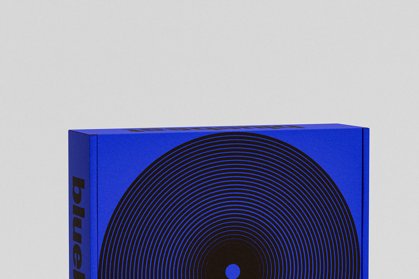
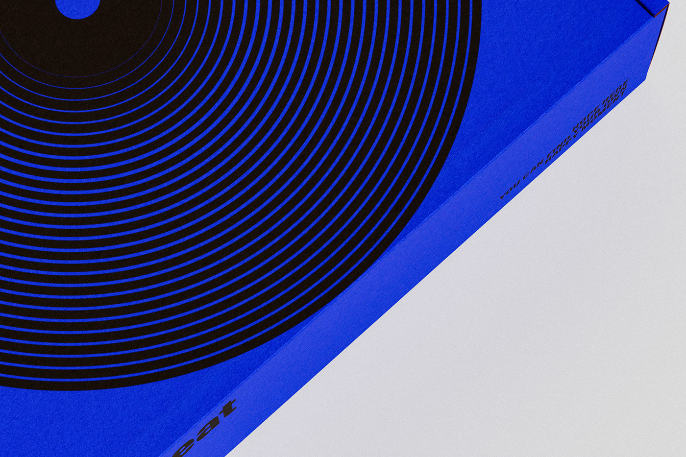
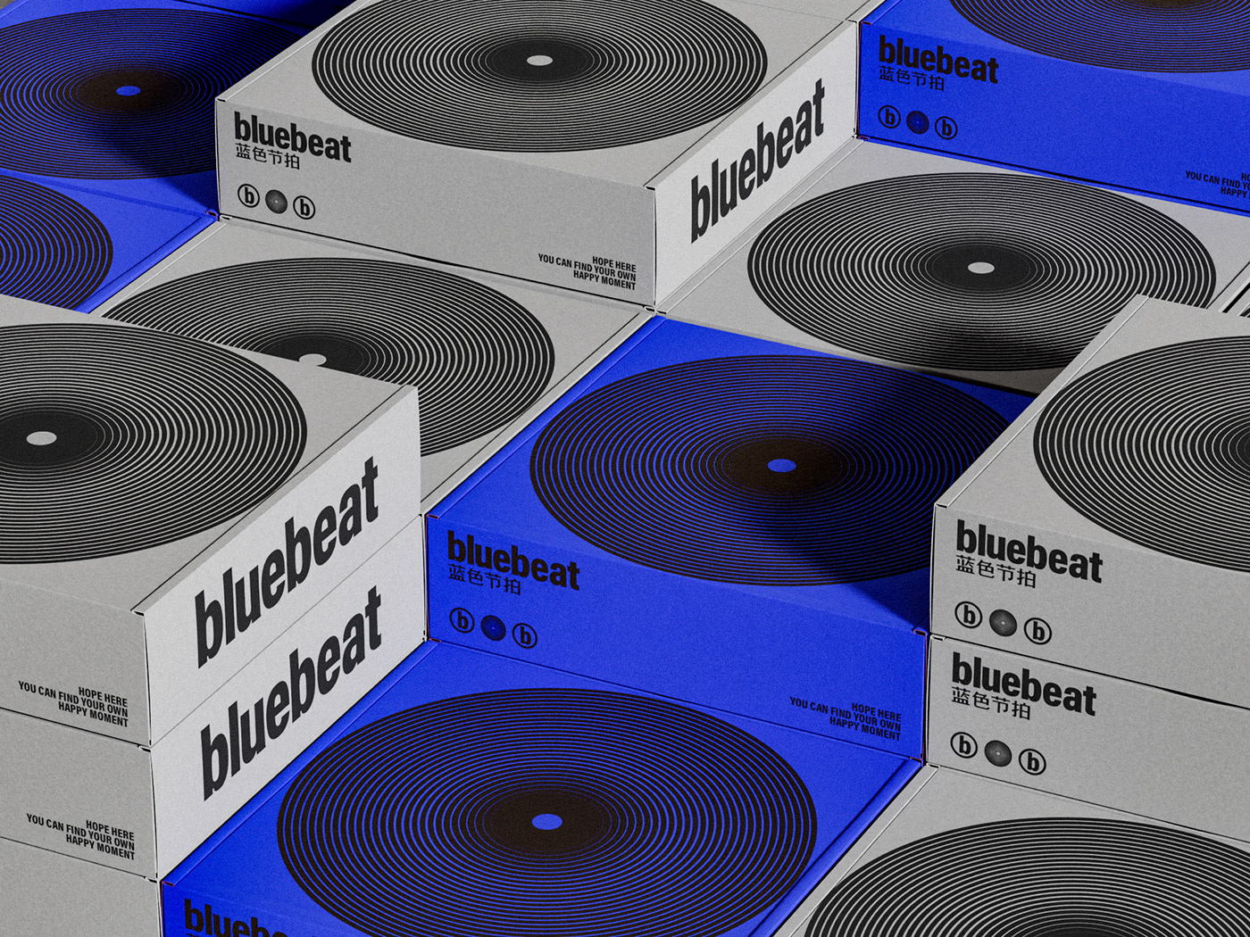
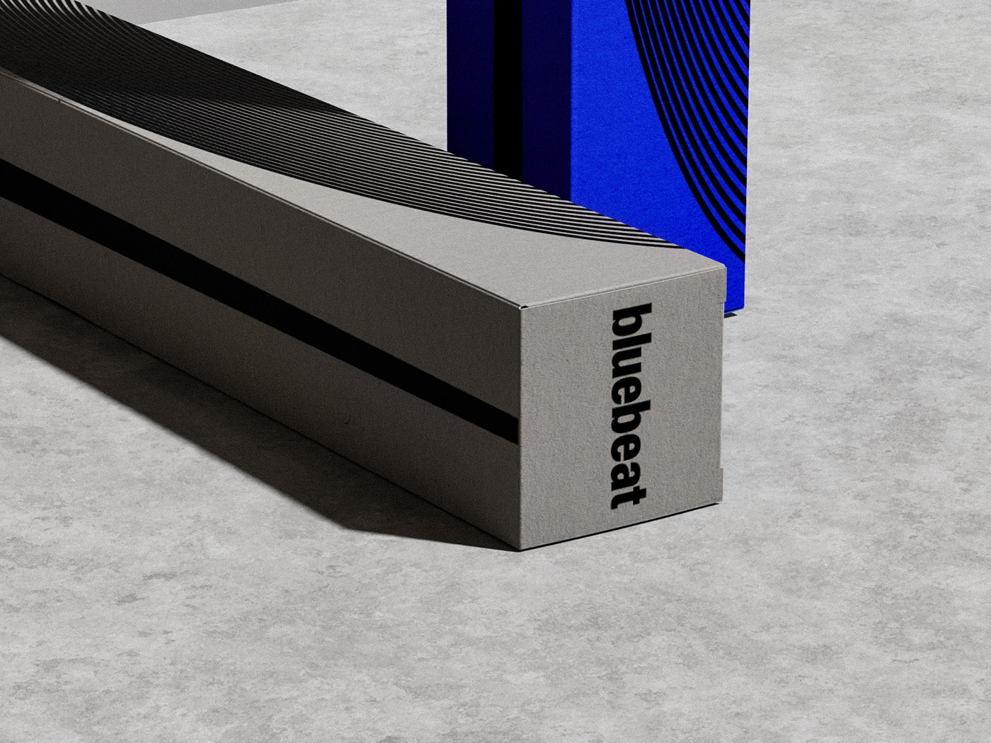
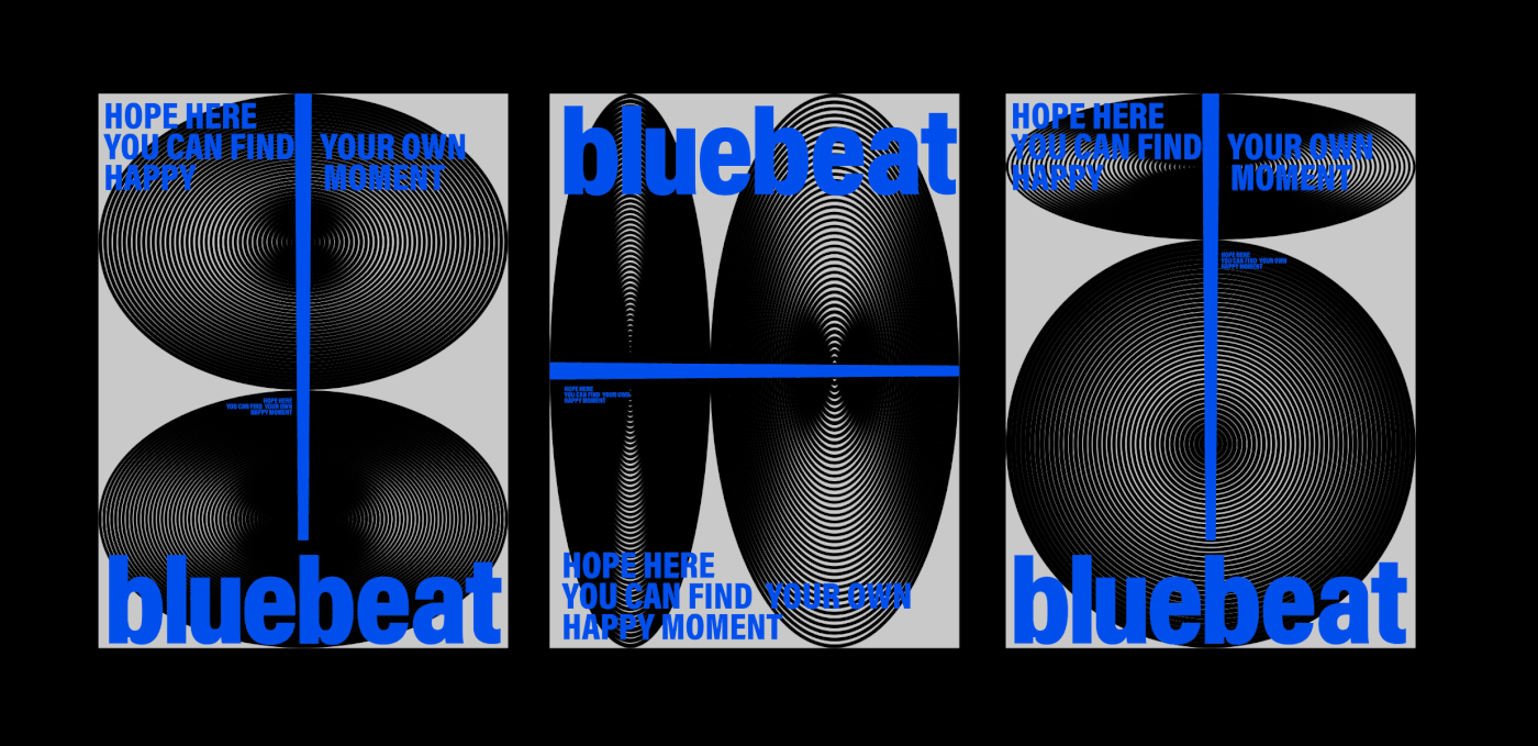
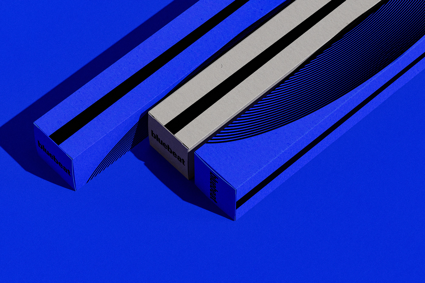
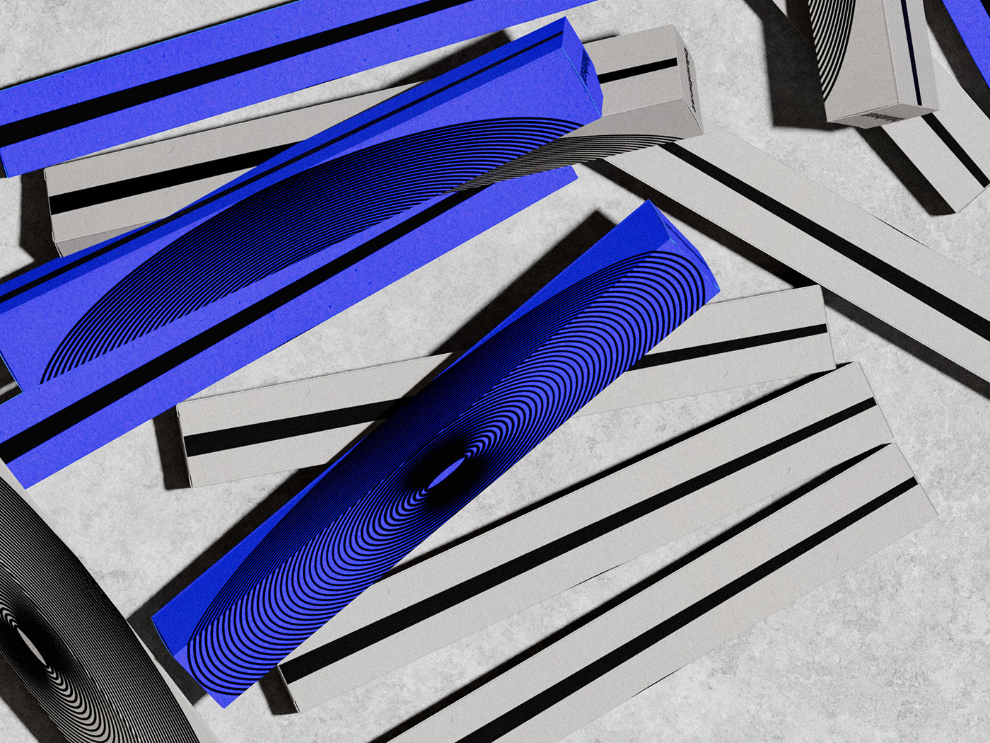
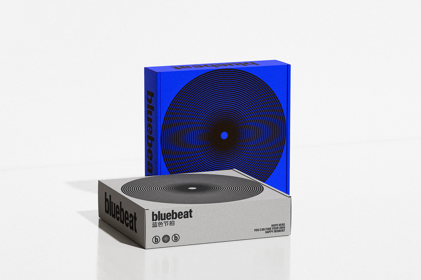
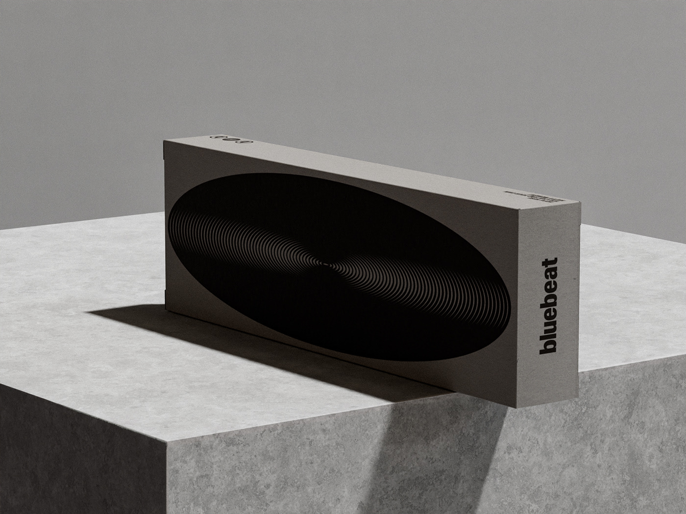
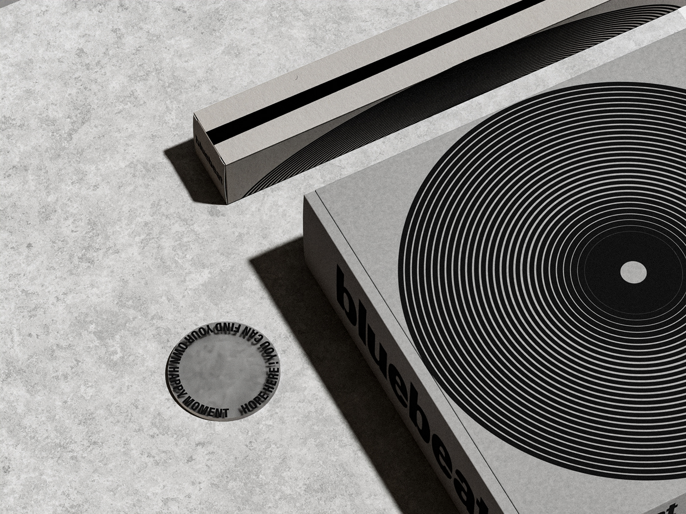
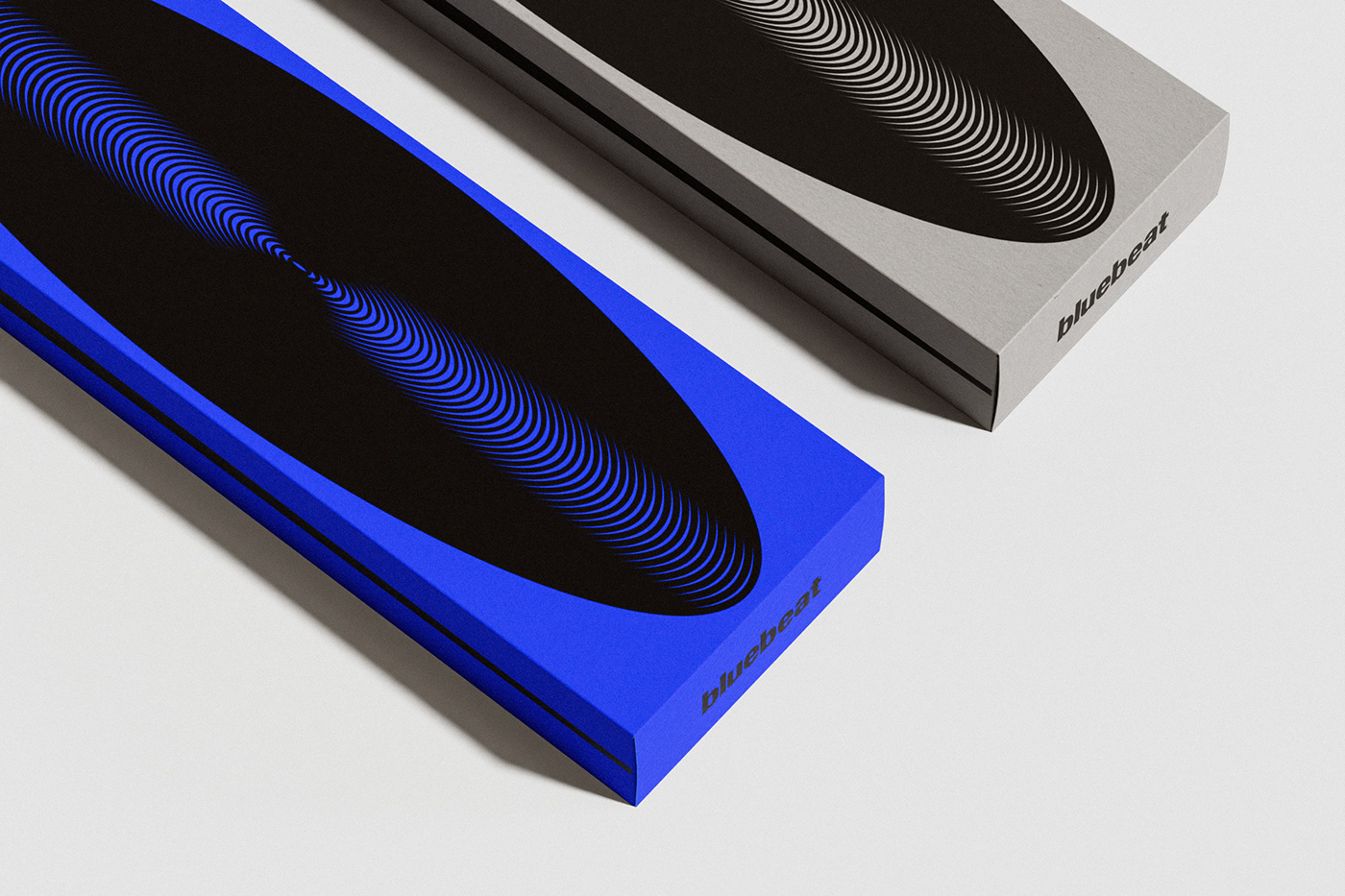
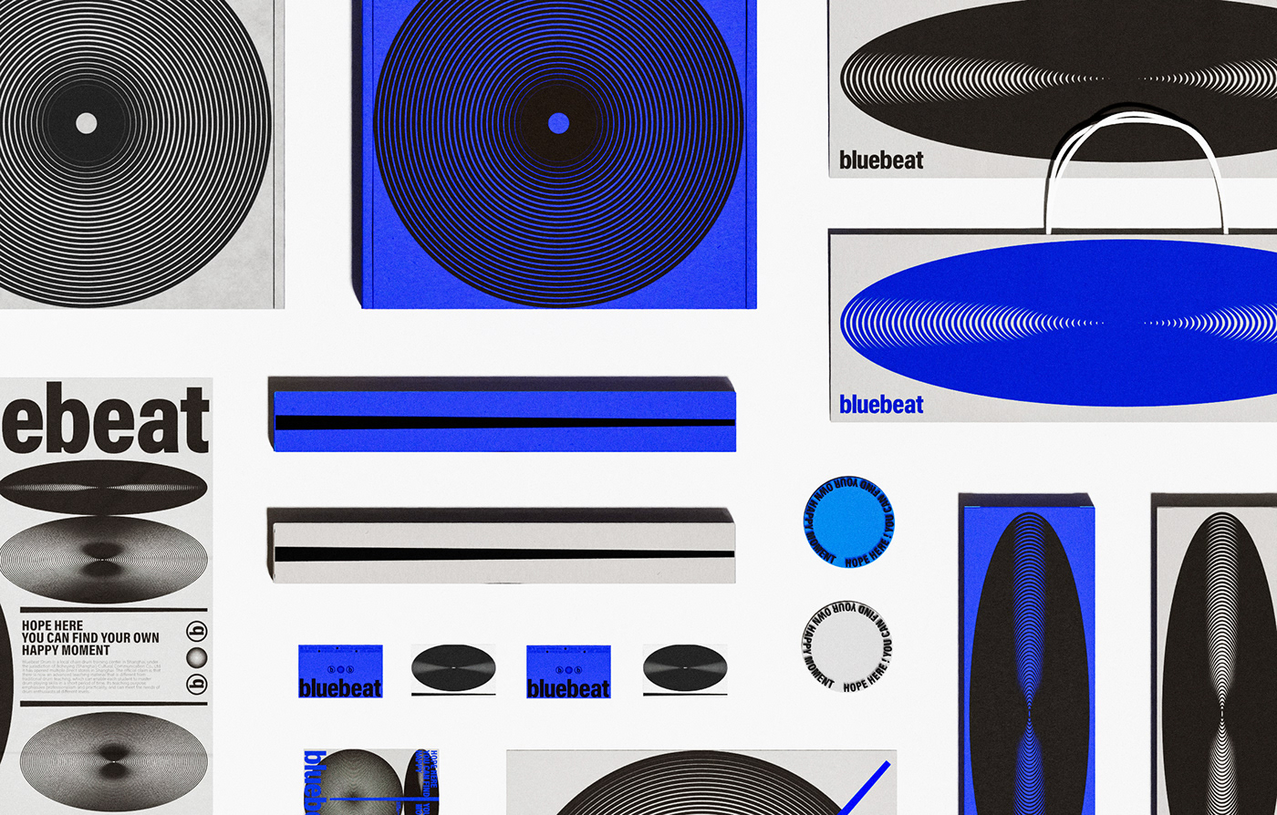
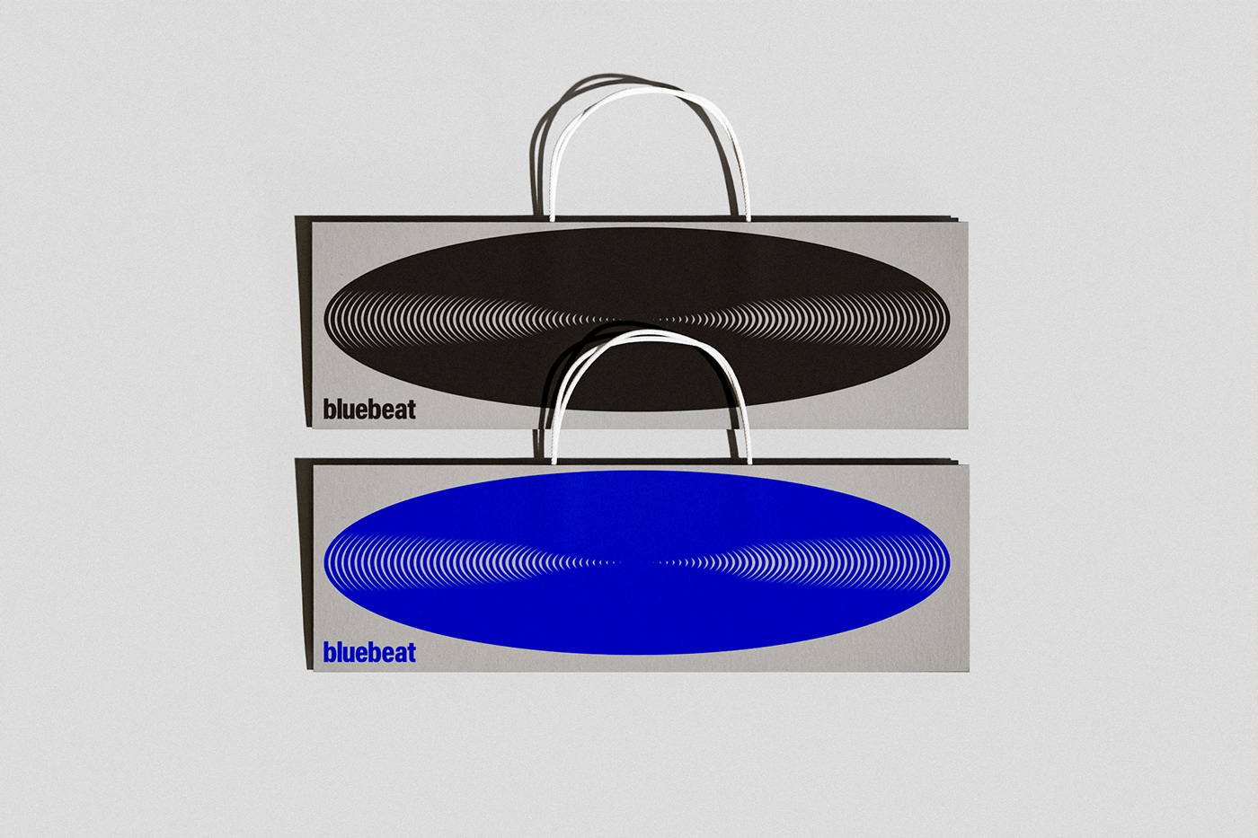
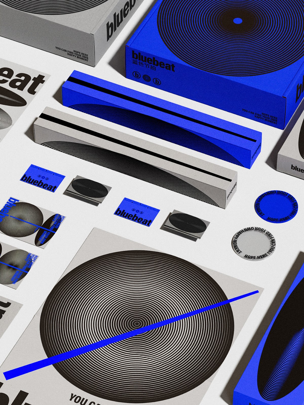
Visually, BlueBeat is a symphony of subtlety and style. Dominated by a serene yet bold blue, the palette evokes feelings of depth, tranquillity, and rhythm - perfectly aligned with the ethos of a modern drum center. This blue doesn't just sing; it resonates, setting the backdrop for every touchpoint of the brand.
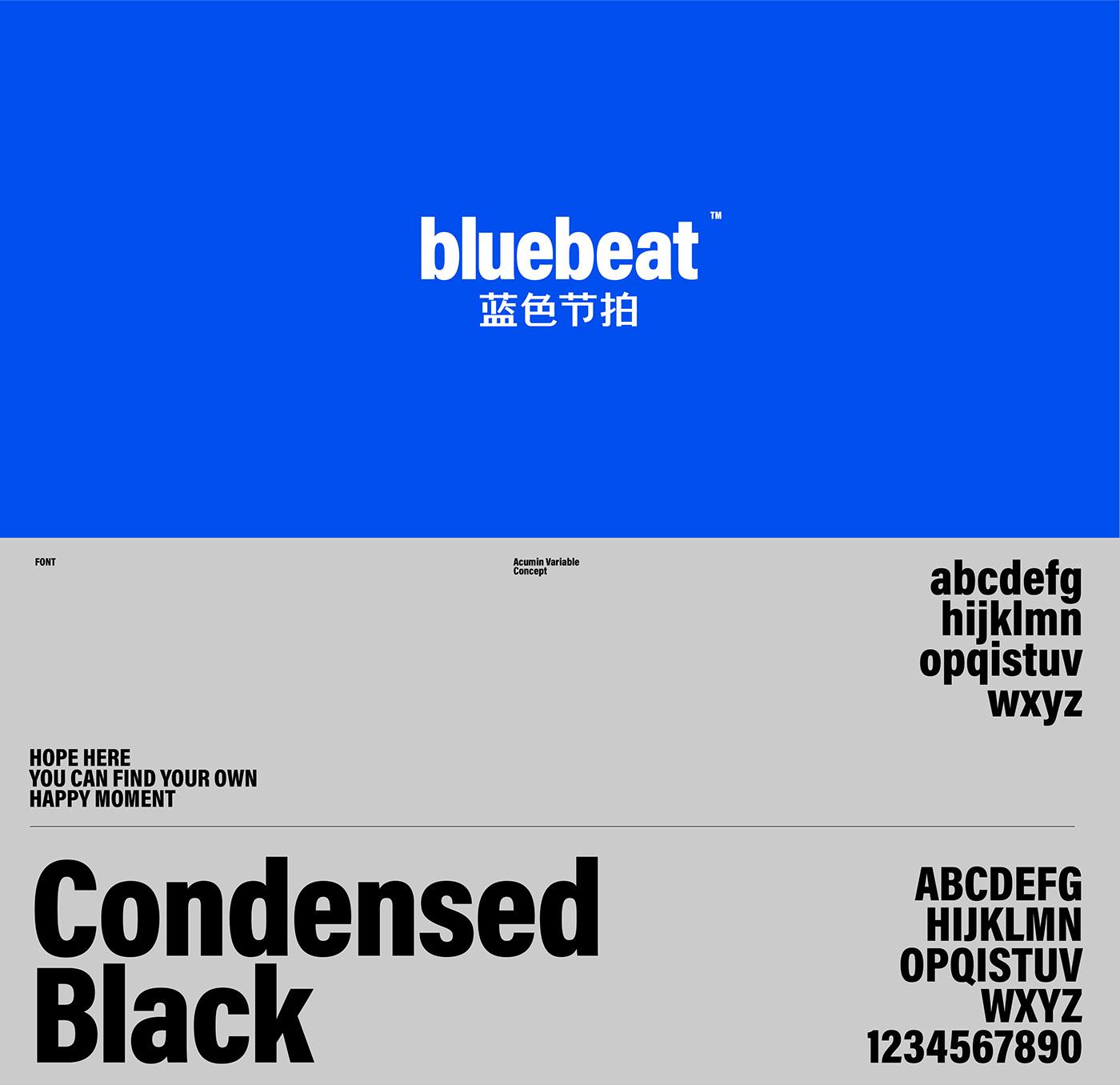
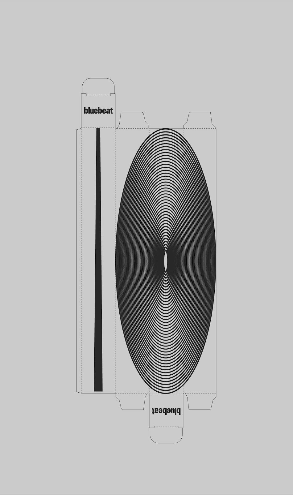
Complementing the color palette is the use of condensed typography. Sleek, modern, and effortlessly cool, it communicates the brand's commitment to professional excellence while ensuring it remains approachable to novices and professionals alike.
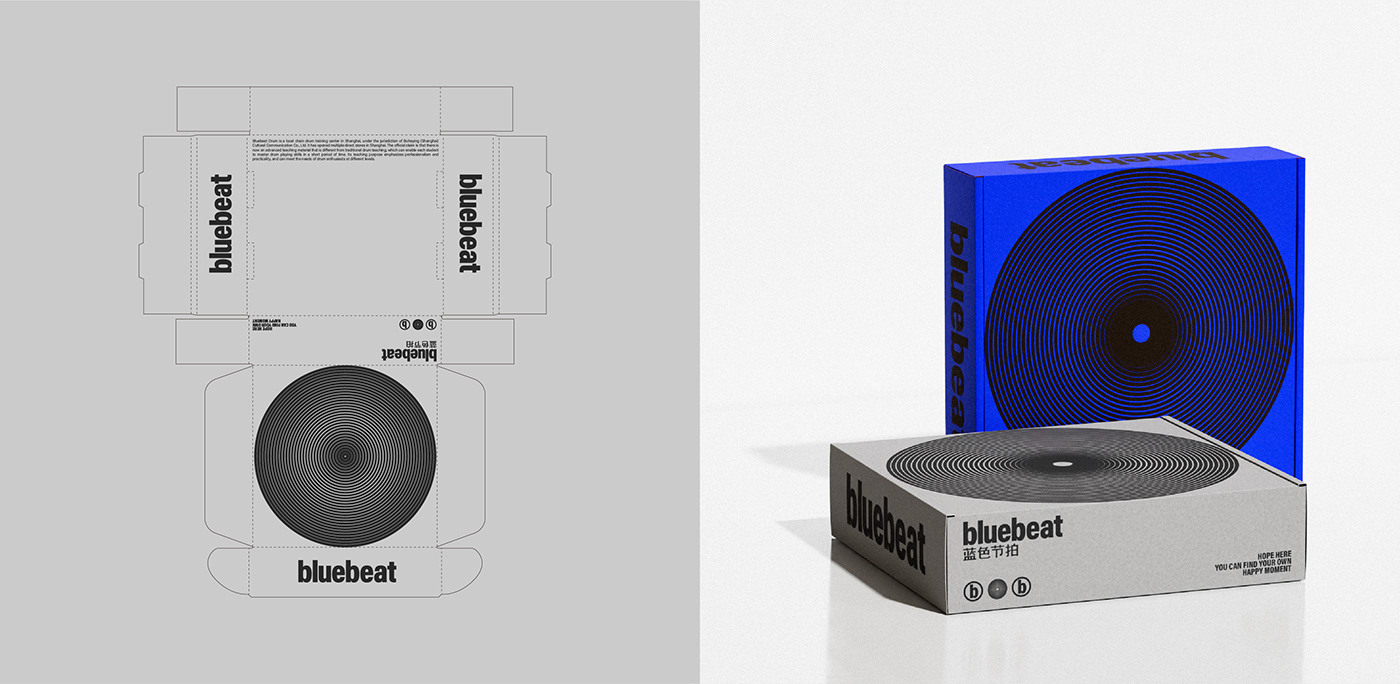
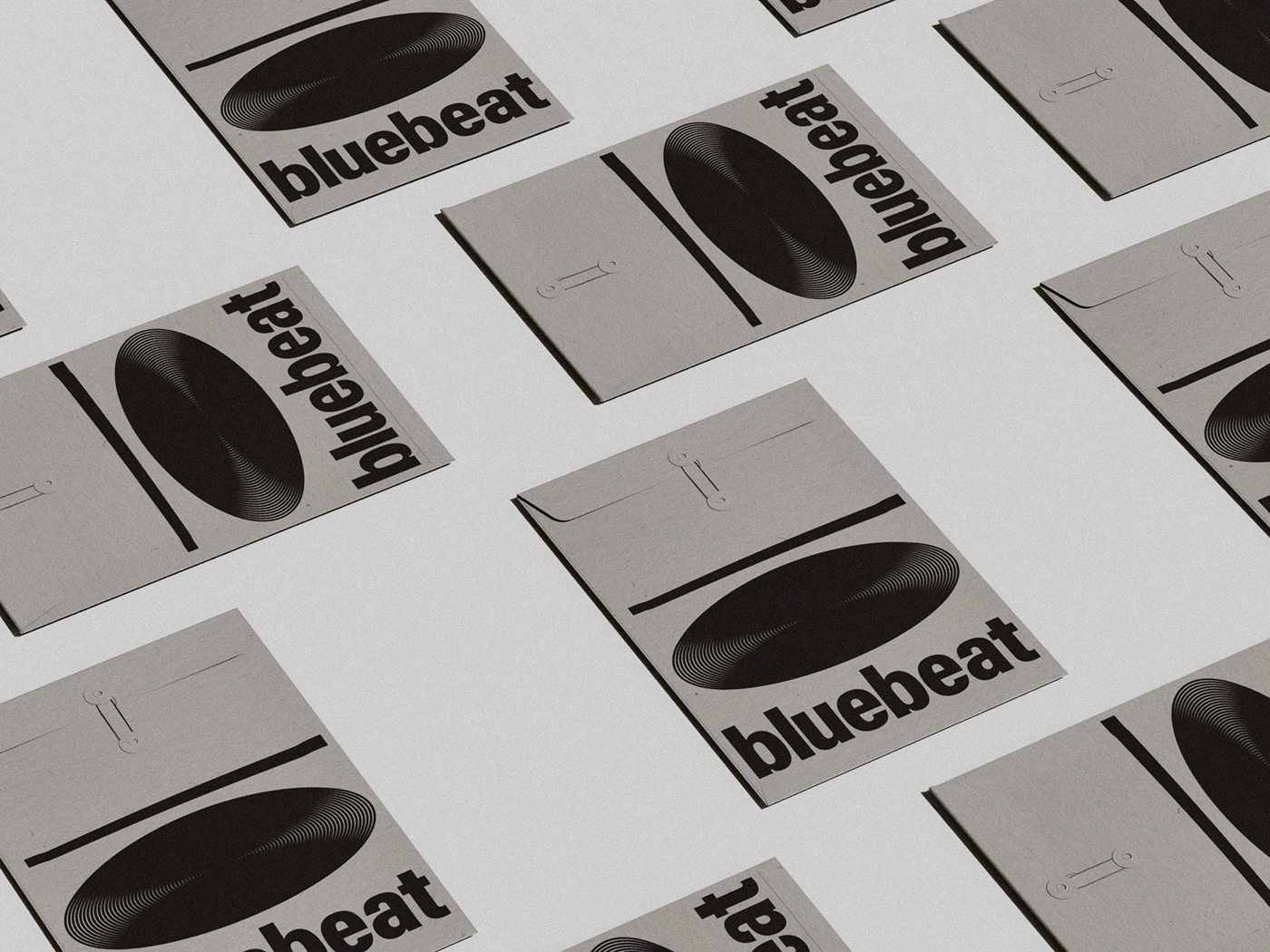
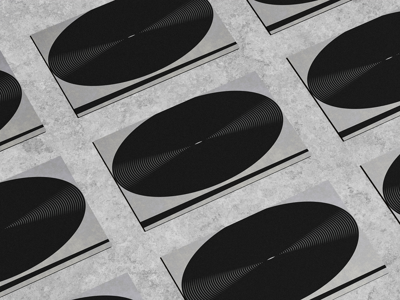
However, the pièce de résistance has to be the innovative graphic of oval lines. This element, reminiscent of sound waves and rhythmic patterns, gracefully adorns their packaging design and other collaterals. More than a mere graphic, it symbolizes the harmonious blend of tradition and modernity, the very essence of BlueBeat.
In conclusion, Min Hui Hu's BlueBeat is not just a brand; it's a sensory experience. It’s a testament to how design, when done right, can elevate a brand from being just a service to a resonating story. In the sea of designs that Abduzeedo has witnessed, BlueBeat undeniably strikes a chord.
Branding and visual identity artifacts


For more information make sure to check out Min Hui Hu on Behance.


