by abduzeedo
In a digital age punctuated by ephemeral moments and fleeting glimpses, "Framed" Photographic Studio emerges as a beacon of sheer elegance. One might say, in the vast desert of pixelated immediacy, here lies an oasis that cherishes the craft of true photography. That was the backstory for this branding and visual identity project by Pedro Garcia.
"Framed", more than a name, is an assertion. An assertion that every moment captured within its walls is worthy of being framed - not just on social platforms for transient applause, but on the tangible walls of our personal sanctuaries. It boldly claims its territory in the modern photographic realm, yet chooses not to flaunt with flamboyance but with a graceful nod to its roots.
The studio, bathed in a seamless blend of minimalism and cutting-edge technology, envelops patrons in an ambiance that whispers sophistication. It's a testament to Pedro Garcia's design goals, where the absence of noise amplifies the beauty of the focus.
At the heart of "Framed"'s branding is a design language that speaks volumes in hushed tones. The logo, ingeniously simplistic, uses circles as an homage to camera lenses, weaving in the subtleties of composition and framing. One cannot help but draw parallels to the very essence of capturing life through a lens, the cyclical nature of moments that come full circle in memories.
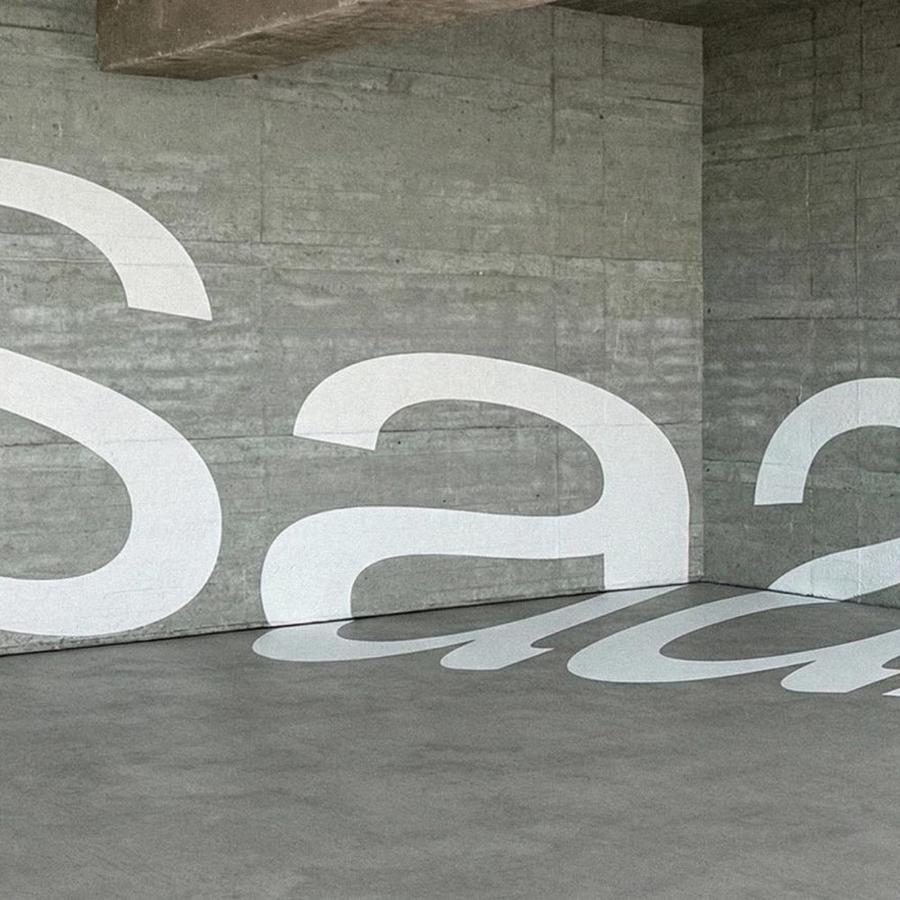
Then there's the typography. A delightful nod to the Swiss Style – stark, bold, yet effortlessly fluid. The contrasting type sizes create a visual dance, capturing the eye, much like the studio itself captures essence.
In an era where complexity often clouds clarity, "Framed" by Pedro Garcia stands tall and still, a testament to the belief that sometimes, less is indeed more. It reminds us that in the vast cacophony of modern photography, there is still a space for the timeless, the classic, the elegantly simple.
Branding and visual identity artifacts
For more information make sure to check out Pedro Garcia website or follow him on Behance .
