by abduzeedo
Explore ton:acc's unique branding and visual identity. See how ASCII+3D graphics create engaging patterns and animations.
Design is about more than just aesthetics; it's about communicating a story. The team behind ton:acc, an acceleration program for early-stage projects in the TON ecosystem, understands this well. They built a flexible identity system rooted in technical monochrome aesthetics and symbol graphics. It's a look that feels both futuristic and grounded, perfectly reflecting the program's innovative spirit.
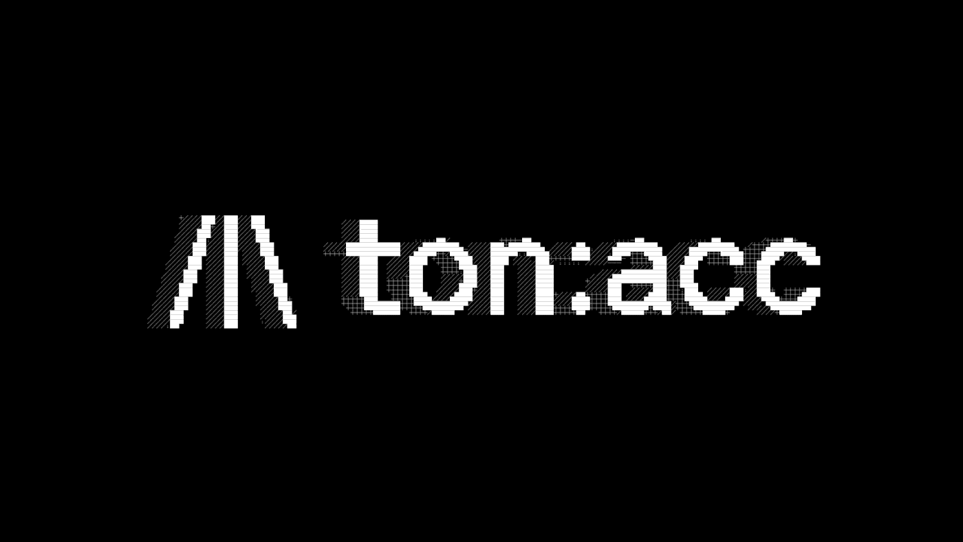
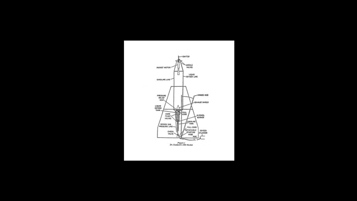
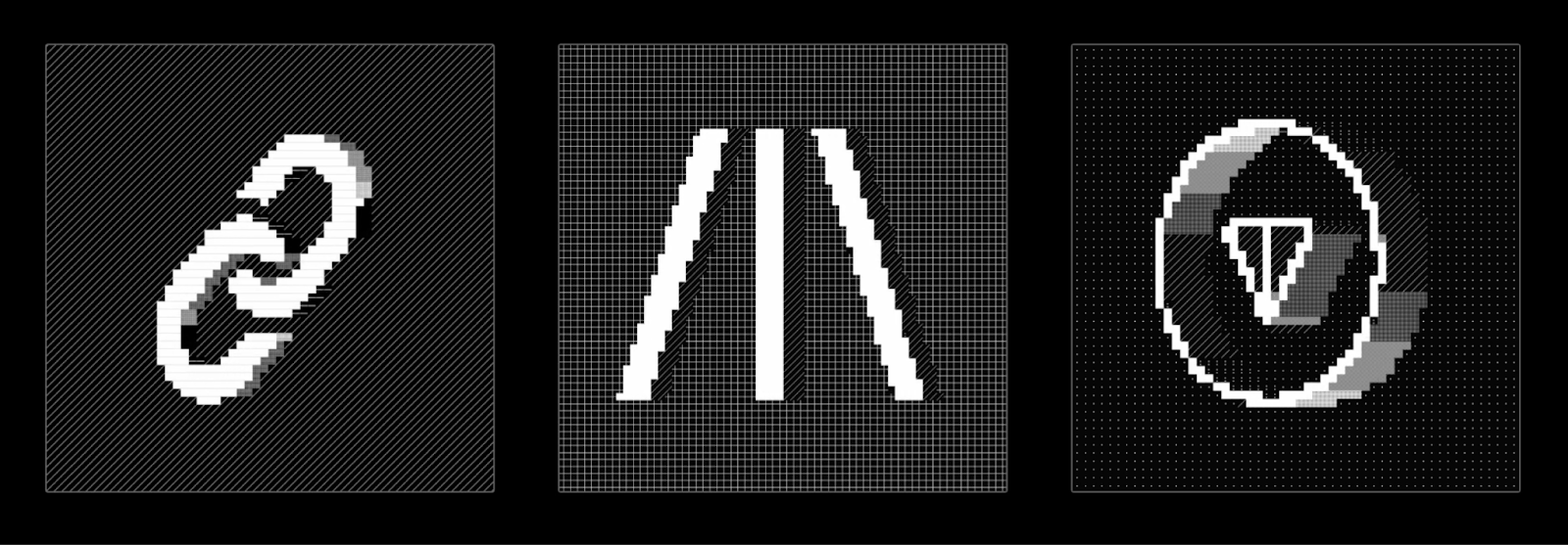
The inspiration behind ton:acc's logo is fascinating. It’s represented using Unicode glyphs, but its roots trace back to the structure of the world's first liquid fuel rocket. This subtle nod symbolizes the program's role in supporting ambitious innovation, providing a strong visual metaphor for acceleration and growth. It's an example of how deep conceptual thinking can elevate branding and visual identity beyond surface-level design. (There will be an image of the rocket after the text.)
The Stylizer: A Tool for Creative Streamlining
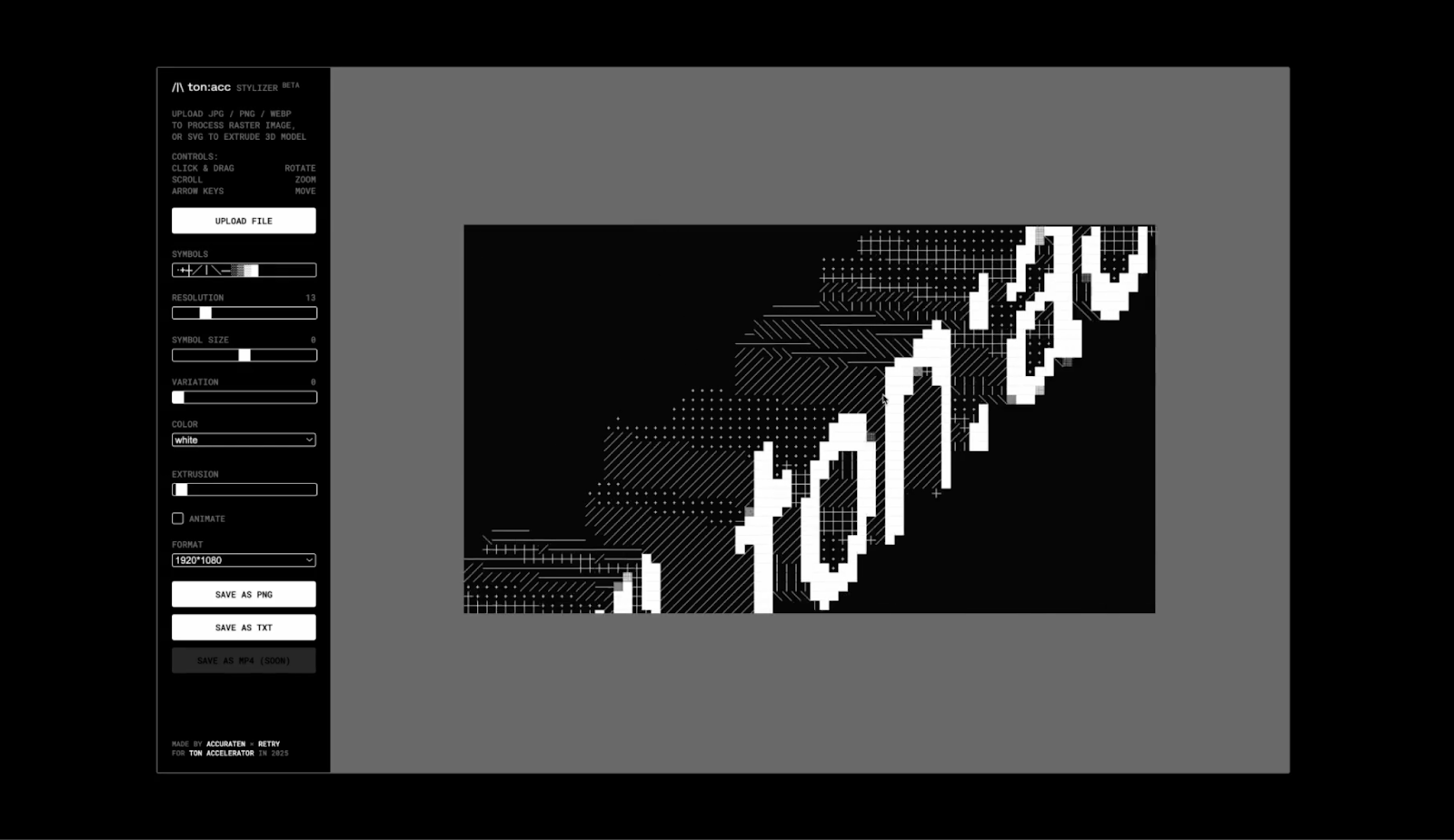
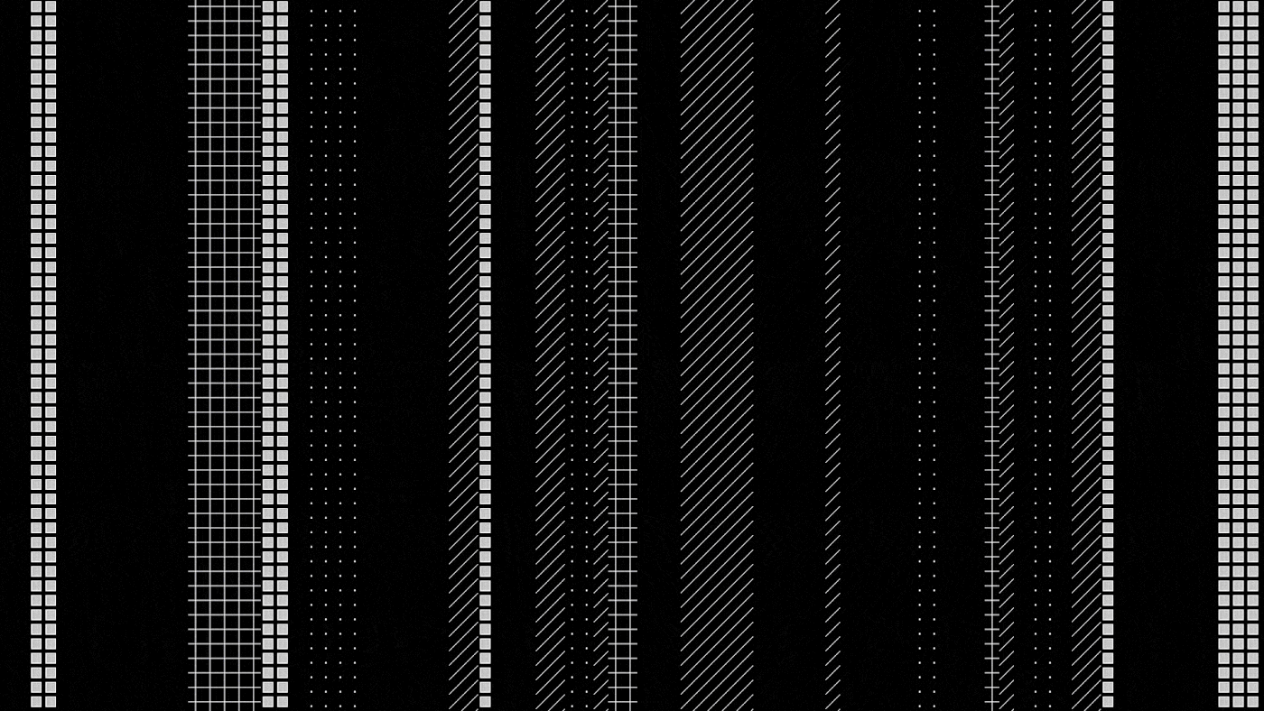
To help maintain this distinct visual style across various content, the ton:acc team developed a custom ASCII+3D graphics tool called the ton:acc stylizer. This tool allows for the creation of unique patterns, animations, and filtered visuals that consistently follow the core aesthetic. Imagine the efficiency this brings to brand content production—a designer's dream for maintaining visual coherence. This kind of custom tool development is a testament to embracing innovation in design workflows. The ton:acc stylizer tool is now publicly available.
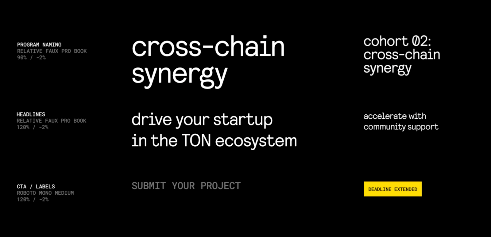
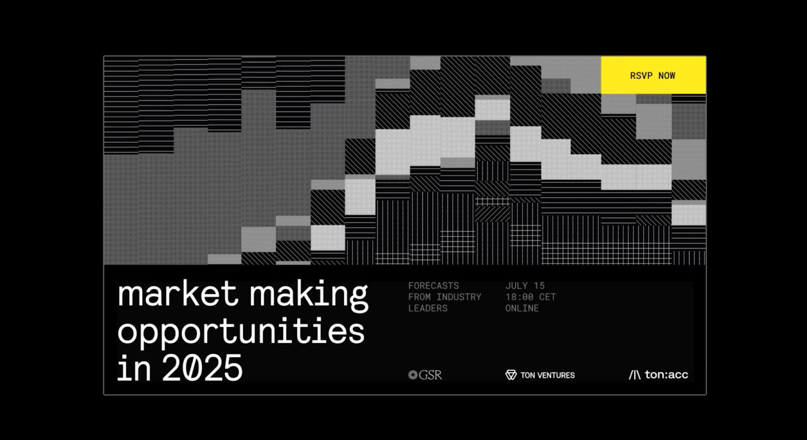
A strong visual identity also relies on clear and consistent typography. ton:acc uses "RELATIVE FAUX PRO BOOK" for program naming at 90% and headlines at 120%, with adjusted line height for optimal readability. For call-to-action (CTA) labels, "ROBOTO MONO MEDIUM" is employed at 120%, ensuring key information stands out without visual clutter. This attention to detail in typography ensures that the brand's message is always clear and accessible, a crucial element in effective UI/UX design. (Typography examples will be shown in an image after the text.)
Dynamic Visuals Across Platforms
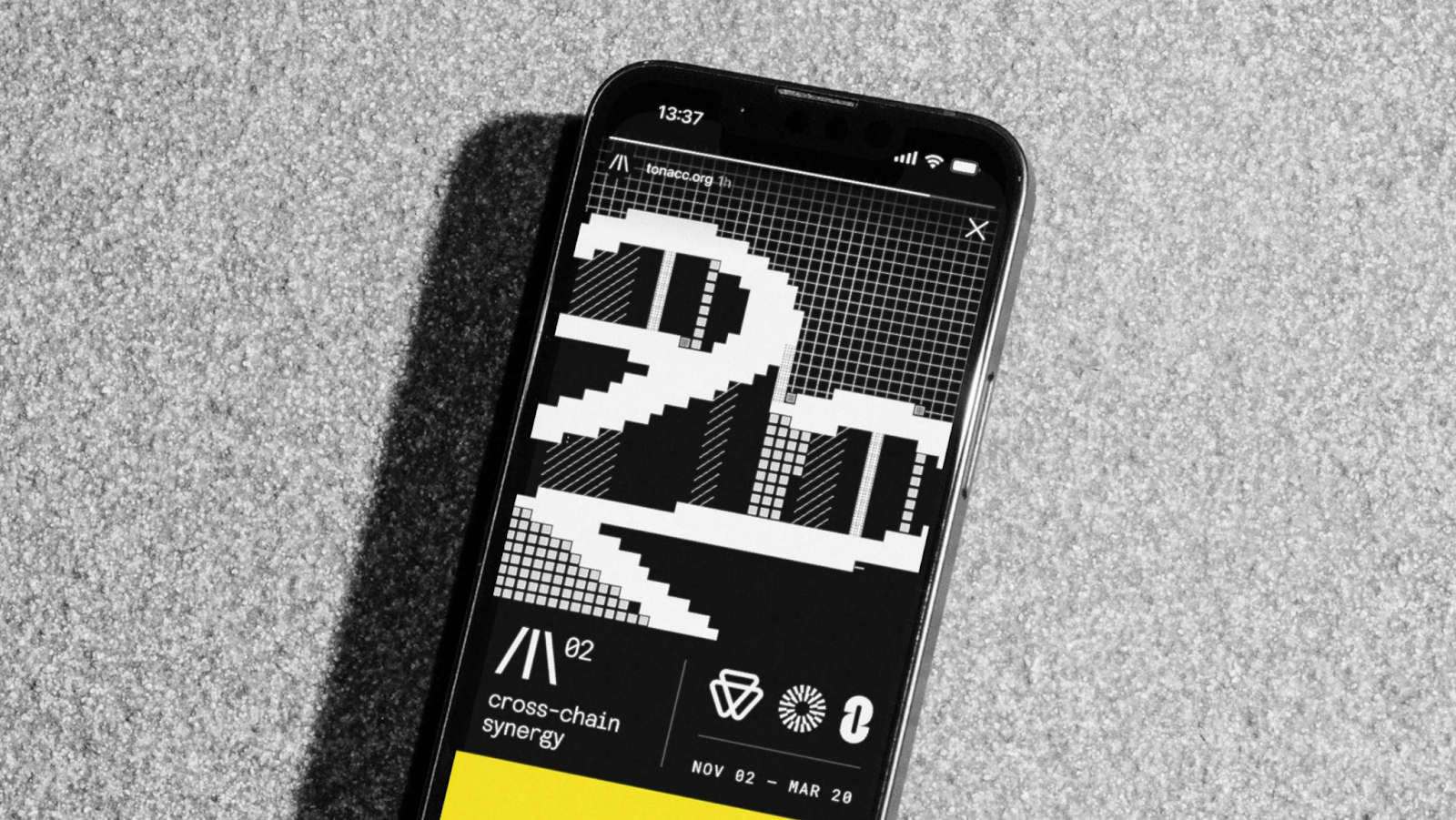
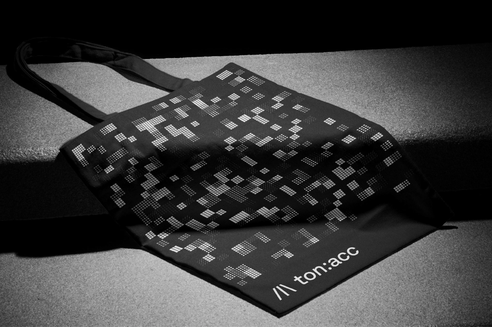
The adaptability of ton:acc's visual system is evident in its application across various touchpoints. From web interfaces to promotional materials, the monochrome aesthetic and dynamic patterns create a unified and engaging experience. The stylizer in action generates rich, pixelated visuals that bring a sense of depth and movement to static designs. This demonstrates how 3D art principles, even when applied to ASCII graphics, can significantly enhance visual engagement. (Examples of the visuals will follow the text.)
More Than Just a Look: A Design Philosophy
What the ton:acc project demonstrates is a holistic approach to branding and visual identity. It's not just about a logo or a color palette; it's about a complete system that supports and amplifies the program's mission. The custom stylizer empowers content creators to stay on-brand , while the conceptual depth of the logo resonates with the target audience. The team, including Art Direction by Slava Mishakov, Graphic Design Lead Seva Varfolomeev, Product Lead Vlad Rafeev, UX and UI Designers Sveta Koliada and Evgeny Smertin, and Management Maria Mota, clearly poured their passion into this project, with tool development by RETRY Studio and special thanks to client Sophia Rusconi.
For those interested in exploring the work further, you can visit the Accuraten website at accuraten.com or try the ton:acc stylizer. It’s a great example of how thoughtful design can drive a brand's narrative.