by abduzeedo
Explore how Machiaveli Law Firm’s branding seamlessly blends tradition and modernity to create a timeless visual identity.
Crafting a visual identity for a law firm requires striking a delicate balance between tradition and contemporary appeal. Machiaveli Law Firm, with its 30-year legacy, showcases an exceptional branding approach that integrates its rich history with forward-thinking design. Developed by LOTIPA, this identity exemplifies how branding and visual identity can narrate a firm’s ethos while staying relevant in a competitive legal landscape.
Tradition Meets Innovation
At its core, Machiaveli’s branding reimagines tradition without losing its essence. The design leans heavily on structured elements symbolizing professionalism and trust. Key milestone dates and historical references are visually woven into the identity, creating a narrative of longevity and authority.
The color palette—comprising blacks, grays, and whites—is deliberately restrained, offering an understated elegance that reflects the firm’s commitment to precision and integrity. The subtle tonal variations add depth without overwhelming, ensuring timelessness in visual communication.
Typography as the Foundation
The typography for Machiaveli is a standout feature, employing bold, geometric sans-serif fonts. This deliberate choice underscores qualities like strength, clarity, and stability—values that resonate deeply with clients seeking dependable legal counsel. Each typographic detail, from size to placement, has been meticulously calibrated for maximum readability, amplifying the brand’s authoritative tone.
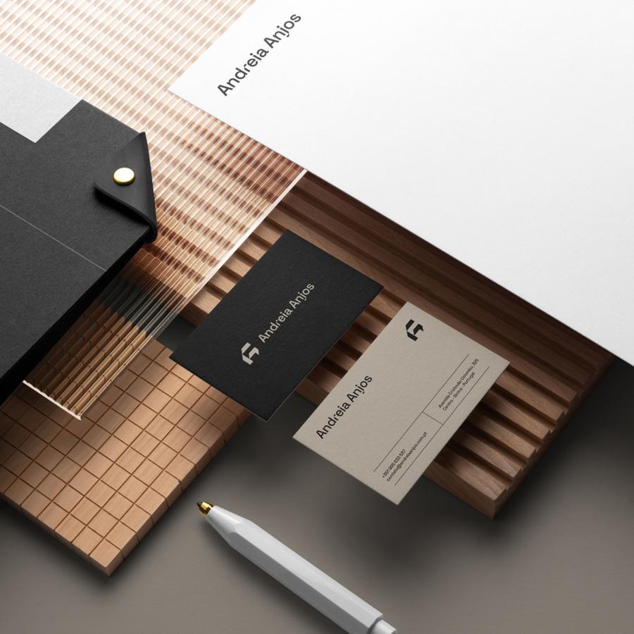
Machiaveli’s branding is not just visually striking but functionally robust. Its design system extends seamlessly across print and digital platforms, ensuring consistency and coherence. Business cards, brochures, office signage, and digital interfaces are all aligned under a unified visual language, reinforcing brand recognition and trust at every touchpoint.
The integration of historical photographs and key achievements transforms this visual identity into a narrative of progress. It honors the firm’s past while clearly signaling its readiness for future challenges. This approach not only appeals to long-standing clients but also attracts modern audiences looking for forward-thinking legal solutions.
The Power of Consistency
One of Machiaveli’s greatest strengths lies in its cohesive branding. By maintaining uniformity across all applications—from office interiors to digital assets—the firm projects reliability and a commitment to quality. This consistency ensures that Machiaveli remains memorable and trusted in an increasingly competitive industry.
Machiaveli Law Firm’s branding exemplifies how visual identity can transcend aesthetics to become a powerful narrative tool. LOTIPA’s approach merges minimalist design with a rich storytelling framework, bridging tradition and modernity. This identity is more than just a brand; it is a testament to trust, progress, and unwavering commitment to excellence.
Explore more about this branding project on Behance.
Branding and visual identity artifacts
