by AoiroStudio
Mixing through branding, graphic design and typography, we've always been fans of Kevin Cantrell. Learning more about Kevin's motto/philosophy, we'll find ourselves in a branding system filled with brand architecture, graphic marks, monograms, seals, badges and much more worth considering. We wouldn't say that Kevin's work is expressing a certain style of typography but through the years we can admit that he has put out incredible and inspiring works that explore many colour palettes and layered patterns. His distinct attention to details gave him opportunities to work with big brands out there and also being named by Print Magazine's 20 under 30 New Visual Artists of 2014.
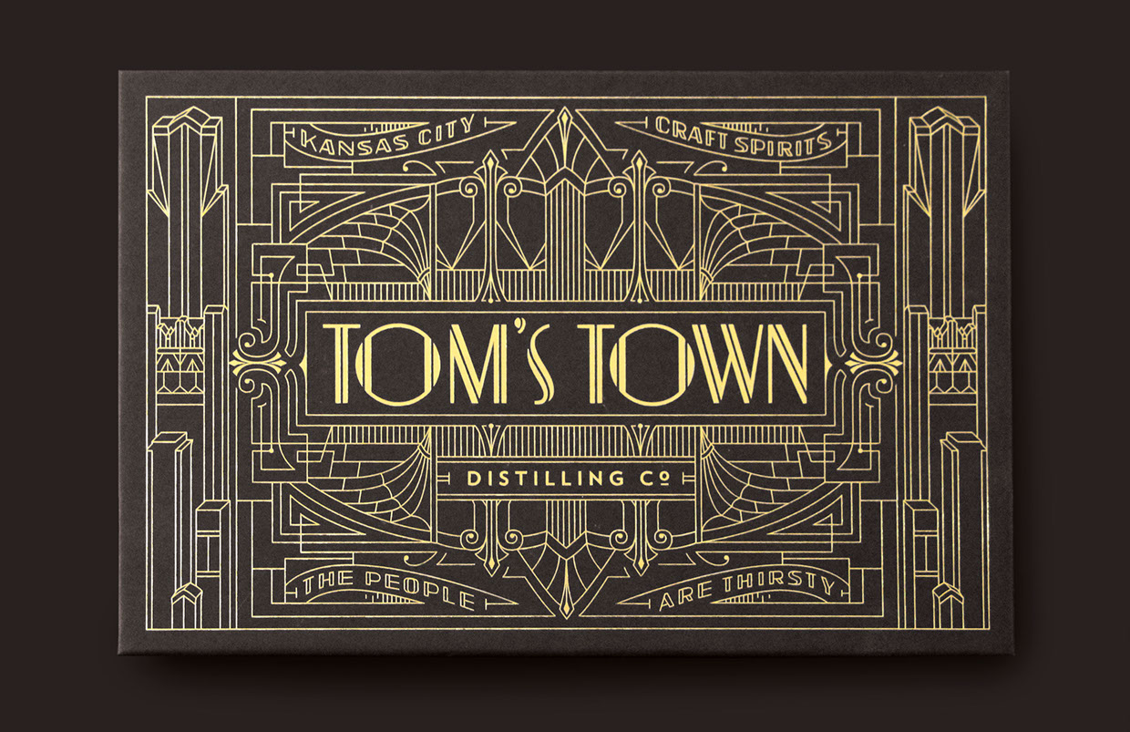
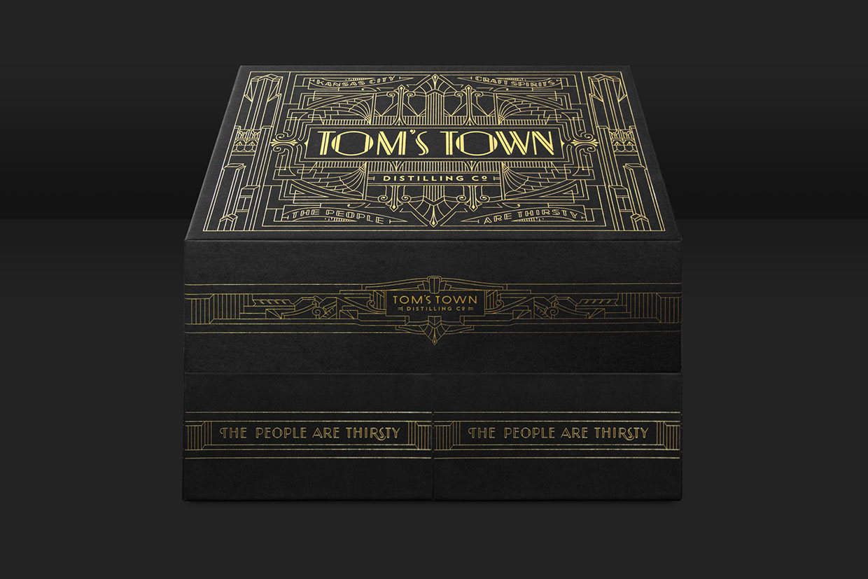
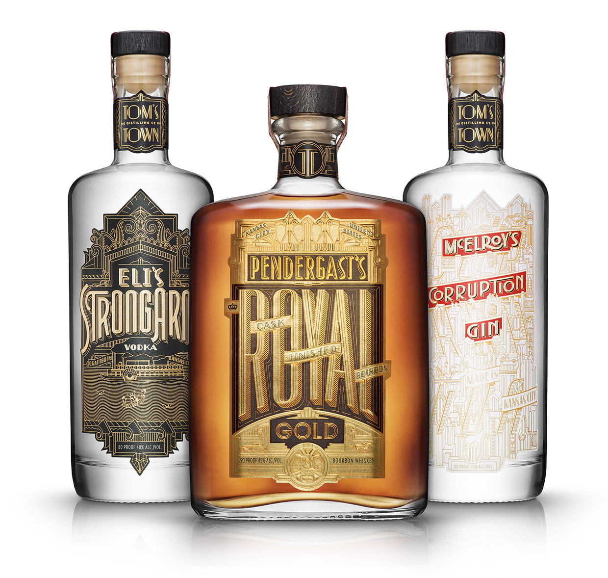
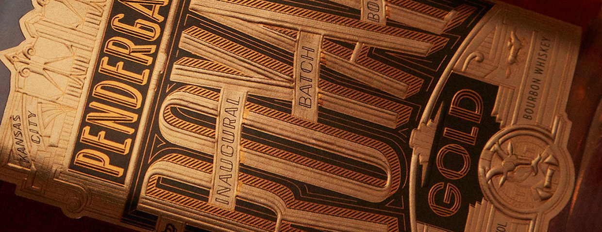
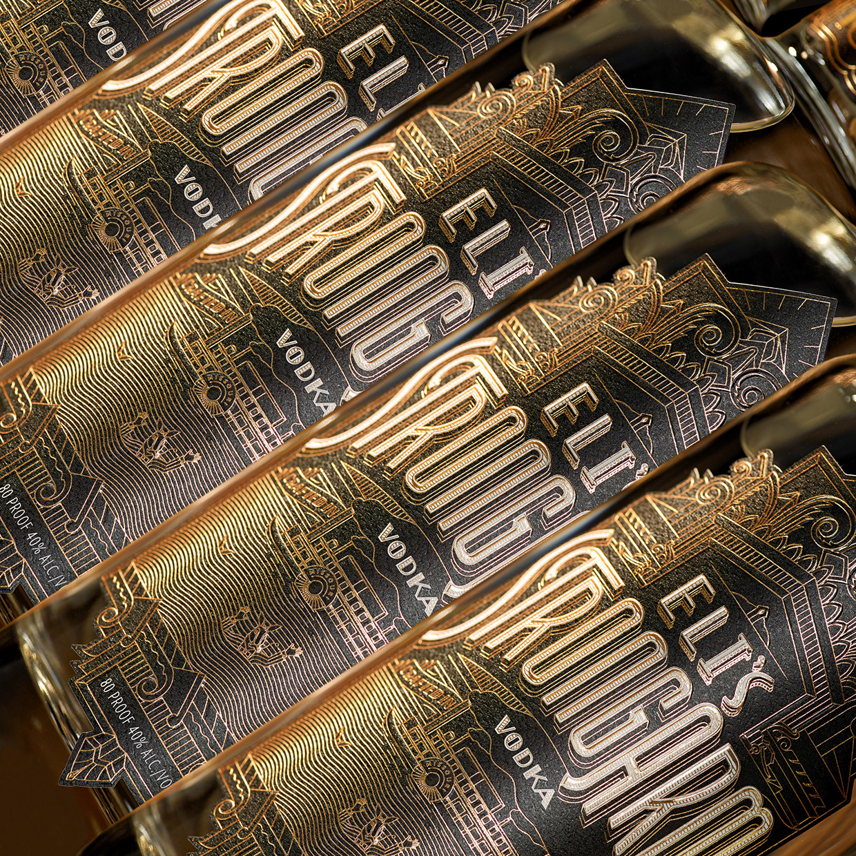
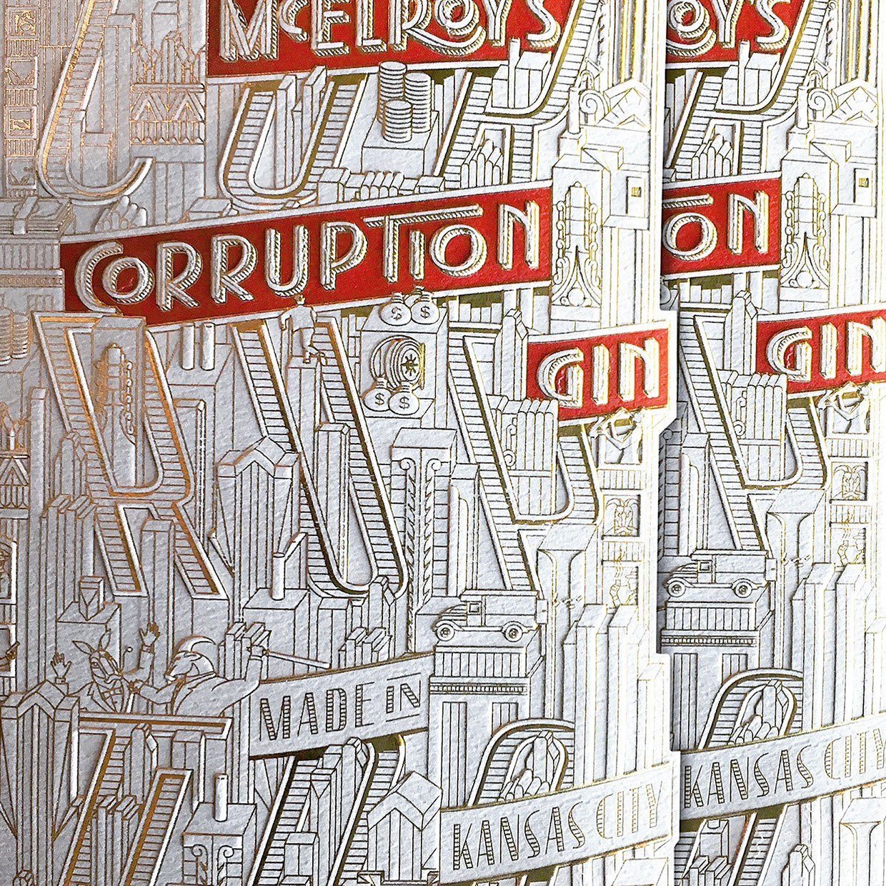
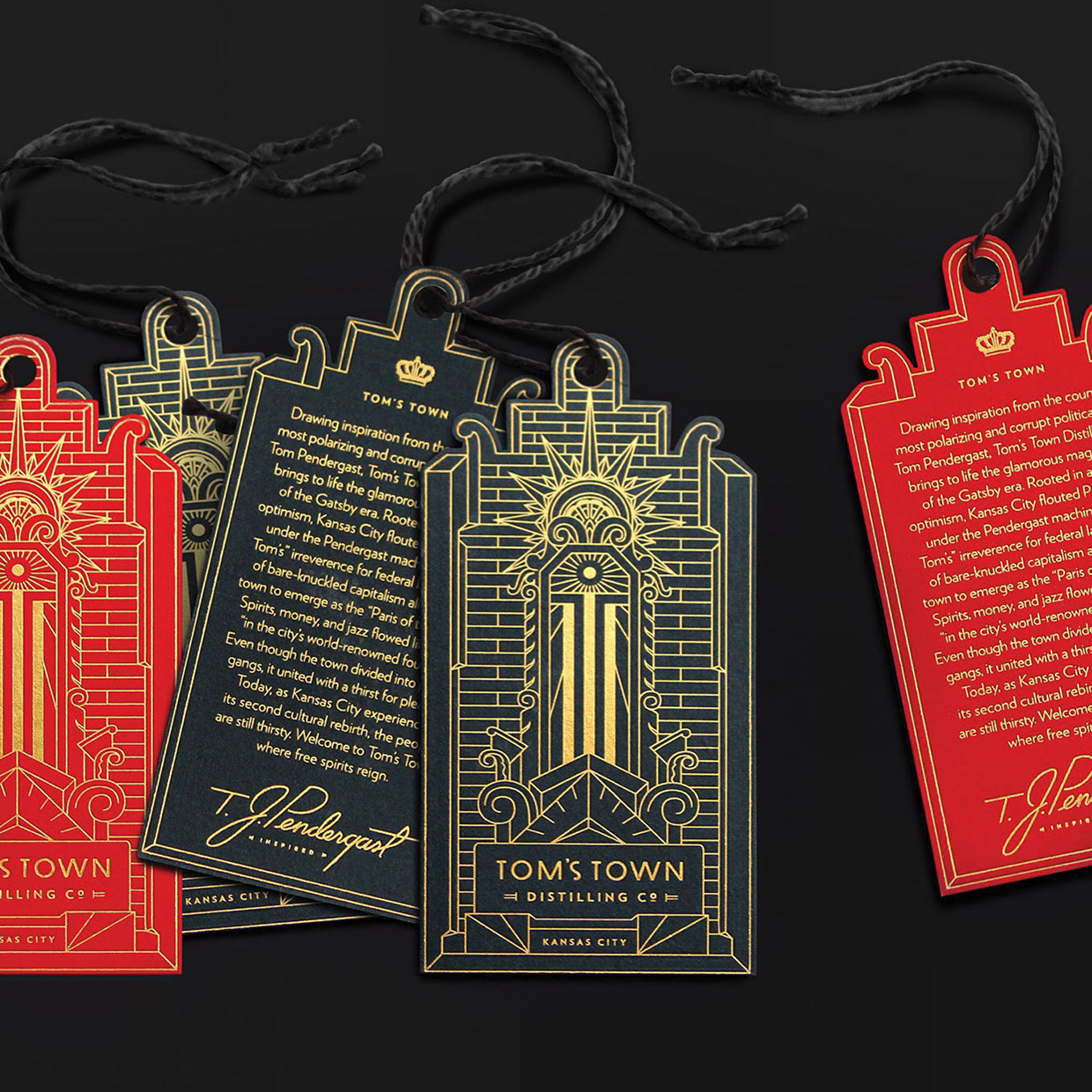
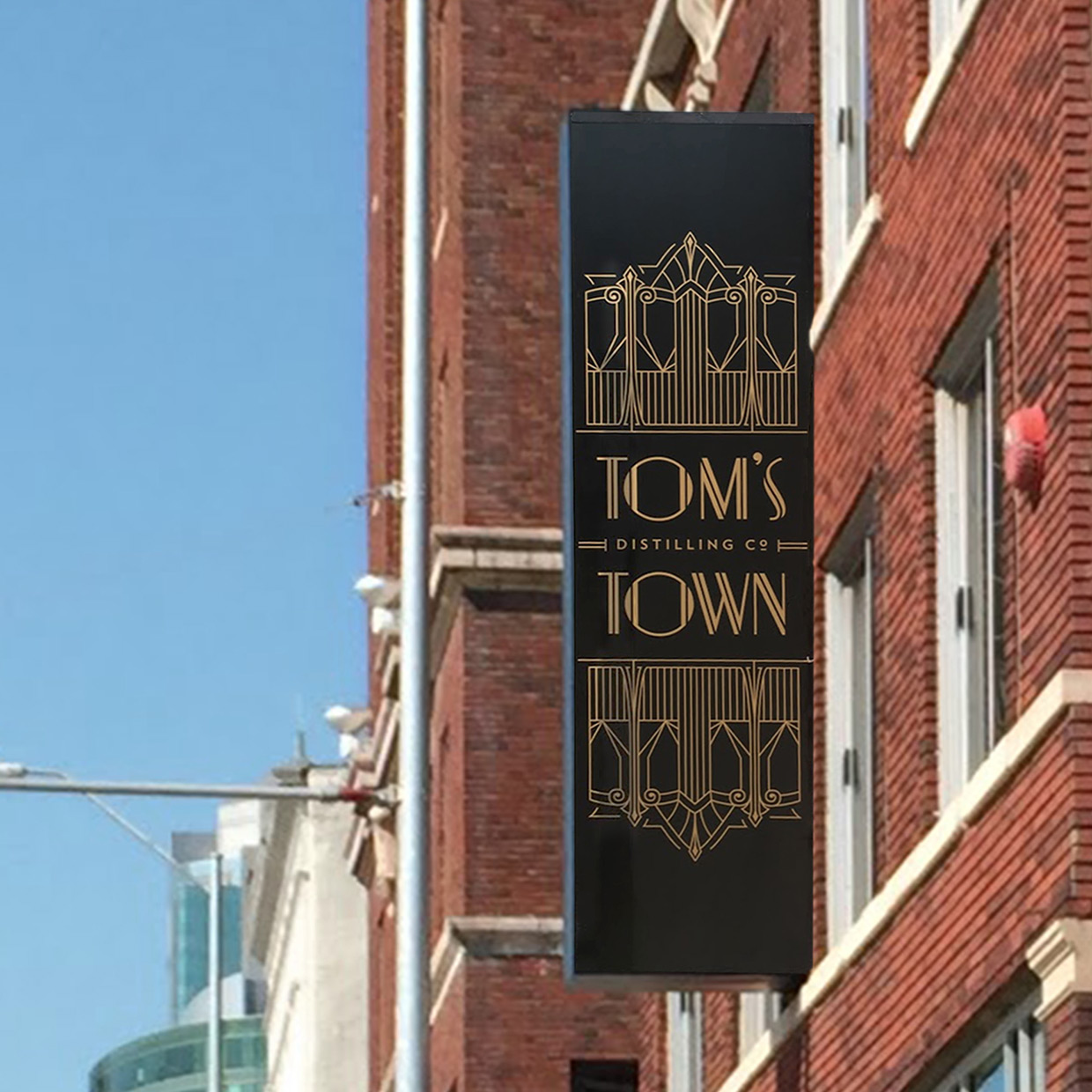
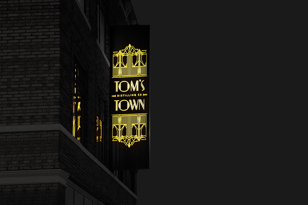
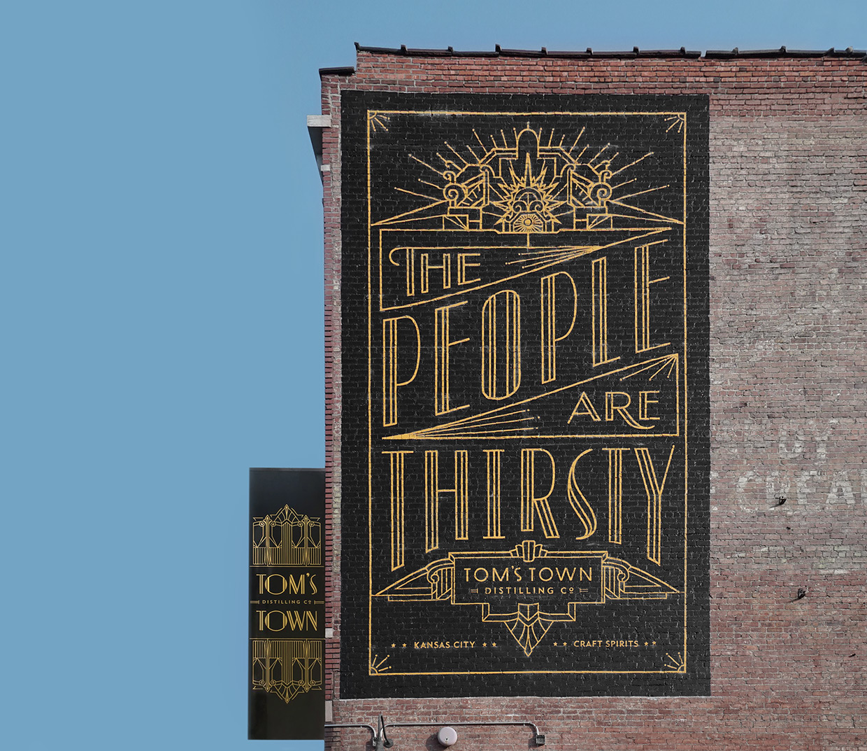
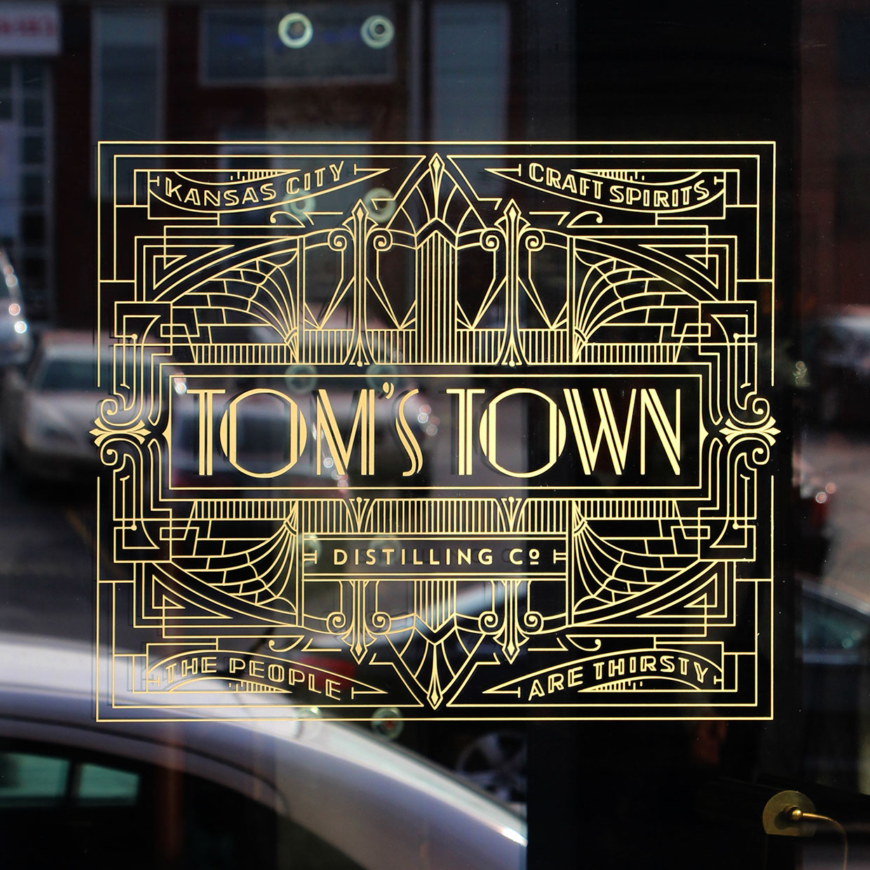
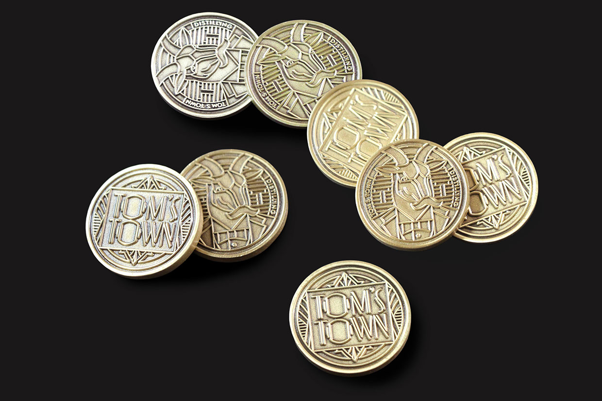
Currently based in Salt Lake City, Utah, we are taking a closer look at his latest project for Tom’s Town Distilling Co, a company who represents the Kansas City’s first legal distillery since Prohibition. Taking inspiration from Tom Pendergast, we are exploring the strong work from the past that shaped the future of its kind, right now.
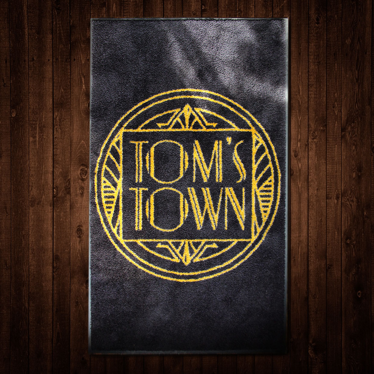
Tom’s Town Distilling Co. is downtown Kansas City’s first legal distillery since Prohibition. Drawing inspiration from the country’s most polarizing and corrupt political boss, Tom Pendergast, Tom’s Town brings to life the glamorous magnetism of the Gatsby-era. Rooted in a deco optimism, Kansas City flouted Prohibition under the Pendergast machine. Today as Kansas City experiences its second cultural rebirth, the people are still thirsty. Welcome to Tom’s Town, where free spirits reign. KCS created a comprehension branding identity system including a proprietary font, designed exclusively for Tom’s Town.

More information: http://kevincantrell.com and also check out http://satelliteoffice.tv.