Modern Web Design for CoType Foundry’s Revamp
CoType Foundry’s web design and website redesign merges custom typography with sleek and minimalist UI for a seamless user experience.
Web design is often a balancing act between aesthetics and usability. In CoType Foundry’s latest website redesign, executed in collaboration with Holographik, that balance is evident in every pixel. The result is a functional yet visually engaging platform that showcases CoType’s typefaces in a seamless shopping experience.
Bringing Type to the Forefront
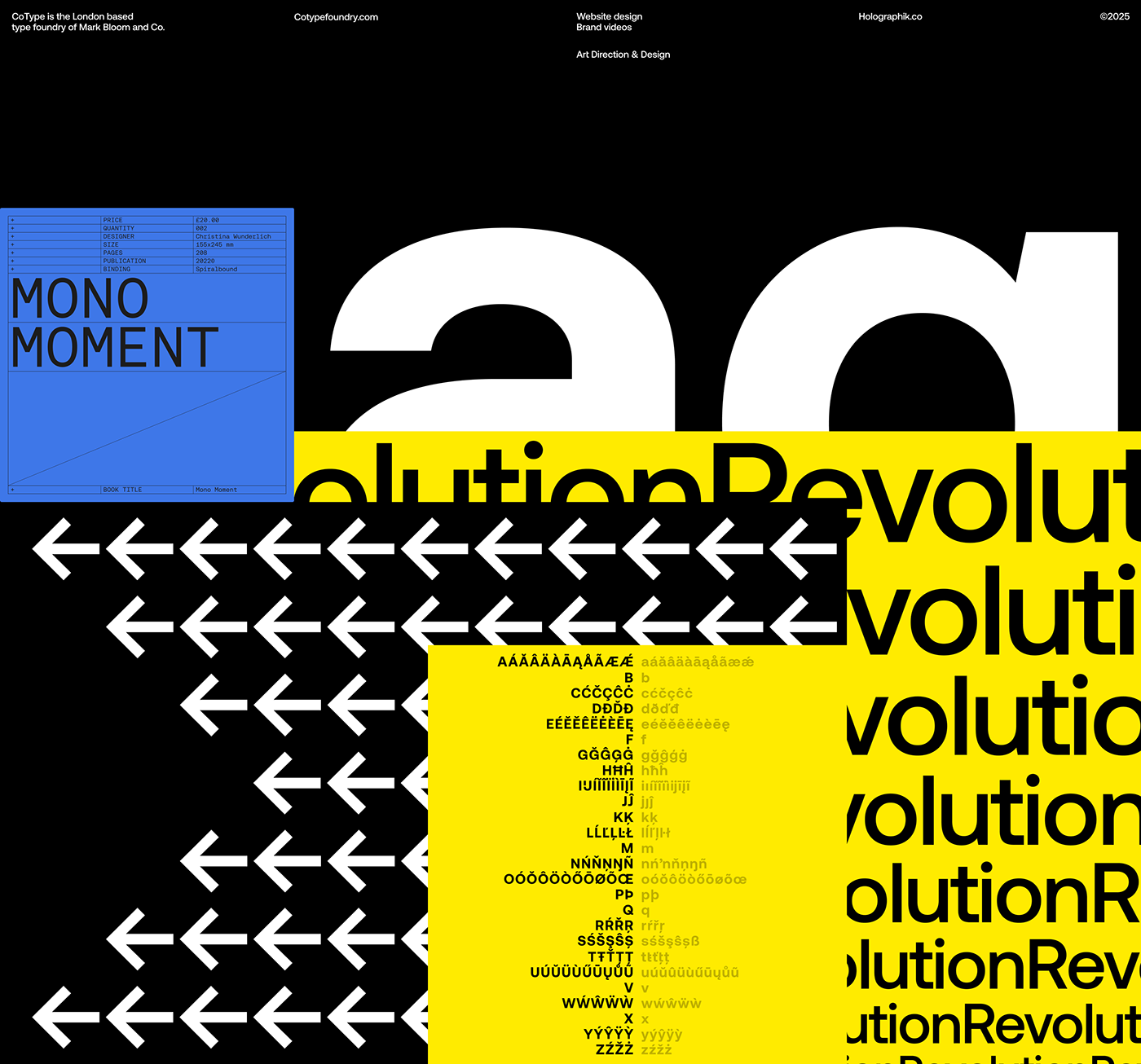
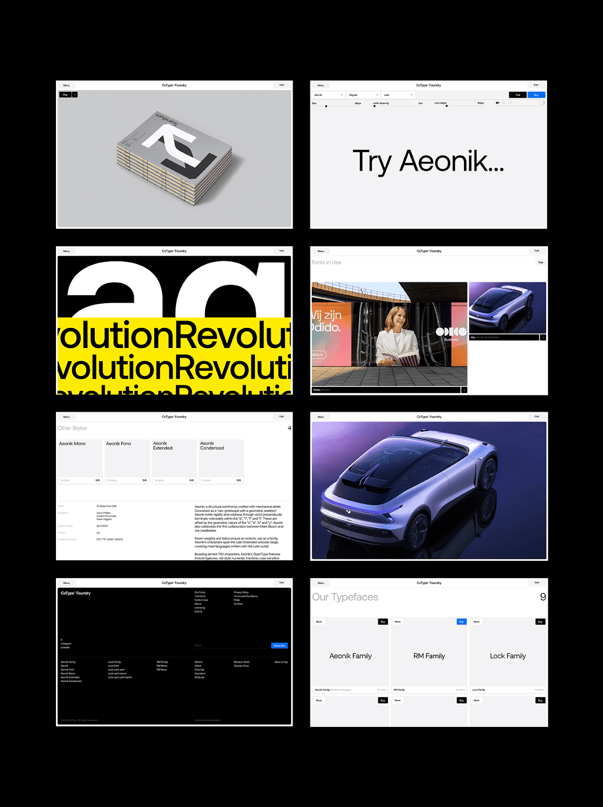
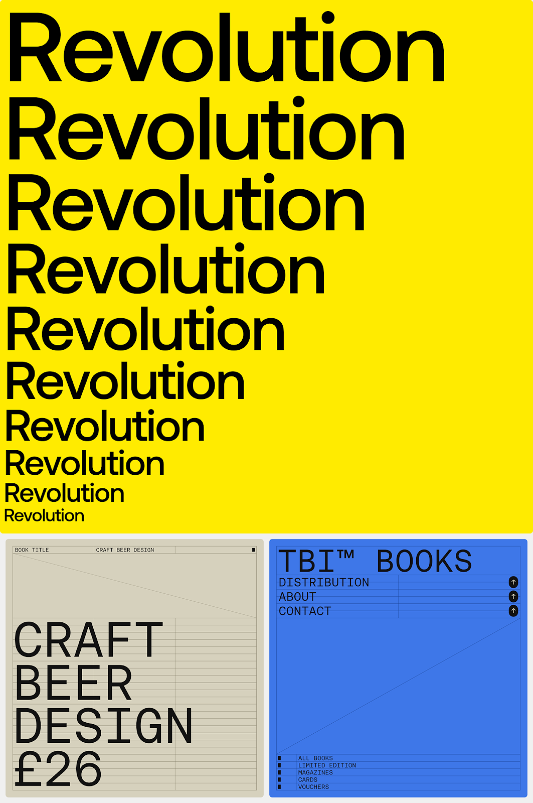
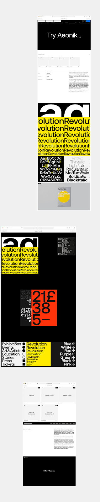
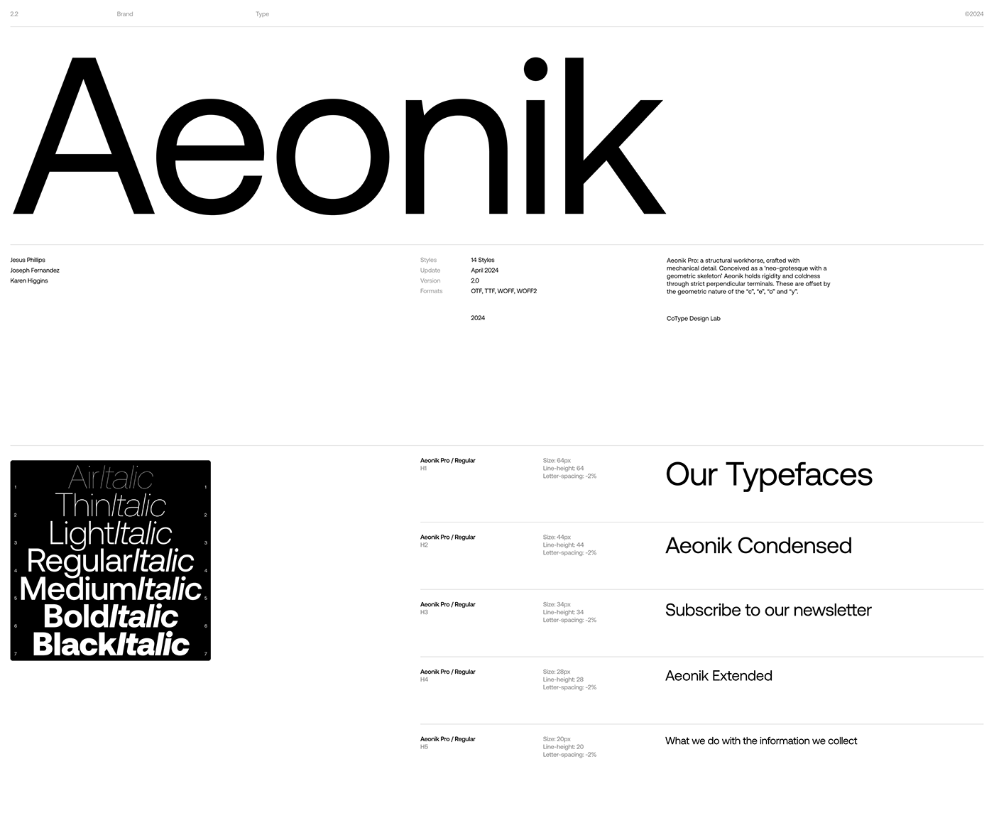
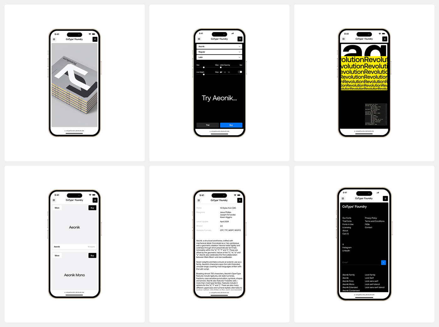
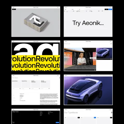
CoType Foundry is known for its meticulously crafted typefaces, and the redesign ensures they take center stage. Instead of treating fonts as static assets, the site integrates them fluidly into the design, making the typography an interactive element rather than just a product on display. Holographik’s approach ensures that the site feels modern and structured while maintaining an intuitive flow.
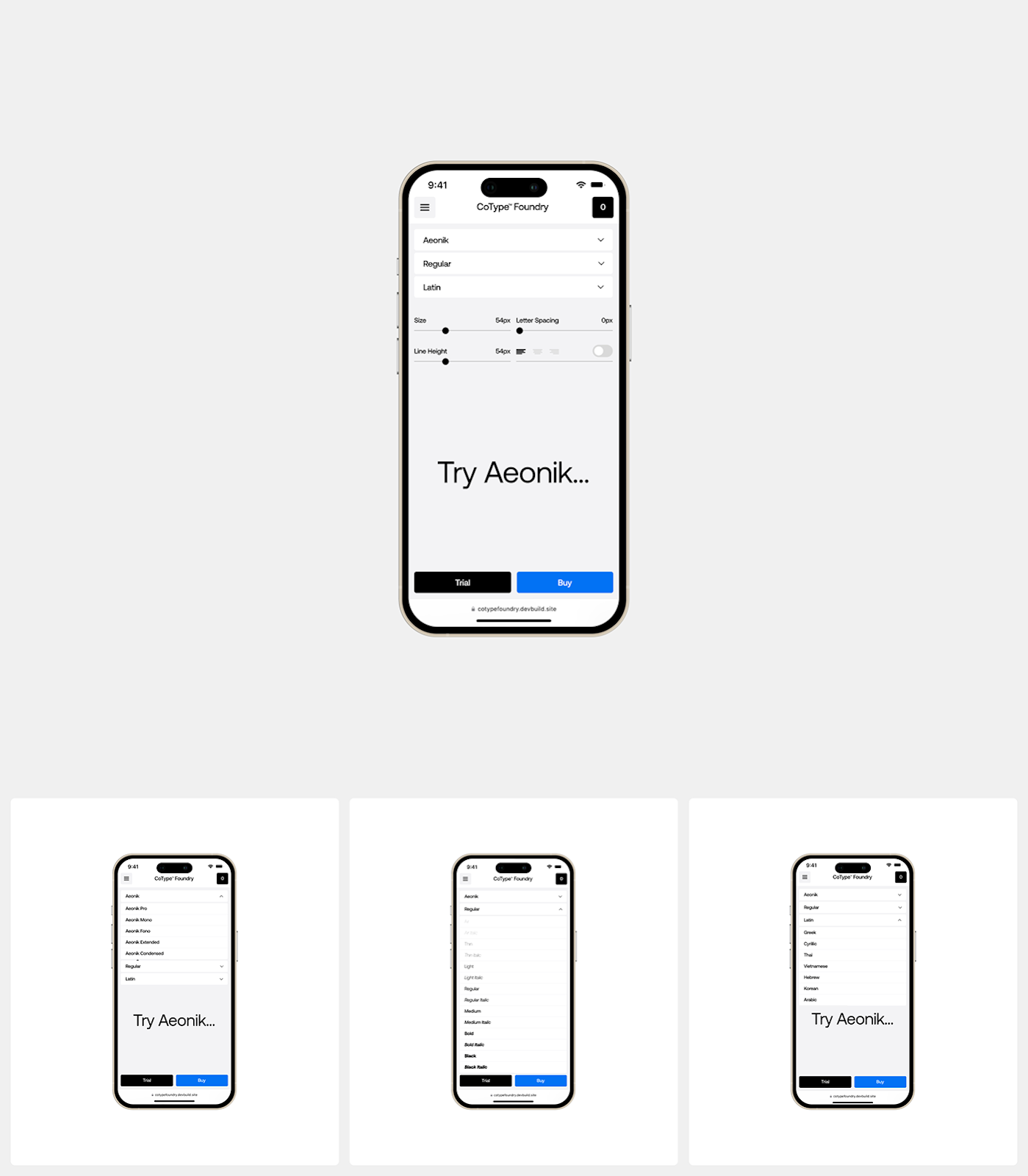
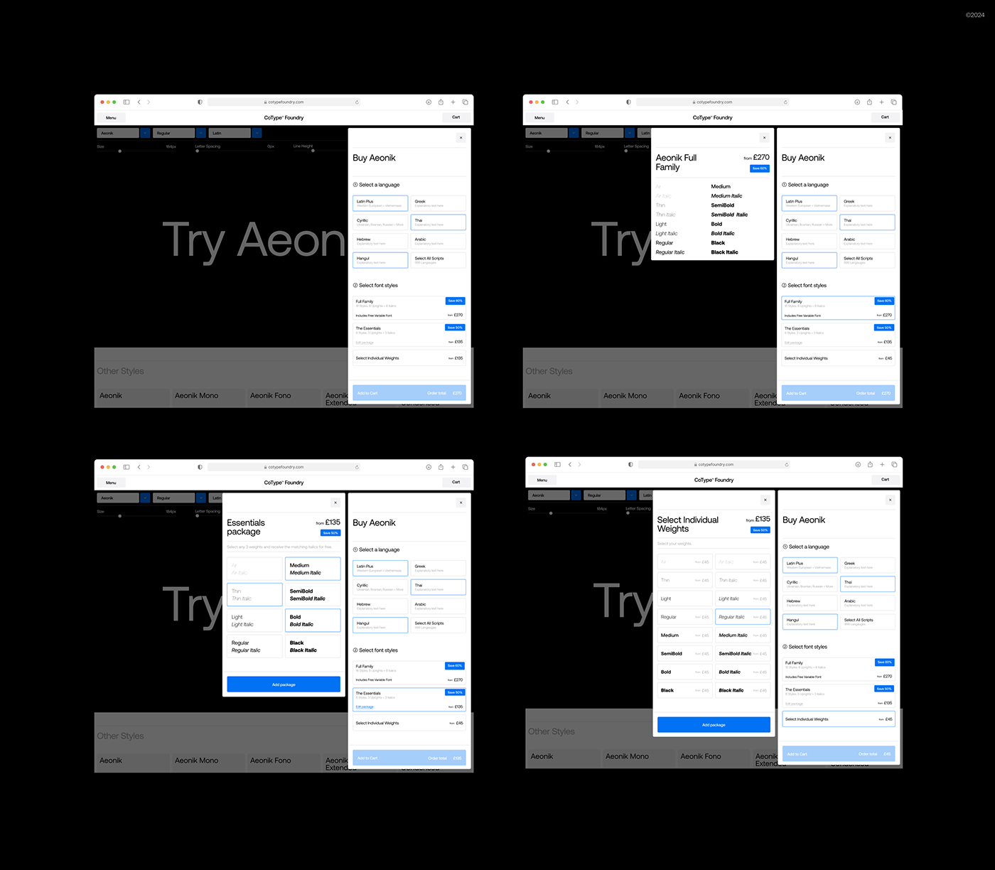
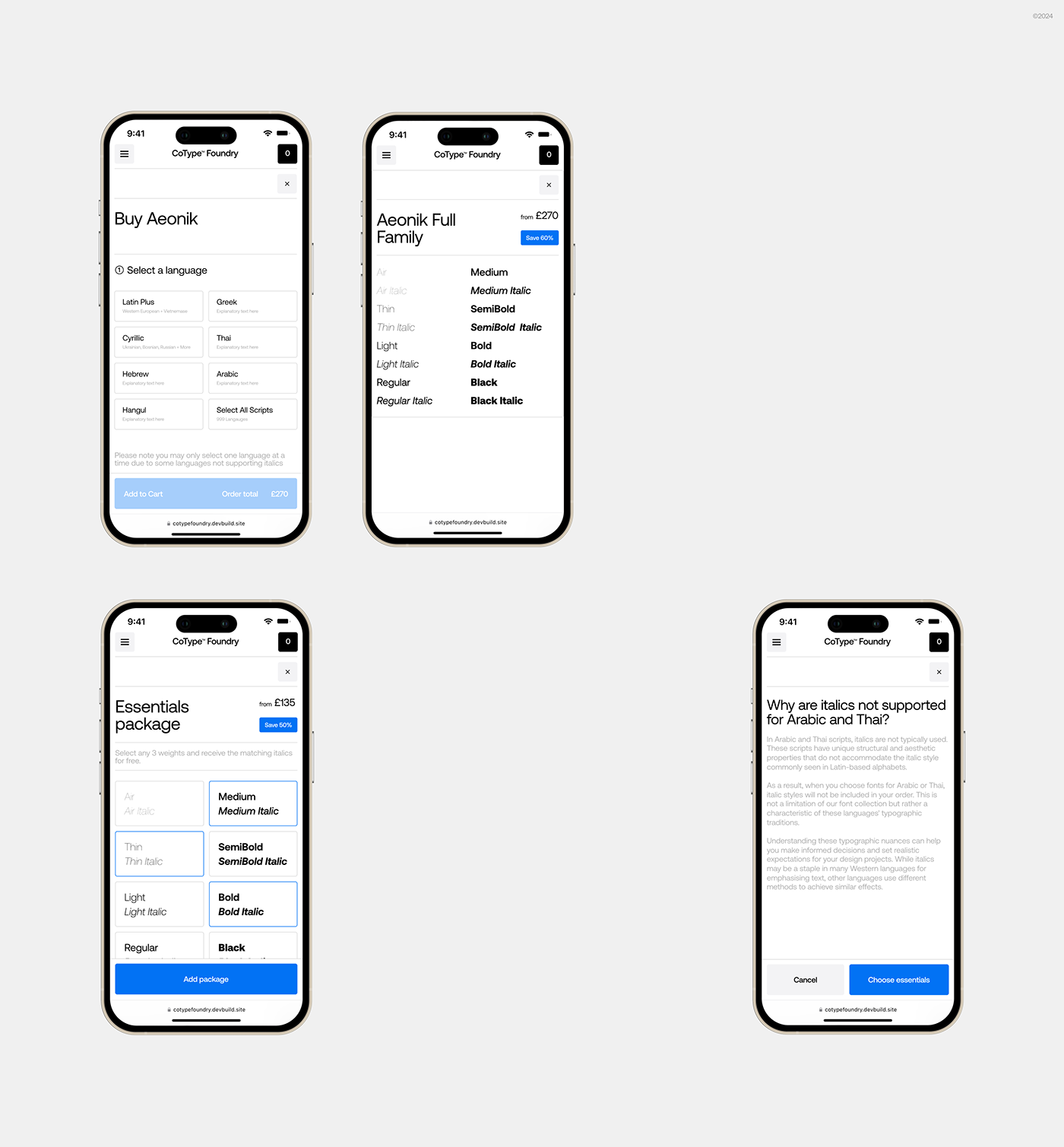
A Store-Like UX for Digital Fonts
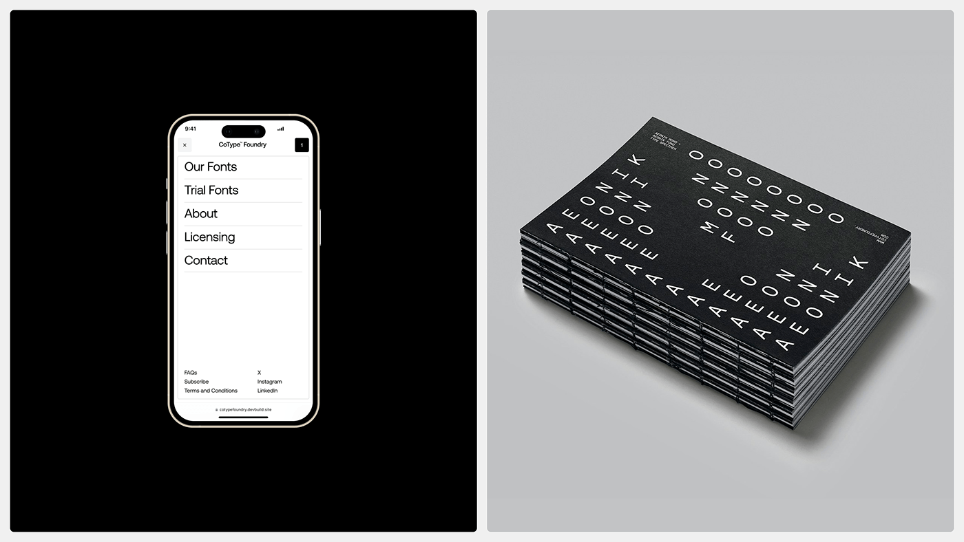
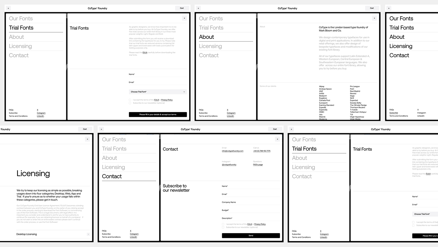
The primary challenge was crafting a UI that mirrored an e-commerce shopping experience—one that made font discovery as intuitive as purchasing physical goods. To achieve this, the team at Holographik adopted a structured grid layout, with clear typographic samples, interactive previews, and straightforward navigation that allows users to find and test fonts effortlessly.
Design Decisions That Matter
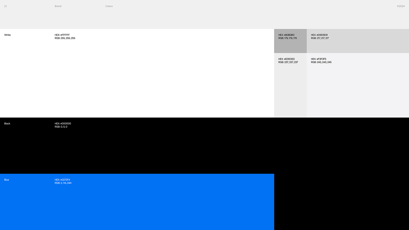
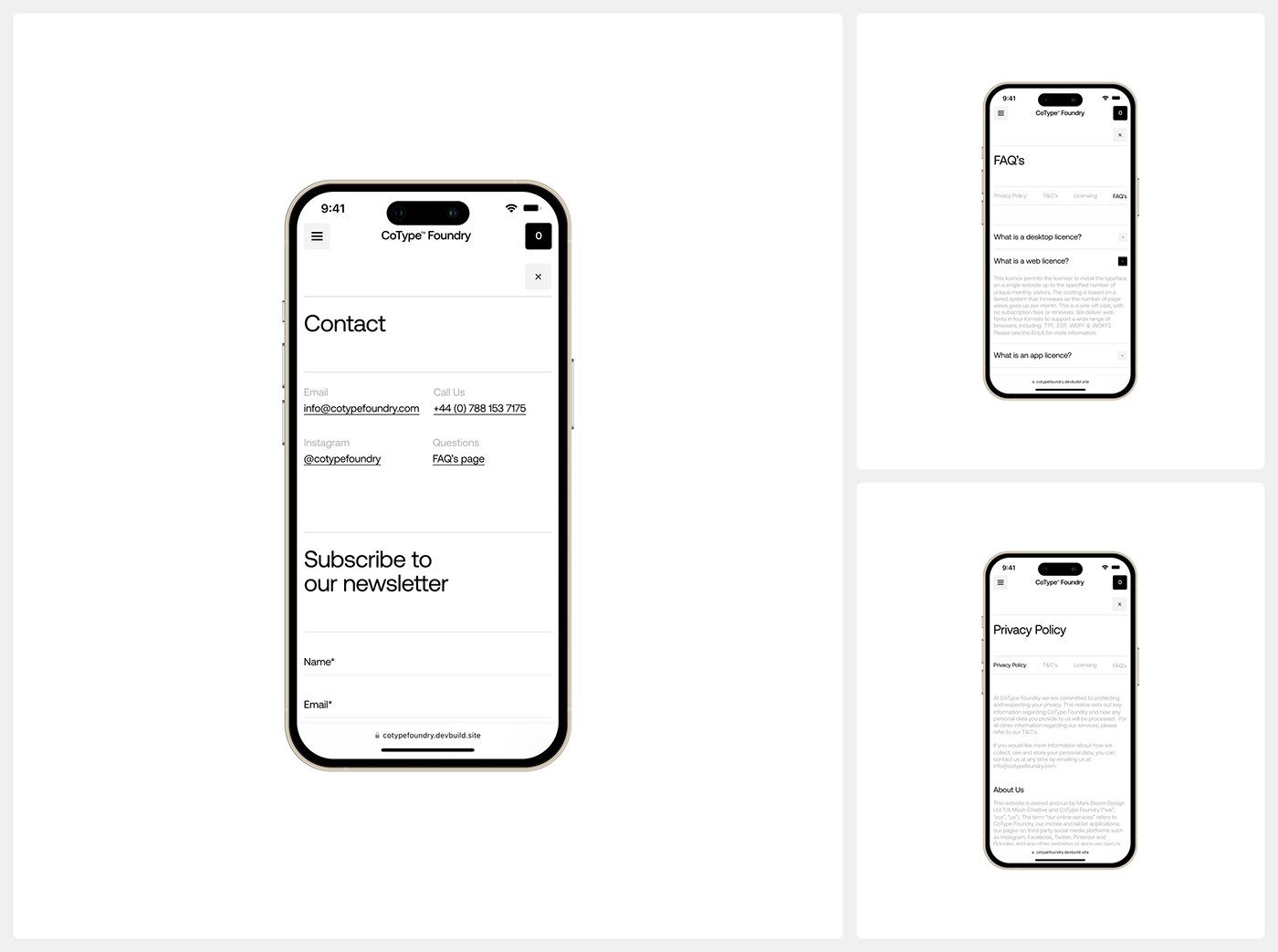
One of the standout aspects of the redesign is its minimalist UI, which avoids clutter while subtly guiding users through the purchase process. High contrast, ample white space, and a restrained color palette create a user experience that is both functional and refined.
Some of the key web design choices include:
- Grid-Based Layouts: The structure provides consistency across different pages, ensuring a fluid user journey.
- Microinteractions: Smooth hover states and transitions enhance the usability without distracting from the primary goal—exploring and purchasing fonts.
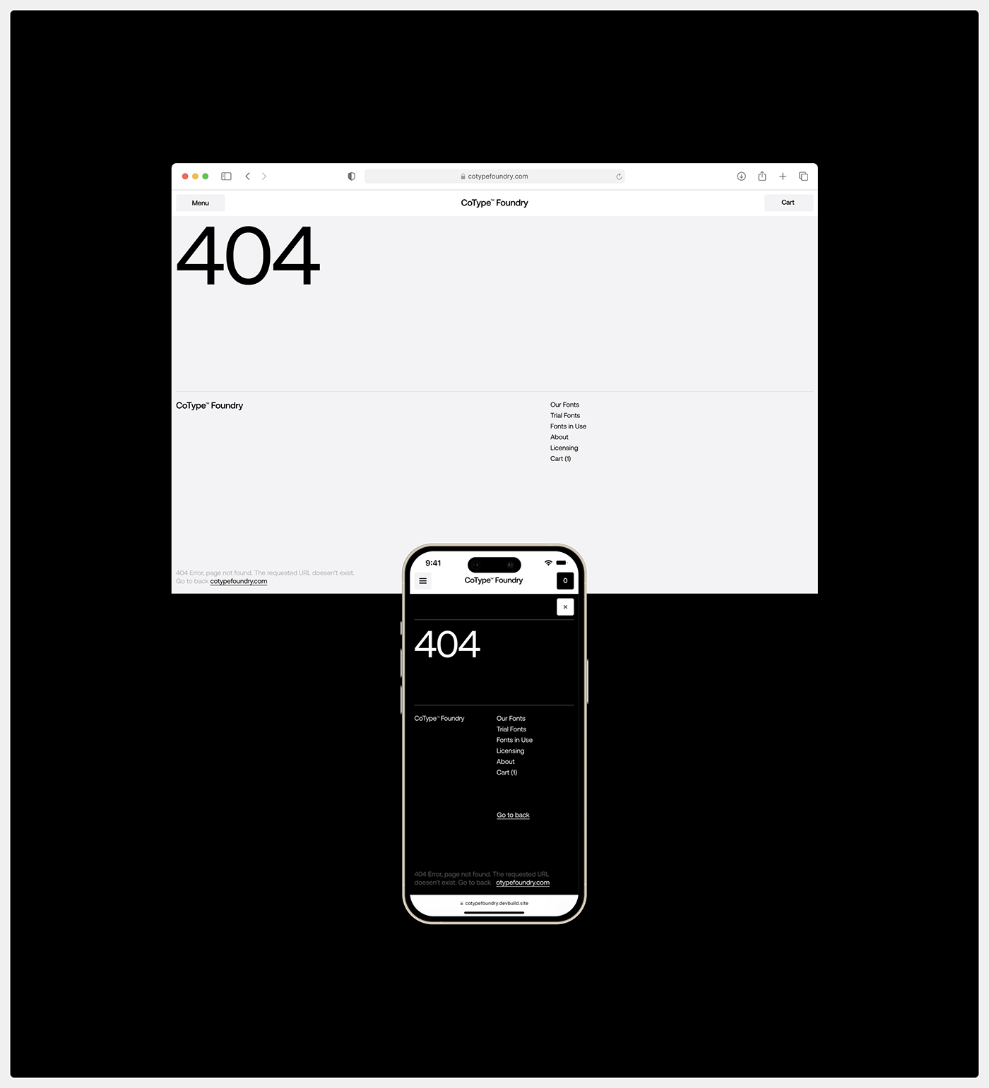
- Responsive Design: The website adapts beautifully across desktop and mobile, ensuring accessibility and ease of use regardless of device.
Performance Meets Aesthetic
Aesthetics aside, performance played a crucial role in the redesign. The site is optimized for speed, utilizing lightweight assets and efficient coding practices to ensure fast load times. This approach not only improves user experience but also benefits SEO, making it easier for designers and agencies to discover CoType’s typefaces organically.
Final Thoughts
The new CoType Foundry website is a testament to thoughtful web design that serves both form and function. It’s a space where typography isn’t just displayed—it’s experienced. With its intuitive purchase flow and modern aesthetic, the platform successfully elevates CoType’s brand while making font selection and acquisition more seamless than ever.
For a closer look at the project, visit CoType Foundry’s website.
Web design artifacts