by abduzeedo
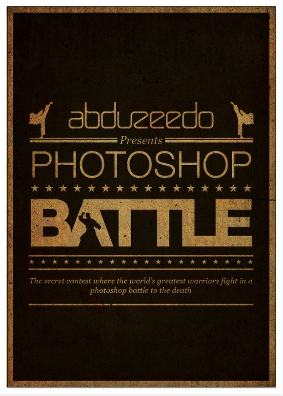
Back in 2007 I was in a design event with Fabiano Meneghetti, my business partner at Zee, and Thiago Bizarro, an old friend of mine, and we started talking about organizing a design event. During this conversation we came up with this crazy idea of creating a battle of designers in which they would compete against one another in a sort of fight style. It was heavily inspired by the Bloodsport movie starring Jean-Claude Van Damme. Now after 3 years this event will finally happen and I had to create an artwork for the poster of the event, and that is what I want to share with you.
So in this tutorial I will show you how I created the poster of the Photoshop Battle event using Illustrator. The idea behind it was that it would have to have that sort of old boxing posters style using only text and basic shapes like rectangles and stars. During the process I ended up adding some extra elements, martial arts fighters, in order to give that cheesy look that I was looking for :)
Before the tutorial however let's watch the trailer of the Bloodsport movie, just to get in the mood to create the poster.
If you are in Porto Alegre, or even if you want to participate of the Photoshop Battle event, visit the site for more information: http://www.battleofphotoshop.com.br/
Step 1
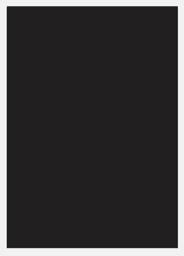
Open Illustrator and create a new document, the size I used was A3. After that using the Rectangle Tool (M) create a rectangle with the size of the canvas. Fill the rectangle with a dark brown (#383434).
Step 2
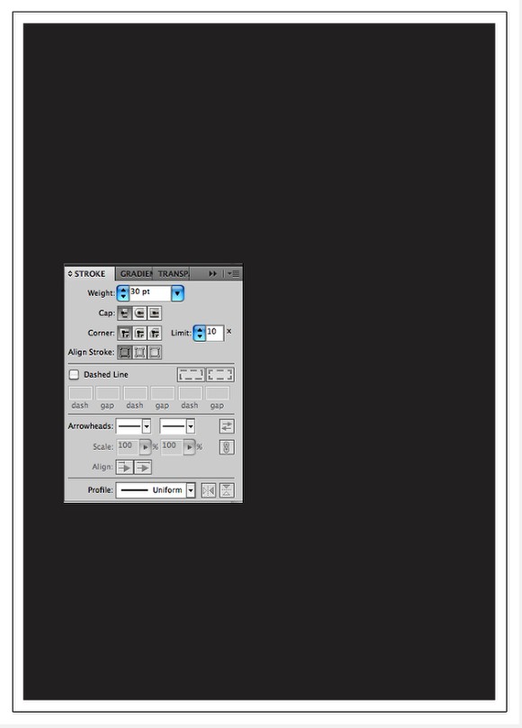
Apply a stroke for to the brown rectangle, for the color use white and for the size use 30 pt.
Step 3
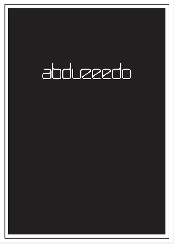
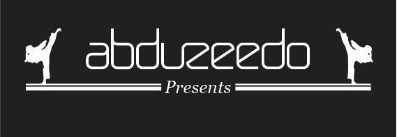
Start placing the logo, in my case the Abduzeedo logo using white for the color. All the objects we will add will be in white.
Step 4
With the Rectangle Tool (M) add 2 rectangles one on the top of the other but the one at the top with half of the height. Also make the space between them very small.

Step 5
In order to add some martial arts feeling to the design I imported a vector file with a karate fighter doing a kicking move. The file is courtesy of Shutterstock and you can find it here . Using only one of the two fighters place one on the left thand duplicate it and go to Object>Reflect. Choose Vertical for the Axis. Move the second fighter to the right.

Step 6
With the Type Tool (T) add the text "Presents", I used Georgia Italic for the font. After that with the Rectangle Tool (M) create a brown rectangle and postion in between the text and the 2 rectangles. Select all elements and align them with the Horizontal Align Center option.
Step 7
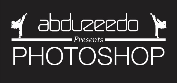
With the Type Tool (T) add another text, this time the word "Photoshop" using Helvetica Neue Light for the font. For the size, resize it until it is the same width as the double white lines.
Step 8
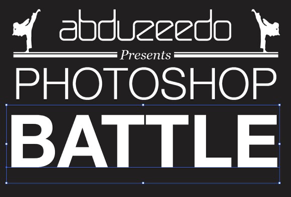
Again with the Type Tool (T) add the word Battle, this time using Helvetica Neue Bold for the font. The size will be proportinal to the width of the rectangles.
Step 9
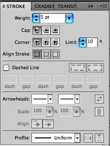
Apply a stroke to the Battle text. I used 5 pts in white.
Step 10
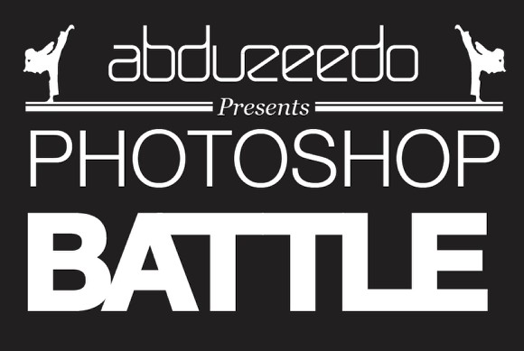
Go to Type>Create Outlines in order to convert the editable text to objects so you will be able to edit the points and move each characters independently. The first thing to do is connect them so, move the E until it connects with the L, the same with the Ts with the A and L, but in the case of the T and A you will have to use the Direct Selection Tool (A) to move the vertices of the top right part of the T to connect with the A.
Step 11
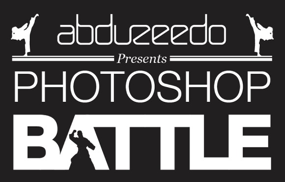
Using another vector file of a fighter, you can find it here, place it in the middle of the A. Use the same brown as the background. You also can see that the B and A are connected, to do that use the Pen Tool (P) and create an object to connect them.
Step 12
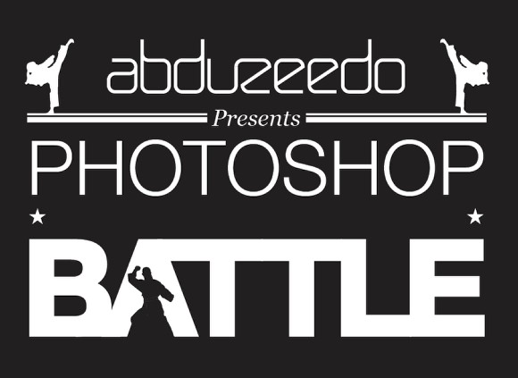
Select the objects of the battle word and the fighter and group them. Move this group down a little bit. Select the Star Tool and create one start. Place it on the left between the words Photoshop and Battle. After that duplicate it and move it to the other side.
Step 13
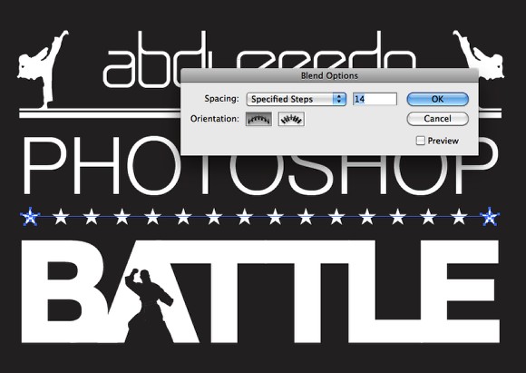
With the Blend Tool (W) click in one star then on the other one to create a blend object. With the blend object selected just double click on the icon of the Blend Tool to open the Blend Options. Use Specified Steps for the Spacing and 14 for the number of Steps.
Step 14
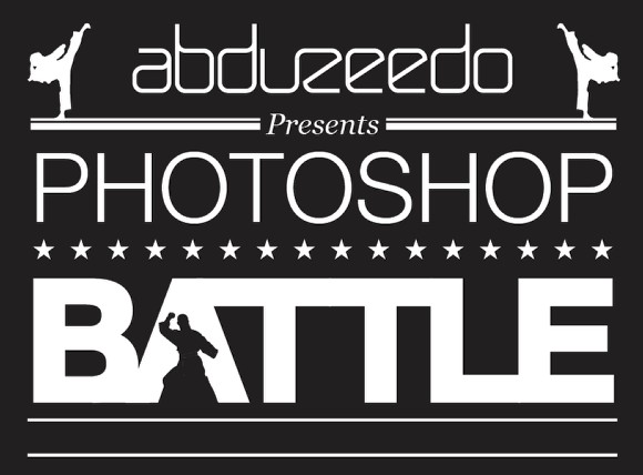
Again with the Rectangle Tool (M) create a line below the word Battle, then duplicate this line by dragging it down holding the Alt key.
Step 15
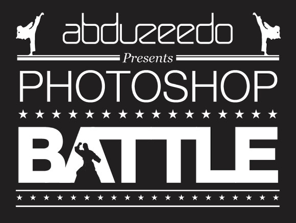
Between the two lines create another blend objects made out of starts, this time use smaller stars. Also, go select the two lines and the blend object of stars and go to Window>Align to open the aling options. Select the Vertical Distribute Space over the Distribute Spacing Options.
Step 16
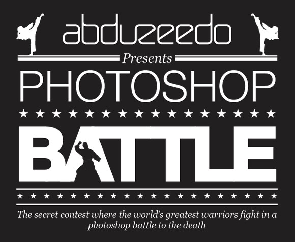
Now let's add some cheesy text to describe the event, the text I'm using is the text that was in the poster of the Bloodsport movie with Jean-Claude Van Damme from the late 80's. The movie is a classic of the action movies and it was about this fighter that went to a secret martial arts contest called Kumite.
For the font I used the same as the Presents word, Georgia Italic, but with a much smaller size.
Step 17
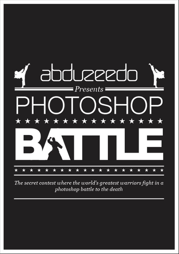
Duplicate one of the lines that we created on the step 14 and move it to below the text. Again with the Vertical Distribute Space option organize your composition so the vertical space among ojects are uniform.
Step 18
Importa a paper texture and place it on top of the other layers. After that go to Window>Transparency. Change the mode from Normal to Multiply. The texture I'm using is from Shutterstock and you can find it here.
Step 19
Let's add another texture, this time I used a texture from Shutterstock called Grunge Texture Background, you can find it here. Place it on top of the other layers and once again, over the Transparency option, change it from Normal to Multiply.
Conclusion
Group the objects and align them in the center of the poster. You can make some adjustments like in the spacing among object or some object sizes, but the composition is done. As you could see it was done using just rectangles with text and the Blend Tool to create the set of starts. The most important thing here in my opinion was the idea of the composition because the process of creating it was pretty easy.
