by PauloGabriel
Being a student is hard work... you spend hundreds of hours designing and evolving so that you may get to the point where you start doing solid, awesome projects that make you proud. The feeling of being able to design an awesome piece is just priceless.
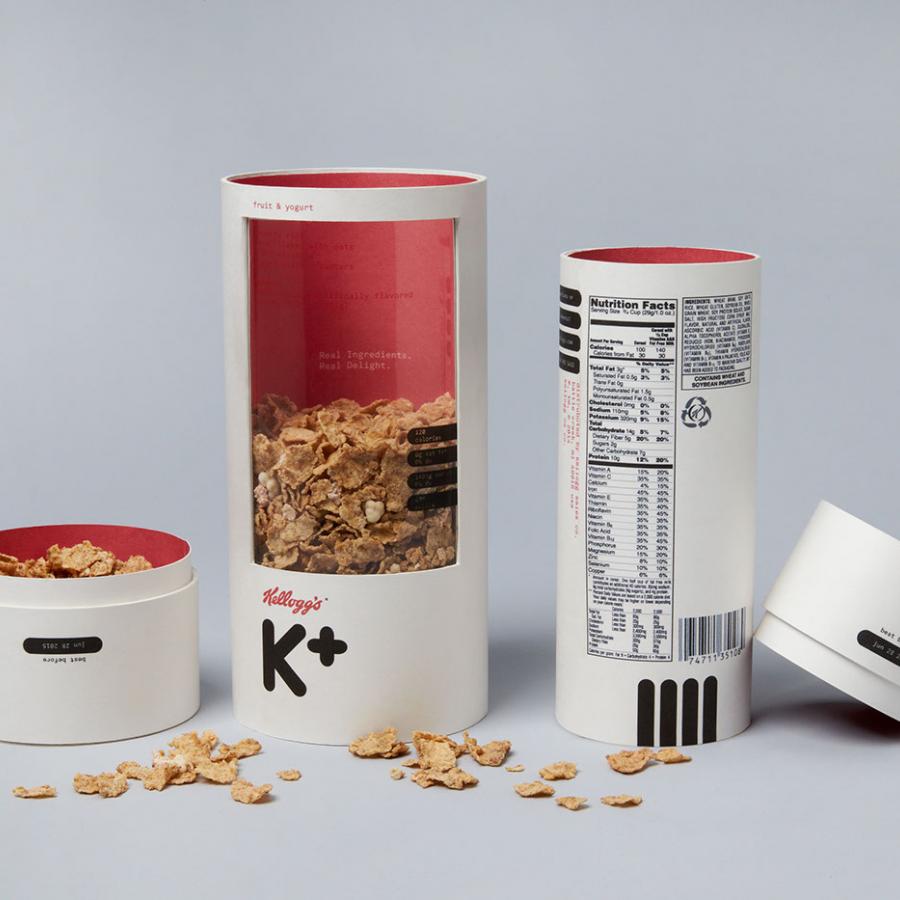
Mun Joo Jane, a young designer from Los Angeles, has designed a fantastic package for a Kellog's cereal. The most awesome part, is that this was a college assignment, student work. If she comes up with something like this being a student, I can't wait to see what she's going to do in the future. About the project:
The overview of this project was to come up with a cereal packaging design for adults. We are no longer kids and it is important that our cereal packaging reflects exactly that. The challenge of this project was to neglect the stereotypical cereal box design. I explored many shapes and came up with two ideas. After much dilemma, I decided to push both concepts. The simple solution was to work on both ideas and see how far I can develop them. Special K was chosen for this re-branding project. Being a suitable cereal brand for adults was a key criterion when choosing the brand to work with.”
Brands like “Cheerios” and “Trix” strongly caters to the younger population while Special K caters more towards the adult population. Also, I had an urge to change the Special K brand into a unisex design, leading to the creation of a b-line for Special K called “K+”. K plus creates a positive reputation and symbol for this packaging. The positive sign symbolizes good health and better nutrients. These perceptions allow consumers to feel like they are making a good decision by buying this product. The target demographics are ambitious and aspiring young adults in their 20s.”
For more of Mun Joo Jane's work, please visit her portfolio at Behance. I hope you enjoy these as much as I did! Cheers. ;)


