by abduzeedo
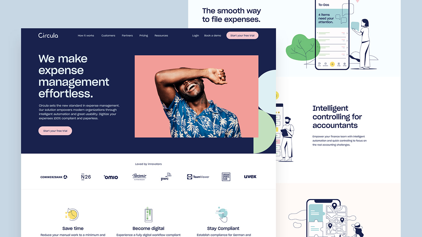
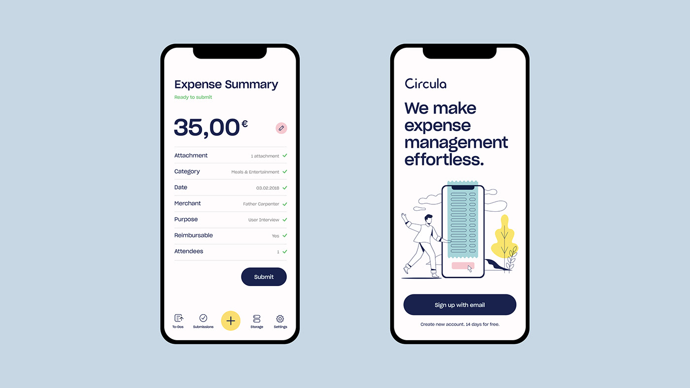
Sofia Dimitrova, Atanas Teodosiev and Jenny Tsaneva shared a branding and visual identity project for Circula, a company that struck them only as a young and determined name on the market, that would not be the whole picture, however. The thing that made them the strongest impression was their simple ambition to make people's lives easier by saving them the only irreversible value in the universe - time.
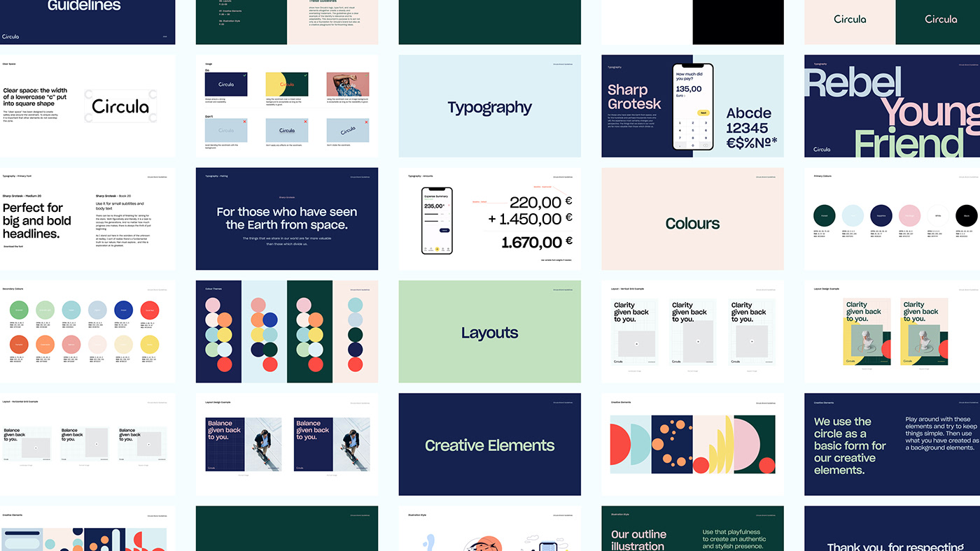
I tried to collect a few images from the full post. I recommend that you check it in its entirety with time and attention. The simplicity is striking. The simple grid for the compositions. The typography. I got quite inspired after navigating the project and trying to imagine the designers process, their ideation.
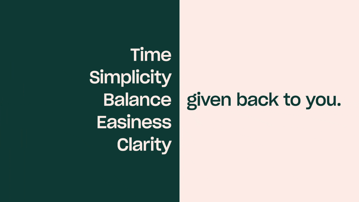
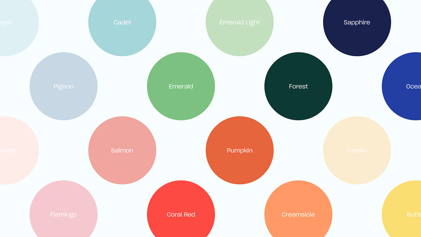
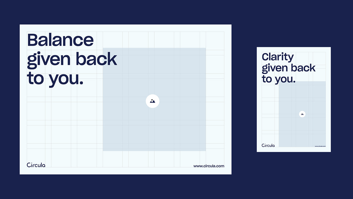
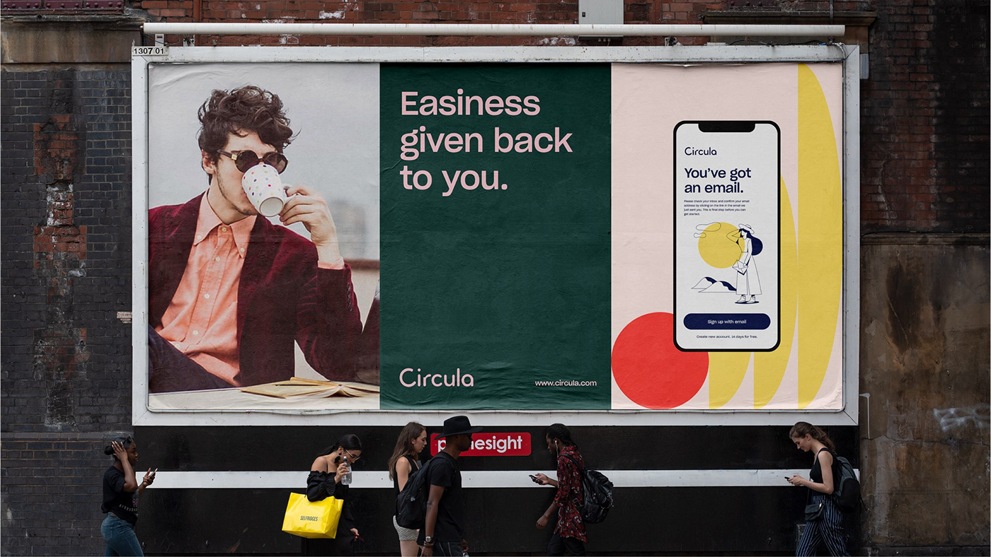
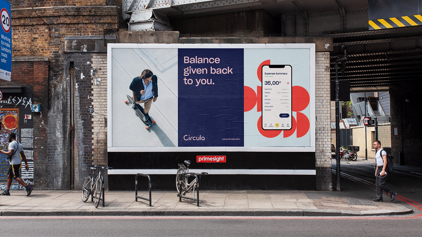
The concept consists of a clear visual language - a rich pastel colour palette and smooth forms which are opposed to the brief yet substantial messages. The texts are directly referring to the company's primary service, e.g. the saving of an essential resource to the client's benefit.
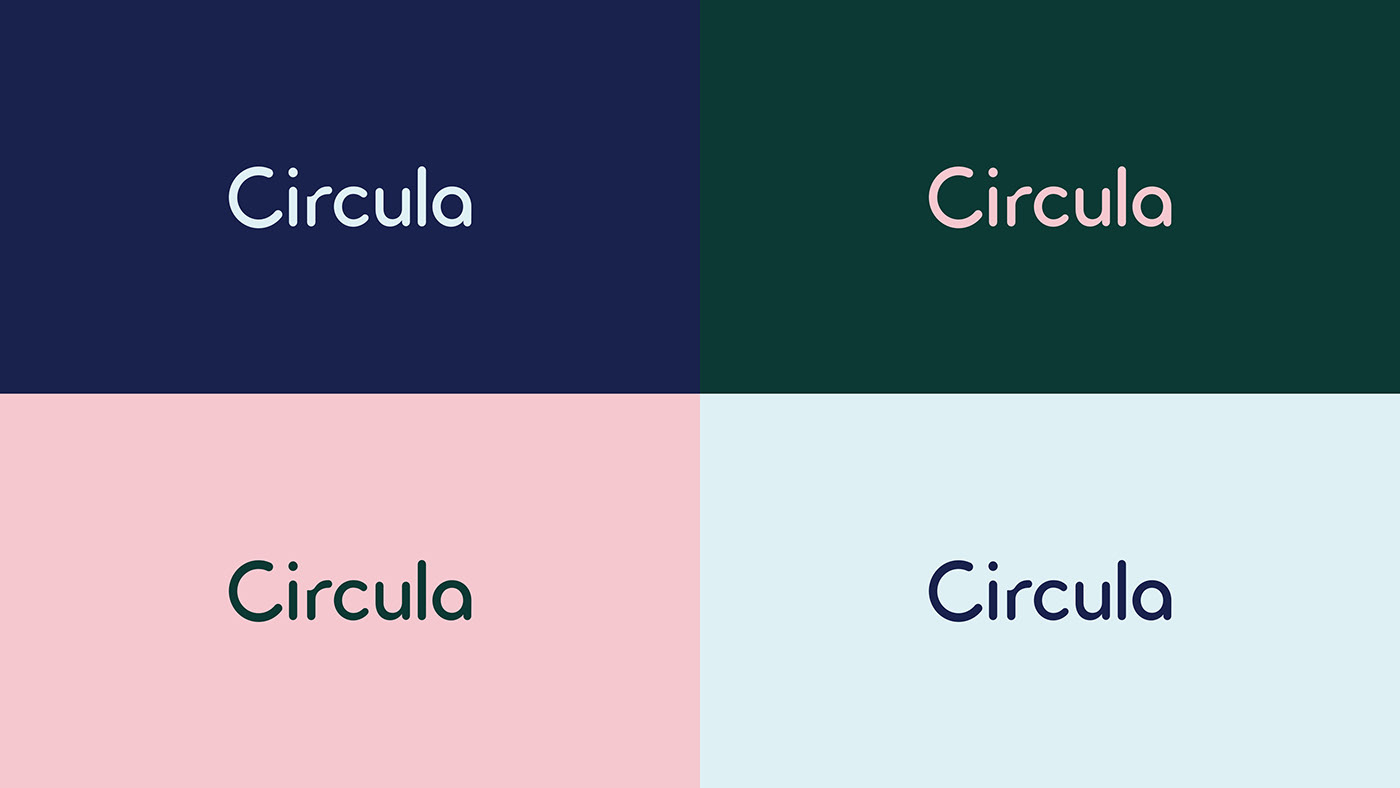
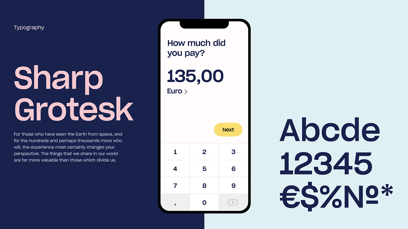
Along with the improved logo and added graphic elements comes the usage of a new font Sharp Grotesk that adds extra stability to the direction. To complement the effect of Circula' services on people's lives, we came up with a set of custom illustrations which eloquently portray ordinary situations.
Credits
- Creative Direction — Atanas Teodosiev
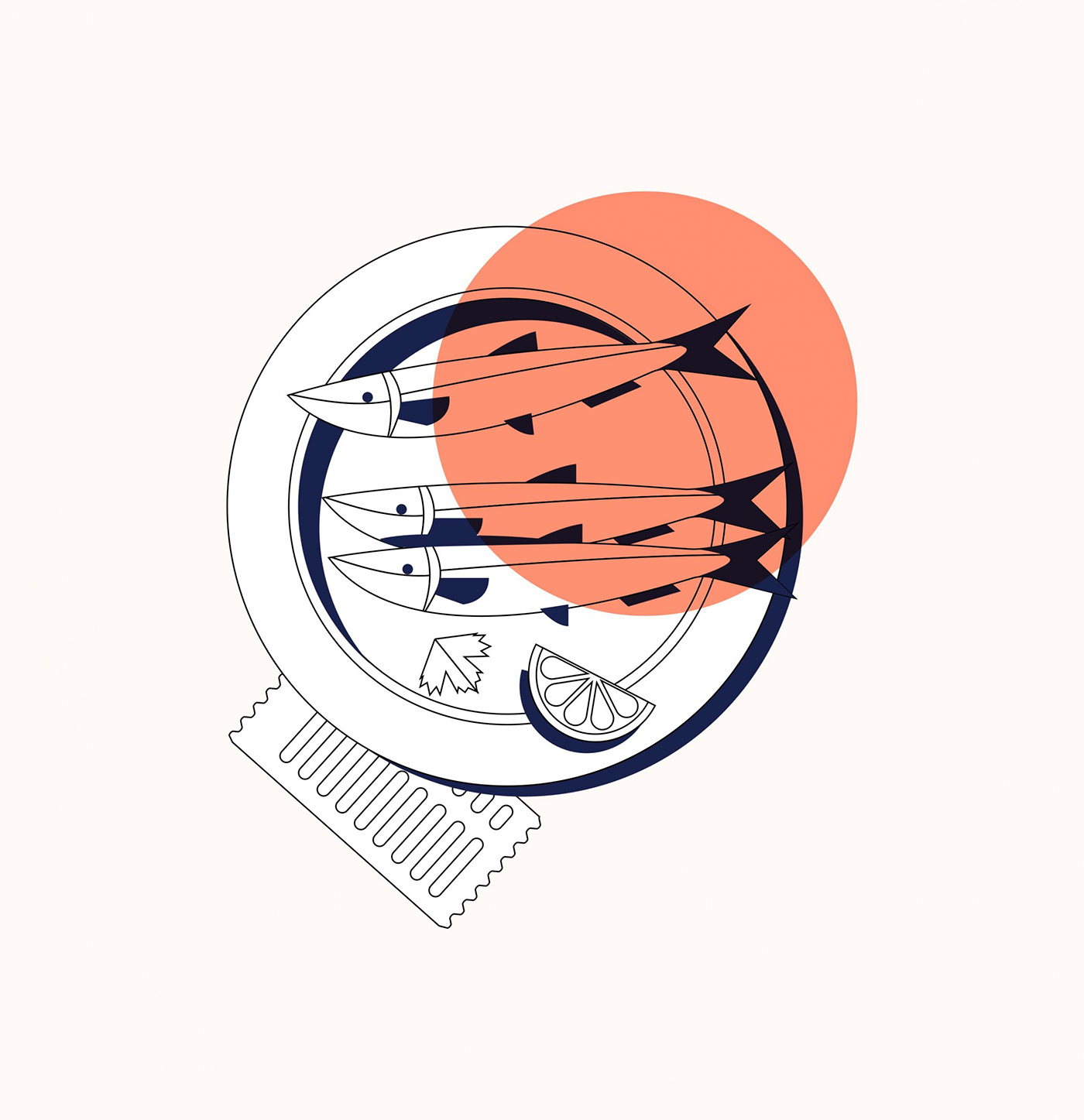
- Illustration — Sofia Dimitrova
Branding & Visual Identity