by abduzeedo
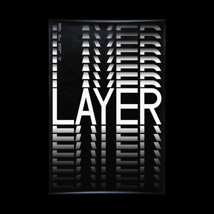
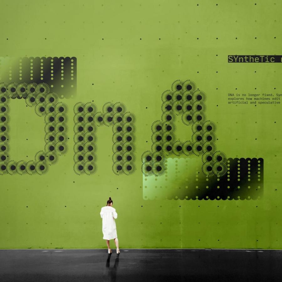
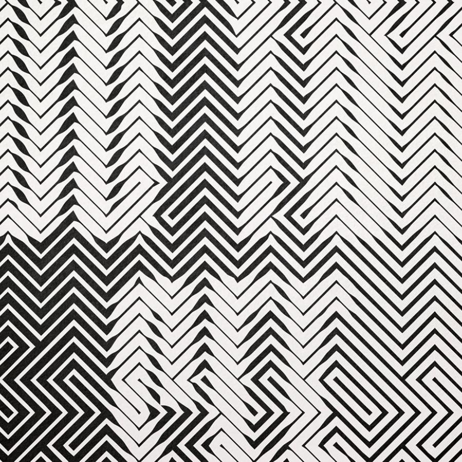
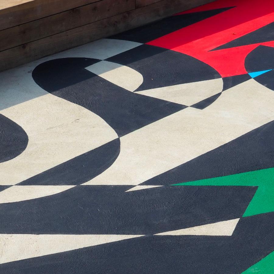
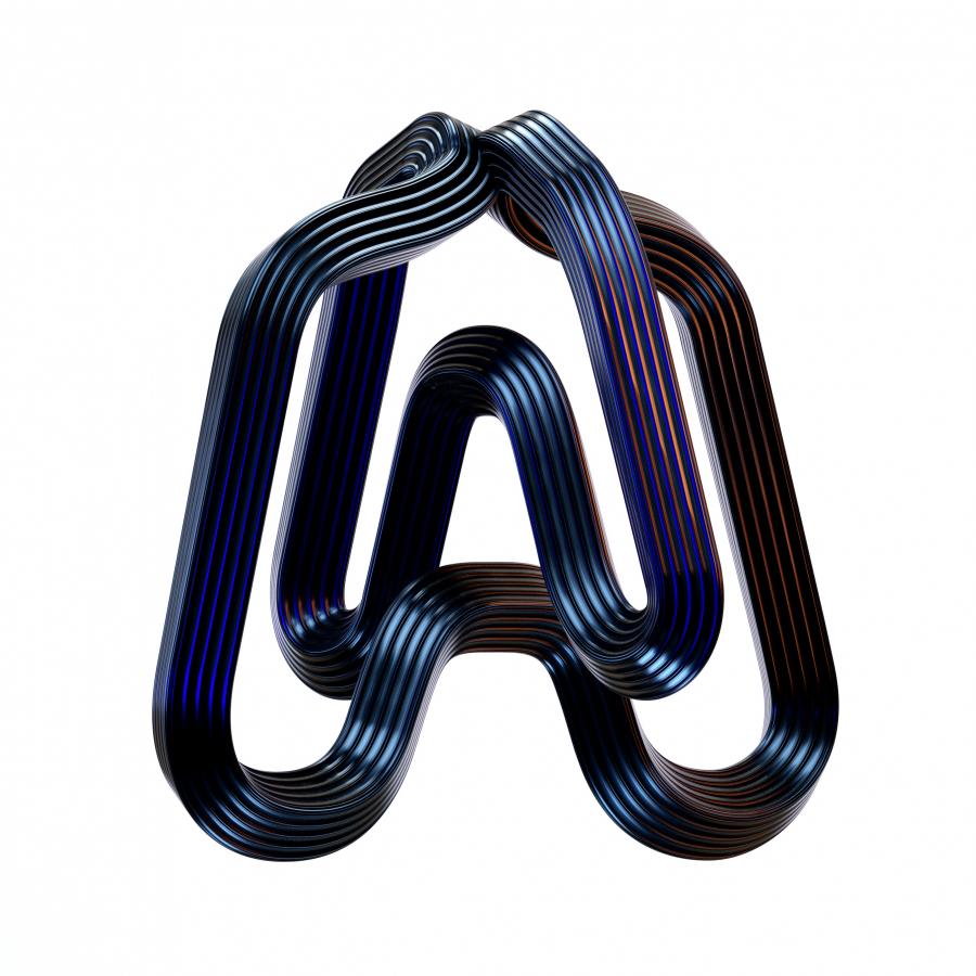
36 Days of Type is a project that invites designers, illustrators and graphic artists to express their particular interpretation of the letters and numbers of the Latin Alphabet. Fatih Hardal created a structure using print screen, type distortion and various photos. Helvetica and Custom type trials were used to create the characters. He created a structure using print screen, type distortion and various photos. “I tried to create a family that is completely different from each other without rules. I was also impressed by SPIN when creating them and I can say that it was effective in its formation.” - added Fatih
You can click on it to see the artwork in high resolution. You can visit the Instagram account for more.
