by abduzeedo
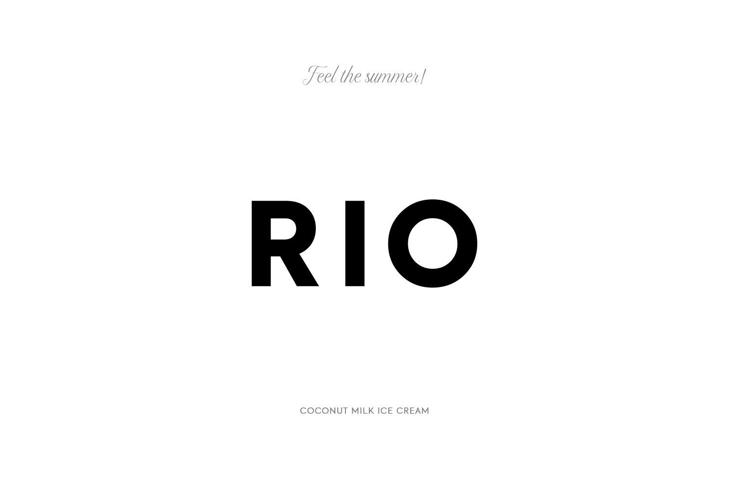
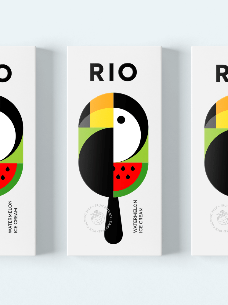
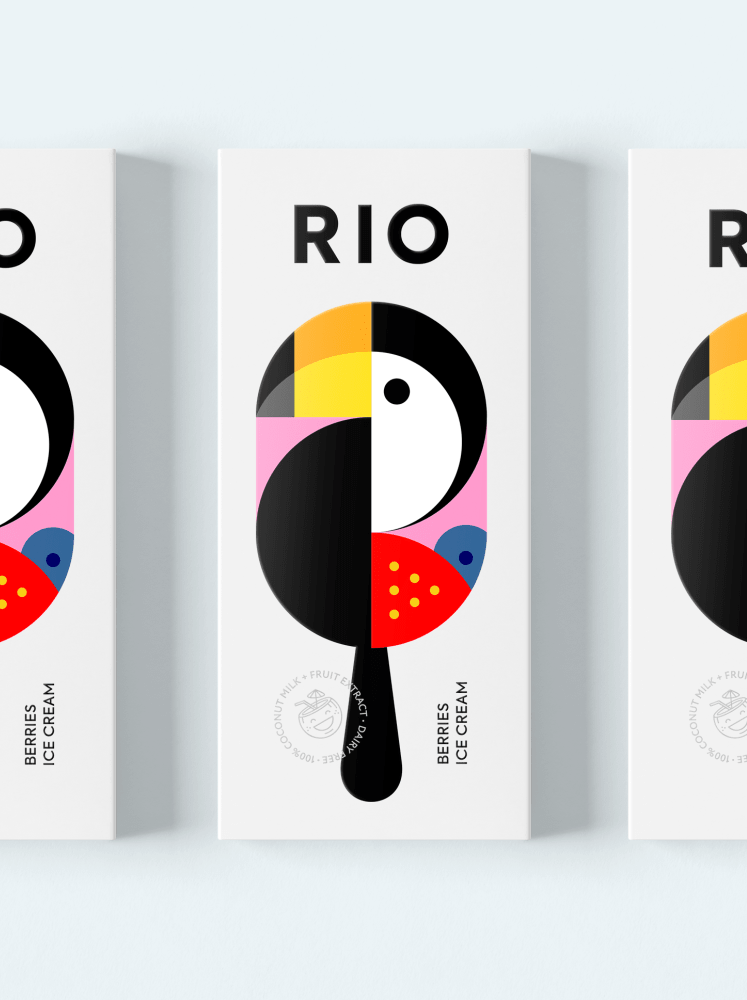
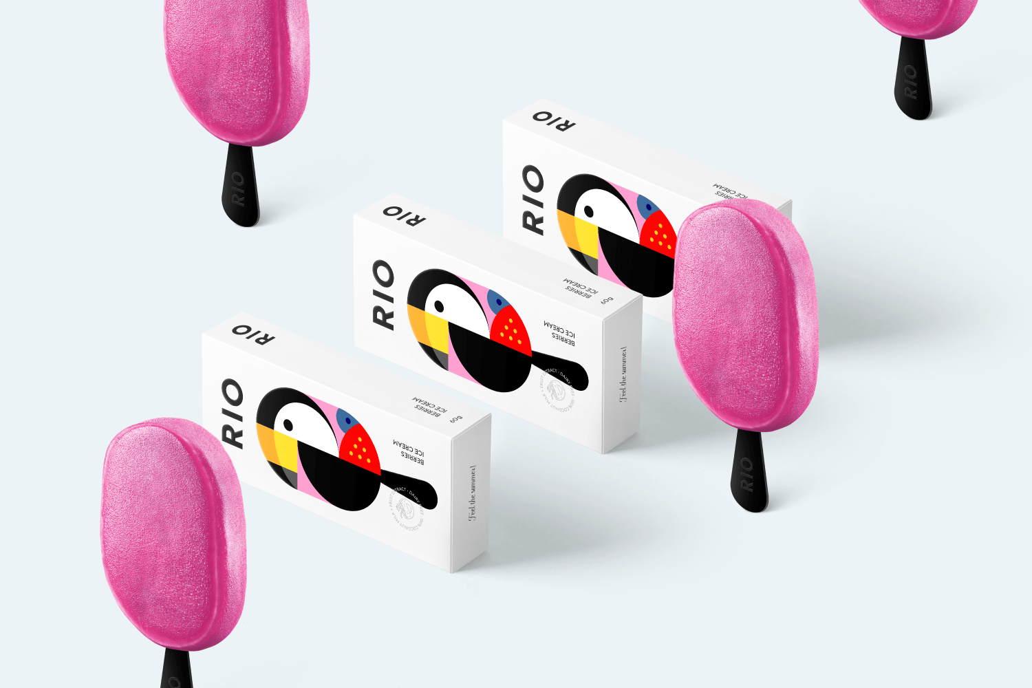
You know those designs that you feel bad, not because of the poor quality but the opposite. When you question yourself, “why didn’t I think about that” or in my case “Why I suck so much”. Well, if you have these thoughts, a word of comfort, you are not alone. But brace for impact. Berik Yergaliyev shared a concept of an ice cream branding and visual identity inspired by one of the most colorful cities in the world – Rio de Janeiro.
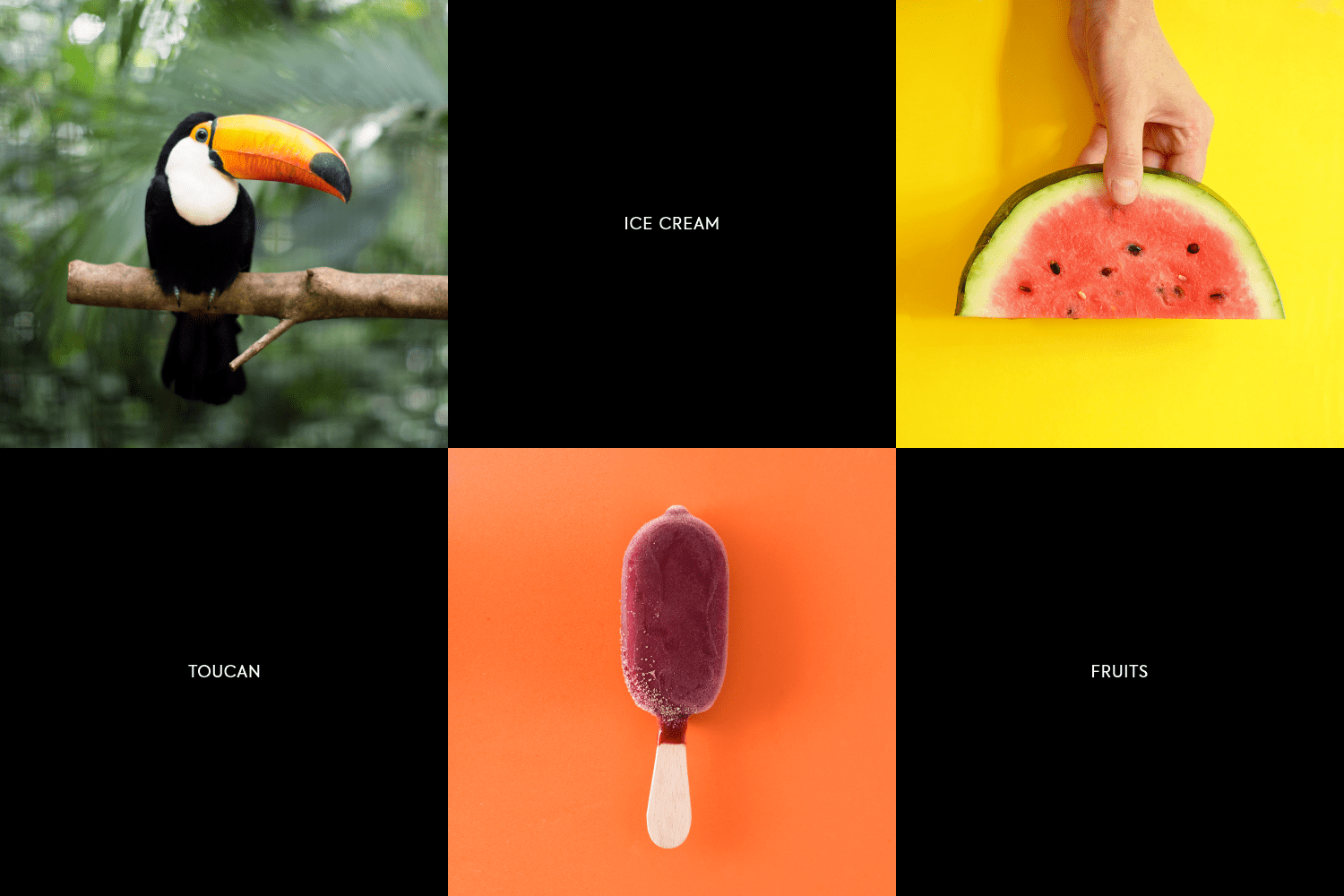
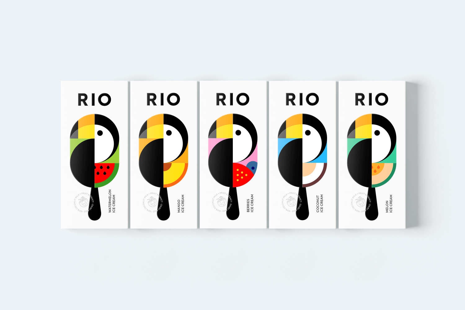
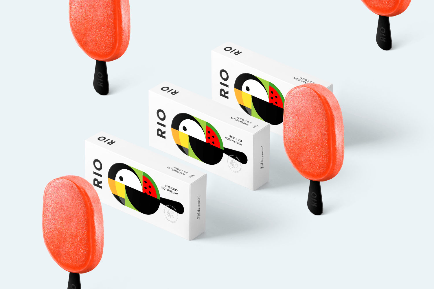
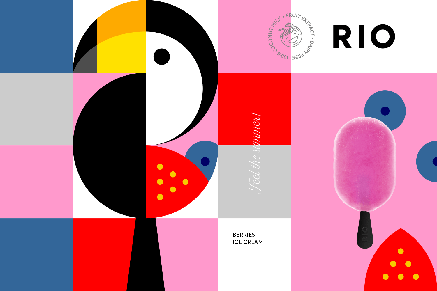
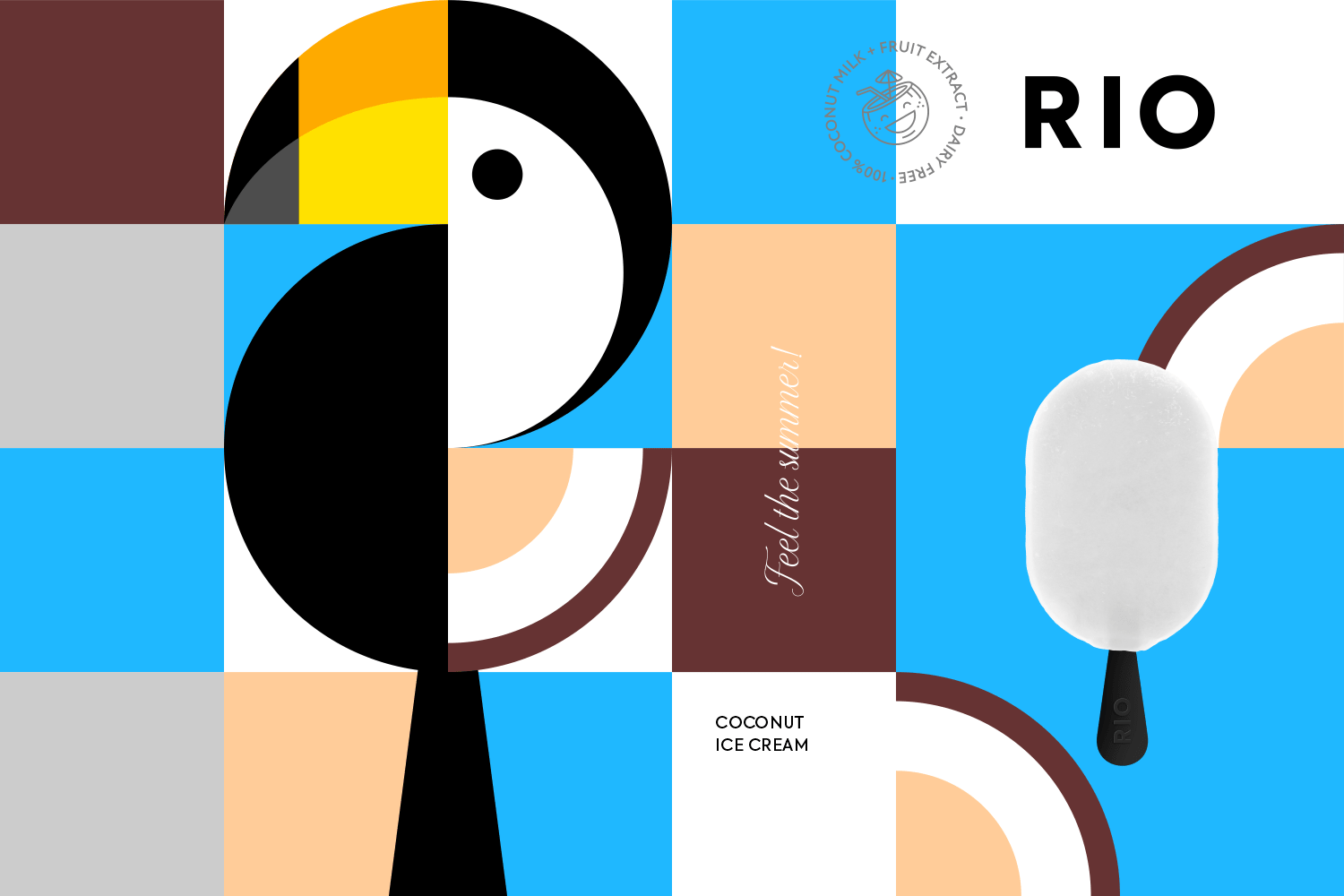
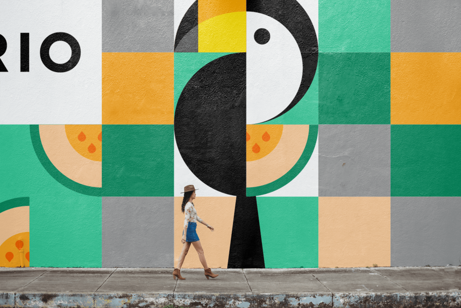
RIO ice cream reflects the main associations of this city – bright, yummy and sunny. Beautiful toucan bird which also reminds us of the city Rio was chosen as the main mascot of any symbol. The main idea for the packaging is to convey the bright taste and its natural ingredients, simple graphics says it all.
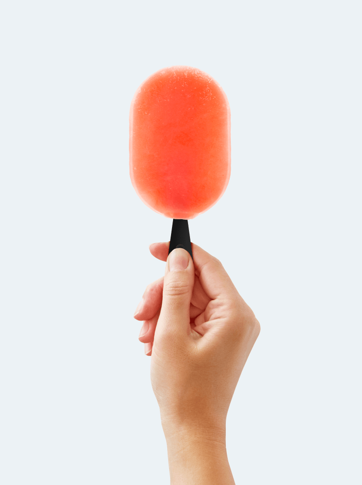
Ice cream’s main flavors are mango, watermelon, berries, melon and coconut. It is supposed that an ice cream will be made based on coconut milk. It has no gluten, soy, eggs and refined sugar. This ice cream is perfect for people who take care of their health and enjoy the taste of tropical fruits.
RIO ice cream reflects the main associations of this city – bright, yummy and sunny.
Branding