by abduzeedo
Artist, designer and typographer Mark Gowing is fascinated by language systems, having developed his own visual approach through his art and graphic design practice. You could say he is obsessed with geometric typesettings that subvert the conventional written word, playing with our innate understanding of reading and comprehension. In a series of lithographic prints, he has employed a type system of deconstructed letterforms to create rhythmic frequency fields.
The three works, Morse, Distance and Sentences create new combinations of form and language. These typographic compositions are rhythmic and textural interventions that elegantly abstract our agreed system of language marks. The frequency of these visual fields creates an illusion of movement and vibration—like an optical form of expression, the works seem to dance with depth and texture. Gowing’s view from outside our standardised language systems provides a kind of alien perspective and lends new meanings to existing writings.
Subverting perceptions of the written word
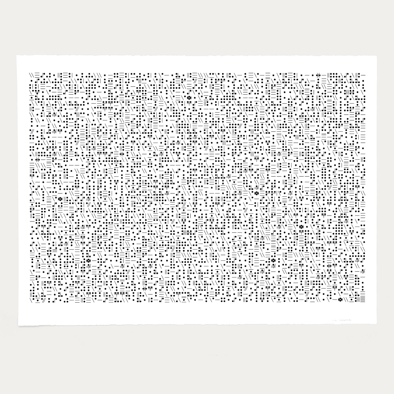
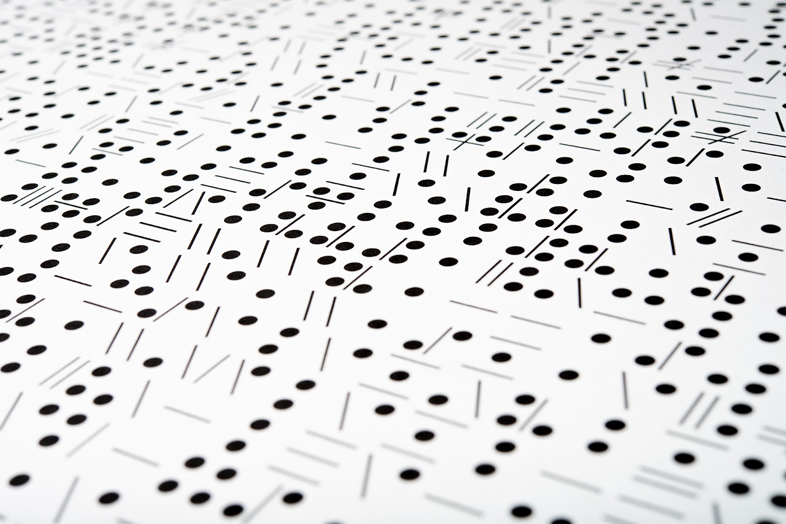
Morse features a text biography of morse code inventor Samuel Morse. The text is constructed using a typeface made from the bones of the now defunct morse code system. Conventional letterforms are assimilated as near as possible with their corresponding morse dots and dashes. The resulting work is a field of dots and dashes lacking a predictable linear reading pattern. Positive and negative spaces share an equal tension, blurring the line between the coded system and the English language.
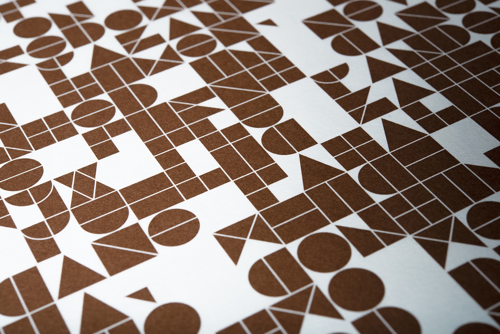
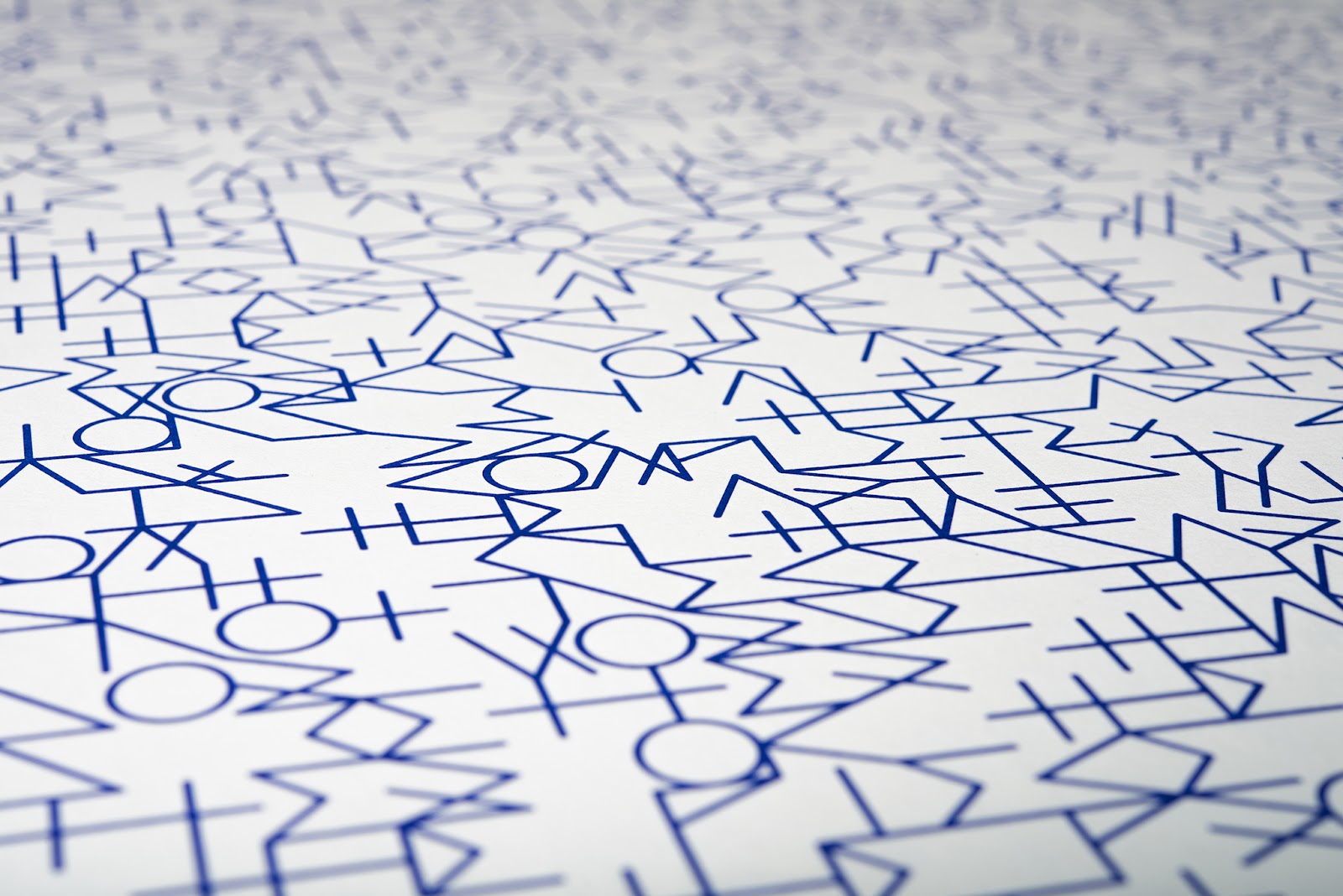
Distance features a text describing the history and practicalities of social distancing. In reference to the disjointed lives we have all been forced to lead, the text is constructed using a typeface made from dissected geometric shapes—circles, triangles and squares. The resulting work is a field of parts that make larger parts, within the larger whole. The negative spaces create an active tension that provides the link between language and geometry.
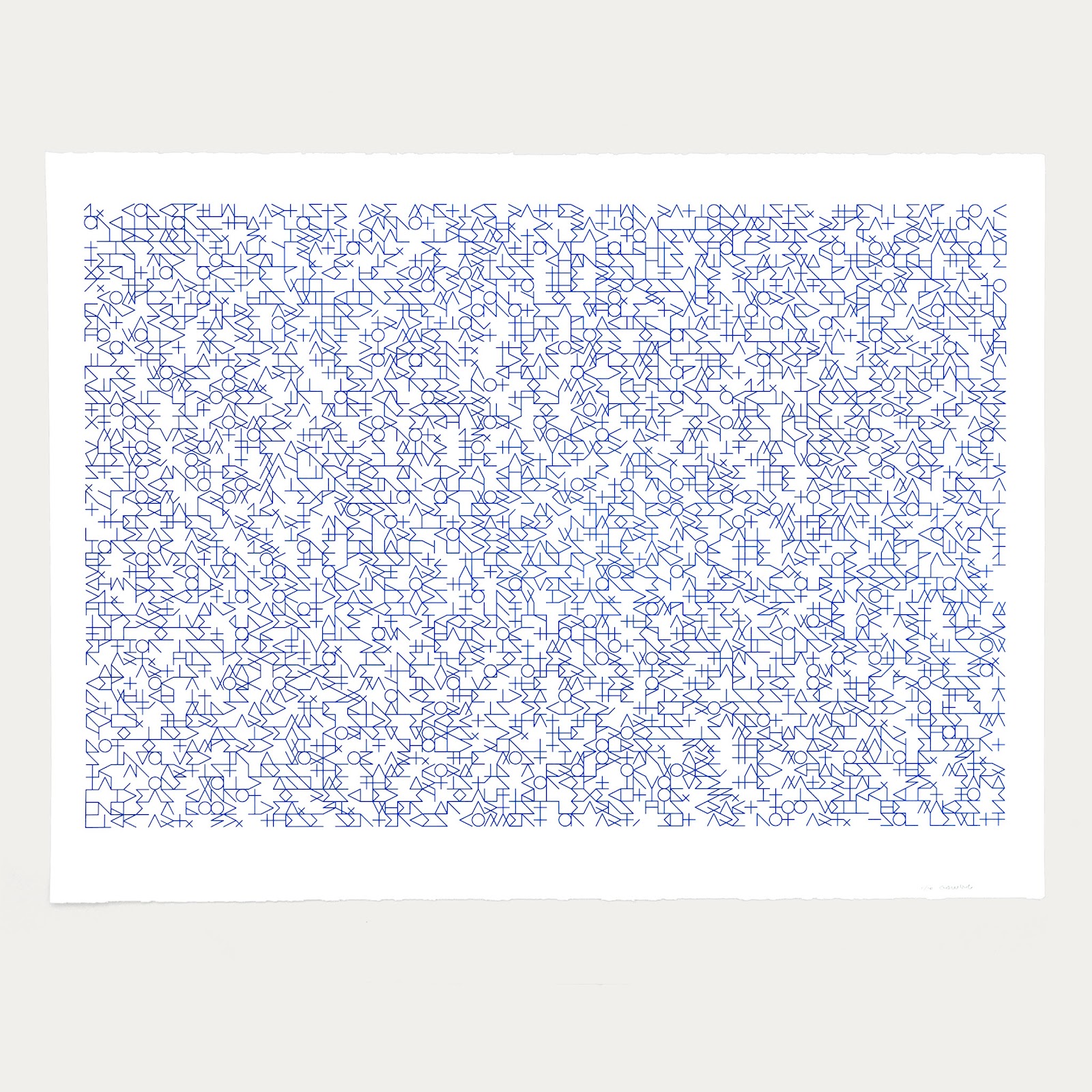
Sentences features the 1968 text Sentences on Conceptual Art by Sol LeWitt. The text is constructed using a typeface made from a strict gridded assembly of lines in reference to LeWitt’s drawing systems. The resulting work is a field of linework punctuated by geometric moments of unity. Sol LeWitt’s 35 sentences are numbered, providing an underlying structure within the overall structure, and lending the reader a small insight into the abstract language system.
Offset lithograph on archival rag paper, the three limited edition prints in the Frequency series are available from Formist Editions: www.formisteditions.co/collections/artworks/
Mark Gowing is an artist, designer and publisher working in Sydney, Australia. He is the director of Formist, a publisher, type foundry and graphic design studio, specialising in books, typefaces and cultural and commercial commissions. Gowing is also co-founder of the groundbreaking music arts organisation Longform Editions. With a practice spanning more than 20 years, Gowing has produced projects for leading organisations and institutions with a passionate focus on visual art and language, design, film and music. He has been honoured with solo exhibitions at the 22nd International Poster Biennale in Warsaw, Poland, the Divieto d’Affissione in Turin, Italy and Monash University in Melbourne, Australia. Gowing is a member of the Alliance Graphique Internationale and his work is held in numerous institutional collections including the Cooper Hewitt Smithsonian Design Museum in New York, USA.