by abduzeedo
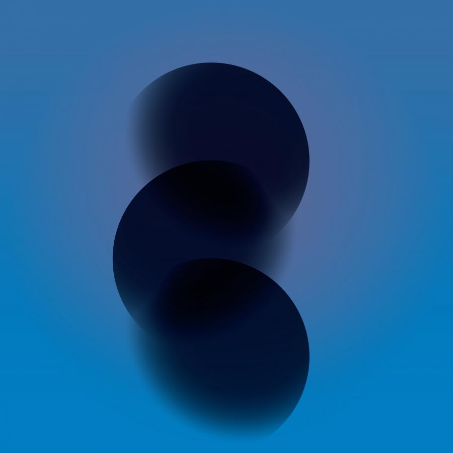
Marek Zielinski shared a series of posters he created as personal projects to explore graphic design, layout and composition. The designs feature a grayscale palette and play with grid and some beautiful graphics simulating movement, translucence and different volumes. All of that with that classic Swiss Style poster composition.
Details
For more information make sure to check out Marek on Behance.
