by abduzeedo
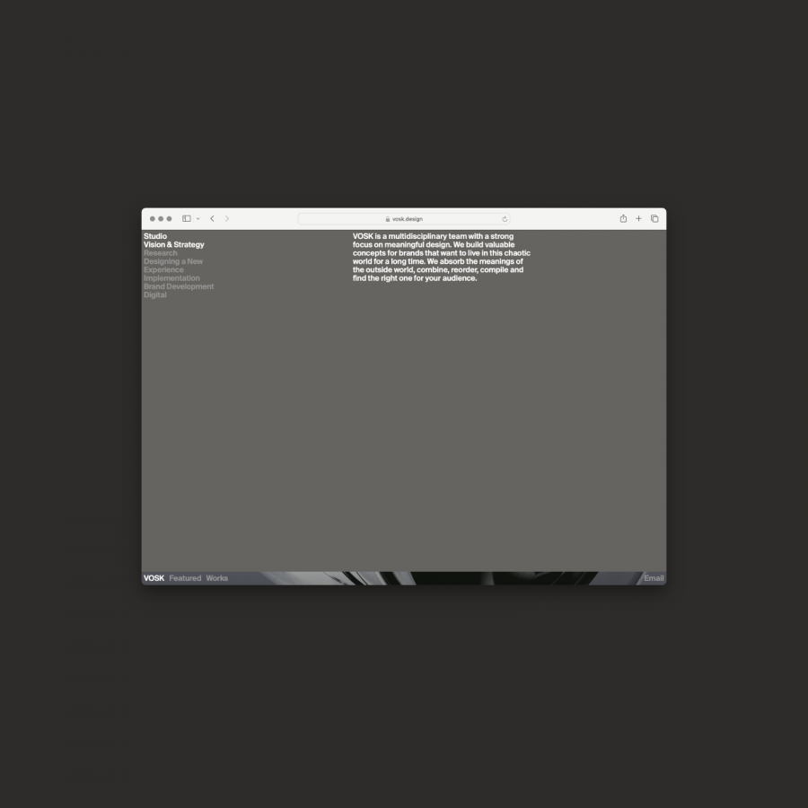
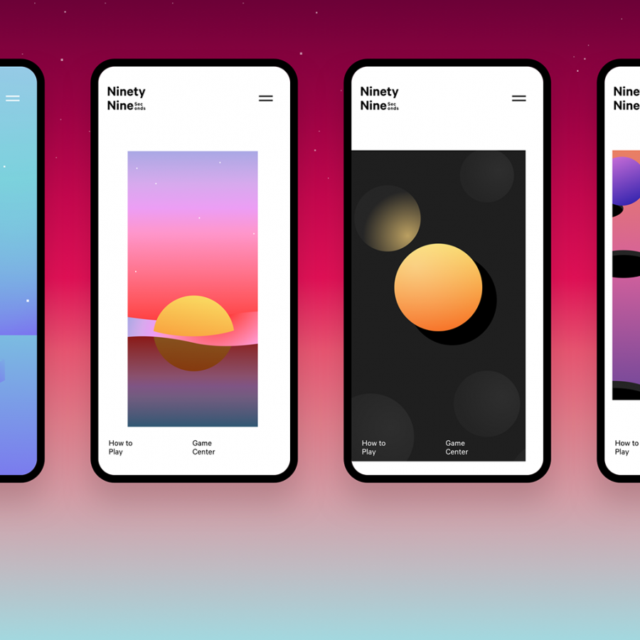
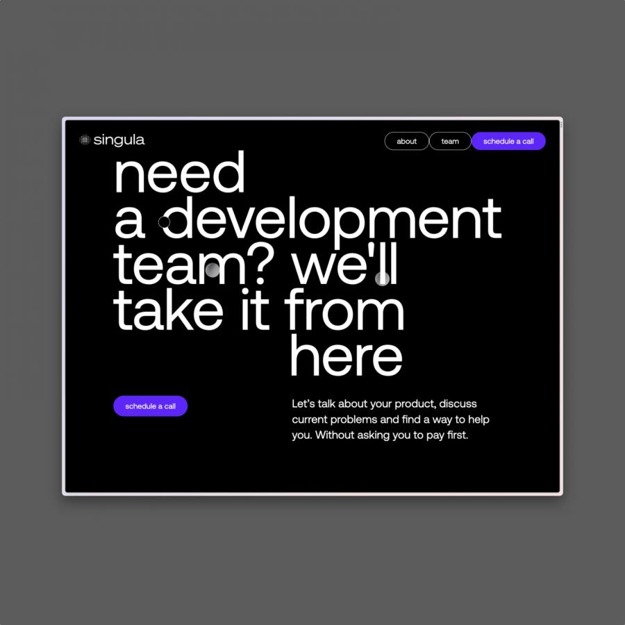
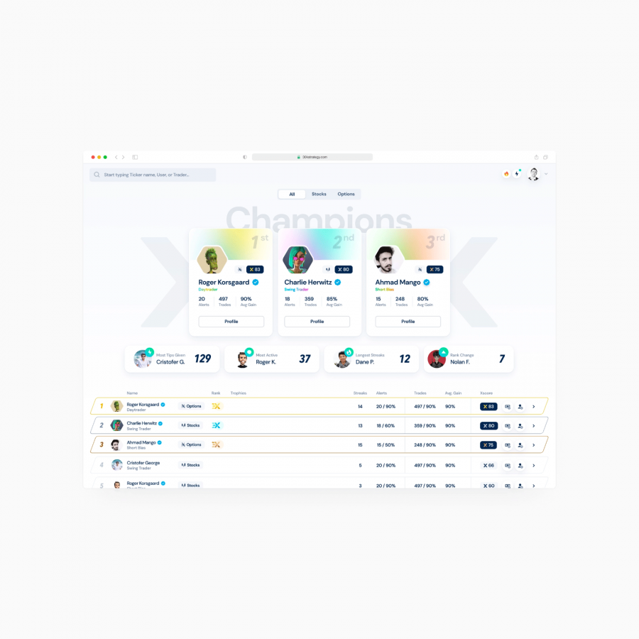
Kirill Kim shared a stylish web design and UX project. The design solution is for what it seems to be a furniture e-commerce and Kim adopts a quite simple and very typographic style. When I look at projects like this the biggest area that I focus is the transition from desktop to mobile. I always feel it’s difficult to preserve the look and feel of a more spacious medium when adapting to a quite contained canvas. I believe this solution was quite effective, hence the feature.
For more information make sure to follow Kirill Kim on:


