by abduzeedo
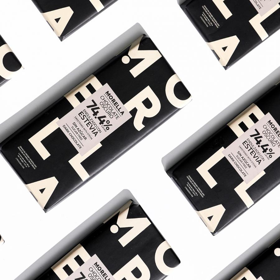
Beta, a leading design agency, has recently undertaken a packaging design project for Morella Chocolates, a brand that prides itself on offering healthy products made with top-quality ingredients. The goal of the project was to create a packaging design that reflects the brand's bold and geometric style while maintaining a minimalistic approach.
Morella Chocolates was founded by Morella Potolicchio, and their products are free from sugar, refined flour, gluten, and preservatives. The brand's commitment to using high-quality ingredients sets them apart in the market, and Beta aimed to capture this uniqueness in their packaging design.
The design agency focused on creating a clean and striking graphic design that would be visually appealing and easy to digest on the different products offered by the brand. The result is a bold packaging design that incorporates the brand's signature geometric shapes and minimalistic approach.
The design features a strong black and white color palette with pops of vibrant colors, which adds a touch of playfulness to the overall design. The use of bold typography and simple graphics makes the packaging stand out on the shelves, drawing the attention of potential customers.
Beta's packaging design for Morella Chocolates perfectly encapsulates the brand's core values and unique selling point. The design is both visually appealing and functional, effectively communicating the brand's message to potential customers.
In summary, Beta has successfully delivered a packaging design that reflects Morella Chocolate's bold and geometric style while maintaining a minimalistic approach. The design agency has effectively captured the brand's commitment to quality ingredients, making it stand out in a crowded market. The packaging design is sure to attract potential customers and drive sales for Morella Chocolates.
Brand identity and packaging design
For more information make sure to check out Betas website or follow them on Behance or Instagram.
