by abduzeedo
Explore how Infinix transformed its branding and visual identity to resonate with Generation Z in a highly competitive tech market. Dive into the details of their innovative design approach.
In the dynamic world of tech branding, standing out is crucial. Infinix, a rapidly expanding technology brand, understands this challenge. Catering to a global audience in over 40 countries, Infinix targets Generation Z with smart technology solutions. Faced with a market crowded with similar offerings, Infinix embarked on a journey to refresh its branding and visual identity.
The cornerstone of this transformation was a unified design system, meticulously crafted to set Infinix apart. It harmonizes various elements, from typography to product wordmarks, weaving a consistent narrative across all touchpoints. The launch of Infinix Display, a custom font, epitomizes this shift. Inspired by the company's logotype, this modern, minimalist typeface features geometric shapes and bold strokes, embodying precision and efficiency – qualities synonymous with Infinix's commitment to advanced technology.
This typeface isn't just aesthetically pleasing; it's functional. Its support for multiple scripts including Latin Extended, Cyrillic, Arabic, and Thai, reflects Infinix's global reach. This multilingual capability is more than a design choice; it's a strategic tool for effective communication across diverse markets, enhancing brand recognition and differentiation.
The revamped website and comprehensive layout system for below-the-line (BTL) and above-the-line (ATL) marketing further reinforce the brand's new identity. This holistic approach ensures that every aspect of Infinix's presence, from digital to physical, aligns with its core values and resonates with its audience.
Infinix's journey is a testament to the power of thoughtful design in branding. By focusing on a cohesive visual language, the brand has not only differentiated itself but has also created an identity that speaks directly to its tech-savvy, youthful audience. This case study exemplifies the transformative impact of branding and visual identity in the competitive tech industry.
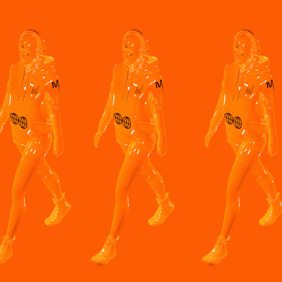
Branding and visual identity artifacts
Credits
- Agency: Mubien Brands
- Account Management: Victor Mubien
- Creative Direction: David Mubien, Younes Badi, Neko Zhang
- Brand Manager: Yini Zhao
- Type Design: Daniel Iglesias
- Languages Adaptation: Sol Matas, Ahmed Zaza, Deltatype
- Art Direction: Daniel Iglesias, Yini Zhao, Carlos Almagro
- UX/UI: Javier Ochoa, Patricia Orden
- Video Production Manager: Vincent Bao
- Head of Marketing: Lake Hu
For more information make sure to check out Mubien on Behance, Instagram and website.
