by abduzeedo
Discover SFT Ritam Sans, a dynamic typeface inspired by Belgrade’s contrasts, blending humanistic design with versatile typography.
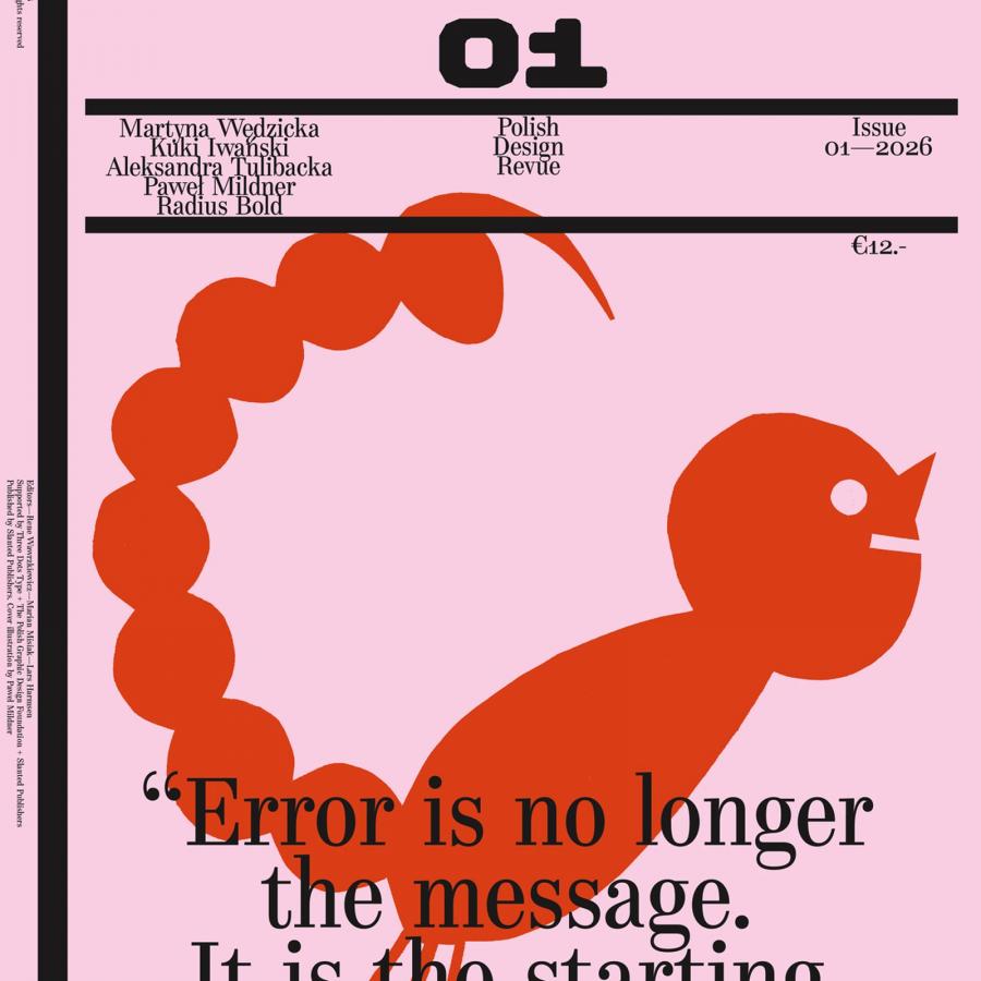
SFT Ritam Sans is not just another typeface; it’s a visual embodiment of Belgrade’s dynamic character, the vibrant capital of Serbia. Created with a deep respect for the city’s contrasts — its historic depth and modern energy — it captures the pulse of a place where the old meets the new with effortless charm. The design strikes a balance between structure and freedom, precision and warmth, making it a versatile and memorable choice for a variety of design projects.
At the heart of SFT Ritam Sans is a commitment to dynamic forms and humanistic design. Its fluid lines, open shapes, and thoughtful details bring life to the text, ensuring both aesthetic appeal and readability. The typeface family consists of 8 weights ranging from ExtraLight to Black, complemented by both true italics and oblique styles, offering designers the flexibility to choose the slanted form that best fits their needs. These options add depth and emotional nuance to compositions, enhancing their expressiveness.
Typography artifacts
The Story Behind SFT Ritam Sans
The inspiration for SFT Ritam Sans began in the streets of Belgrade, a city alive with energy and contrasts. Rather than focusing on iconic architecture, the designer delved into the everyday rhythm of life — exploring its dynamic streets, eclectic typography, and the interplay of tradition and modernity. The challenge was to translate this atmosphere into a typeface that could resonate with global audiences while retaining the essence of its origins.
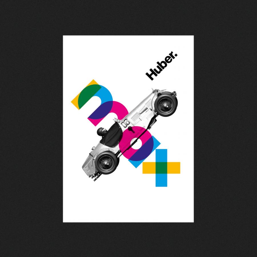
Belgrade’s vibrant spirit inspired key design elements: strokes that end perpendicularly to the direction of movement create open and approachable shapes; dynamic italics bring a sense of motion, reflecting the energy of the city.
The typeface was designed to communicate more than words — it conveys a sense of place, culture, and energy. The dynamic, lively forms and humanistic proportions of SFT Ritam Sans make it a powerful tool for designers looking to craft engaging and unique visual identities.
Three Features That Set SFT Ritam Sans Apart
- Dynamic Forms with a Humanistic Touch
SFT Ritam Sans is designed to feel alive. Its humanistic proportions and fluid forms make it a standout choice for branding, editorial design, and user interfaces, delivering both clarity and character.
- True Italics for Expressive Nuance
Unlike simple oblique styles, the true italics in SFT Ritam Sans are designed from scratch, offering expressive, elegant slants that elevate any design. For projects requiring subtlety or emphasis, these italics add a layer of depth and sophistication.
- Thoughtfully Designed Alternates
With alternates like the single-story 'a' for a geometric appearance, a double-story 'g' for a classic feel, and an ‘I’ with serifs for better differentiation, the typeface offers unparalleled flexibility. These details ensure that SFT Ritam Sans meets the needs of a wide range of applications, from branding to editorial work.
Why SFT Ritam Sans Matters
In an era where authenticity and individuality matter more than ever, SFT Ritam Sans brings a unique voice to the design world. It’s a typeface that doesn’t just perform — it inspires. Perfect for designers looking to make a statement, it balances personality with practicality, allowing creativity to shine without compromising functionality.
“SFT Ritam Sans is more than a typeface; it’s a rhythm, a movement, a story.”
With its launch, SFT Ritam Sans is available for free trial and purchase at a discounted rate. This is an invitation for designers to experience its versatility and incorporate its bold yet approachable character into their work.
Explore SFT Ritam Sans:

