by abduzeedo
Explore Karst, a versatile geometric sans-serif typeface. Sharp angles meet smooth curves. Ideal for modern typography.
Hey design friends! Ever stumble upon a typeface that just feels right? Clean, modern, but with a little something extra? Let's talk about Karst, a geometric sans-serif that's been catching eyes. Designed by Mirela Belova and Stan Partalev over at Type Forward, Karst brings a cool mix of precision and personality to the table.
What's the Vibe?
At its core, Karst is all about geometric clarity. Think clean lines and straightforward shapes. But it’s not just another geometric sans. The designers threw in some subtle but distinct angular details. This isn't your standard circle-and-square font.
One thing you'll notice is its excellent readability. This comes down to a few key things:
- High x-height: Makes lowercase letters feel open and easy to read, even at smaller sizes.
- Open letterforms: Characters like 'c' or 'e' don't feel cramped.
- Minimal contrast: The thickness difference between vertical and horizontal strokes is slight, giving it a consistent look.
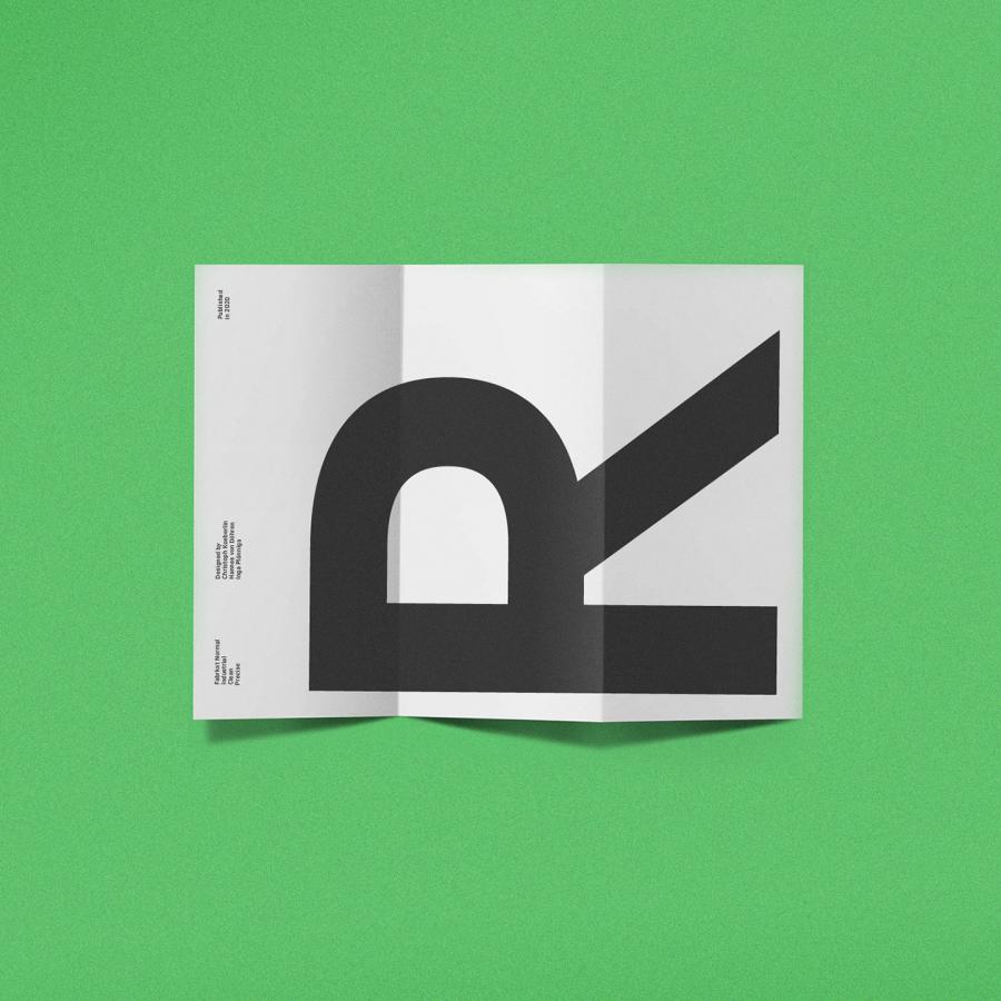
This balance makes Karst pretty versatile – it works well for big, bold headlines and holds its own in paragraphs of body text.
Inspired by Nature's Angles
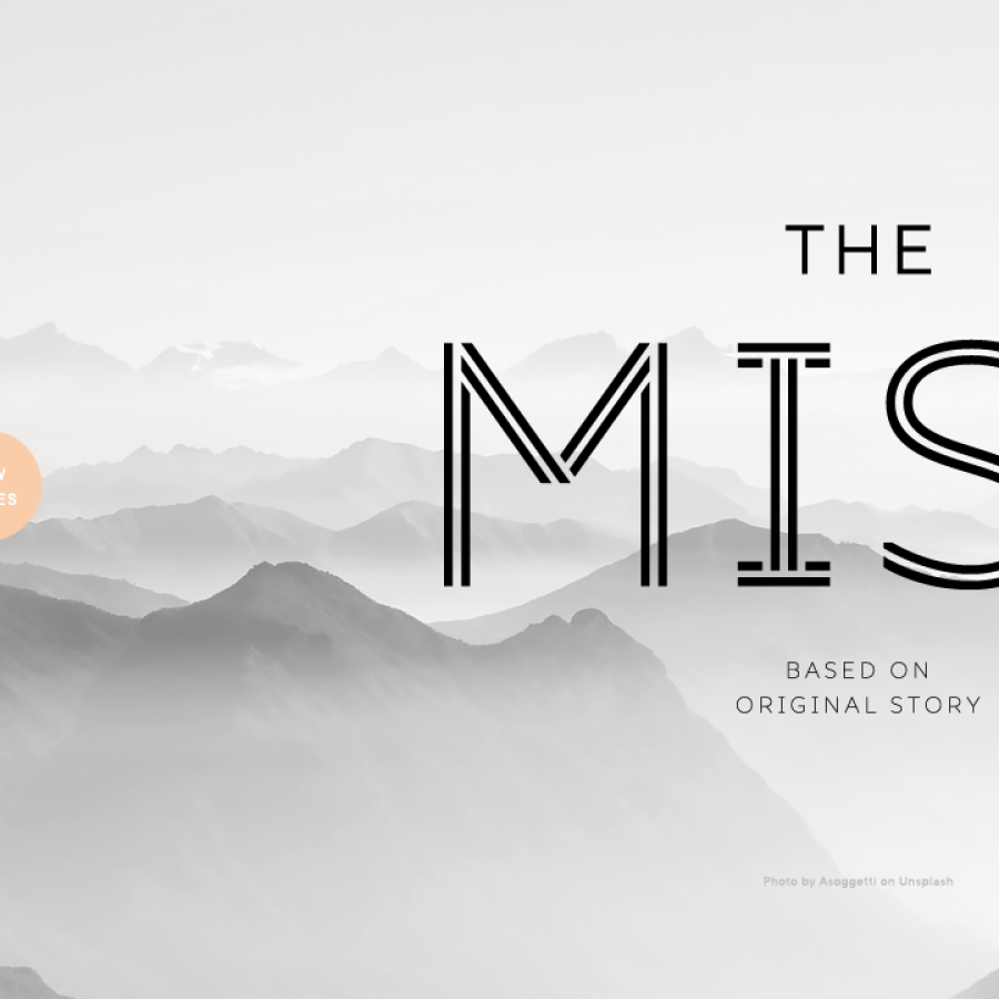
So where did this unique look come from? The name "Karst" gives it away. It’s inspired by Karst landscapes – those cool geological formations with caves, sinkholes, and underground streams, known for their mix of smooth, eroded curves and sharp, fractured edges.
You can see this inspiration directly in the typography. Look closely at letters like 'A', 'V', 'M', 'K', and 'Y'. They feature sharp diagonal cuts and distinct blunt endings. Even the horizontal bars on lowercase 'e' and 'a' have angled terminals. It’s these little details that give Karst its unique character, blending that geometric foundation with something more organic and edgy.
A Flexible Family
Designers love options, right? Karst delivers. It comes in a full family of 18 styles. That’s nine weights, ranging from a super delicate Thin all the way to a chunky Black, each with a matching italic.
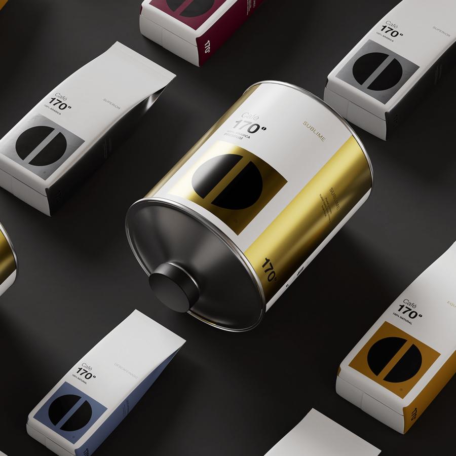
Need it for the web? Check. Branding? Yep. Editorial layouts or print? Absolutely. It’s available in standard OTF and TTF formats, plus web fonts.
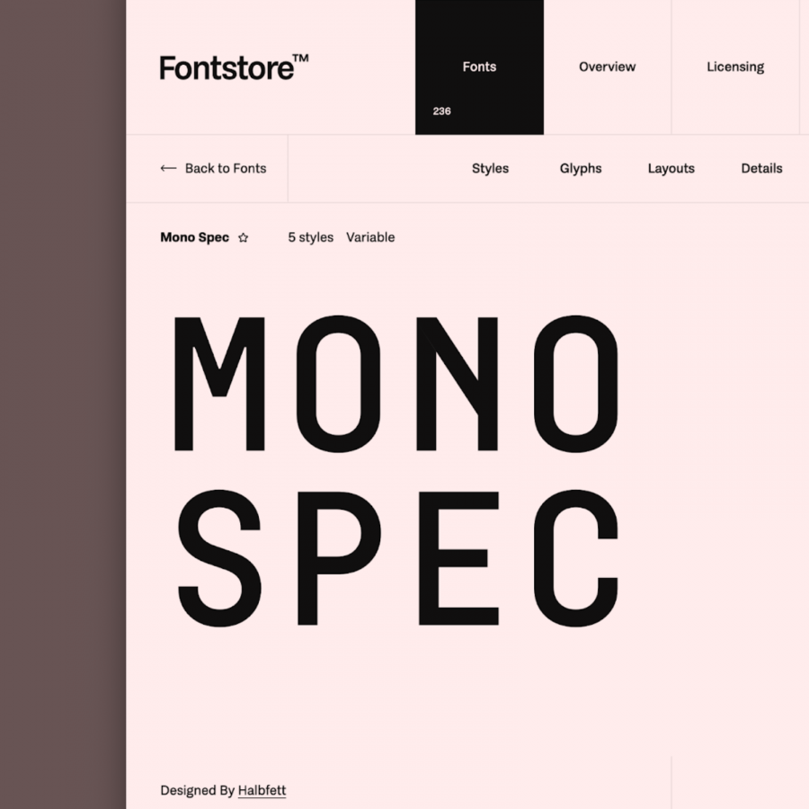
And for those who love fine-tuning, Karst also comes as a variable font. You get two axes to play with: weight and italic. This offers incredible flexibility for responsive design and getting that exact look you need.
Packed with Features
Beyond the basics, Karst is built for serious typography work.
- Language Support: It covers Extended Latin, Cyrillic, and Greek scripts, supporting over 220 languages. Nice.
- OpenType Goodies: You get standard and discretionary ligatures, stylistic alternates (check out the cool alternative 'a' and 'g'), tabular figures for data, small numbers, ordinals, case-sensitive punctuation, and even localized forms.
These features mean Karst isn't just stylish; it's a robust tool ready for complex projects.
The Takeaway
Karst strikes a great balance. It’s geometric and clear, but those sharp cuts and landscape-inspired details give it a contemporary edge. It’s readable, versatile across weights and applications, and packed with useful features. If you're looking for a functional sans-serif that doesn't blend into the background, Karst is definitely worth exploring.
Check out more from the designers at Type Forward: https://www.typeforward.com/typefaces/karst
Typography artifacts

