by abduzeedo
Explore Avec's clean and functional brand identity. Discover how design celebrates simplified bedding through innovative branding.
In the world of design, a well-crafted brand identity can tell a compelling story, even about something as seemingly straightforward as bedding. Billur Eda Bilgi, a designer at The Working Assembly, recently shed light on the thoughtful branding behind Avec, an innovative bedding company. Their mission: to simplify routines and enhance sleep through smart, functional bedding.
The Essence of Simplicity
Avec's journey began with a desire for bedding that makes daily routines easier – comfortable, convenient, and simple to clean. Inspired by a European approach to bedding, they developed a duvet cover with an attachable top sheet, ensuring a perfectly made bed every time. This emphasis on effortless organization is central to their philosophy: a well-made bed leads to a well-made life.
Crafting a Clear Brand Message
The challenge for Billur Eda Bilgi was to create a brand identity that not only highlighted Avec's innovative bedding technology but also championed the core value of simplicity. The brand needed to be educational, explaining the unique features like the 2-in-1 top sheet and duvet cover with multiple zippers, while still conveying a sense of ease and time-saving benefits.
Visual Storytelling: Icons and Illustrations
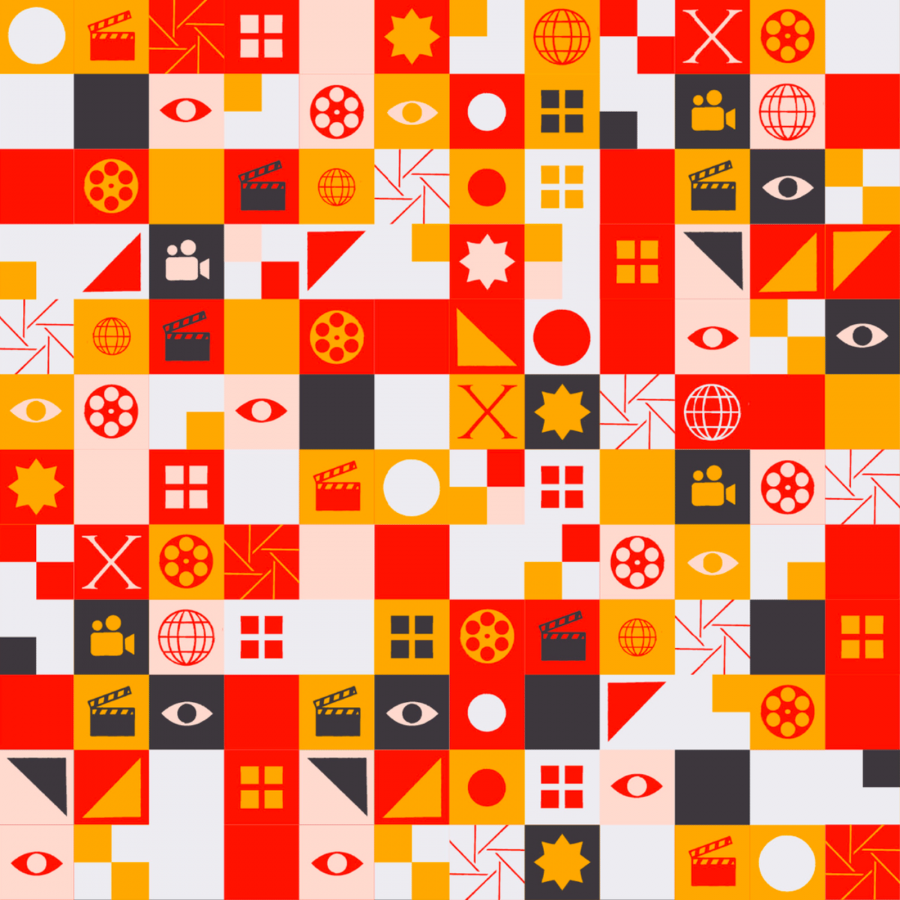
The new brand identity achieves this balance through a robust system of icons and illustrations. These illustrative diagrams serve multiple purposes: they communicate product functionality, convey benefits, and infuse a playful, dynamic element into a clean and minimal visual identity. Simple, easy-to-understand graphics explain product composition, care, and benefits, making engagement seamless for customers.
Given the pivotal role of the zipper in Avec's products, a zipper-inspired graphic device was integrated into the branding. This element reinforces the brand's commitment to convenient bedding that upgrades routines. The Avec logo itself echoes this concept with subtle zipper tab-like notches, symbolizing craftsmanship and quality.
Typography and Color Palette
The chosen type system reflects an approachable yet distinct personality. GT Alpina, a serif typeface with a unique charm, acts as the primary brand typeface, complemented by the friendly and precise ABC Diatype. The color palette is clean, modern, and elevated, combining warm accents with shades of blue. These blues are thoughtfully selected to represent a good night's sleep, transitioning from evening to morning.
Authentic Visuals
Photography for Avec is warm, approachable, and authentic. The imagery includes lifestyle shots, interiors, textures, close-ups, and product photography, all working together to form a simple, functional brand identity that underscores Avec's mission: to help customers achieve quality rest.
These examples showcase how a well-executed brand identity can transform a product into a lifestyle, simplifying routines and enhancing daily life. Dive deeper into the design process and see how thoughtful branding makes a tangible difference.
Designed by Billur Eda Bilgi atThe Working Assembly. More information make sure to check out https://edabilgi.com/
Branding and Visual Identity Artifacts
