by jeff
Xolve Branding transforms Chateau Dalat wine packaging design with bold color, cultural typography, and a Dalat landscape narrative across three bottles.
Wine packaging design rarely earns the label of cultural artifact. The Chateau Dalat rebrand by xolve branding comes close. Working for Ladofoods on Vietnam's most recognized wine brand, the studio faced a problem that most packaging briefs avoid: how do you make something feel young and modern without stripping out the soul?
The answer, for xolve, was not to simplify. It was to translate.
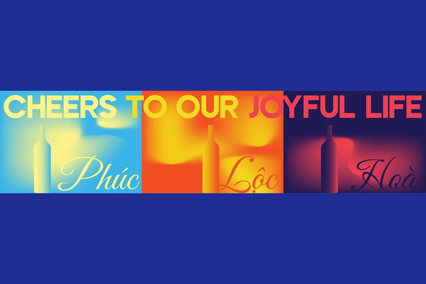
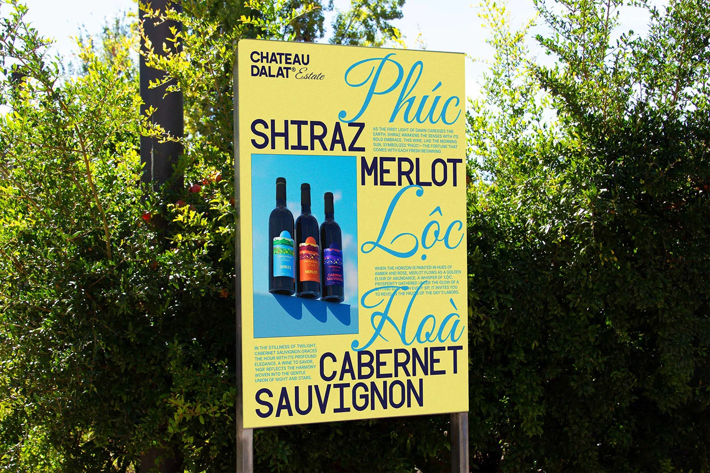
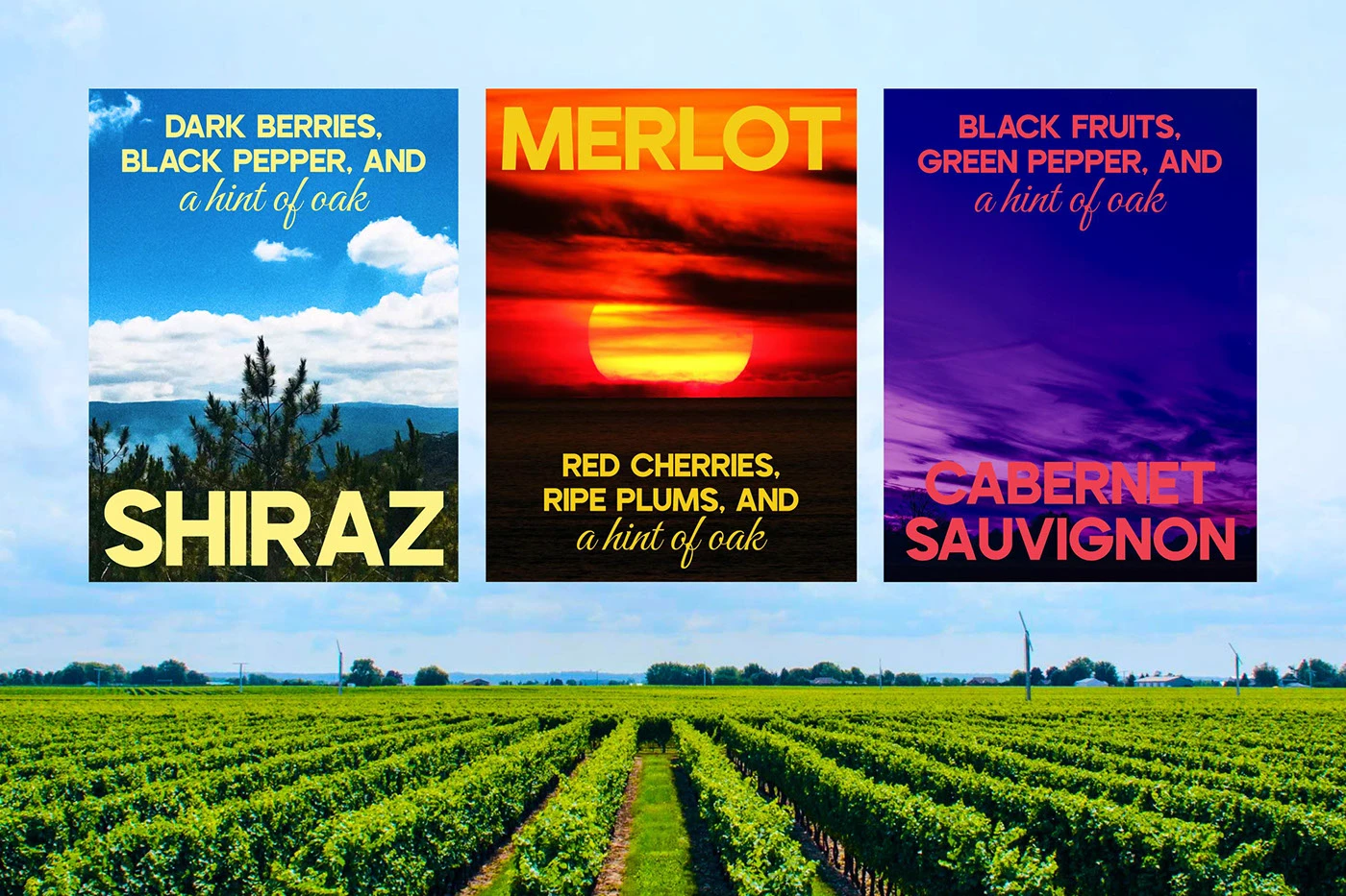
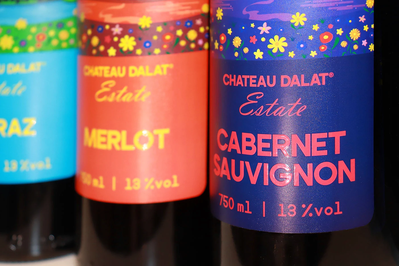
The Phúc Lộc Hoà Ca collection — its name a Vietnamese phrase meaning harmony, fortune, and happiness — centers on a continuous landscape narrative. Three bottles, three moments in a single Dalat sky: Dawn, Sunset, and Twilight. The labels share the same rolling hills, but each shifts in color temperature. The Shiraz label runs cool and bright, its horizon bathed in morning blue. The Merlot label turns warm and fiery, a deep orange sun sinking behind the ridgeline. The Cabernet Sauvignon goes dark — a purple-blue dusk held at the edge of night.
Wine Packaging Design That Doubles as Print Culture
What separates this project from a label refresh is the collateral. xolve built an entire visual world around the bottles. The Wine Handbook — a compact publication with a cobalt cover and a 3x3 grid of halved color circles — reads less like brand documentation and more like a design object. Shot resting on a deep blue corduroy surface, its geometric language echoes the label palette without repeating it directly.
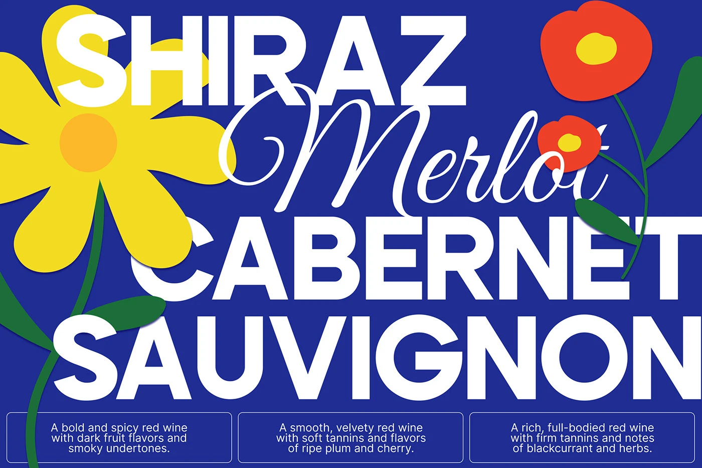
The poster work is where the studio's typographic range shows fully. One design stacks SHIRAZ, Merlot (in script), and CABERNET SAUVIGNON in overlapping weight and size against a deep blue field scattered with folk-art flowers. The composition is confident — almost editorial. Another piece, a billboard-style print, runs the Vietnamese script names Phúc, Lộc, and Hoà in flowing cursive alongside the varietal names in blocky caps. The tonal shift between the two styles is deliberate: tradition meeting directness on the same plane.
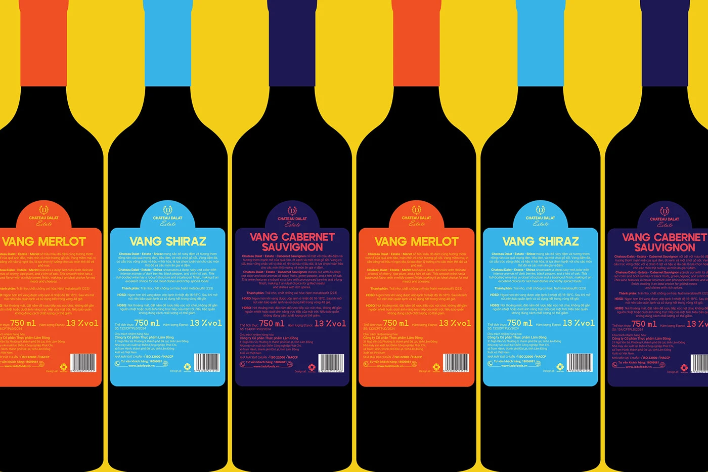
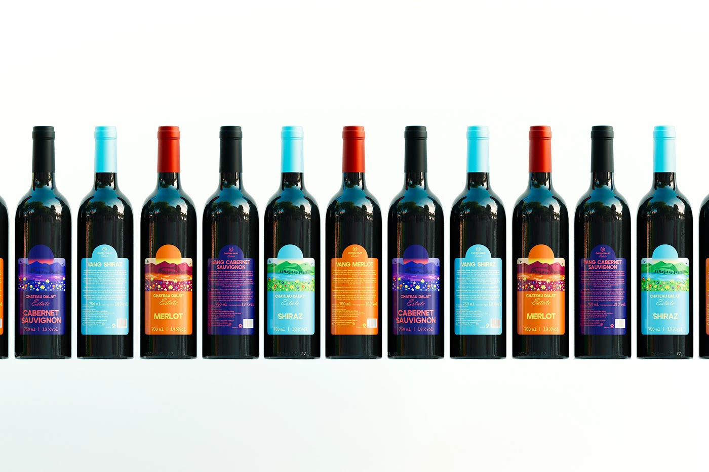
The back-label system deserves attention on its own terms. Six bottles lined in a row show a strict grid of orange, blue, and purple ground colors, each carrying consistent typographic anatomy. The visual rhythm is tight. The color logic is immediately readable as a system, not a collection of one-offs.
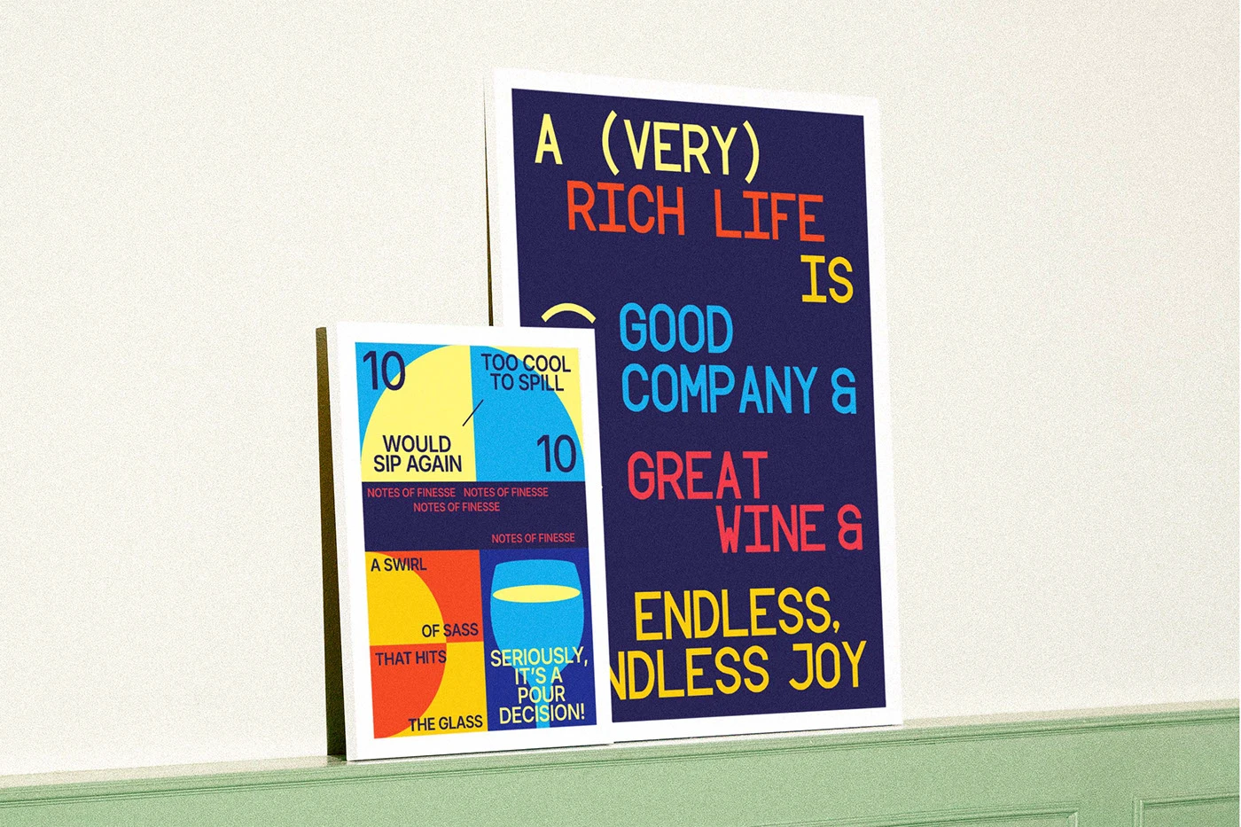
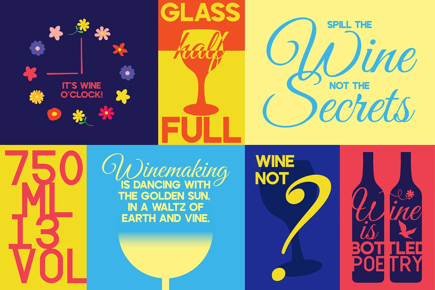
A social content grid rounds the project out — six panels running wine humor and aphorisms in punchy sans-serif type against the brand's primary palette. "Glass Half Full." "Spill the Wine Not the Secrets." These lines are light, but they do real work: they lower the brand's register without abandoning craft.
The result is a wine packaging design system that operates at multiple scales — intimate collectible, shelf presence, and cultural touchpoint — without losing coherence across any of them. xolve branding has delivered something Chateau Dalat clearly needed: a visual identity that younger consumers can actually feel something about.