by abduzeedo
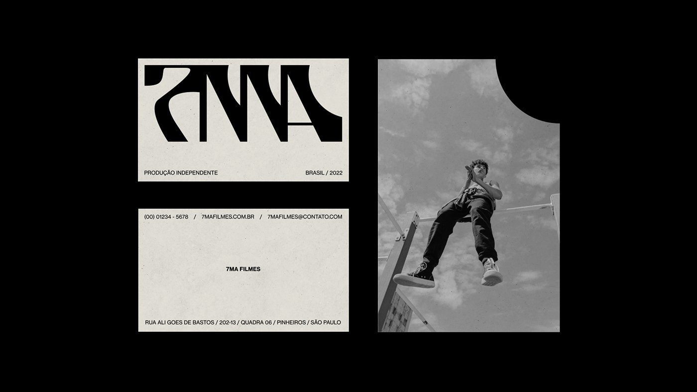
7MA Filmes is a striking film branding project from Brazil, by João Luz and ODUPLO DESIGN, built around a custom logotype and a light leak color palette.
The brief was clear: build a visual identity for an independent Brazilian film production company that could hold its own without leaning on tired cinema clichés. The team at ODUPLO DESIGN, with João Luz and Maykon André, answered with a film branding system that treats sensation as structure. The result is a 2022 identity that feels as at home on a street poster as it does on a press envelope.
The logotype is the central argument. It merges hard geometric strokes with sudden rounded exits, creating a glyph that reads almost as a ligature — the 7, M, and A compressed into a single interlocking form. On a pure black field, the off-white logotype generates a level of contrast that is almost architectural. Film branding rarely goes this far with custom type, and the monogram-like result gives 7MA Filmes a mark that functions as a visual stamp across all touchpoints.
![]()
Film Branding Built Around Cinematic Tension
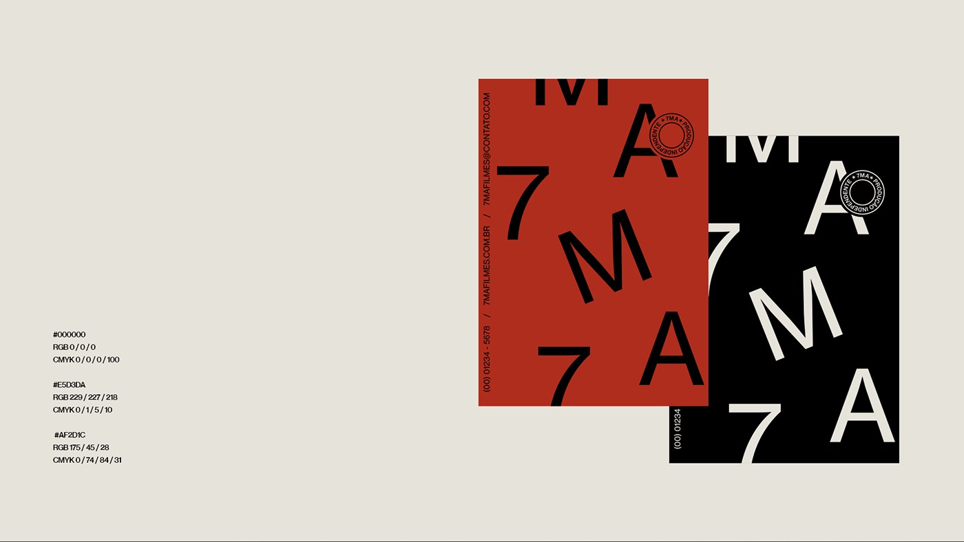
The color palette follows the same logic of controlled tension. Black and cream reference the bitonal origins of cinema — the silver halide era where every frame was a negotiation between light and dark. A third color, a deep arterial red, enters the system as a practical metaphor: the light leak. In analog photography, light leaks were accidents — unwanted exposures that bled warmth into the frame. Here, the design team recasts that incident as intention, using the red to infiltrate the black and cream system. The effect is cinematic without being decorative.
![]()
Brand applications carry the film branding vocabulary into physical materials. Business cards and letterheads deploy the logotype at scale, setting it against the cream ground so the negative space does the heavy lifting. A circular stamp seal, reading "Produção Independente," adds an institutional register that anchors the mark in Brazilian independent cinema culture. The poster compositions push the type further, fragmenting the 7MA characters across red and black ground to create layouts that read as editorial spreads.
Even the tote bag application, photographed against a diamond-mesh steel fence in harsh natural light, carries the same aesthetic gravity as a festival credential. The dark envelope system, featuring the monogram at tight scale alongside contact details, handles the functional end of the identity with the same restraint that governs the hero applications. Nothing in this film branding system overreaches or softens what the mark is trying to say.
What makes this project worth studying is the discipline. The system does not expand recklessly — every application reinforces the same three-color, single-typeface constraint. The identity understands that 7MA Filmes exists in a world of moving images, and the brand must survive as a static mark in motion contexts, on title cards and credits, as well as on physical collateral. The design achieves that versatility by keeping the rules simple and the execution precise.