by jeff
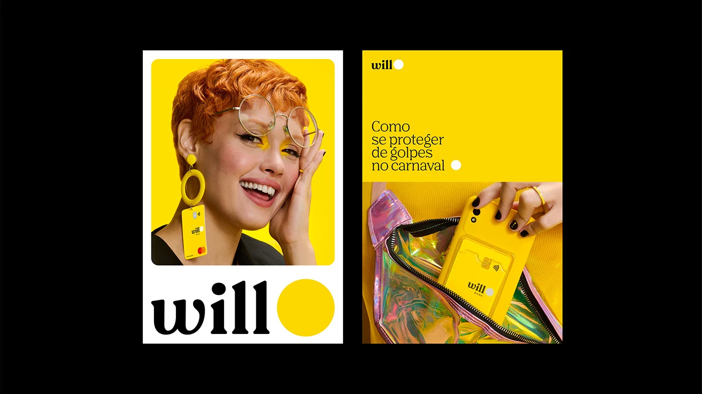
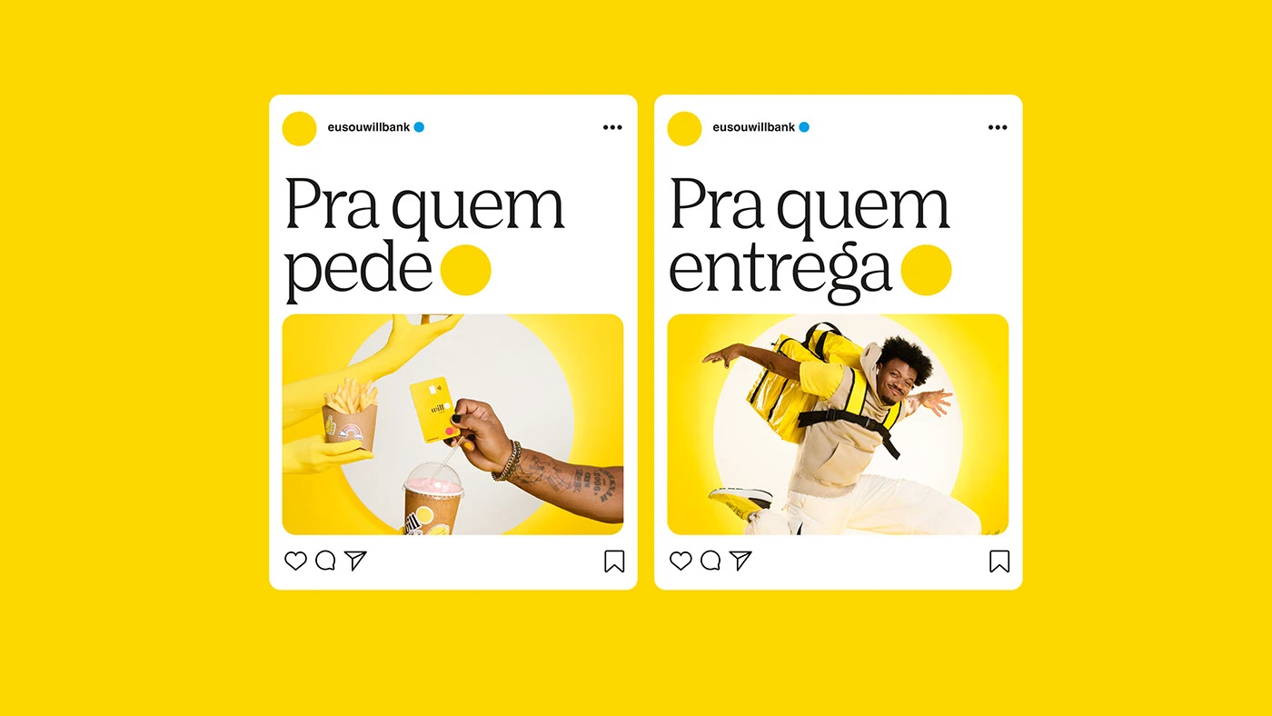
Will bank identity by Renan Benvenuti combines acid yellow with a geometric wordmark system applied across signage, stationery, and campaign photography. A Brazilian identity design with clear scale contrast and visual hierarchy.
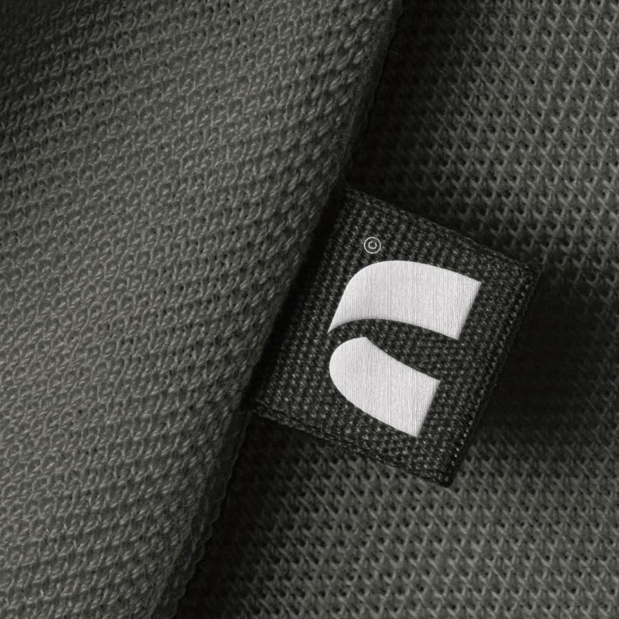
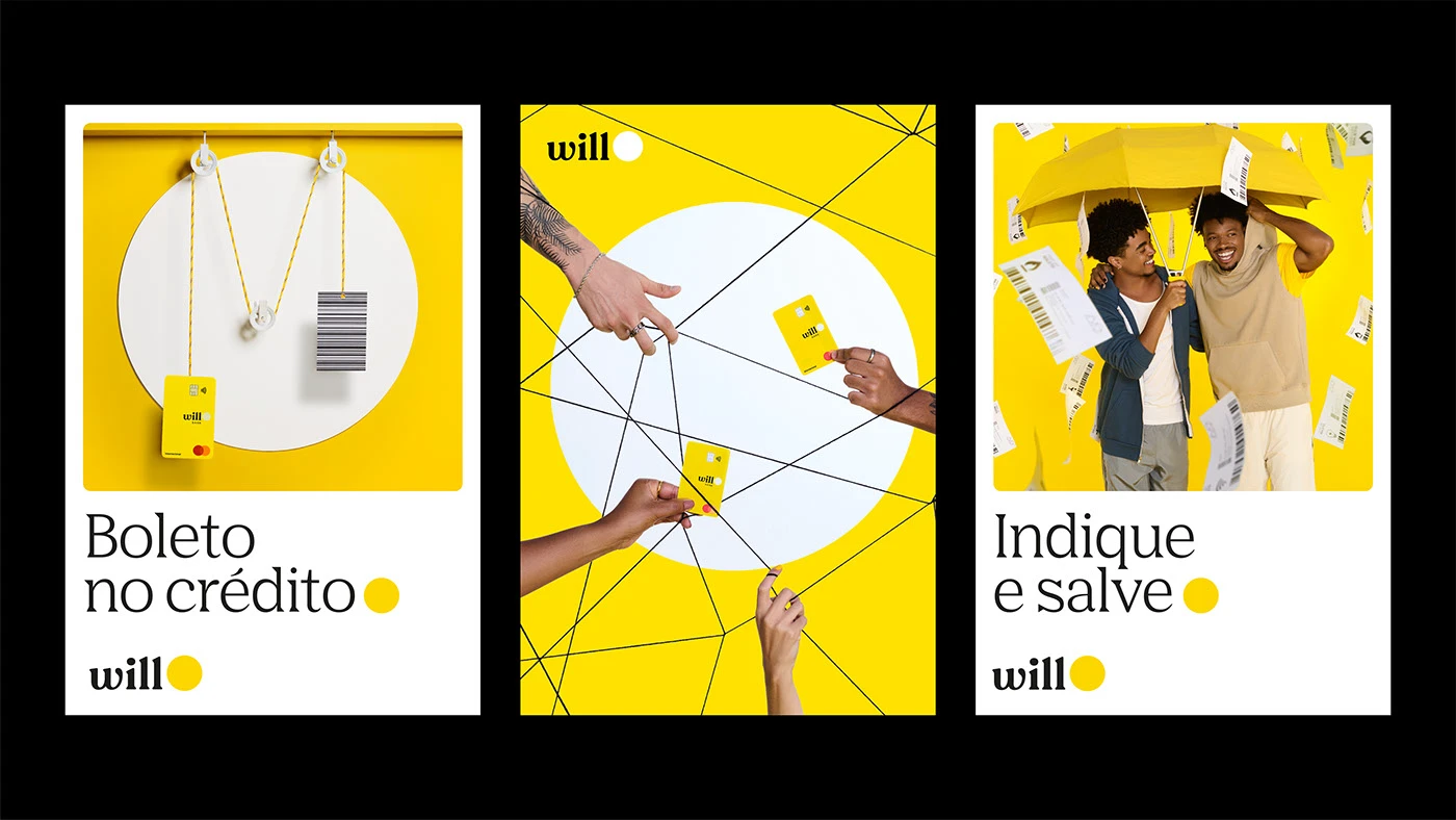
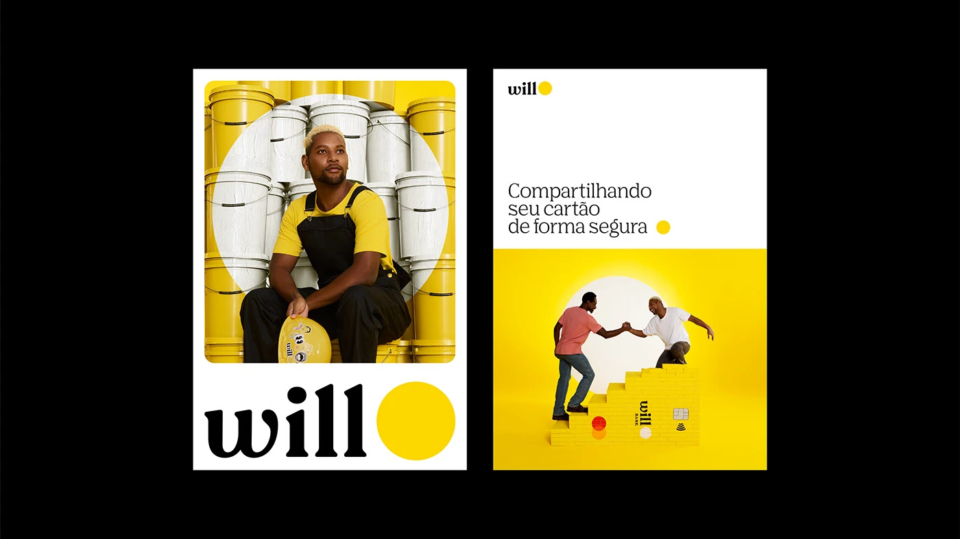
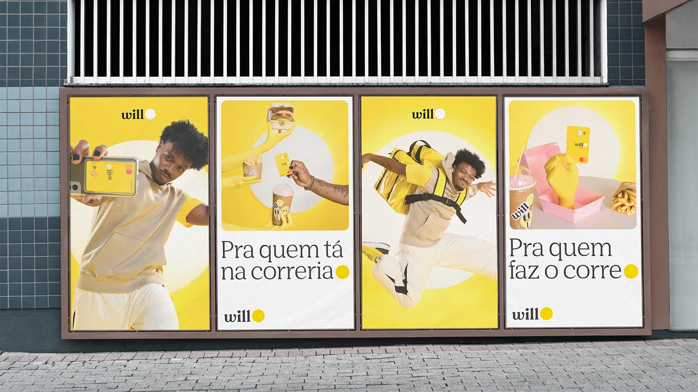
The identity system begins with a single accent color—bright acid yellow—set against off-white and neutral backgrounds. The wordmark itself is a modern geometric sans-serif, which appears in two weights: large lockup formats and small icon marks that repeat across artifacts. This scale contrast between the logo at 100% and the icon at perhaps 20% creates visual tension without clutter.
Will bank identity with geometric clarity
The strongest applications show the identity at work on artifact tier: hang tags, stationery cards, and labels mounted on simple white platforms. A bank storefront in São Paulo shows how the system scales to environmental signage. Photography direction for the campaign—product shots, lifestyle frames, close-ups of cards in use—supports the identity but doesn't overshadow it. Renan Benvenuti led the design, with teams handling photography, art direction, and creative strategy.
Via: Renan Benvenuti