by abduzeedo
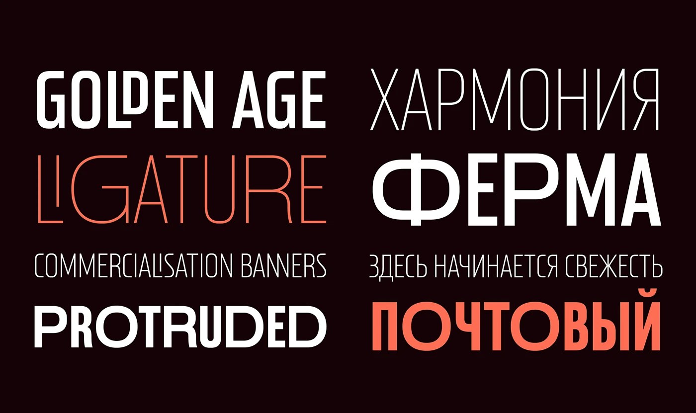
Postamp Grotesk is a condensed sans serif typeface by Fontfabric, derived from U.S. postage stamp letterforms across five weights with Cyrillic supports.
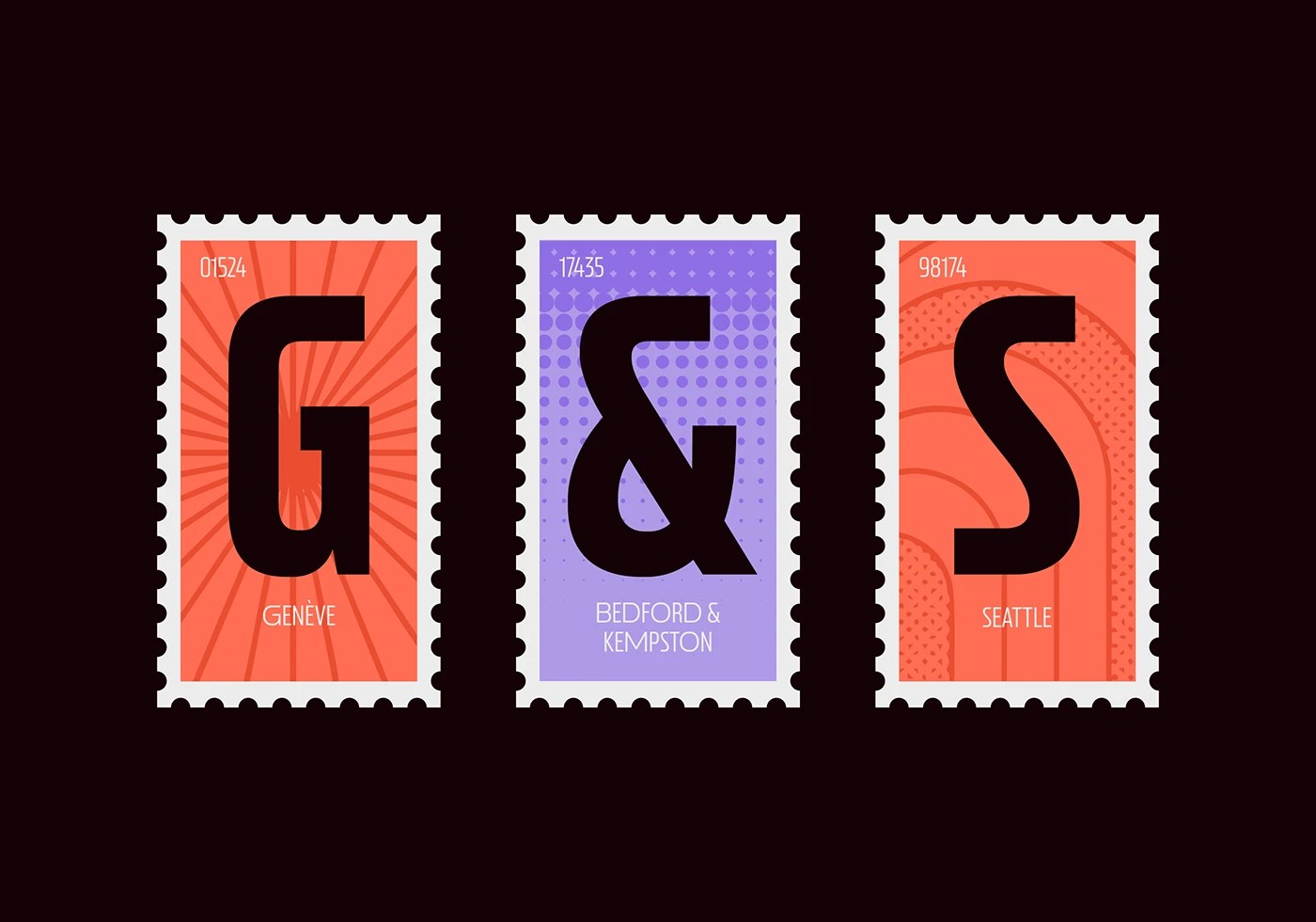
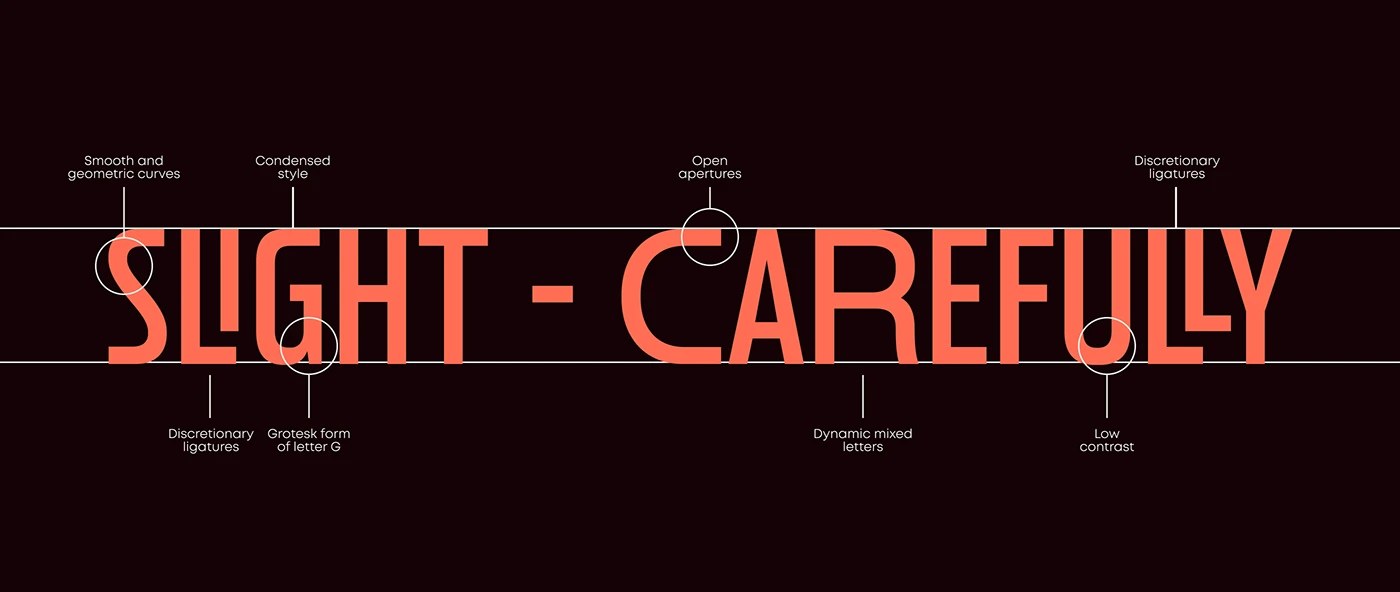
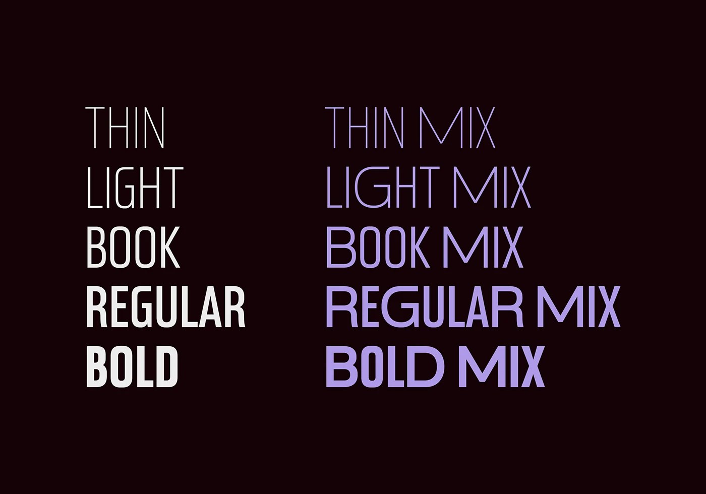
The starting point was a James Buchanan postage stamp — one of the stranger places to mine for type forms. Fontfabric's five-person team, led by Ivelina Martinova, spent time with late 19th-century American specimens before settling on what makes this condensed sans serif typeface distinctive: open apertures, smooth geometric curves, and a low-contrast stroke that reads at display scale without the fussiness of historical revival work. The weight staircase runs Thin through Bold, each presented in stamp-frame compositions on near-black — single letters at scale, coral and lavender fills on outer and center frames respectively, perforations intact on all four edges. The specimen is the argument: the forms hold even when isolated at that kind of size.
Condensed Sans Serif Typeface Built From Historical Stamp Typography
The Mix variant adds Cyrillic alongside the Latin set, and the annotated structural diagrams make explicit what the design is doing — six callout circles label the grotesk G form, the discretionary ligatures, the dynamic mixed letters. Fontfabric does not leave the rationale implicit. For this condensed sans serif typeface, the five-weight range gives it genuine range across editorial, branding, and signage contexts. The Mix variant does not feel like an afterthought — Cyrillic and Latin share the same proportional logic. That consistency is what makes a condensed sans serif typeface built from archival letterforms still feel like a contemporary tool.
See the full project by Fontfabric Type Foundry on Behance.