Skincare Packaging Design: MELABODY's Saturated Color Palette Feels Lived-In
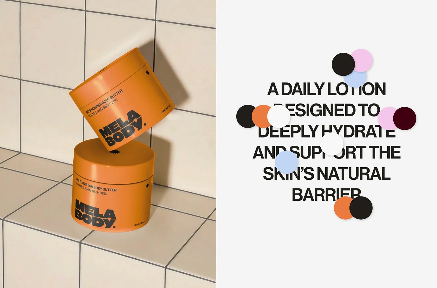
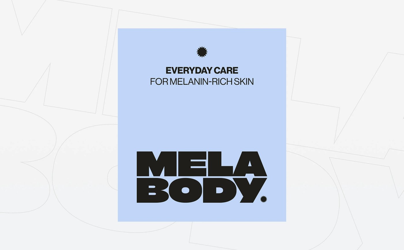
CAPS Design Studio has designed MELABODY, a modern skincare packaging design system. The visual system targets melanin-rich skin with clear, comfortable layouts. The studio rejects aggressive mass-market branding. Instead, the team uses large, saturated color fields. The brand mark remains small, which maintains geometric restraint. The color blocks create high compositional tension on the shelves. This direction ensures the products feel easy to live with in daily routines.
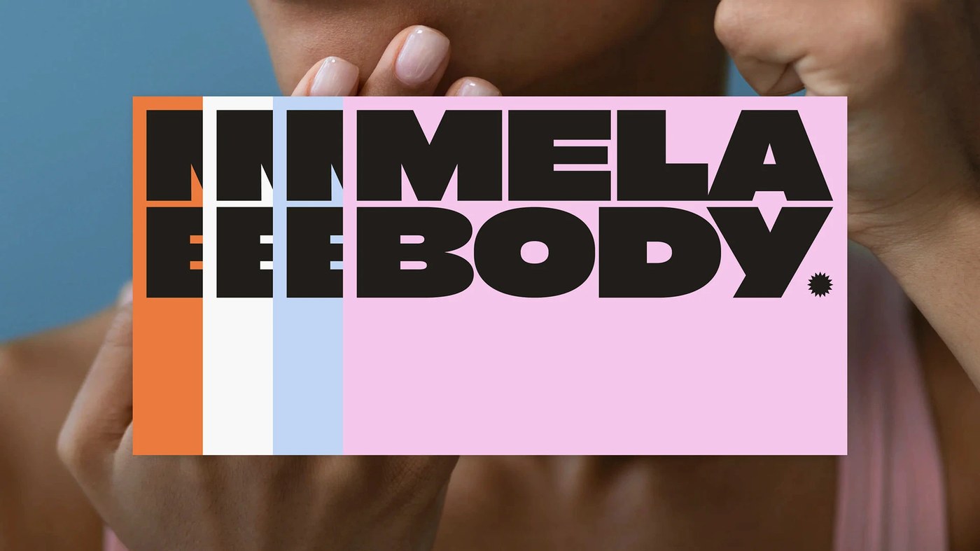
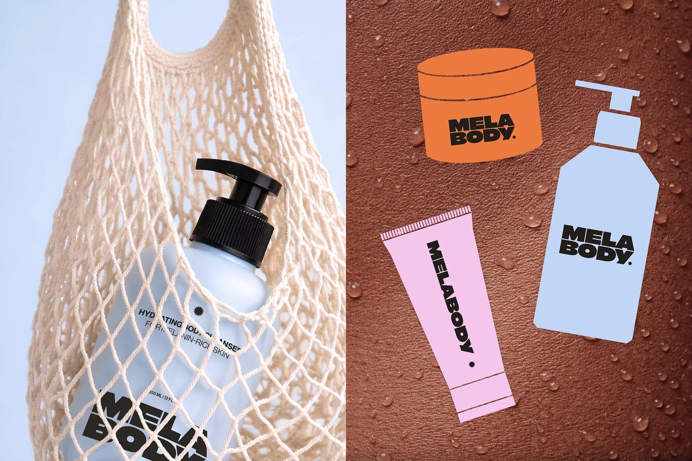
The packaging system is built on a modular grid. This grid controls the baseline alignment of all typographic elements. The layout scales across different product formats and sizes. The design uses vertical color blocking. Saturated pink, light blue, and warm orange stripes run down the left margins. These stripes contrast with clean white backgrounds. The resulting visual rhythm feels active but balanced. This makes the skincare packaging design feel distinct without being loud.
Saturated Color Systems in Skincare Packaging Design
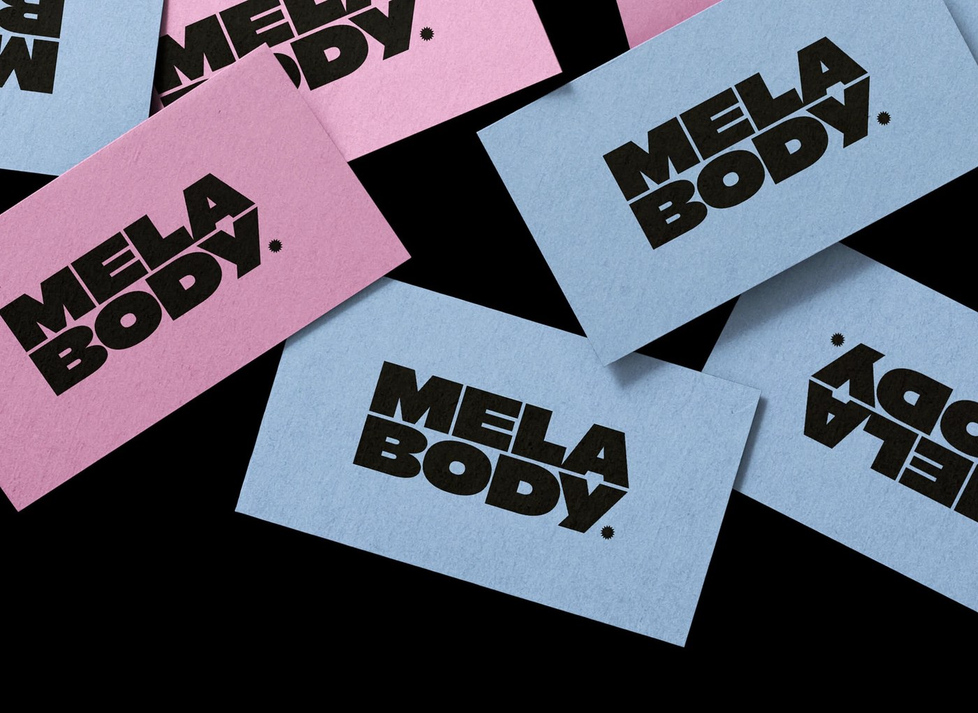
The typography relies on an ultra-bold display sans-serif. The logotype has massive weight. The letters are sliced vertically where they meet the color stripes. This slicing creates a strong graphic connection between type and packaging. Below the title, the design presents standard utility texts. The clean humanist sans-serif keeps the technical details clear. The typographic scaling balances the heavy logotype with high-contrast metadata. This careful scaling demonstrates how modern skincare packaging design can achieve premium tactile contrast.
CAPS Design Studio designed the identity to be gender-neutral. The flexible color palette carries all products. It does not require separate versions. The studio shifts inclusive skincare away from expected muted earth tones. The team chooses a saturated, lived-in aesthetic. The brand mark includes a small, sharp starburst icon. This detail acts as a focal point. This project sets a new standard for skincare packaging design. It proves that minimal layouts can have strong visual presence. For more information, check out the portfolio on CAPS Design Studio.