by abduzeedo
Explore how Oito Barbearia's branding and visual identity merge classic and underground aesthetics to mark its 8th anniversary with style and unity.
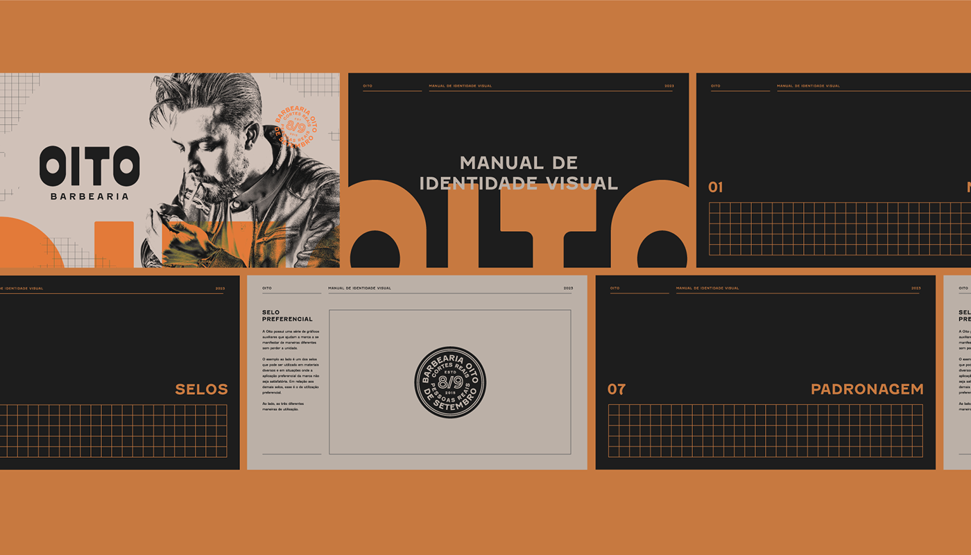
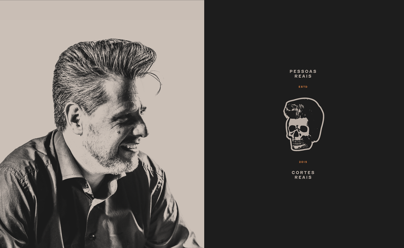
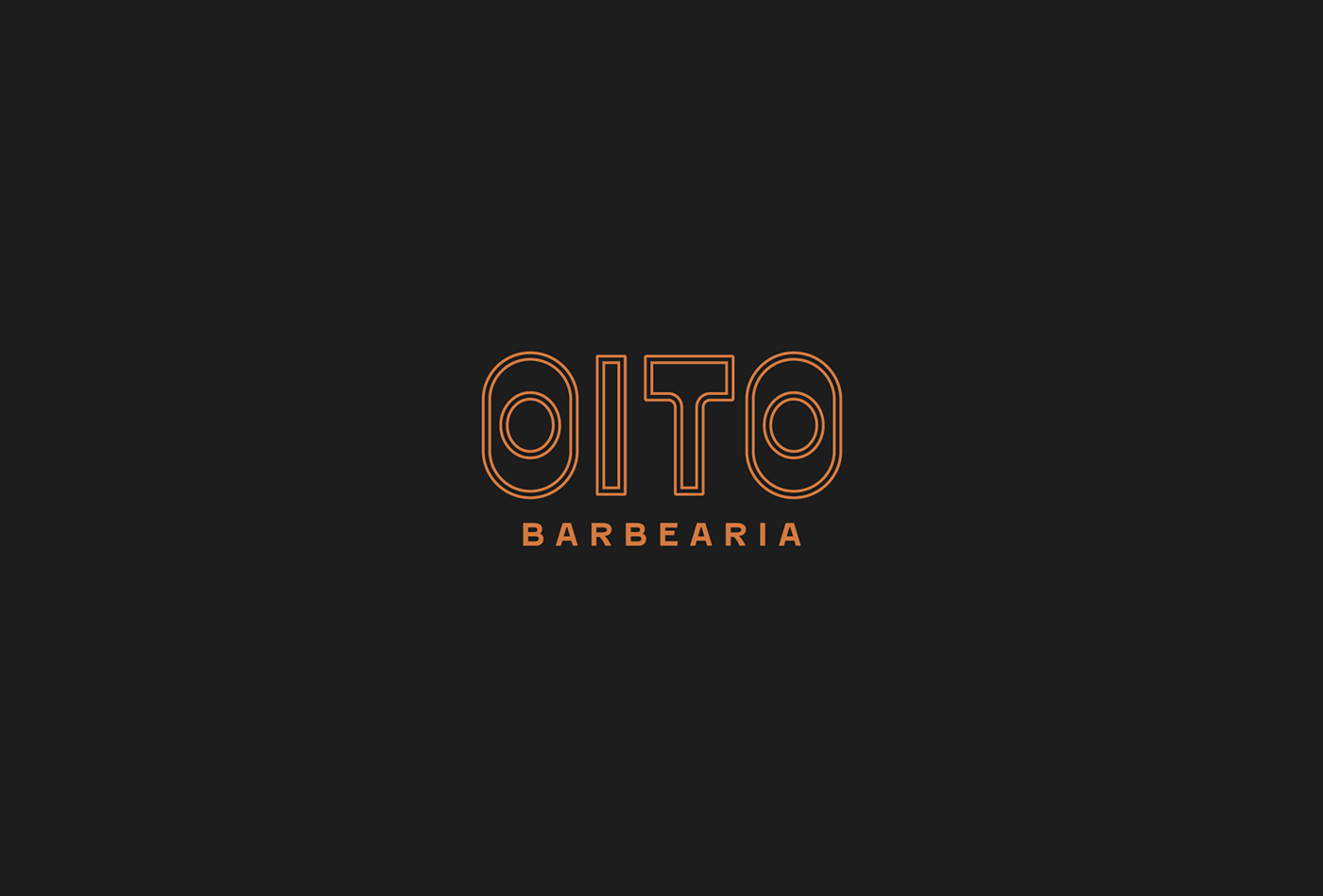
The visual identity of Oito Barbearia, crafted by Estúdio Faixa 2, marks a celebratory reinvention as the brand commemorates its eight-year journey. This redesign is not just an update; it's a strategic repositioning that encapsulates the brand's essence while paving the way for future growth. The design team has adeptly intertwined classic elements with an underground vibe, culminating in a distinctive and cohesive brand identity.
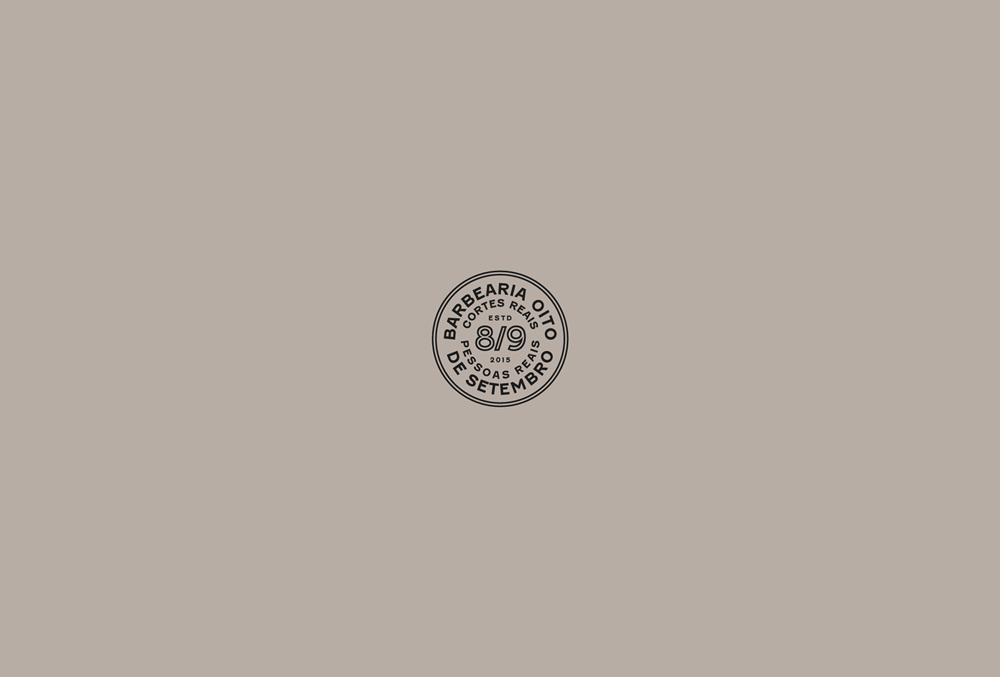
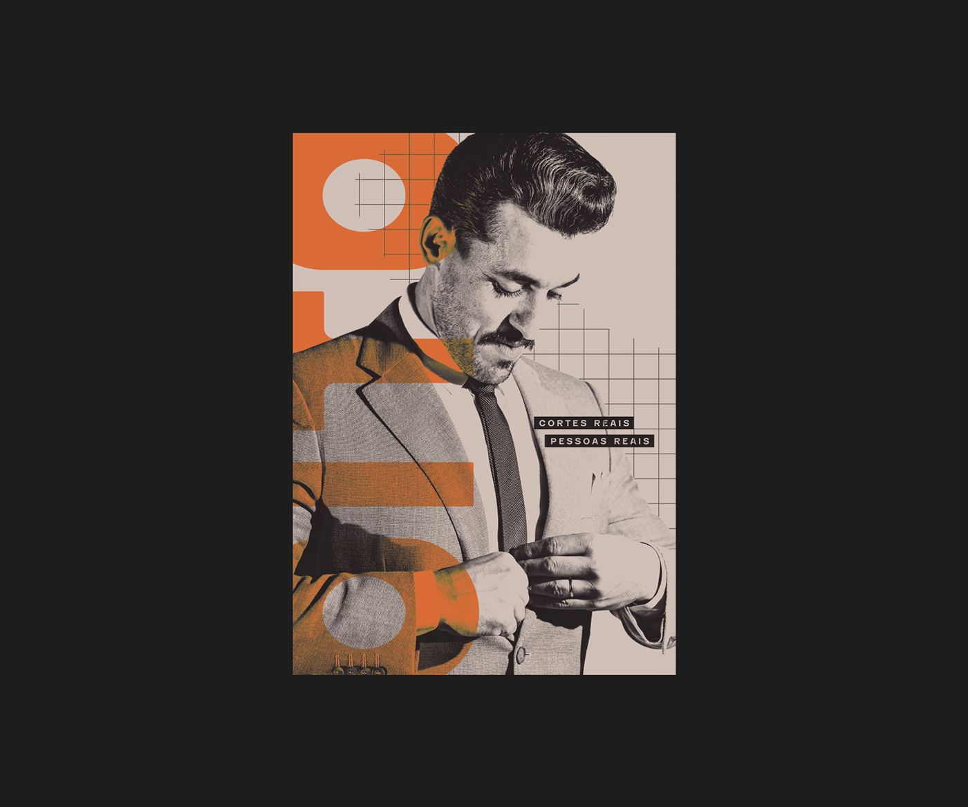
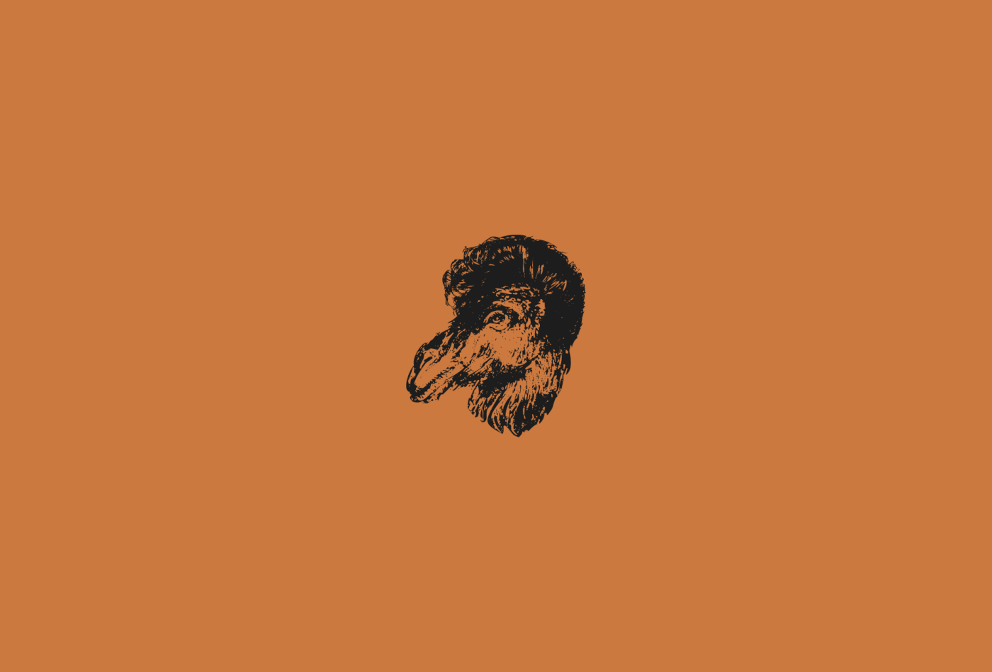
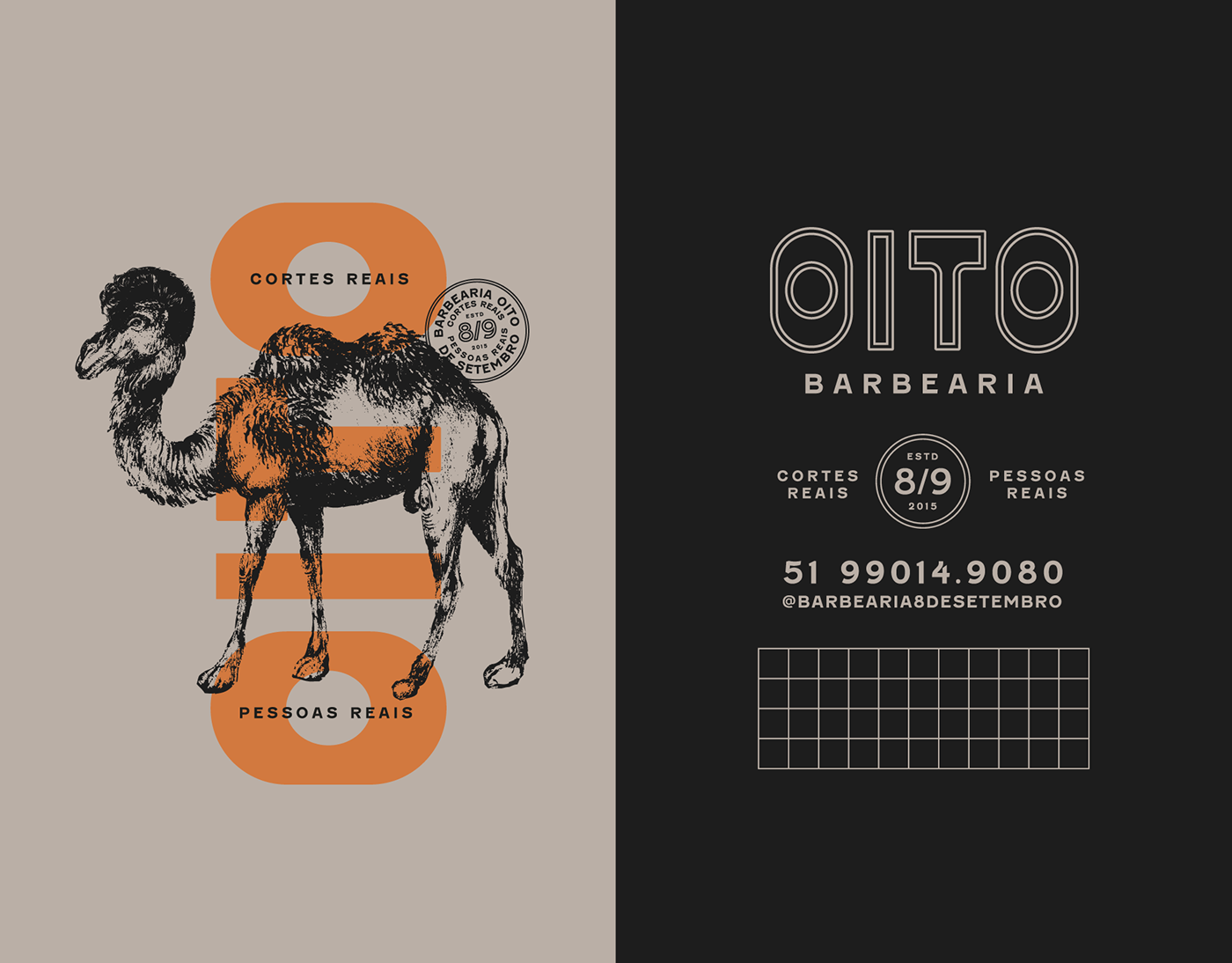
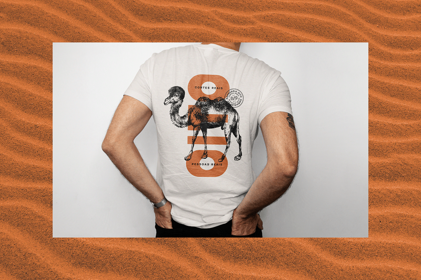
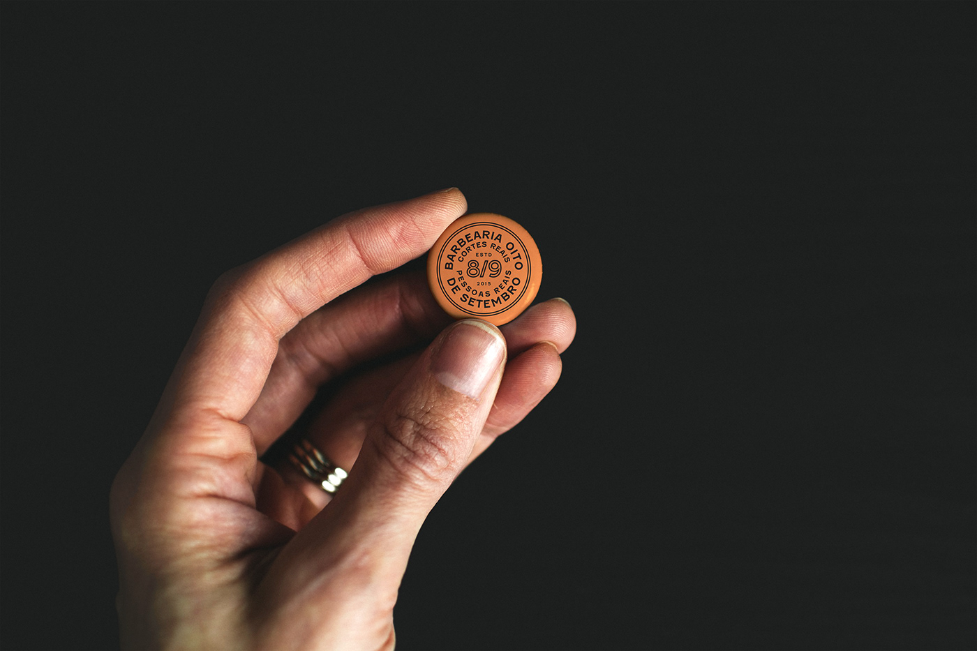
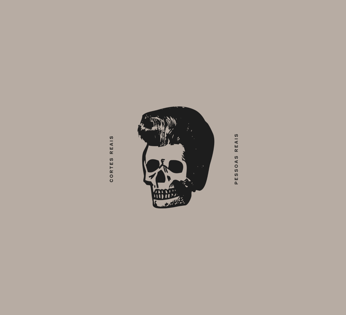
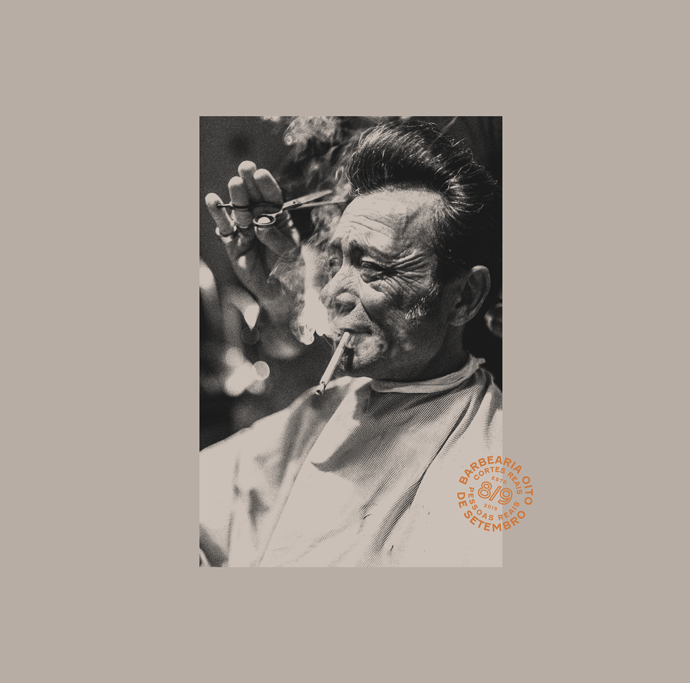
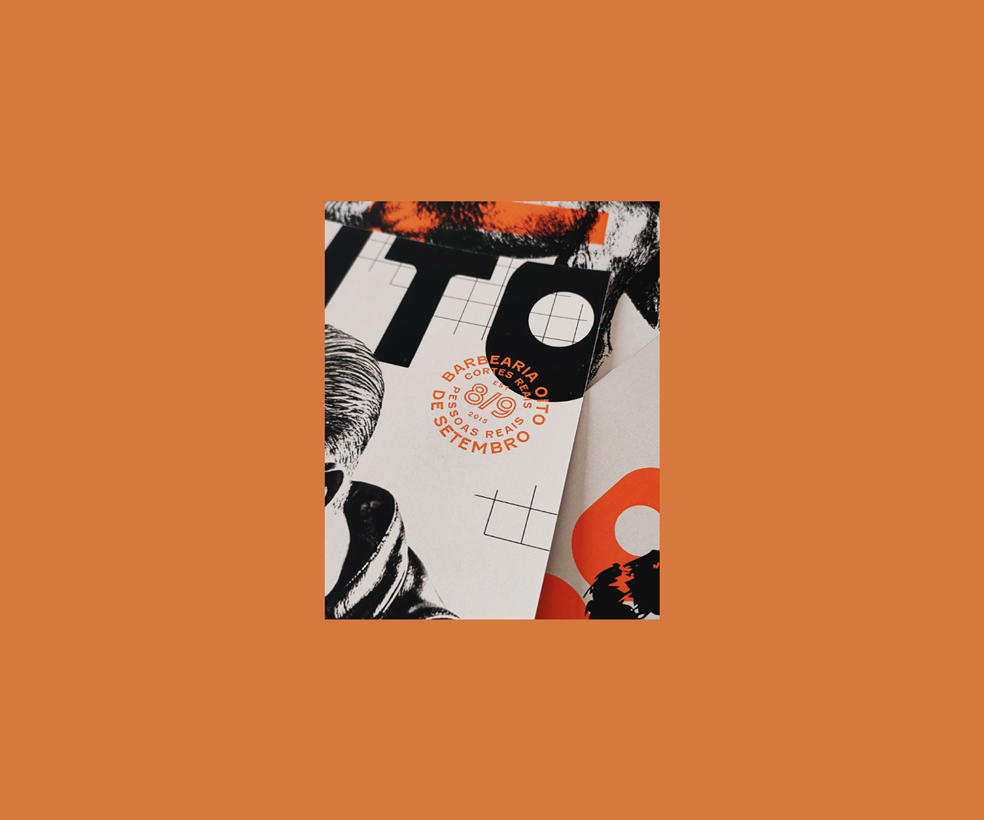
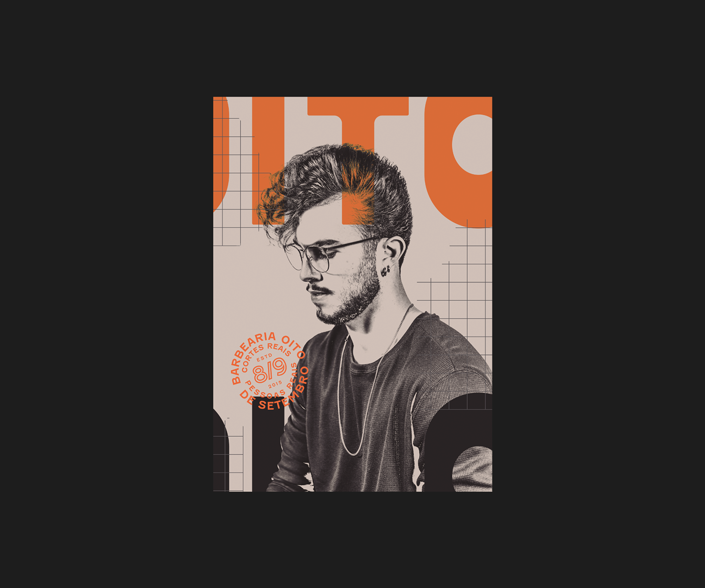
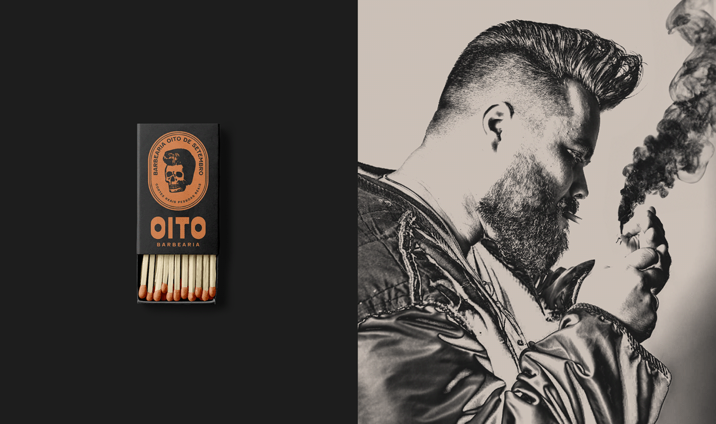
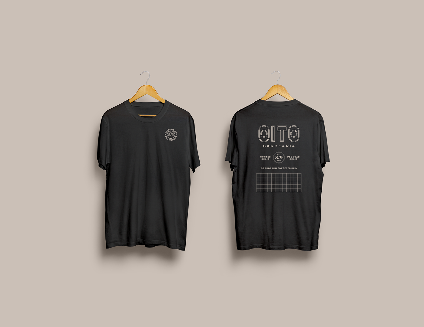
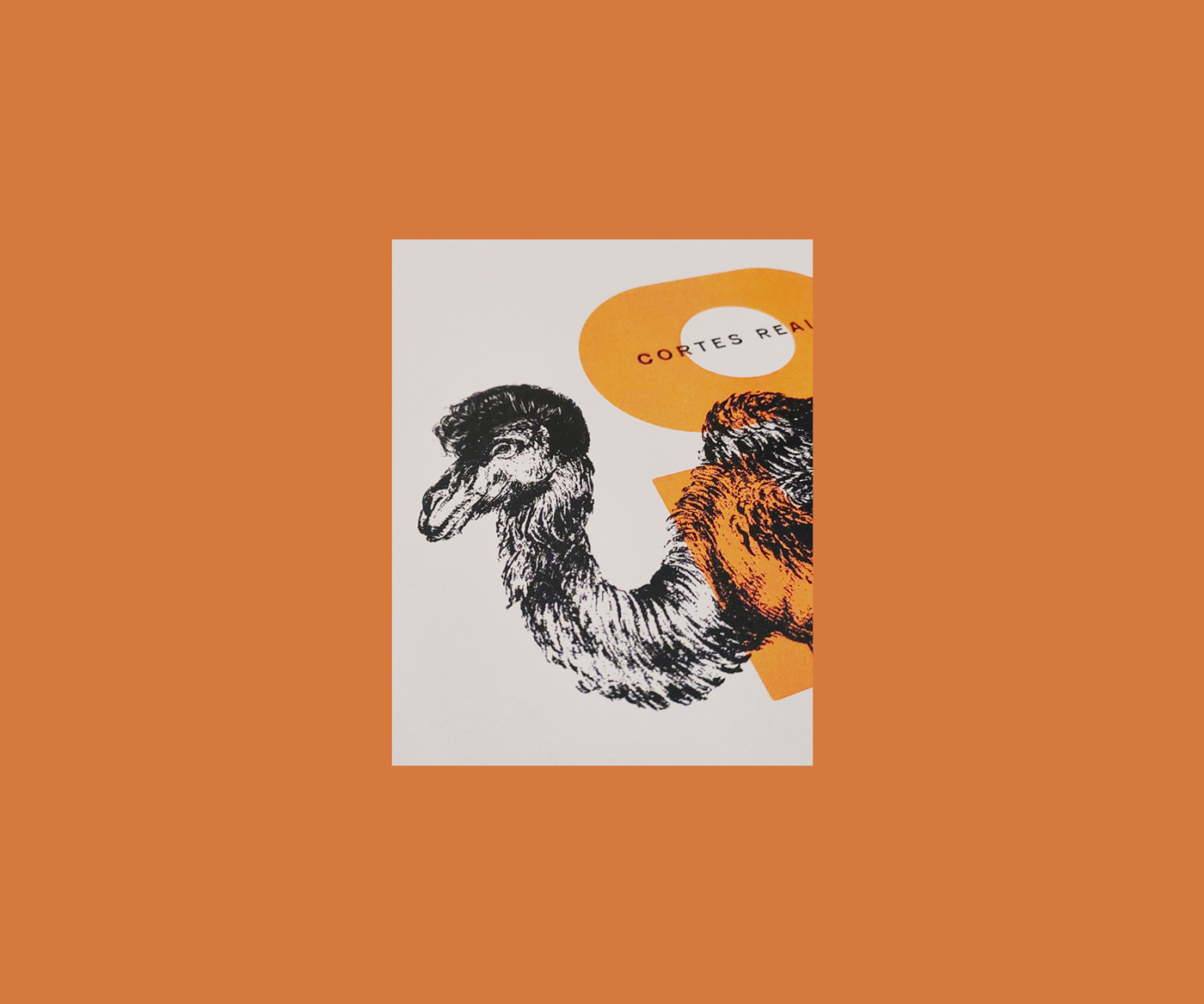
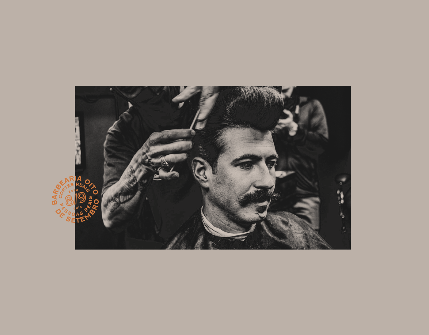
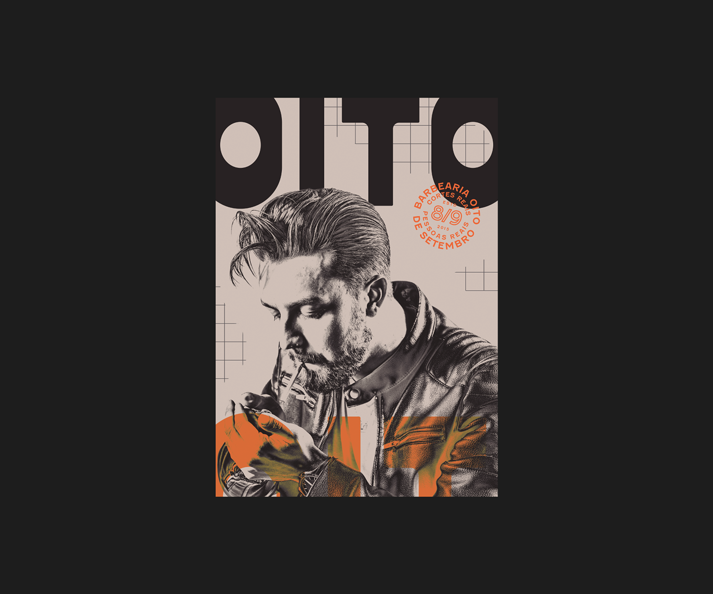
The new branding is a masterclass in balancing contrast. Seals and illustrations, reminiscent of vintage barber shops, convey a sense of tradition and authenticity. These are juxtaposed with compositions that echo an underground aesthetic, infusing the brand with a contemporary edge. This dual approach ensures the brand remains relevant to its loyal clientele while appealing to a new generation.
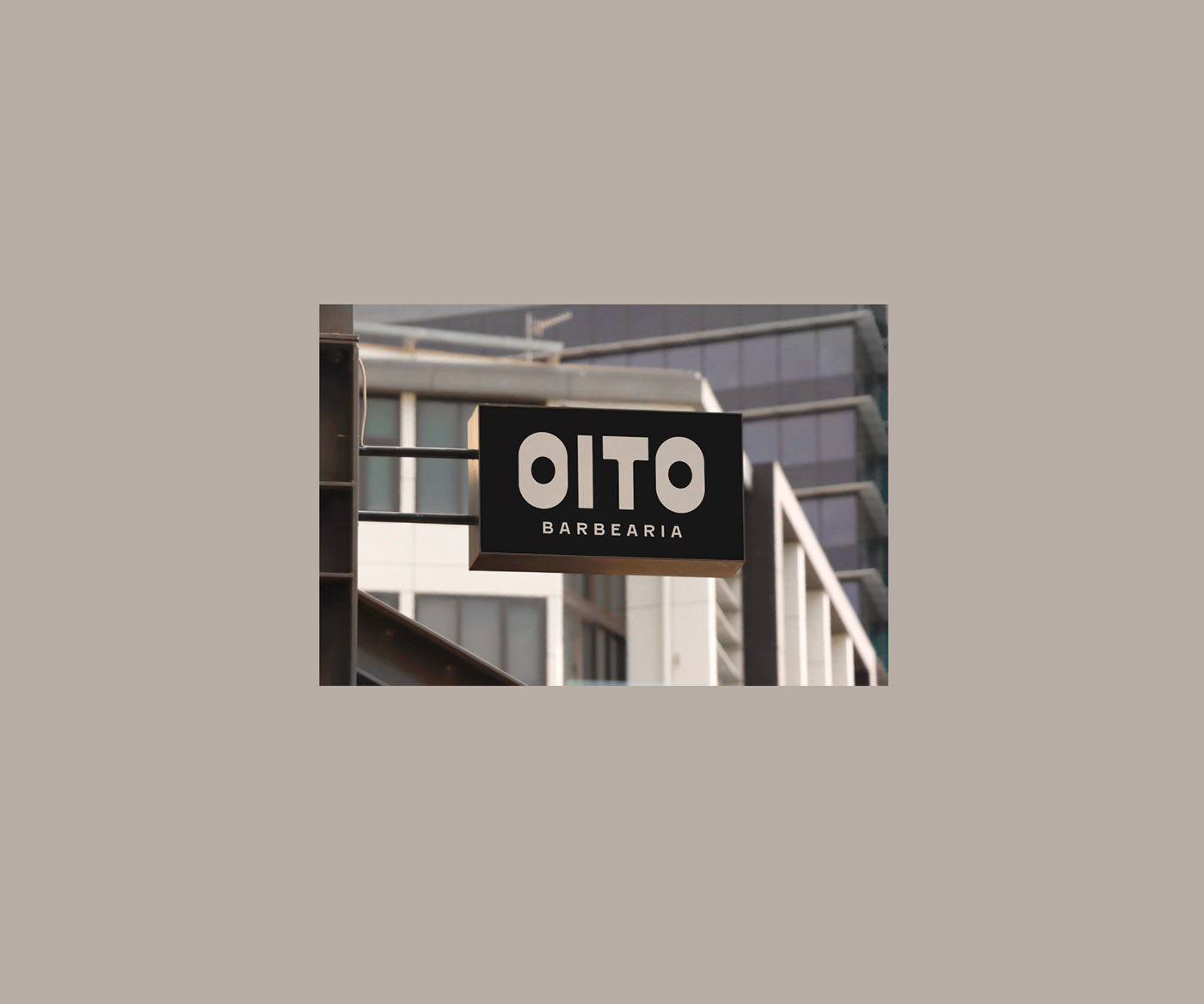
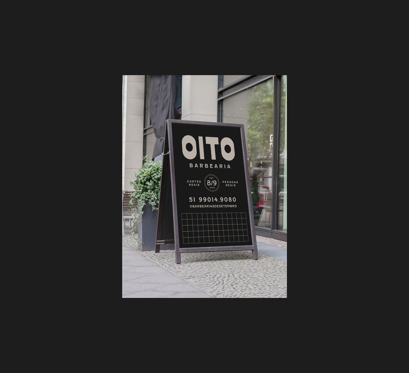
Flexibility is at the heart of the visual strategy. Each element is designed to be versatile, adapting to various media and contexts while maintaining brand recognition. This adaptability ensures that Oito Barbearia's visual identity is equipped to evolve, mirroring the dynamic nature of the beauty industry.
A pivotal aspect of the design is ensuring visual unity. Despite the diverse application, there is a coherent visual language that threads through every touchpoint. This coherence strengthens the brand's market presence, fostering a strong connection with customers.
In essence, the reimagined visual identity of Oito Barbearia by Estúdio Faixa 2 is a celebration of the brand's history and a bold step towards its future. It is an identity that honors the past, engages with the present, and is prepared for the inevitable shifts of the future—ensuring that Oito Barbearia remains not just a business, but a recognizable and beloved brand.
The Flesch Reading Ease score is designed to indicate how difficult a passage in English is to understand. The score calculated for this article suggests it is fairly easy to read, ideally targeting a score above 80 to ensure readability for a wide audience.
Branding and visual identity artifacts

Credits
- Client: Barbearia Oito de Setembro
- Creative direction: Eduardo Braun and Monique Juchum
- Art direction: Eduardo Braun
- Research: Luísa Reis
- Photography: Eduardo Defferrari
For more information make sure to check out @estudiofaixa2 on Instagram and their website at estudiofaixa2.com


