Packaging Design: Balancing Heritage and Modernity via Silhouette
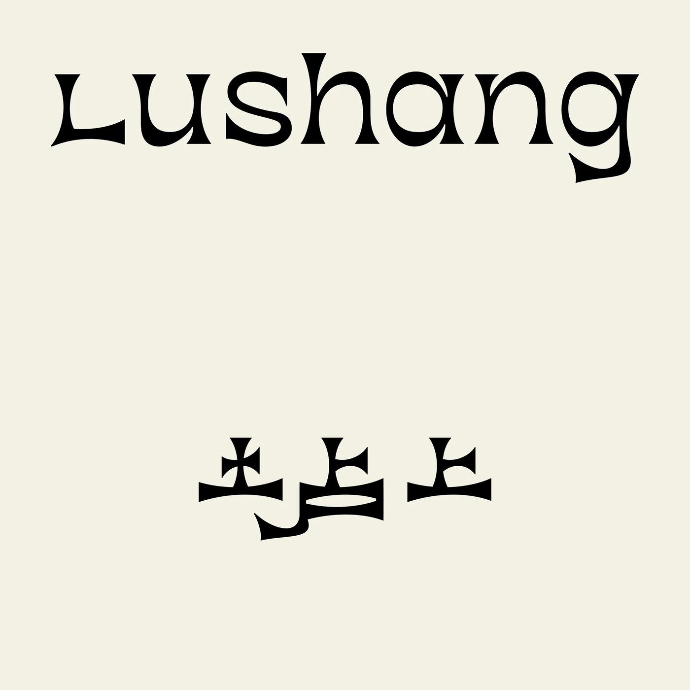
taoSTUDIO builds a bilingual packaging design for Lushang Chinese Tea where hill silhouettes and leaf forms merge into a single structural identity. The mark balances traditional Chinese aesthetics with modern and retro textures through careful adjustments to stroke details and visual weight. Each character carries the tension between written brush tradition and contemporary minimalism without losing legibility across both languages, making the logo equally readable in Chinese and English.
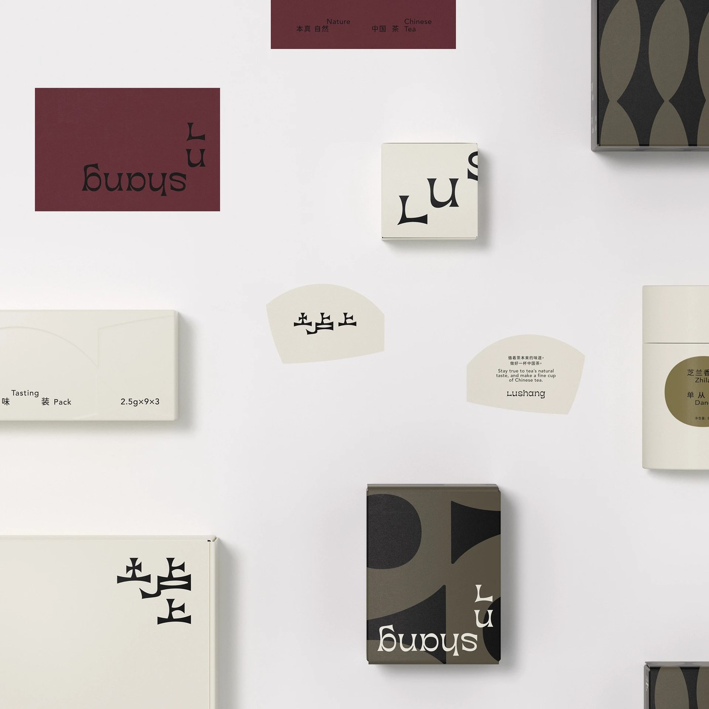
taoSTUDIO derives the Lushang logo from the organic silhouette of a tea leaf layered against the geometric profile of a mountain range. This dual reference appears in both the Chinese and English versions of the mark, where each stroke carries a deliberate thickness that echoes hand-painted brushwork. The studio applies a restrained color palette dominated by matte black, cream white, and earthy brown across the identity system, grounding the typography in natural references that avoid decorative excess. The bilingual alignment positions Lushang distinctly within the premium Chinese tea market while maintaining readability across every application from small labels to large signage. These typographic decisions create a mark that reads as both rooted in tradition and appropriate for contemporary retail shelves, bridging written language and visual form through shared structural principles rather than purely decorative devices.
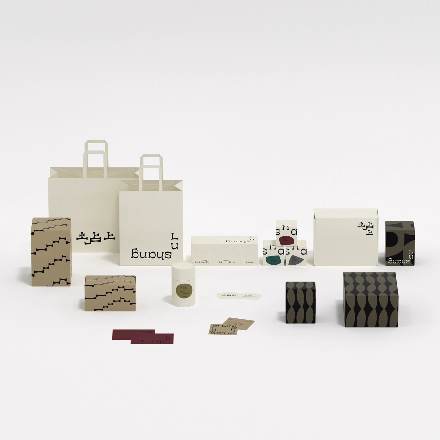
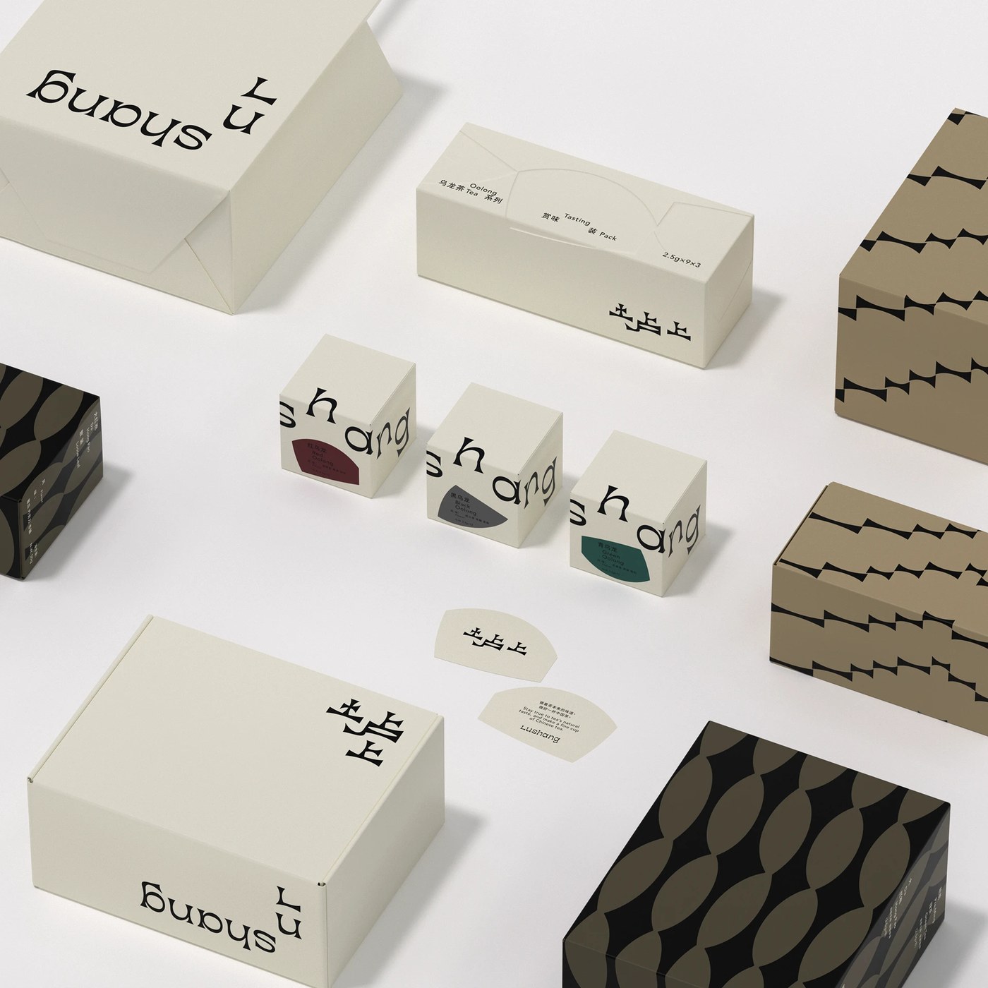
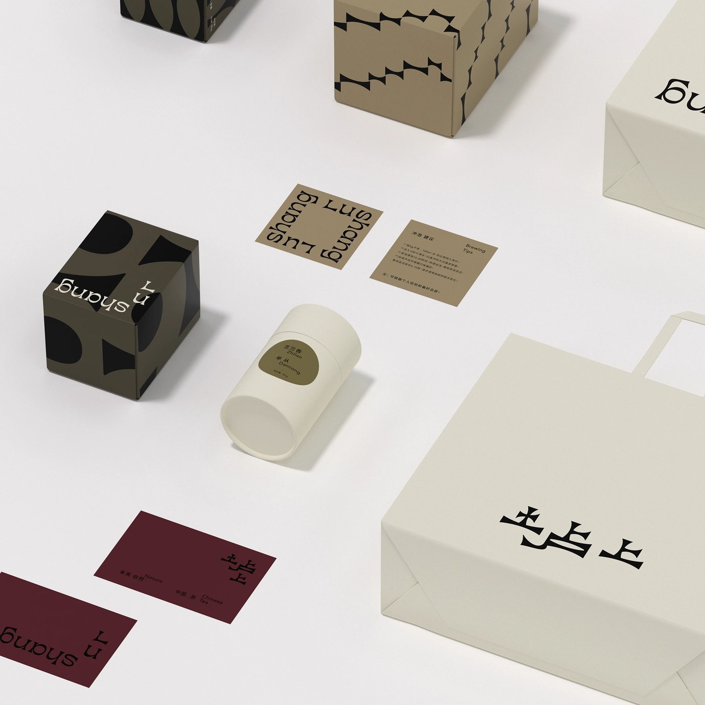
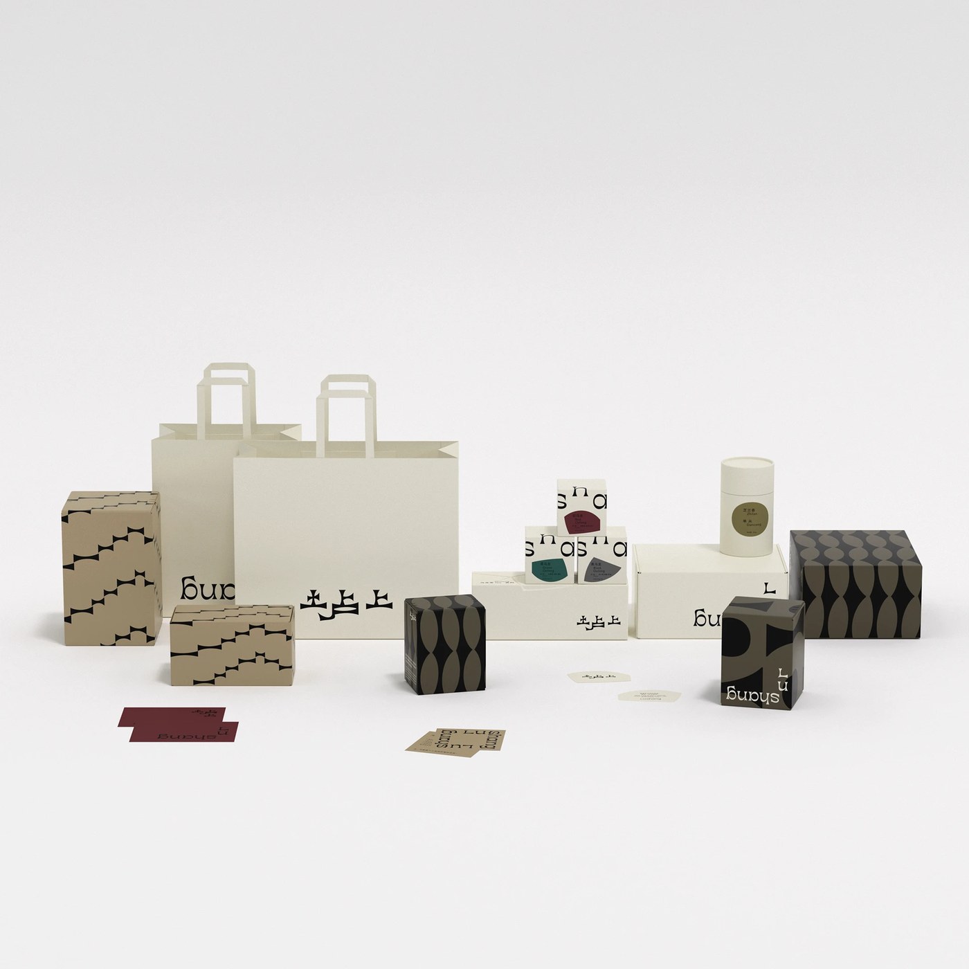
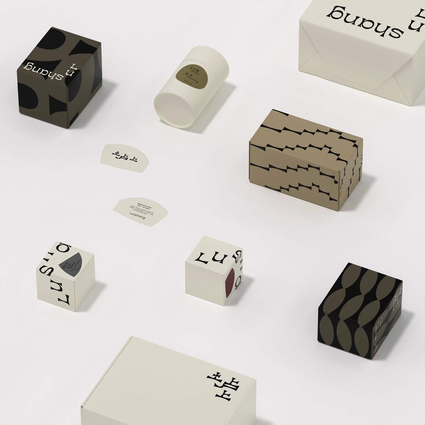
Tea packaging design built from logo geometry
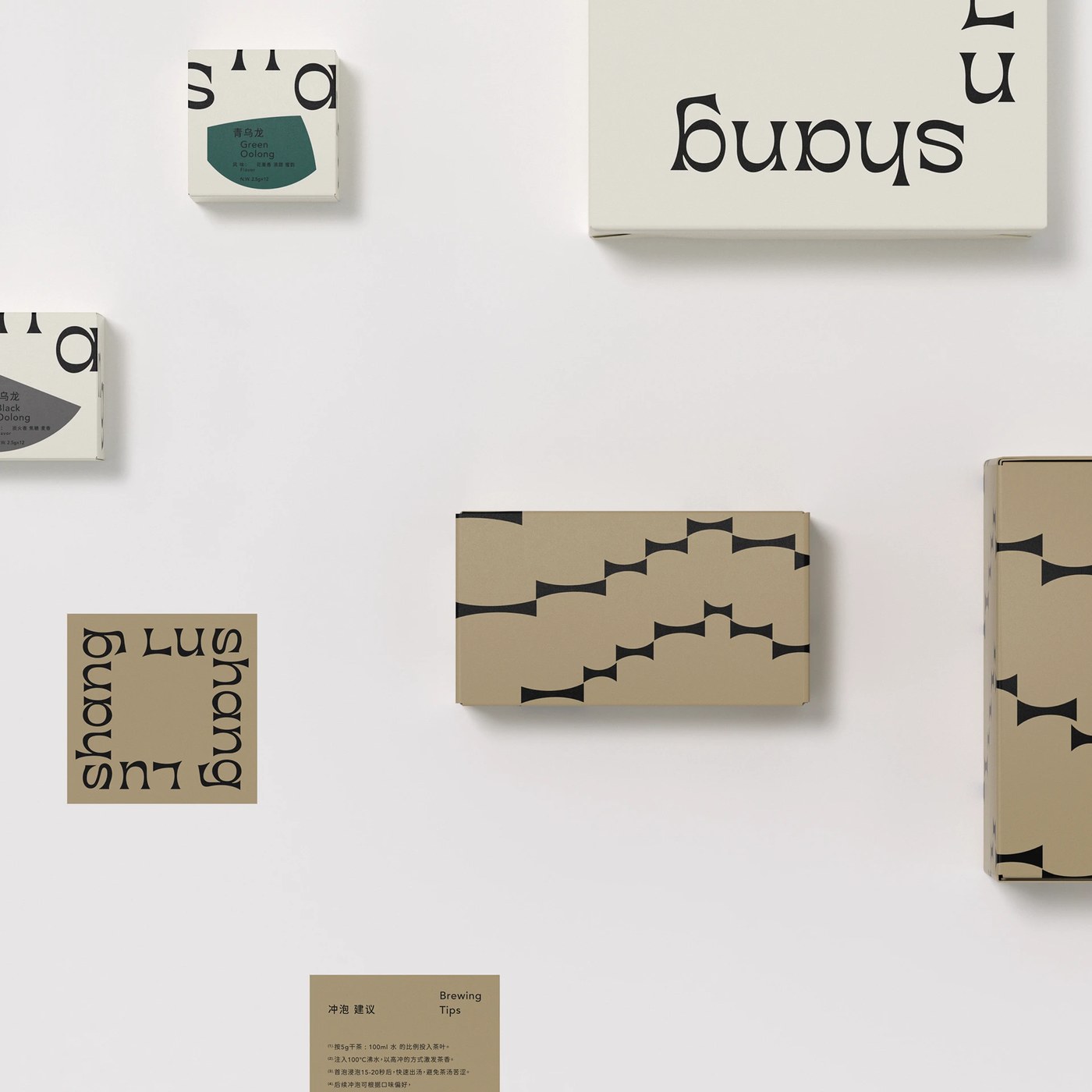
The box structures use straight folds and exposed board edges that recall the clean lines of the logo stroke architecture. One frame shows a slim tea tin wrapped in a paper band that repeats the hill contour at a smaller scale, creating a nested visual echo across the product range. Another presents a set of packaging blanks laid flat, revealing how the leaf-and-mountain motif scales across different dimensions without losing recognition. taoSTUDIO extends the same graphic language to business cards and stationery, ensuring every collateral piece reads as part of the same system. The paper textures visible in the production shots add a tactile dimension that reinforces the natural positioning, while the structural folds echo the geometric precision found in the original mark. Every physical touchpoint translates the visual identity into a material experience that buyers can hold and feel, extending the logos structural logic into three-dimensional form while maintaining consistency across all brand materials.
See the full project by taoSTUDIO 张韬 on Behance.