by abduzeedo
Discover how BROKLIN redefined Paperstack's branding and visual identity, blending innovative design with digital marketing excellence.
Paperstack, an Australian digital marketing agency, recently unveiled its new brand identity, designed by BROKLIN. This rebranding marks a significant step in Paperstack's journey, reflecting its innovative approach in the digital marketing landscape.
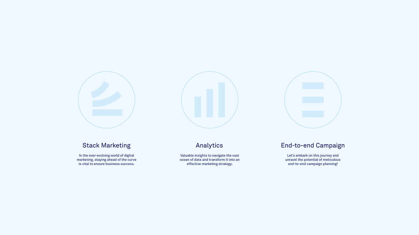
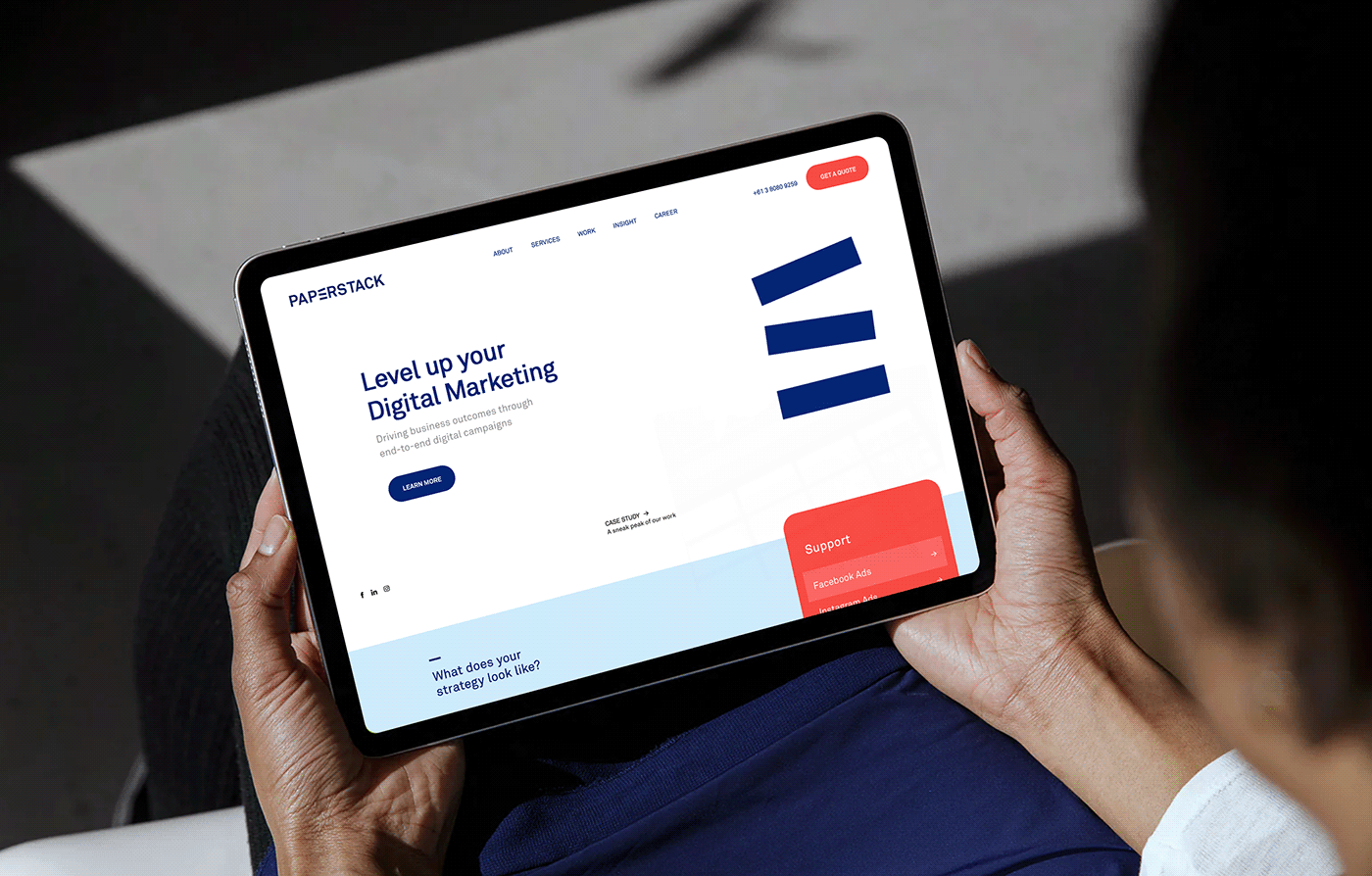
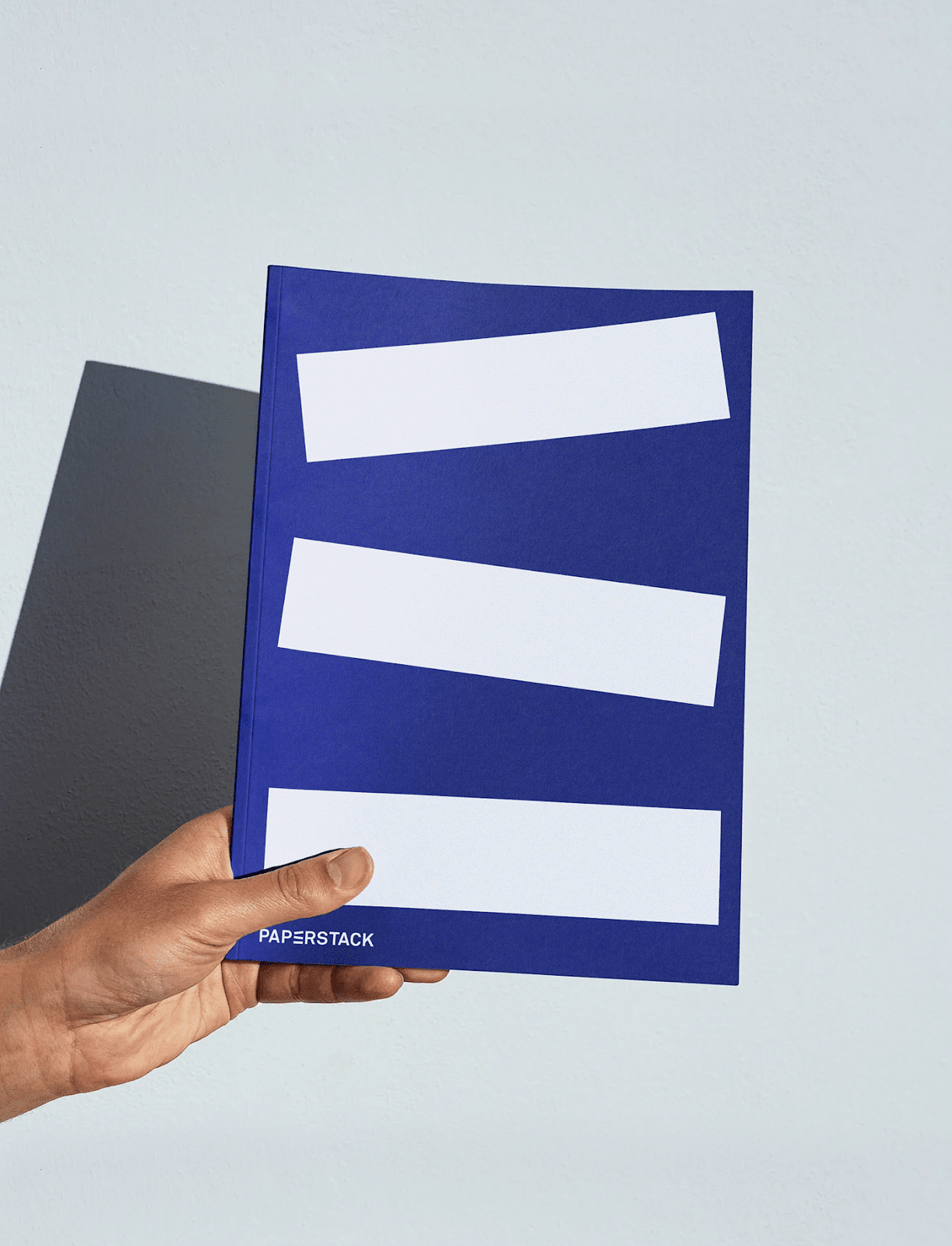
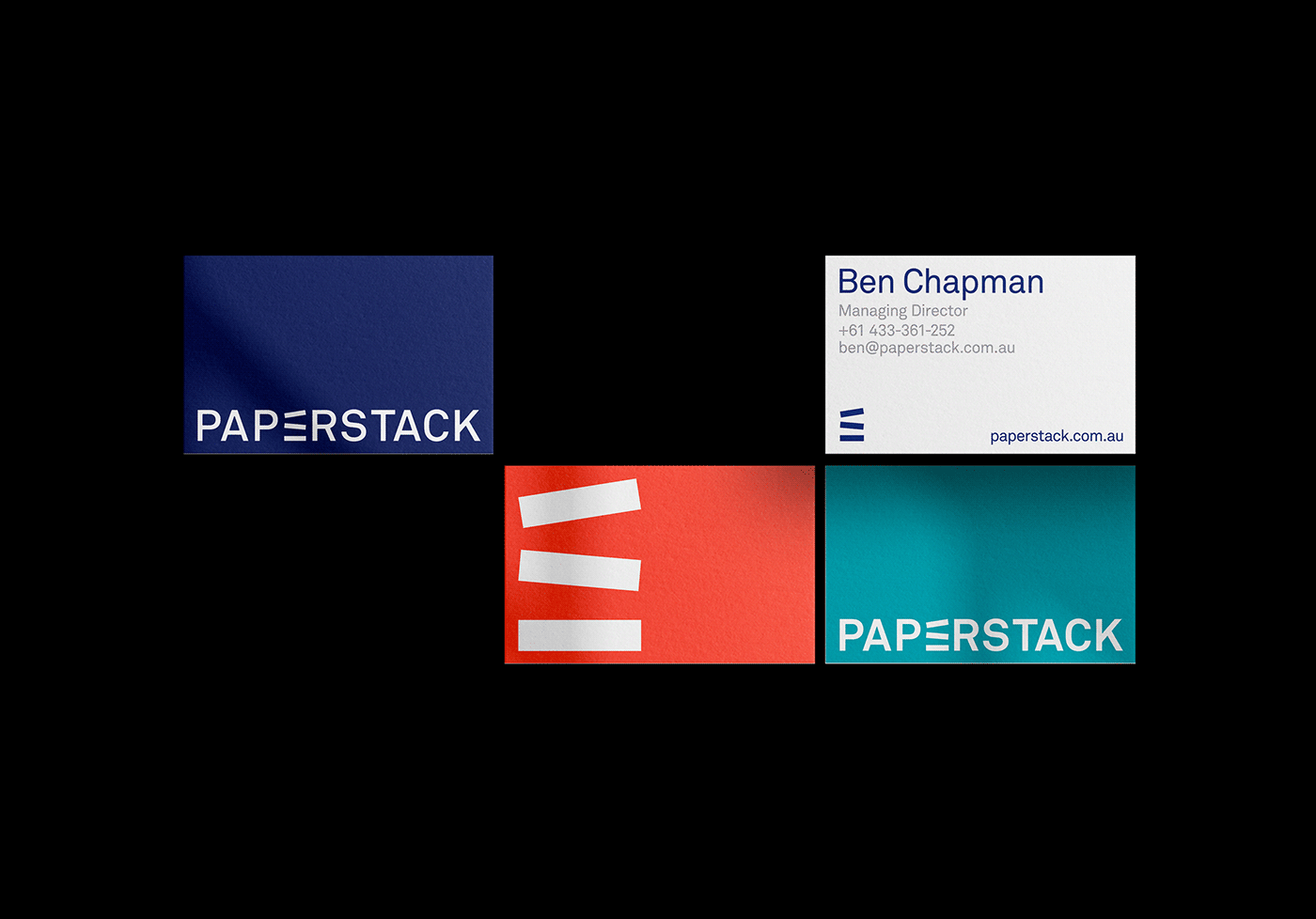
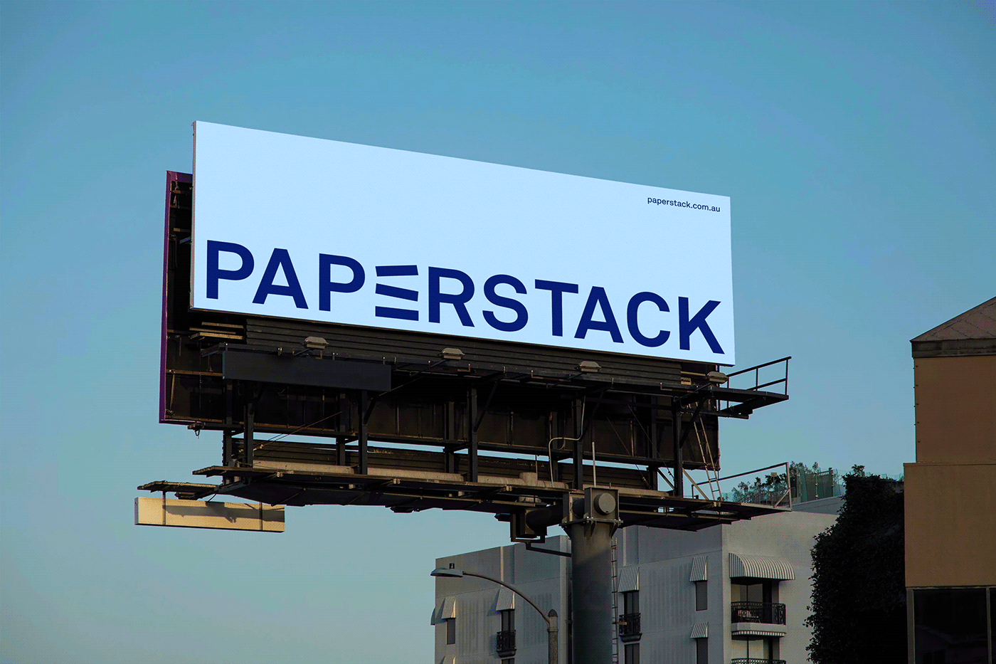
BROKLIN's design strategy for Paperstack was centered on capturing the essence of digital marketing's dynamic nature. The new logo symbolizes the catalyzation of business growth, a core aspect of Paperstack's mission. This symbolism is not just an artistic choice but a representation of Paperstack's commitment to evolving brand-customer interactions.
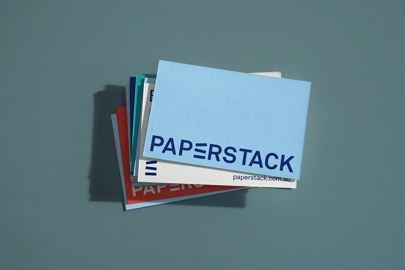
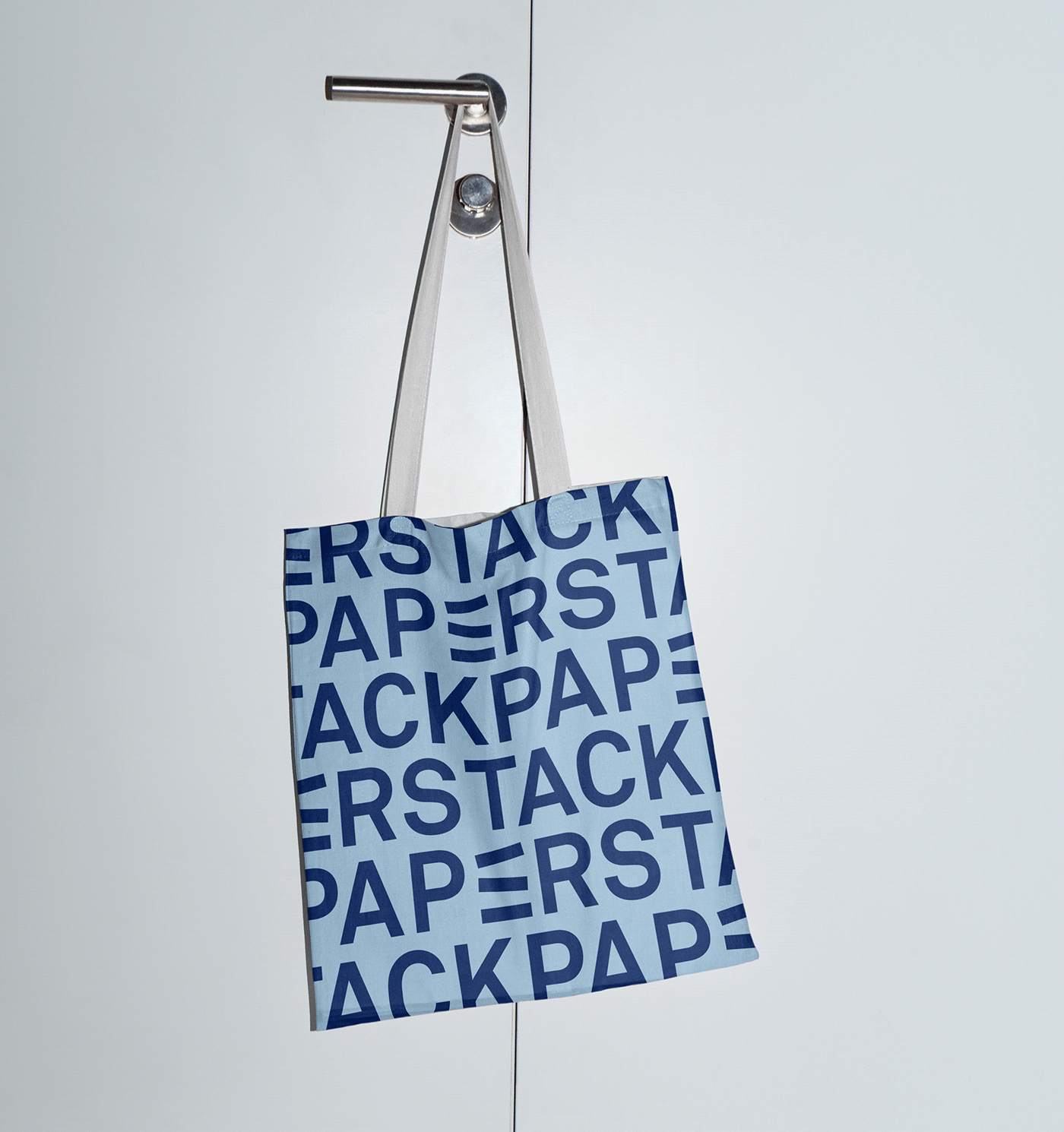
The wordmark, a critical element of the new identity, was crafted using the Akkurat Pro typeface. This choice is deliberate, as Akkurat Pro is known for its contemporary feel and clarity. It aligns seamlessly with Paperstack's vision of being a forward-thinking, clear, and effective digital marketing agency. The typeface is consistently used throughout Paperstack's visual identity system, ensuring a cohesive and unified brand presentation.
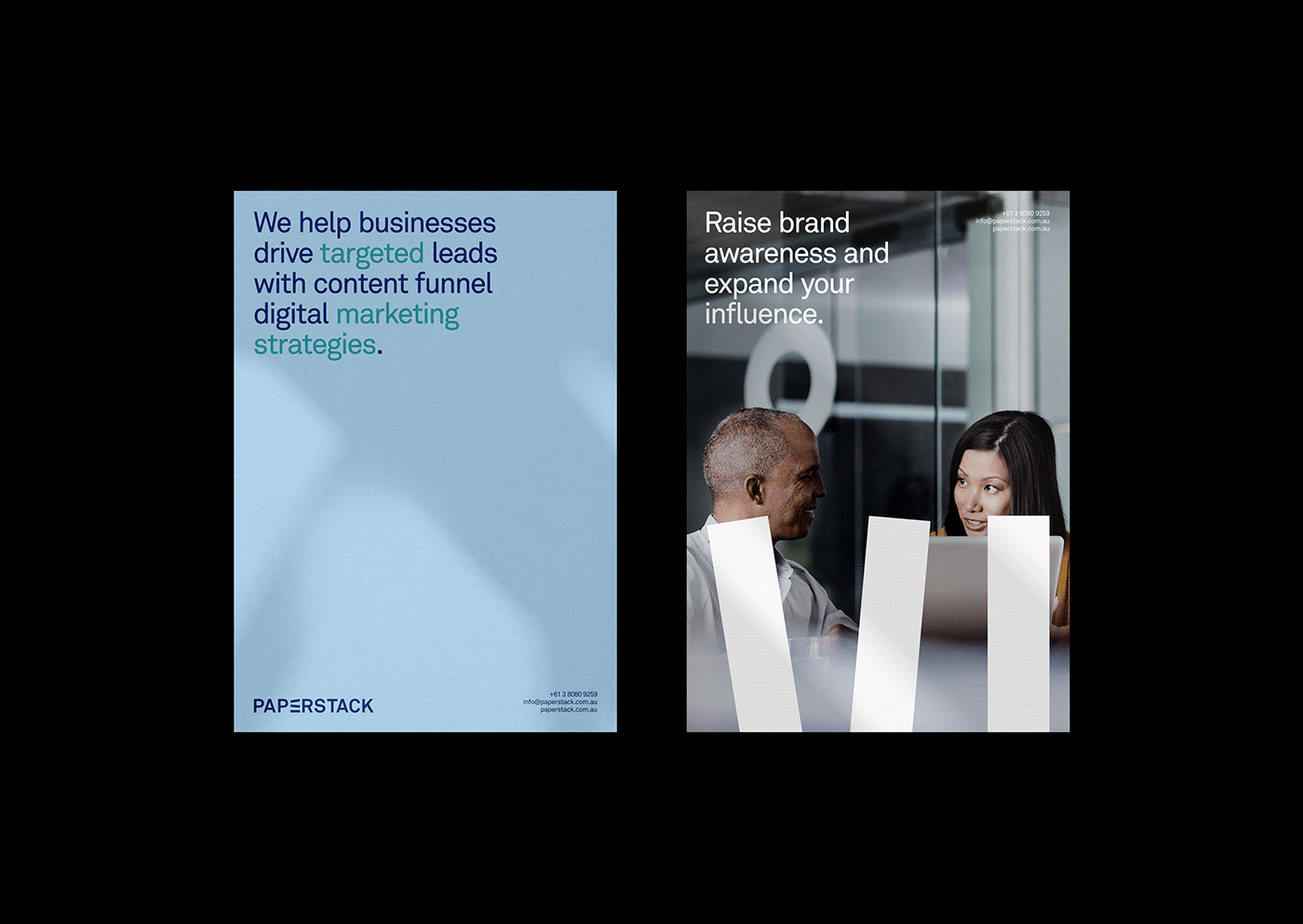
Special attention was paid to the typography style. BROKLIN ensured that the typography not only complements the logo but also reflects Paperstack's business perspective. This harmony between the logo and typography enhances the overall visual impact of the brand identity.
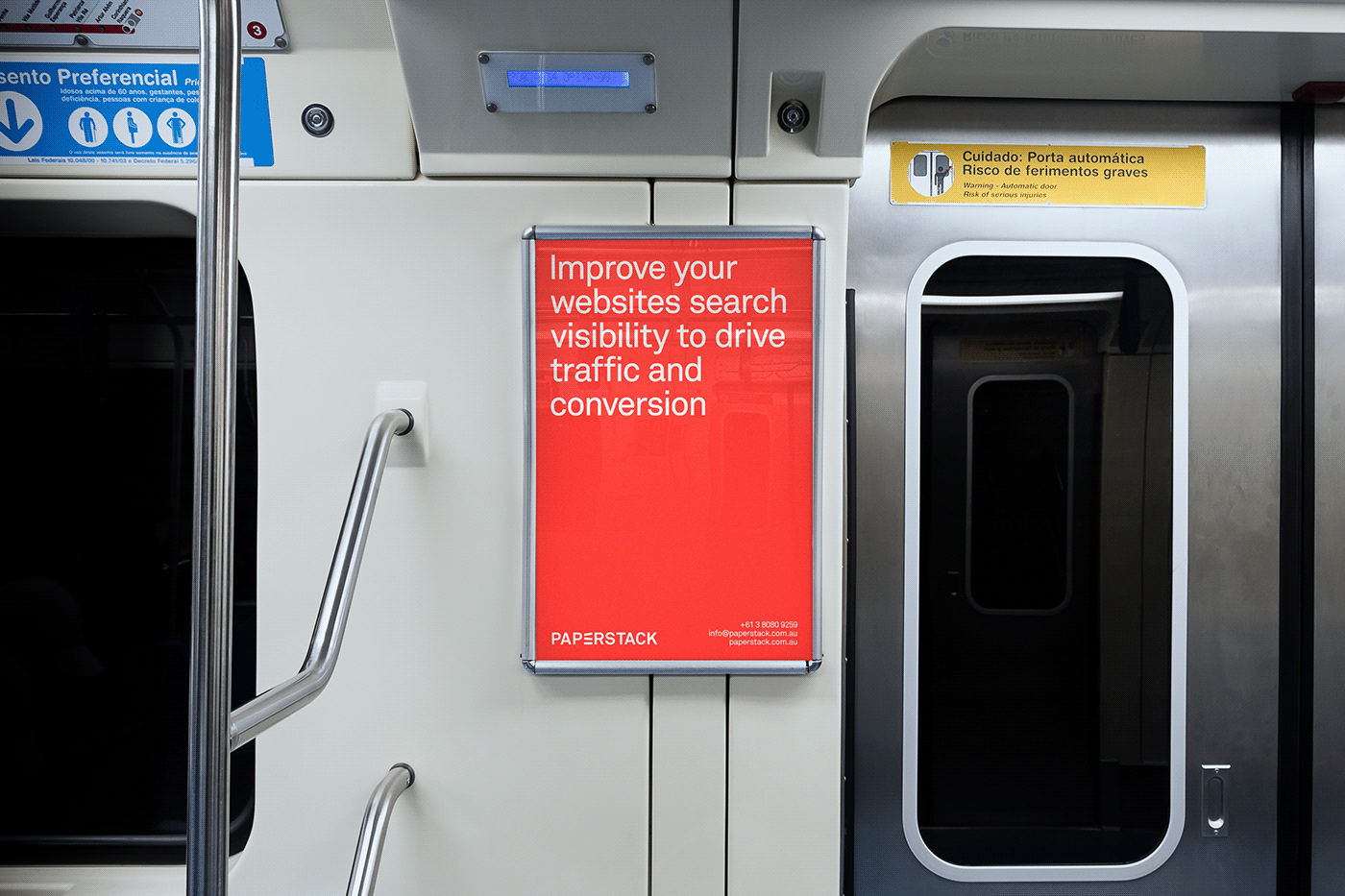
The rebranding of Paperstack by BROKLIN is more than just a visual makeover. It is a strategic move to position Paperstack as a leader in the digital marketing space. The new brand identity resonates with modernity, innovation, and growth, mirroring the core values and capabilities of Paperstack.
In conclusion, BROKLIN's work for Paperstack sets a new benchmark in branding and visual identity for digital marketing agencies. It showcases how thoughtful design can encapsulate a company's essence and ambition, paving the way for a stronger connection with their audience. As Paperstack embarks on its new journey with this refreshed identity, it stands as a testament to the power of effective branding in the digital age.
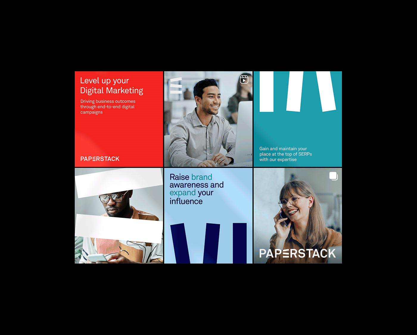
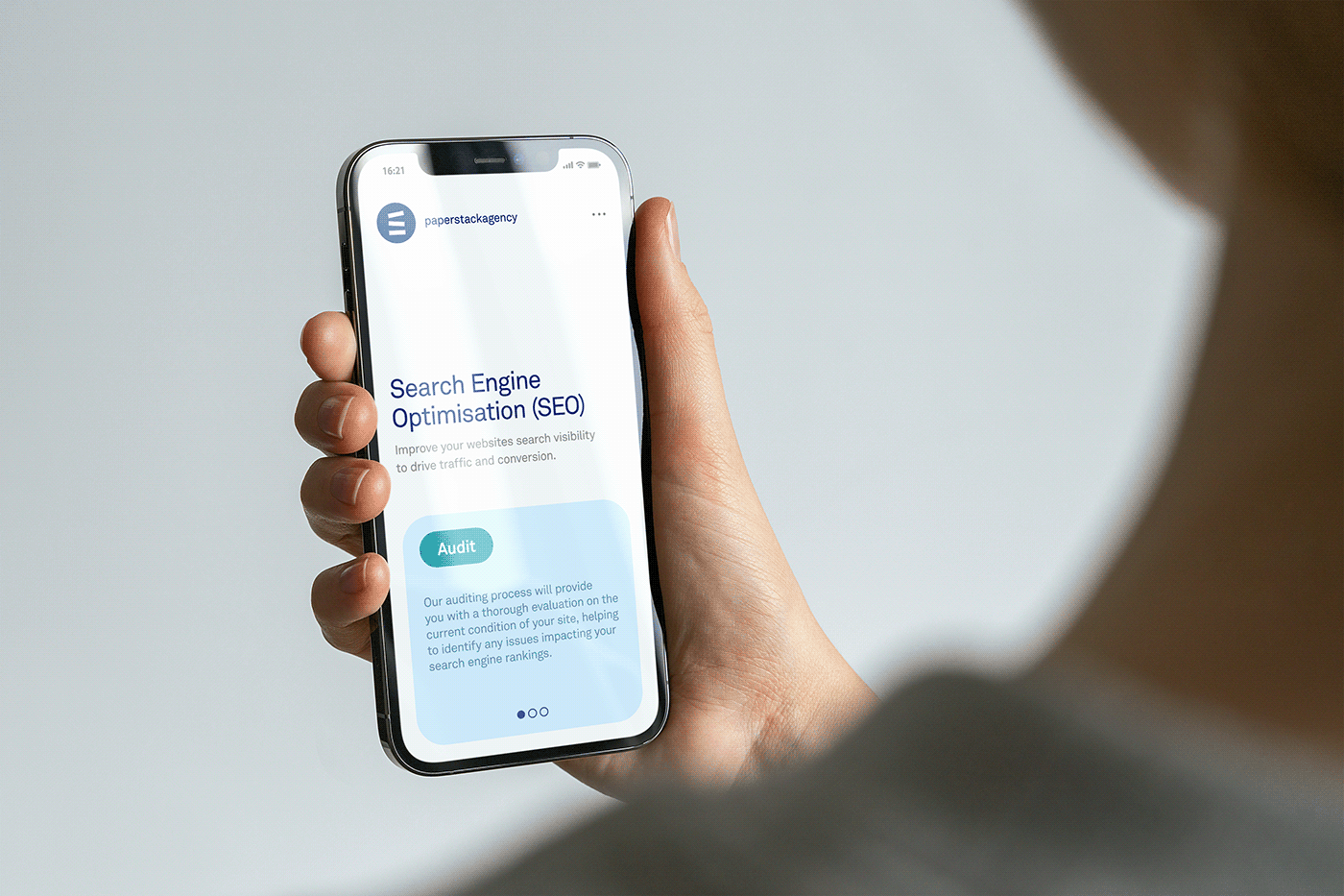
Branding and visual identity artifacts


For more information make sure to check out BROKLIN website or LinkedIn, Instagram and Behance.


