Primo Honey | Packaging Design by Brandsummit Studio
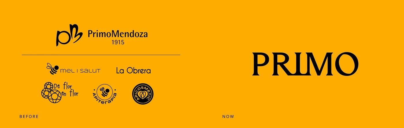
Primo Honey by Brandsummit Studio: Primo Mendoza had spent more than 100 years in the honey industry, but over time the business had become fragmented: 8, a packaging design project.
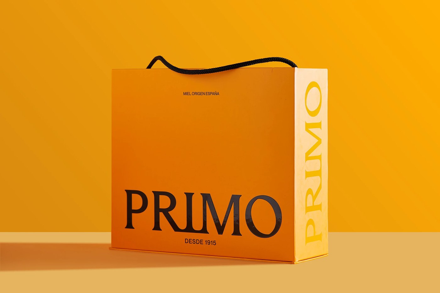
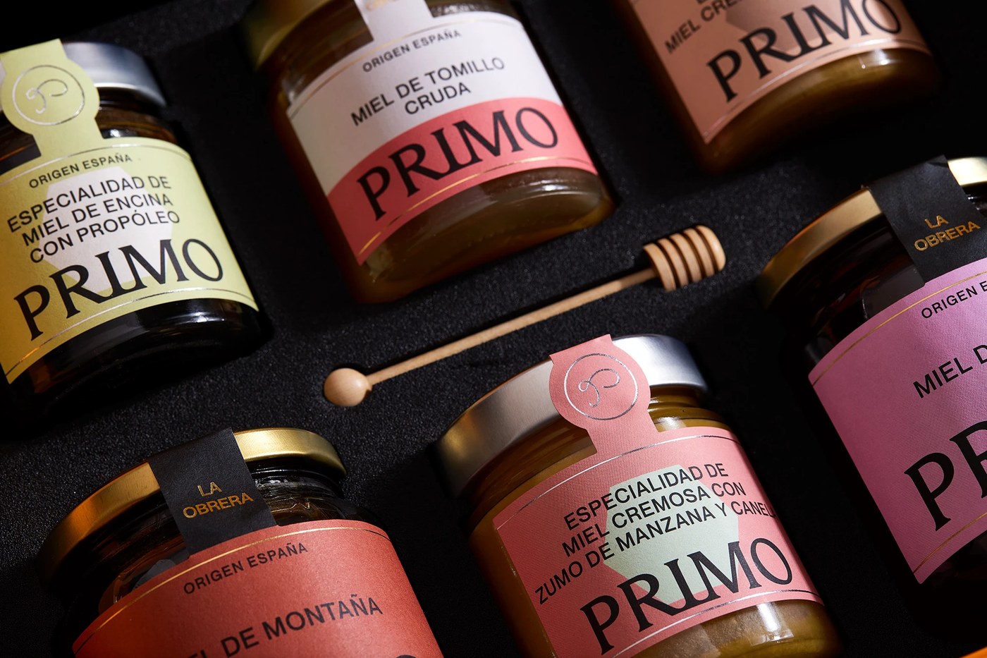
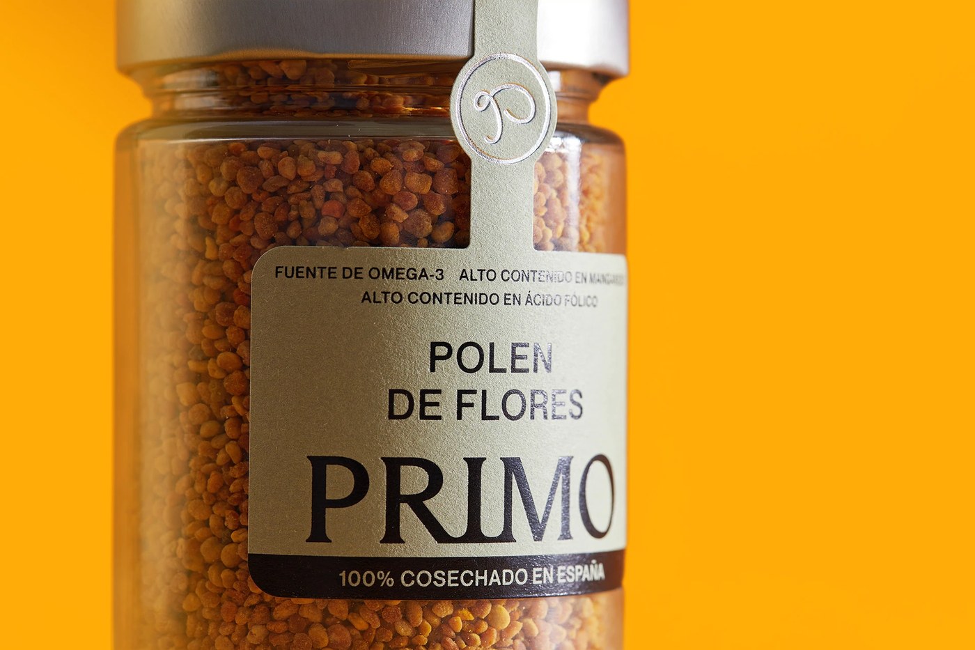
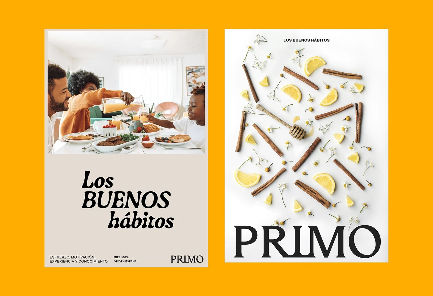
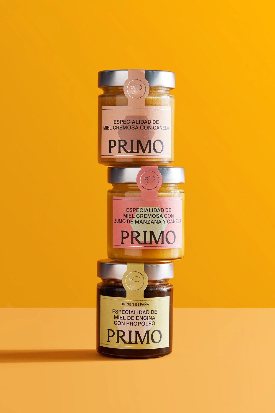
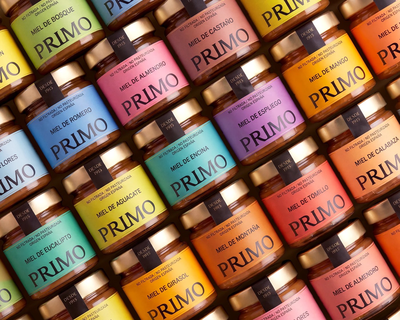
Eight different brands created a fractured retail presence for Primo Mendoza's century-old honey business. Brandsummit Studio restructured this portfolio by extracting the core company name, PRIMO, to serve as an umbrella brand. They moved away from disconnected identities toward a unified system designed to organize 150 references. This structural shift replaces visual chaos with a coherent architecture that supports future growth while keeping the product line navigable for customers.
Organizing scale through packaging design
The new identity system provides clarity across more than 150 products by using a consistent, recognizable architecture. Brandsummit Studio focused on a simple idea of good habits to ground the brand. The visual language simplifies navigation on the shelf, ensuring that each product reference remains easy to identify within the larger portfolio while maintaining a reliable connection to the original company name.
See the full project by Brandsummit Studio on Behance.