by abduzeedo
Explore Respo’s clean, functional branding and visual identity, blending modern minimalism with smart technology.
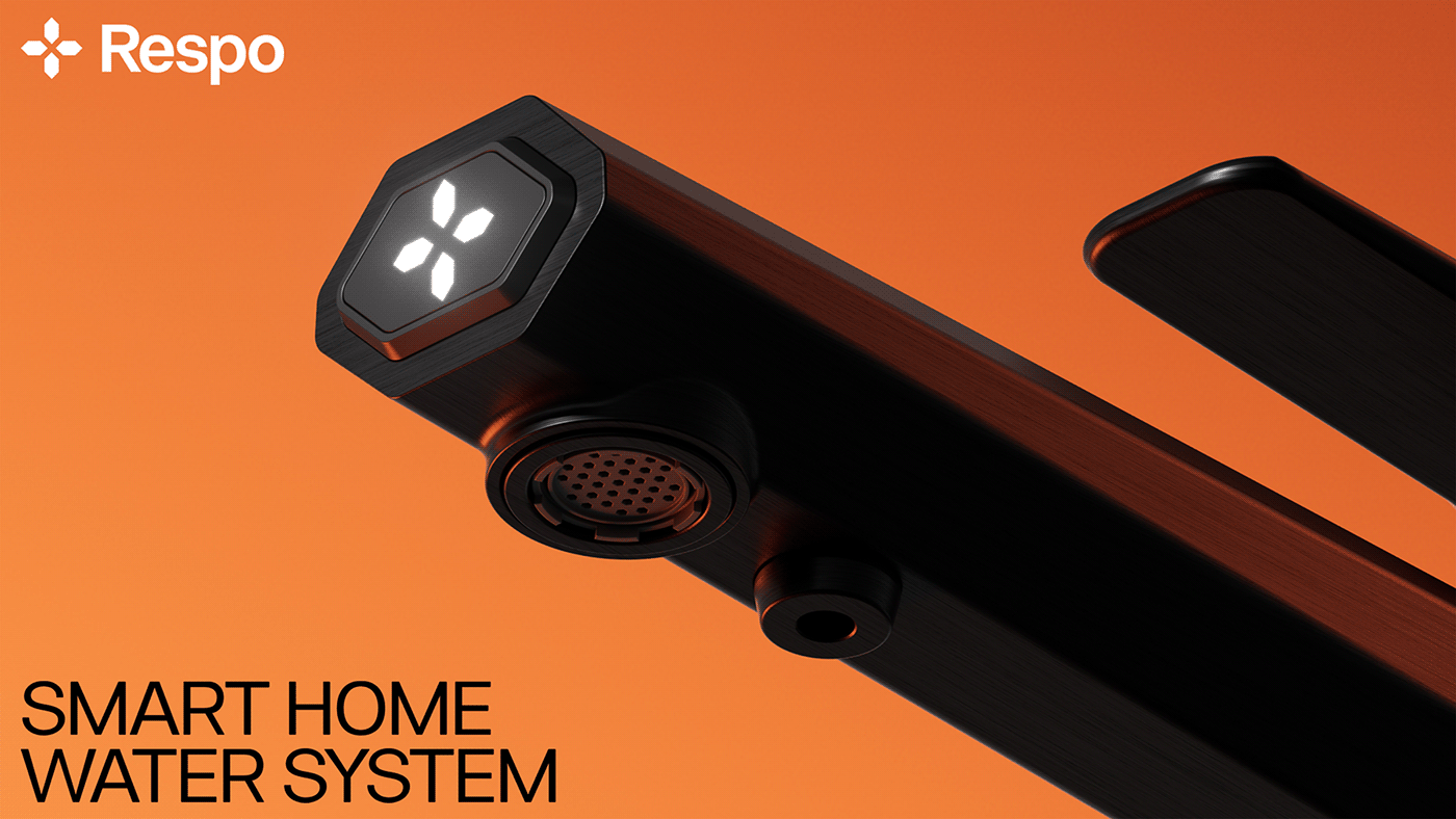
Branding and visual identity play a crucial role in communicating a brand’s values and connecting with its audience. In the case of Respo, a smart ionized water system, the branding successfully reflects the brand’s innovative, environmentally-conscious ethos while maintaining a clean and modern aesthetic.
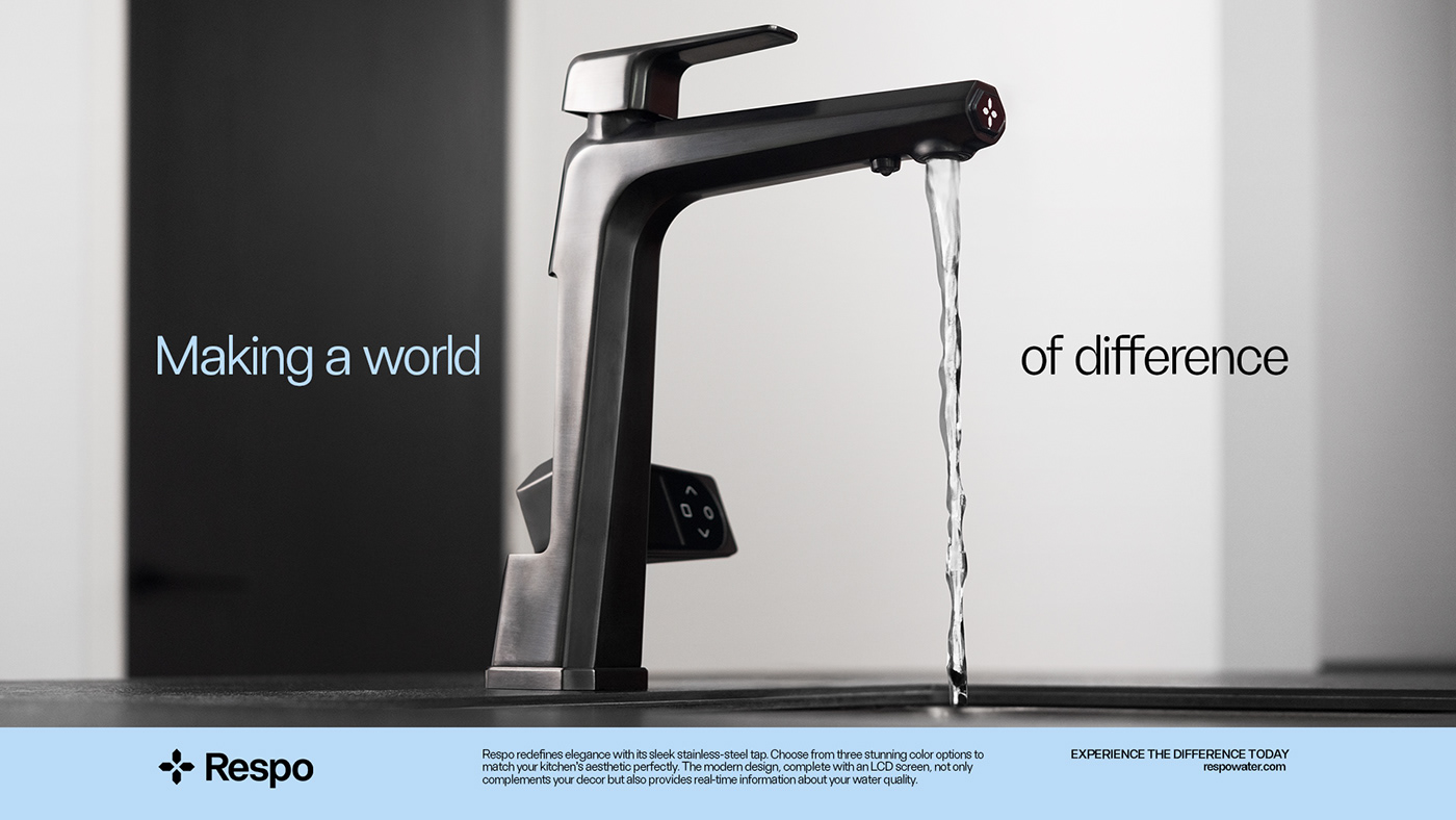
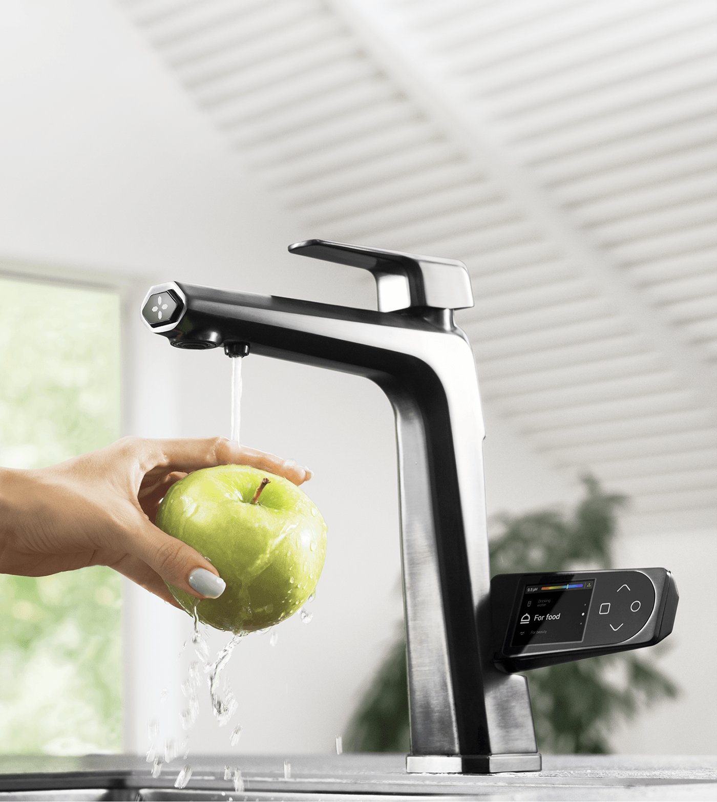
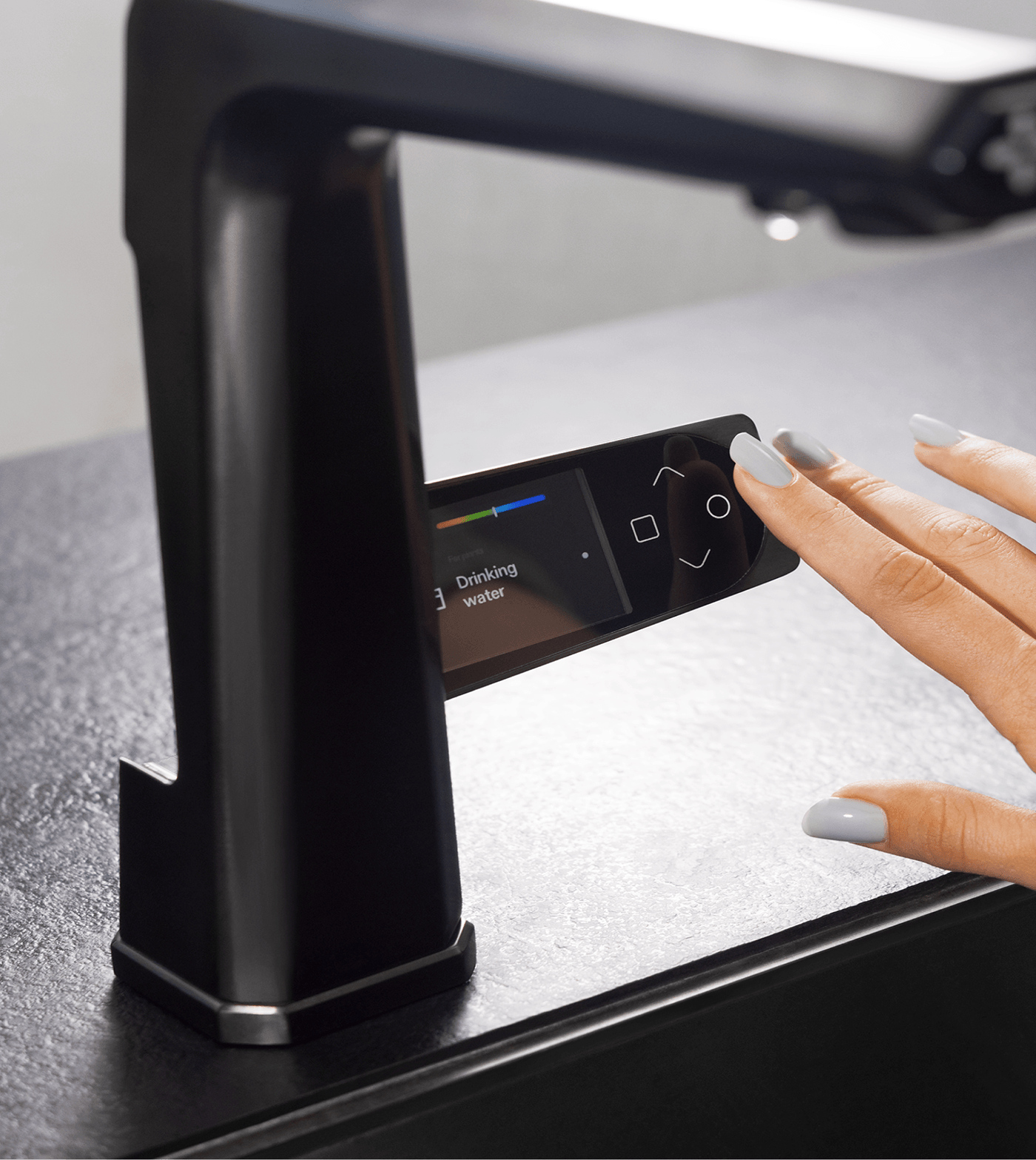
Respo, which turns ordinary tap water into a safer and more effective cleaning solution, focuses on enhancing both hydration and home care. The product design and functionality are all about simplicity and efficiency. The challenge for the brand identity was to mirror this ethos—balancing technology with nature, and making it both visually appealing and functionally accessible to modern city dwellers.
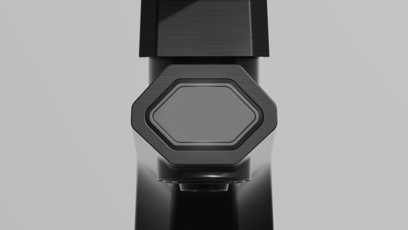
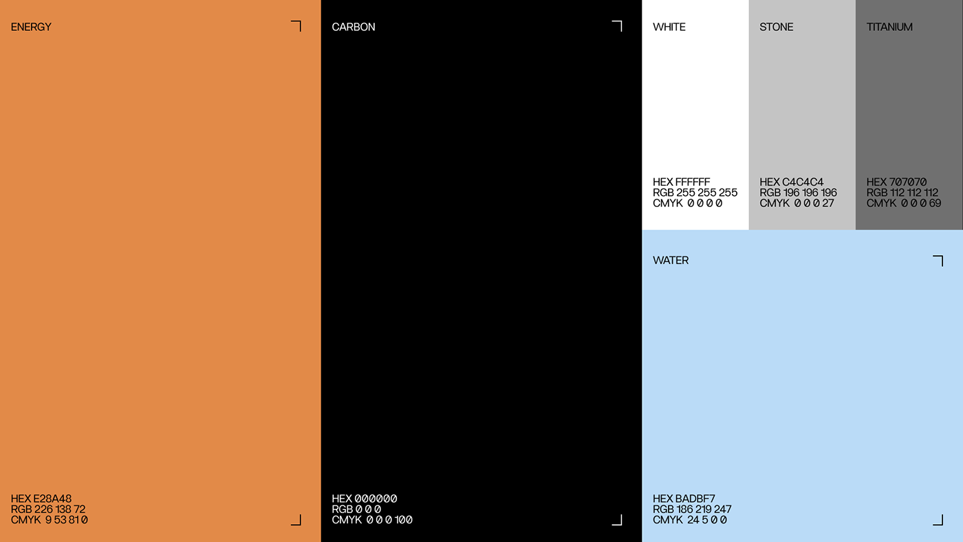
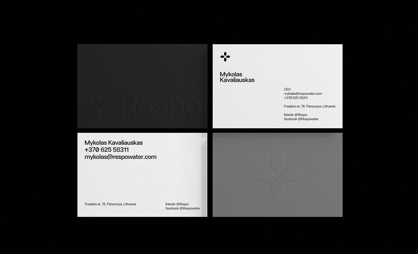
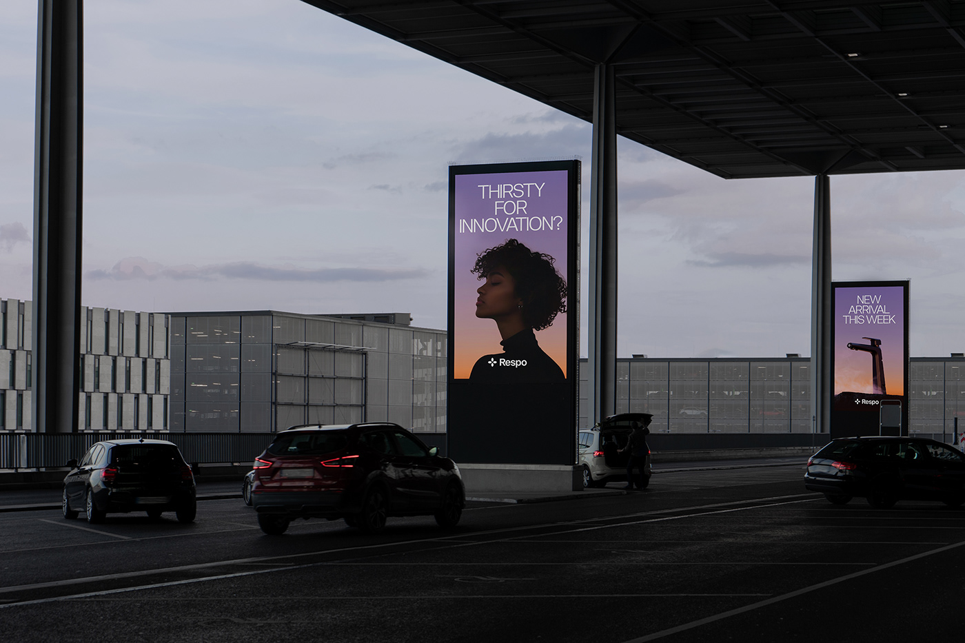
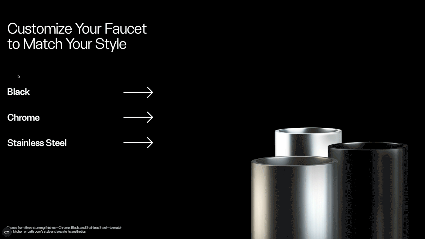
At the heart of Respo’s branding lies the principle of “less is more.” The visual identity embodies a minimalist approach, aligning with the product’s design philosophy. The color palette is a blend of timeless black and white, complemented by vibrant tones, which symbolize the positive, life-enhancing qualities of water. The combination results in a look that is not only clean and modern but also distinctive.
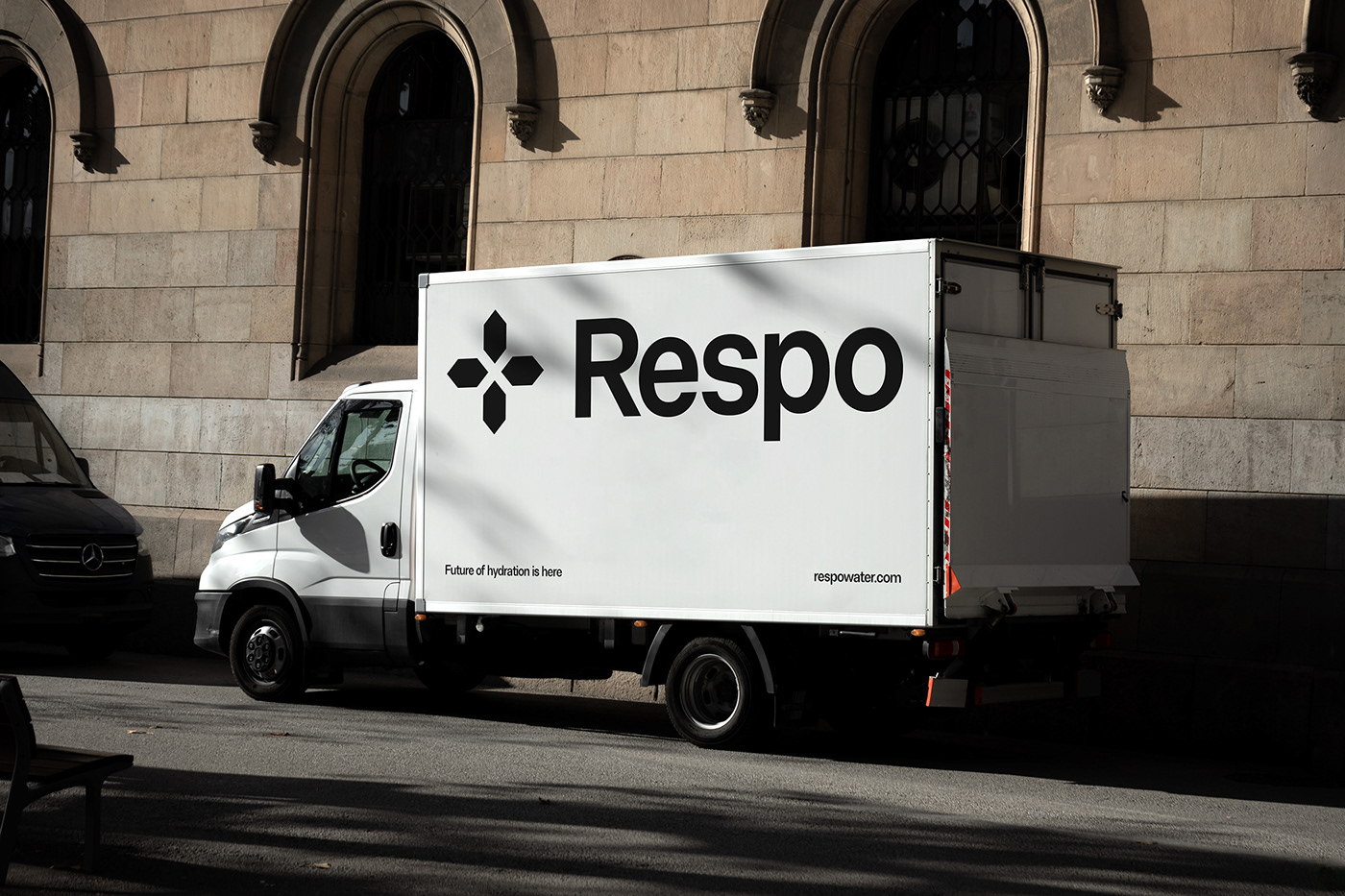
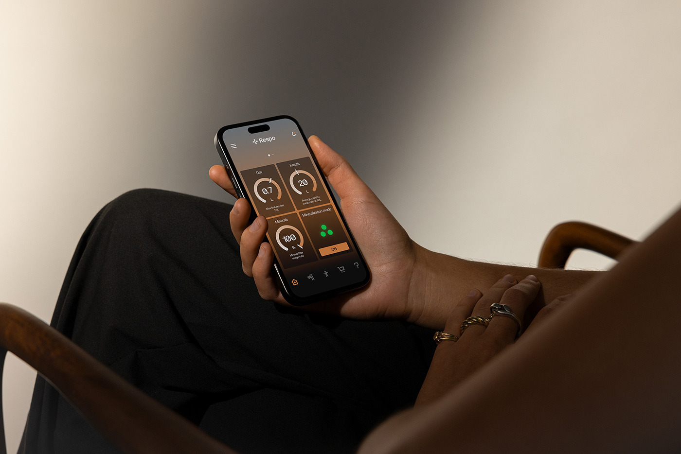
This minimalist approach extends beyond the visual elements to the overall user experience. The graphic layout system is designed to be highly functional and flexible. This system enables the creation of visually appealing variations that maintain consistency while providing enough room for adaptation across different platforms and marketing materials.
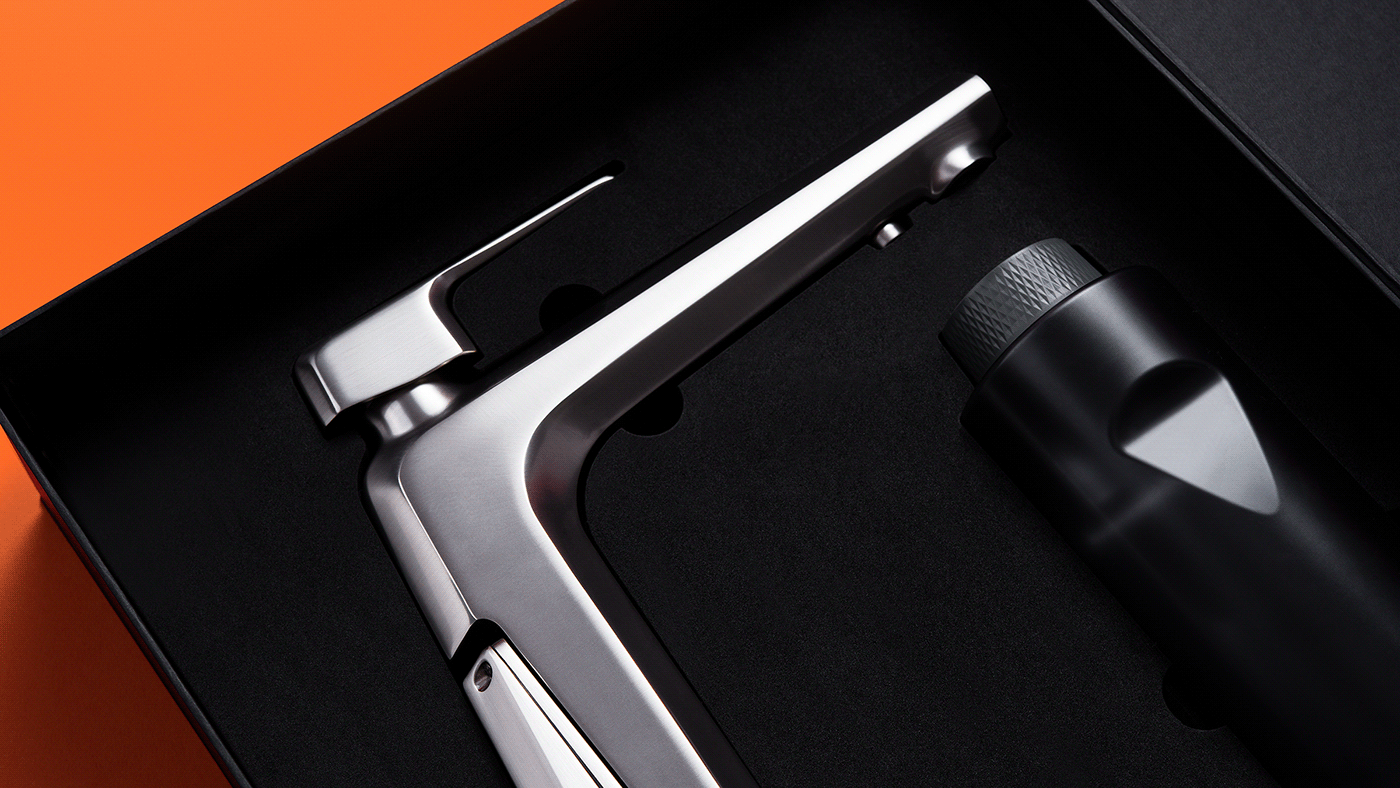
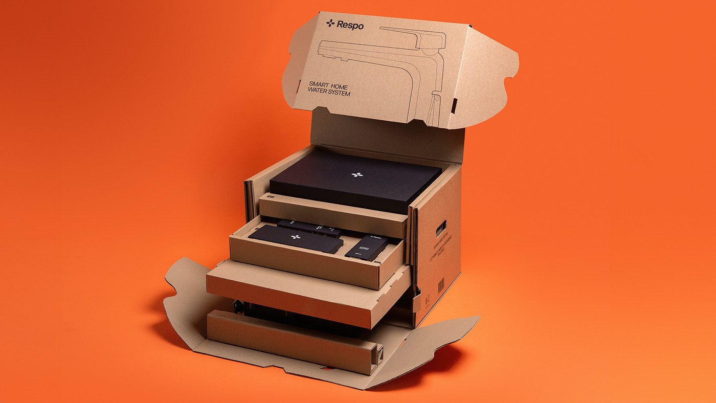
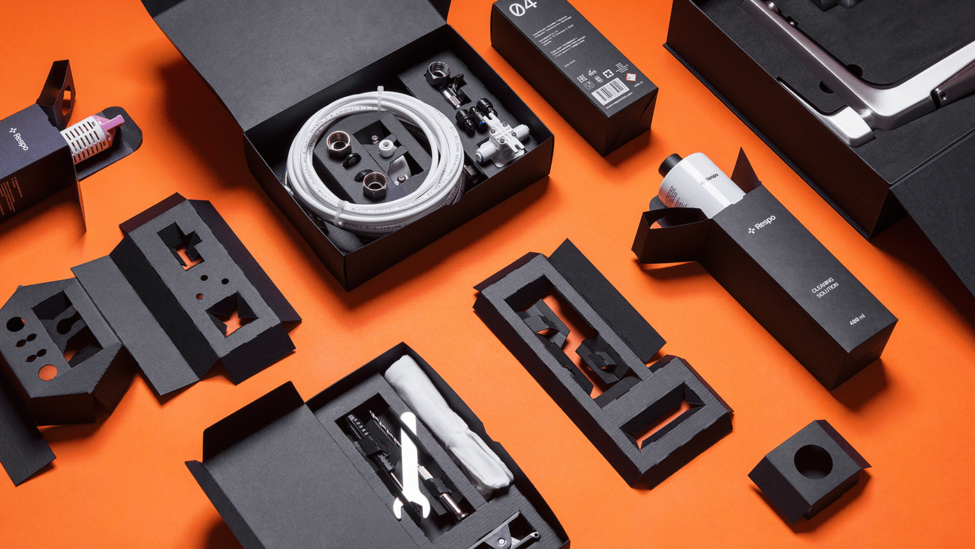
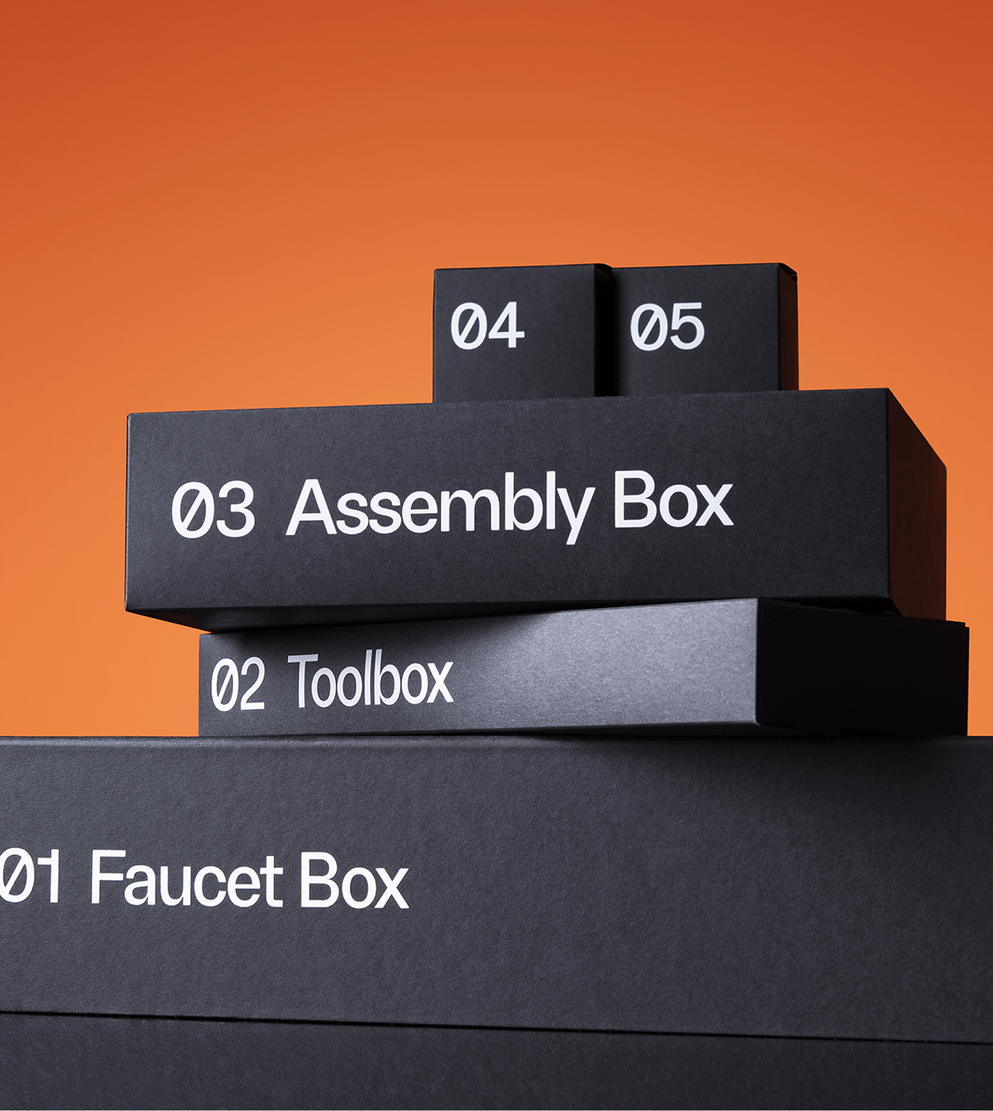
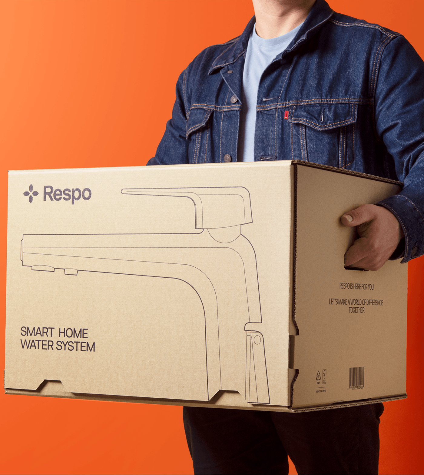
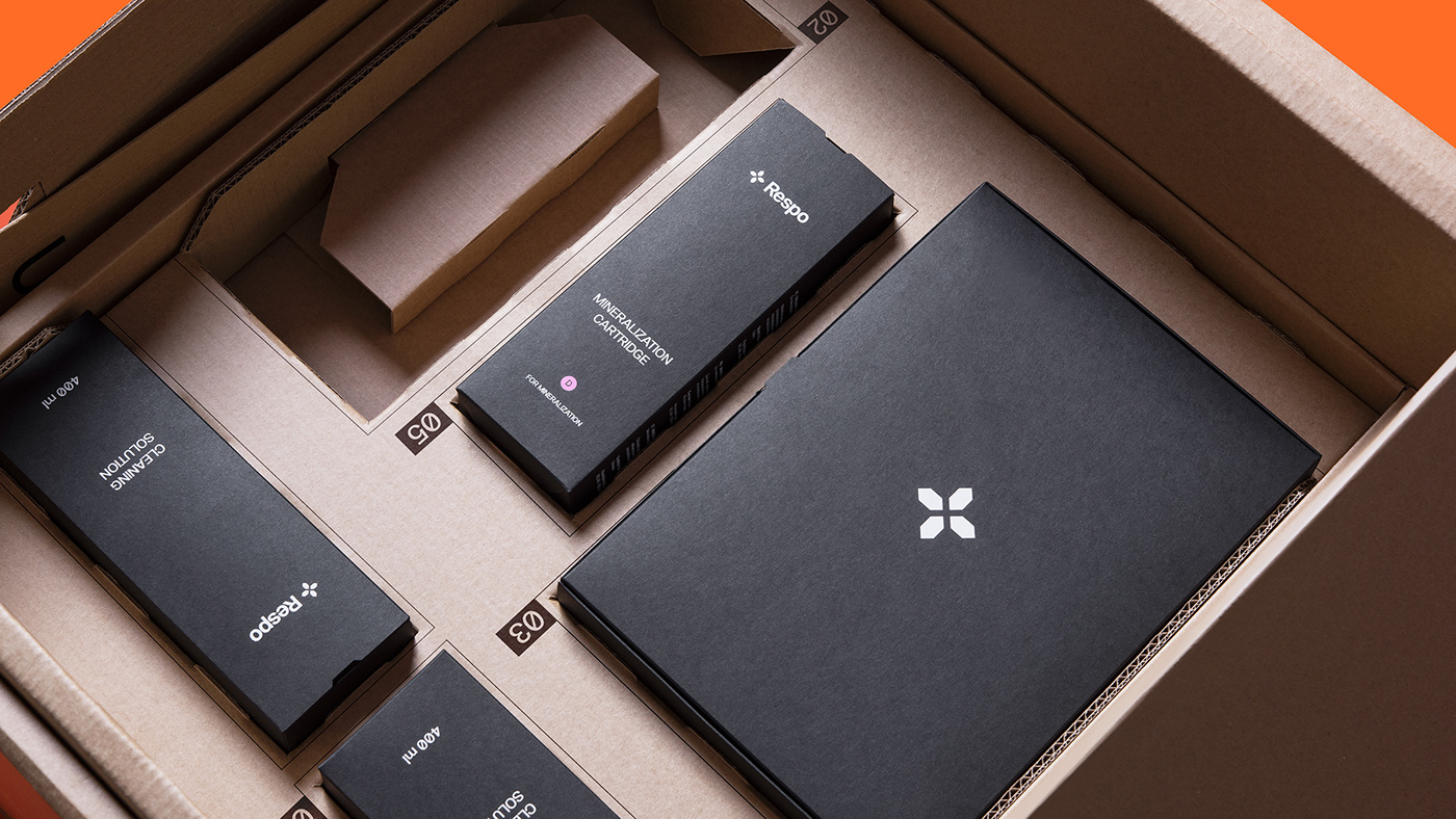
The branding doesn’t stop at the visuals; it also extends into Respo’s packaging design. This element plays a significant role in reflecting the premium nature of the product. The packaging design needed to balance aesthetics with functionality, considering the product’s sensitive components.
The result was a unique hexagonal shape, a subtle nod to the product and brand identity. The layered black boxes inside the packaging ensure that the product is protected while providing an organized and visually pleasing unpacking experience. The packaging, much like the product itself, focuses on simplicity, elegance, and functionality.
The success of Respo’s branding lies in its ability to create a cohesive brand experience. From the minimalist logo and clean typography to the thoughtful packaging design, every element works in harmony. This consistency strengthens the brand’s identity, making it instantly recognizable and reinforcing the brand message of combining smart technology with natural solutions.
For anyone working in branding and visual identity, Respo provides a masterclass in how to balance aesthetics with functionality. The brand’s minimalist visual language and well-thought-out design choices ensure that the product not only stands out but also effectively communicates its values to the target audience.
In a world where first impressions matter, Respo’s branding shows how a clear and consistent visual identity can shape a product’s perception. Through minimalist design, attention to detail, and a focus on functionality, Respo has created a branding and visual identity that not only reflects the product’s essence but also elevates it.
For more design inspiration, check out Respo’s official website here, or visit Younique Studio for the creative process behind the branding.
Branding and visual identity artifacts


Credits
- Client: Respo
- Agency: younique studio
- 3D: @noveltyexposure
- Product Photography: Packshot
- Packaging Development: PinProof
For more information make sure to check out younique.lt


