Senac: A Minimalist Approach to Branding and Visual Identity
Explore the design process behind a new, minimalist branding proposal for Senac, a Brazilian educational institution.
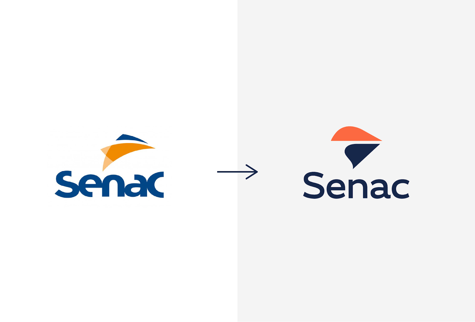
As a designer, I believe in the power of simplicity. So, when I approached the creative challenge of rebranding Senac, I knew that a minimalist approach would be key. Senac is a well-established Brazilian education institution, and its existing logo held a certain level of recognition. However, I felt it lacked the clarity and visual impact needed to effectively communicate its mission and values in today's competitive landscape.
My main goals for the rebrand were threefold:
-
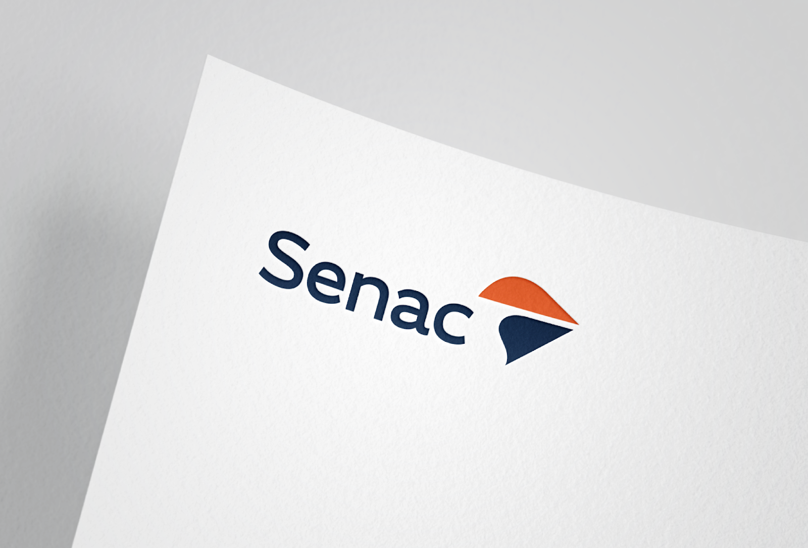
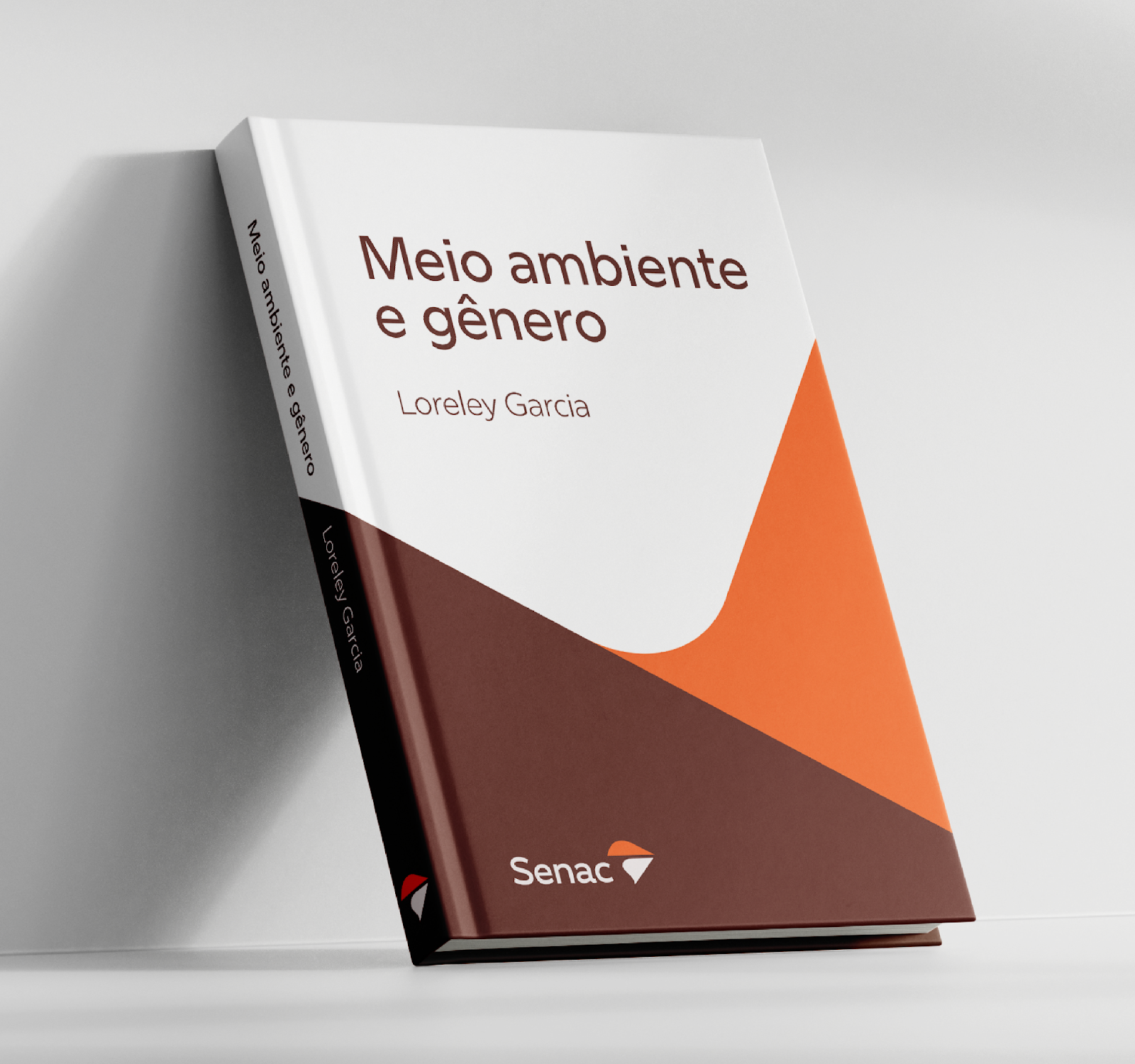
Simplify the typography: The original logo used a combination of three different fonts, which created a sense of clutter and inconsistency. I opted for a single, modern sans-serif font for improved legibility and visual coherence.
-
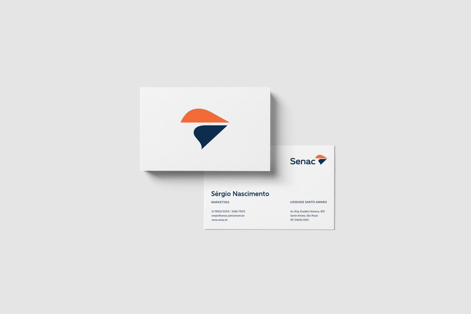
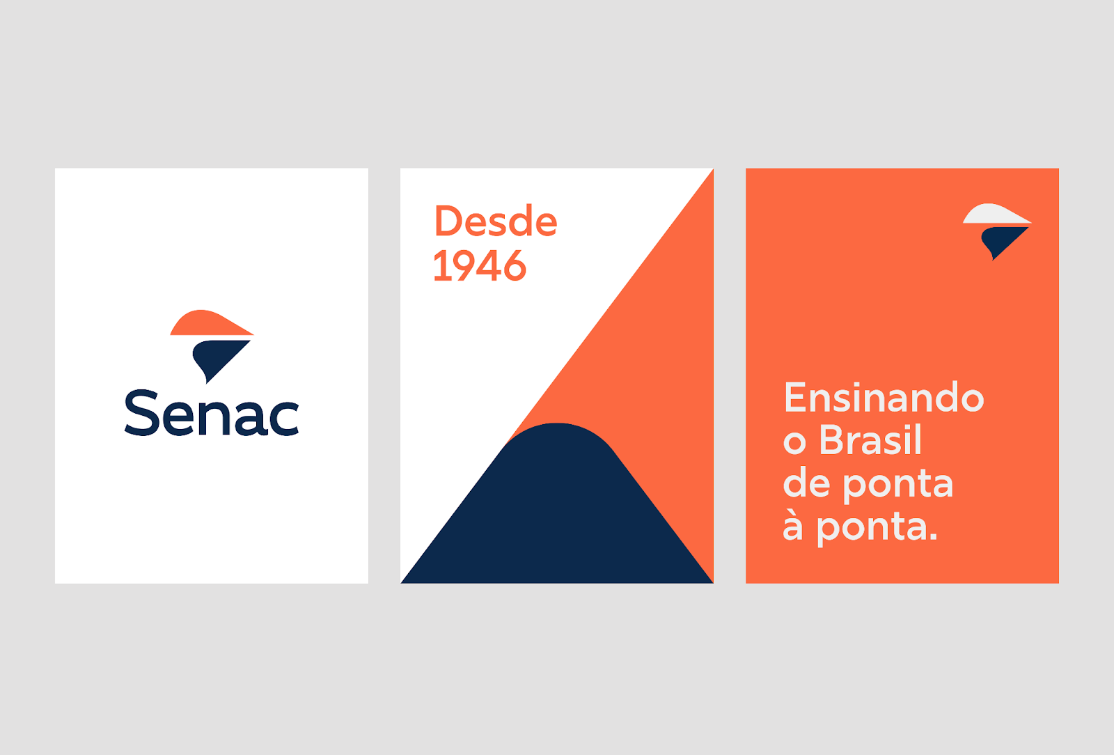
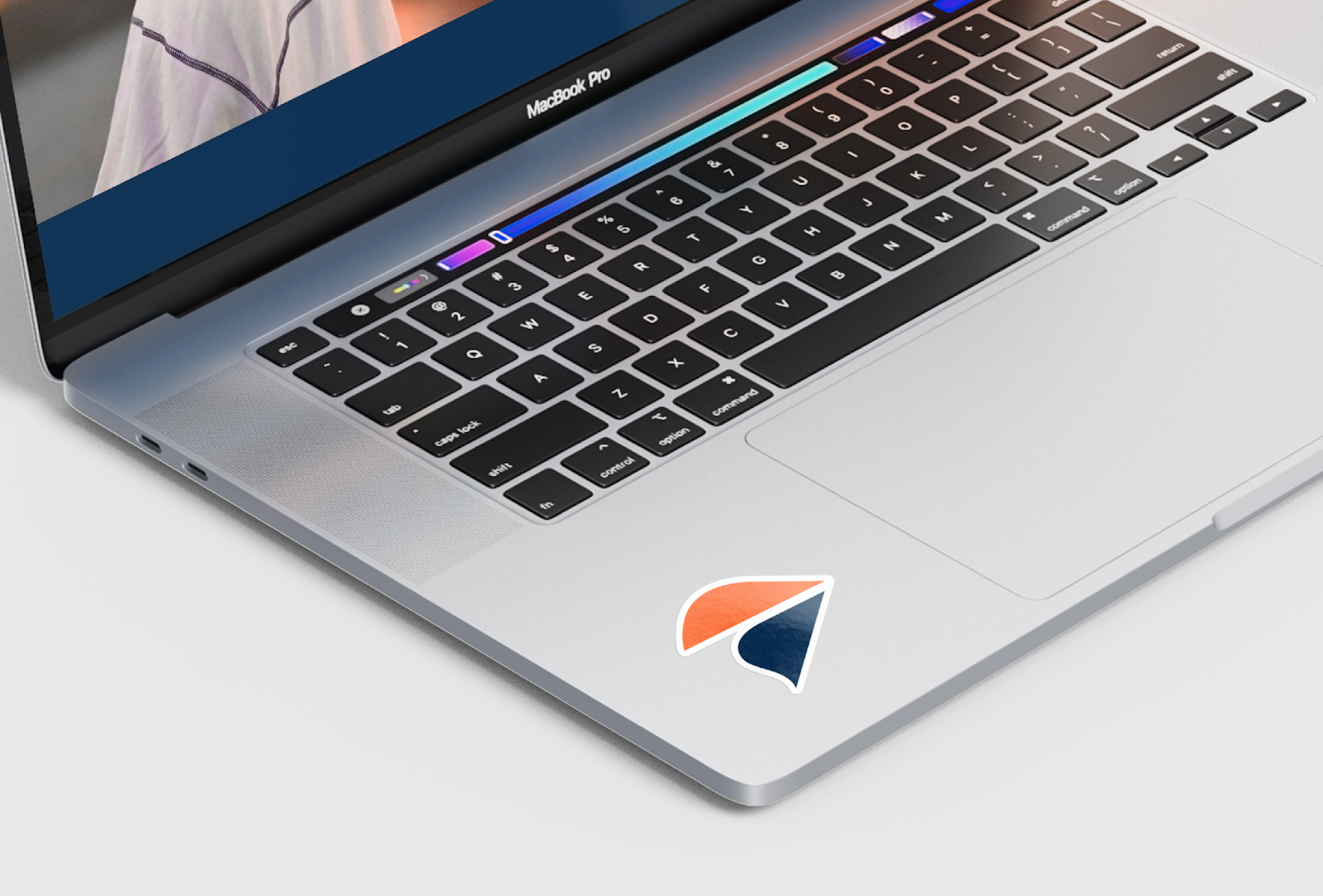
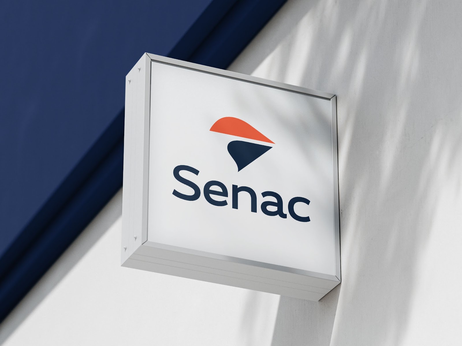
Strengthen the symbol: The existing symbol, a stylized representation of a book, was difficult to decipher at smaller sizes. I redesigned the symbol to be more geometric and abstract, while still retaining its connection to education.
-
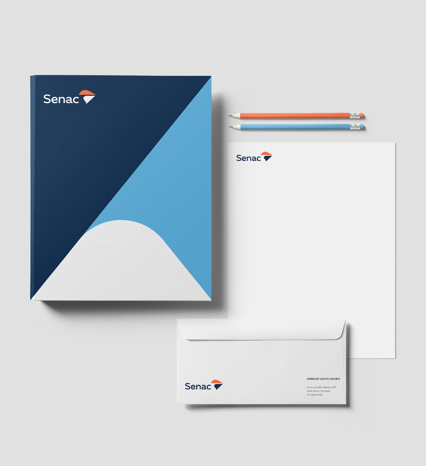
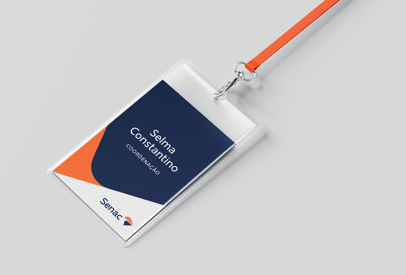
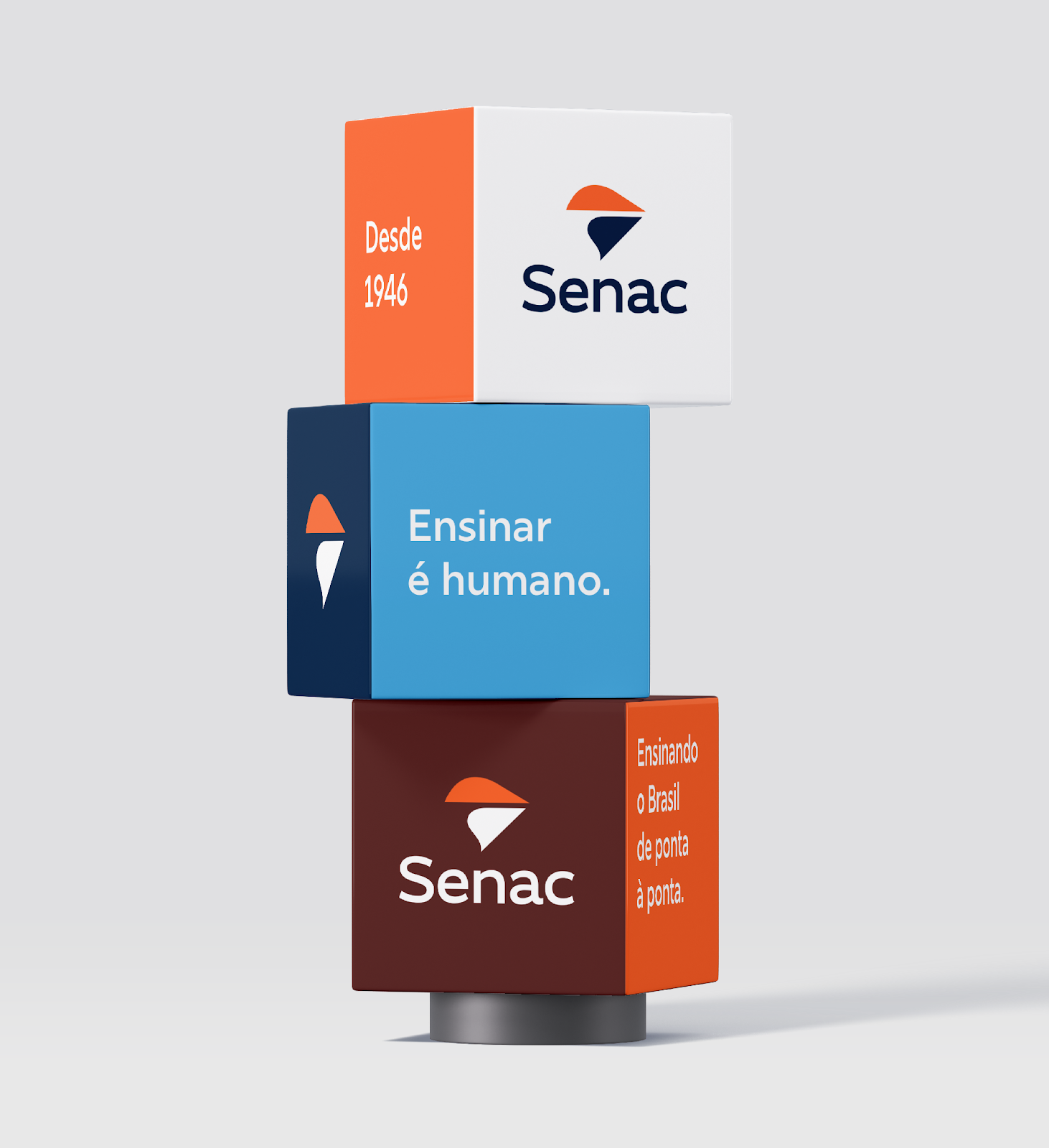
Preserve the most remarkable features: While I wanted to modernize the brand, it was important to respect its heritage. I retained the overall color scheme and the basic shape of the original logo, ensuring a sense of continuity and familiarity for existing stakeholders.
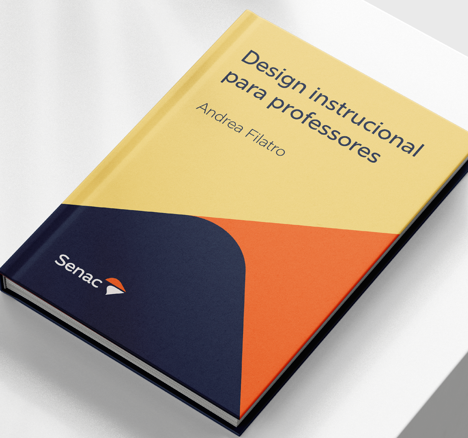
The result is a new logo that is clean, modern, and impactful. It retains the essence of the Senac brand while making it more relevant and engaging for a new generation of students.
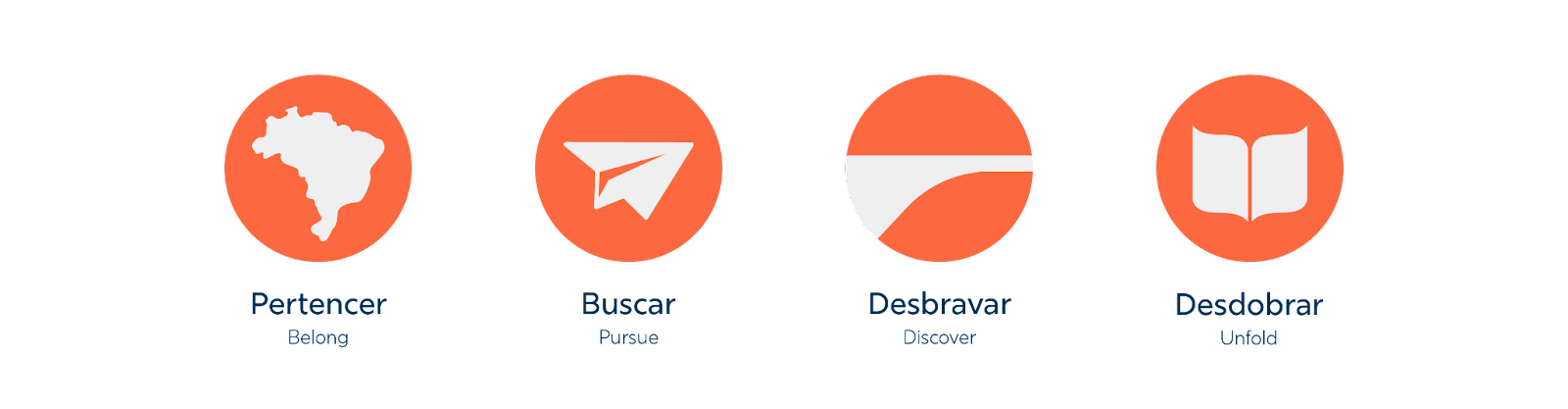
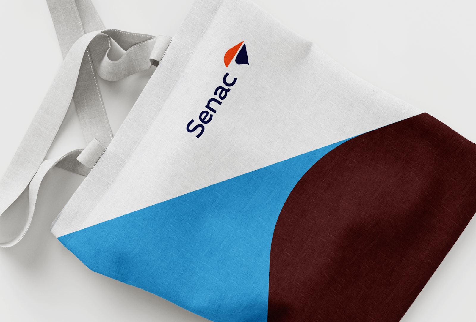
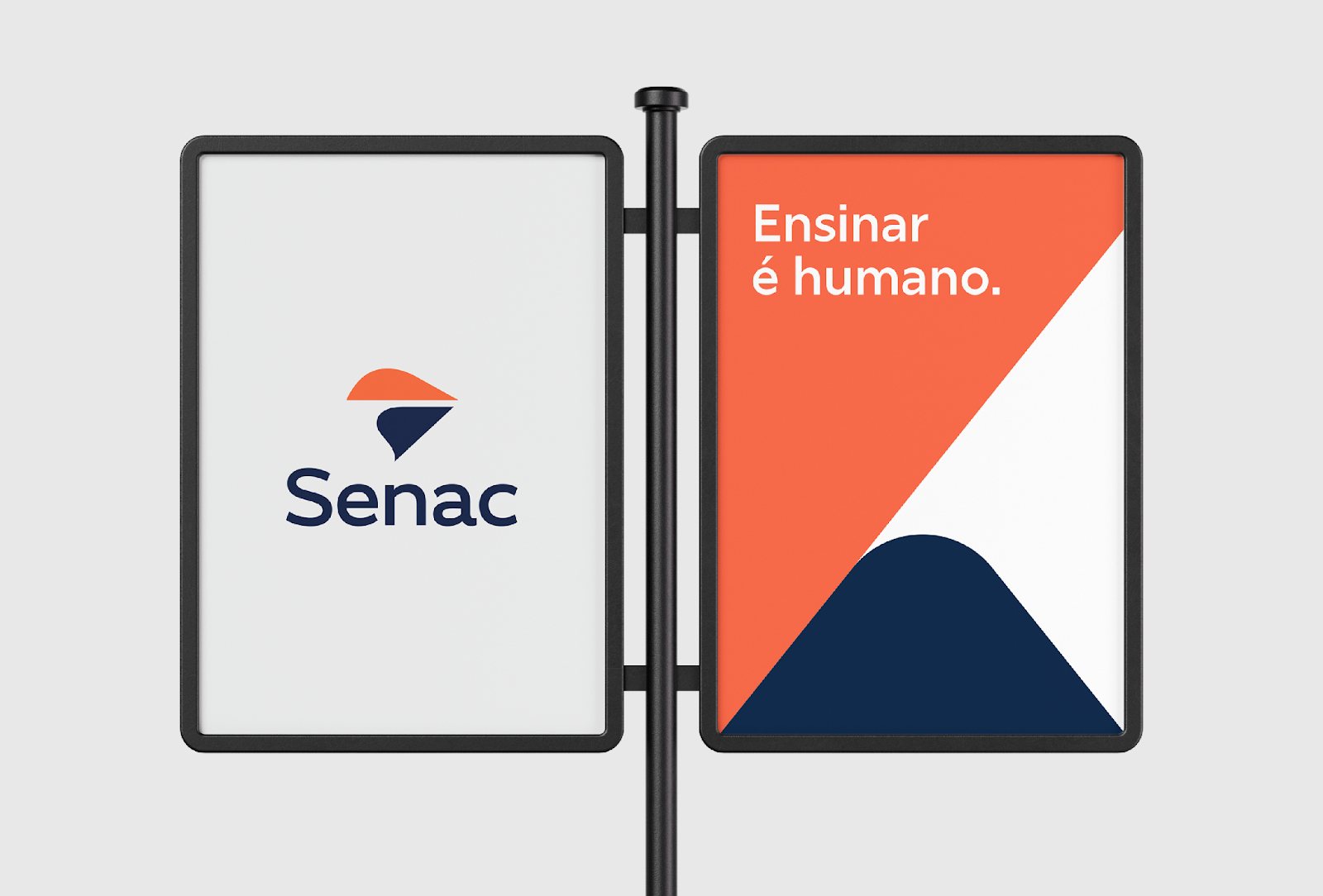
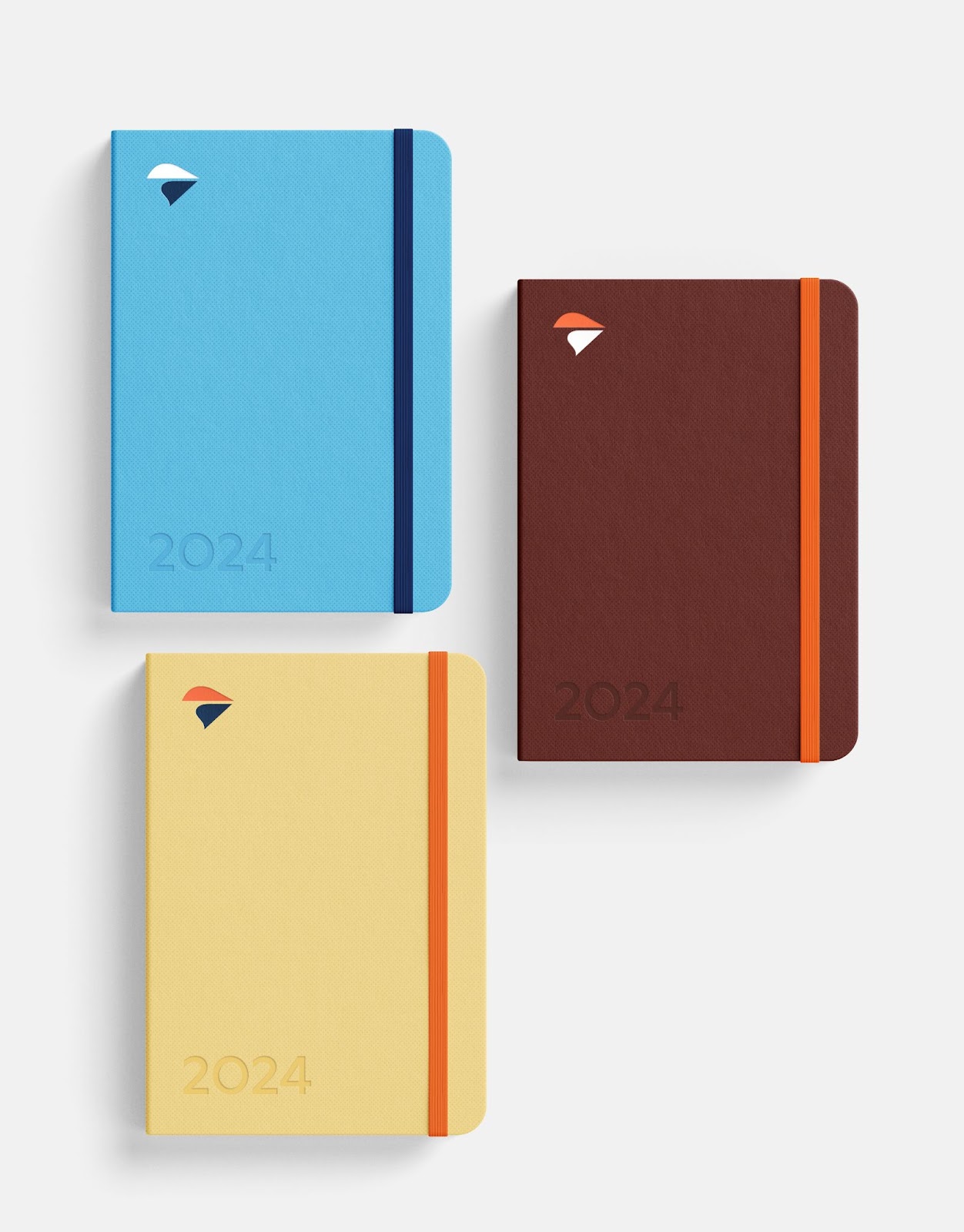
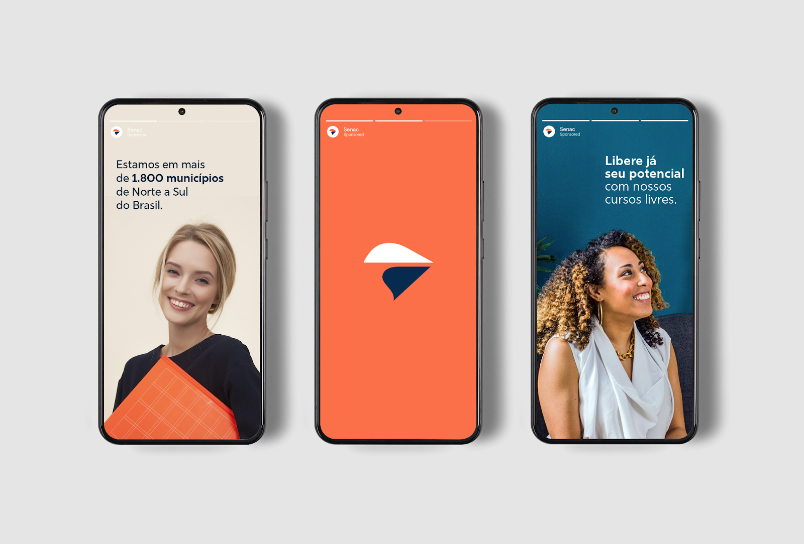
The minimalist approach also extends to the visual identity system I developed for Senac. I created a set of guidelines for typography, color palette, and imagery that are consistent across all communications materials. This ensures that the brand is presented in a cohesive and professional manner, regardless of the medium.
The redesign of Senac's branding is a testament to the power of simplicity. By focusing on clarity and visual impact, I was able to create a brand that is both new and familiar, and that effectively communicates Senac's mission and values to its target audience.
Branding and visual identity artifacts


For more information make sure to check out Amanda Louisi website and Behance profile.