by abduzeedo
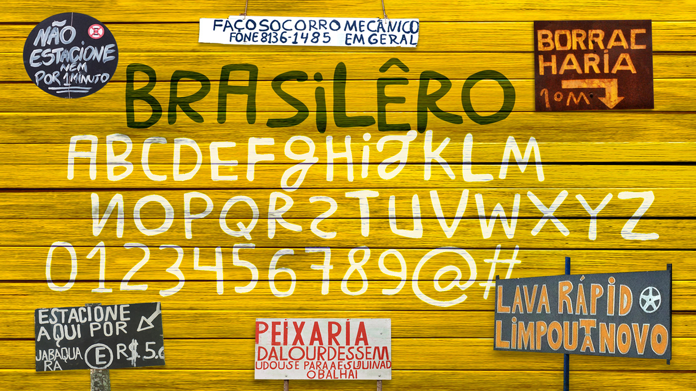
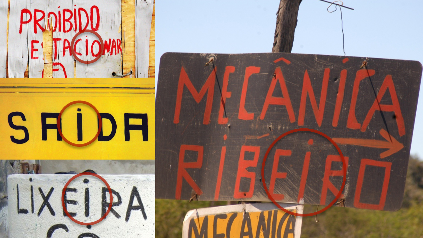
Crystian Cruz shared an awesome typography or type project that started with the analysis of hundreds of hand-lettered signs from the urban landscape in several cities of Brazil, in order to convey the impact of this popular Brazilian visual culture in a single digital typeface. It was designed in 1999, but only released to the public in 2003, as a free font.
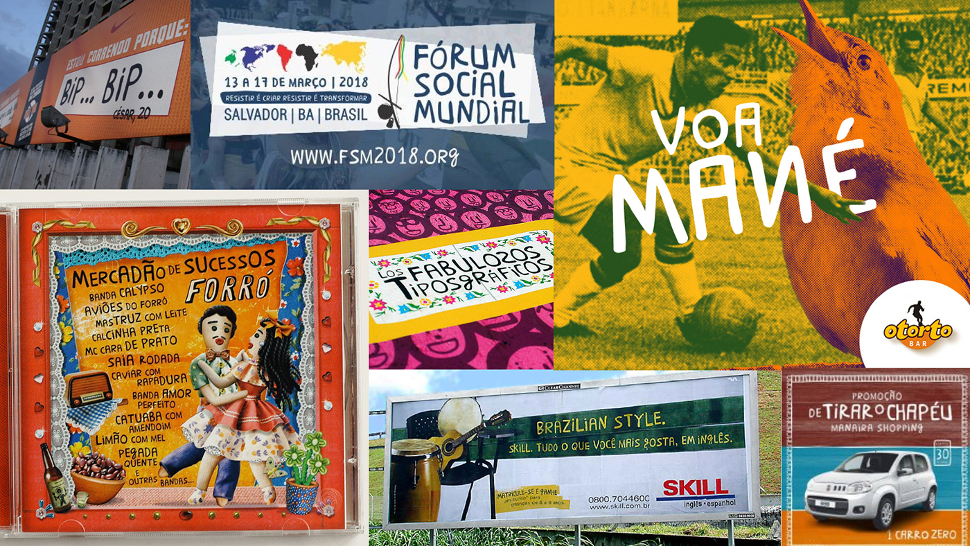
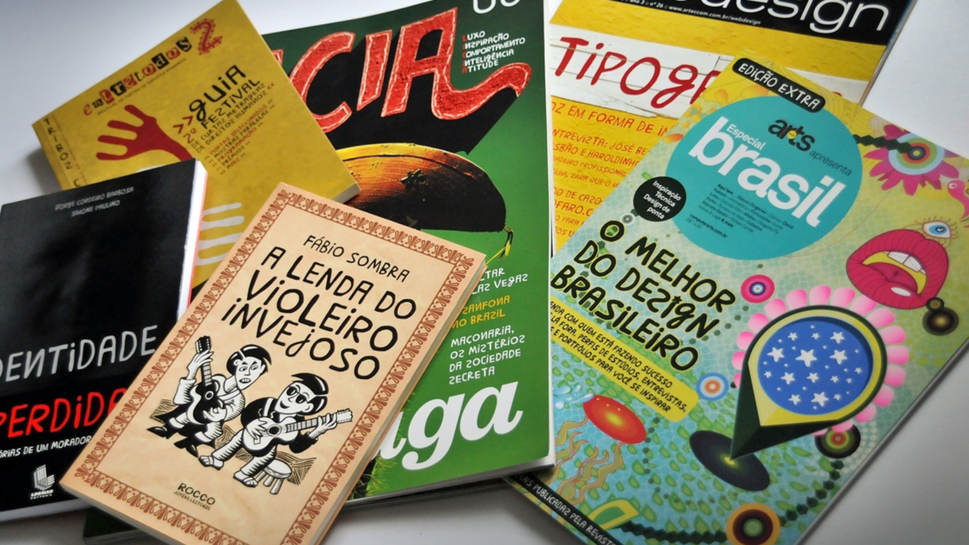
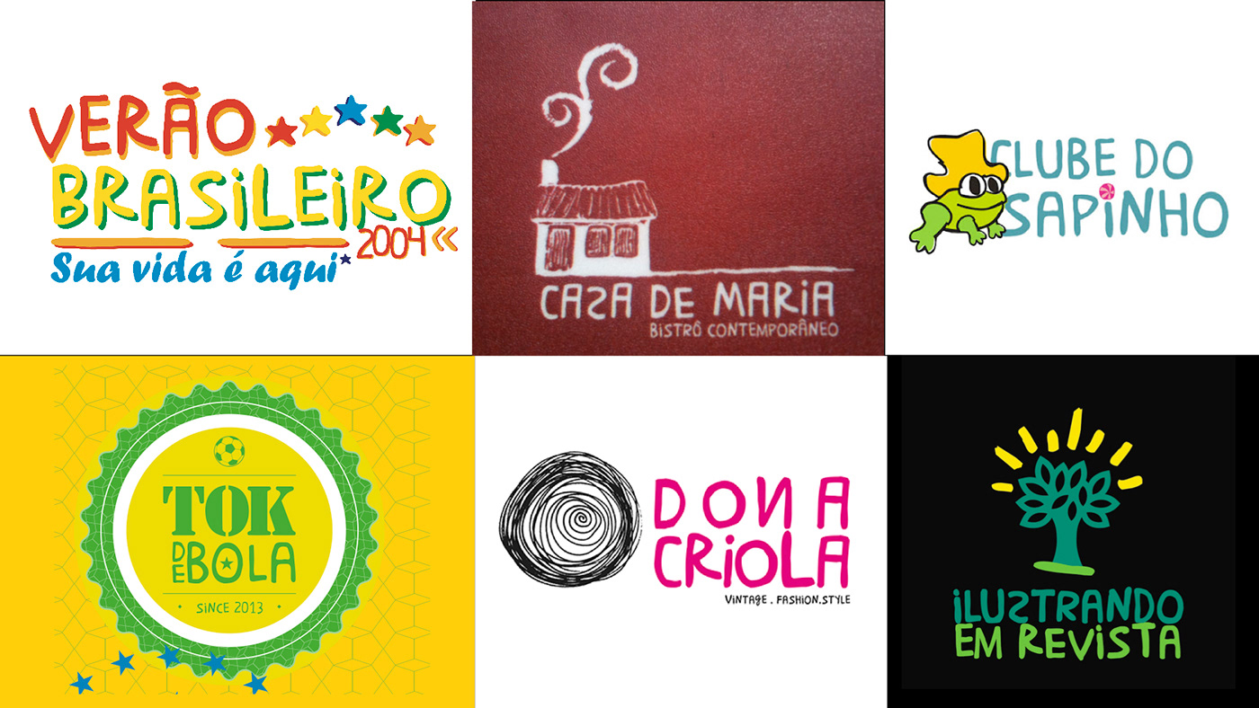
With more than 300 catalogued cases of commercial projects, it is one of the most distinguished Brazilian typefaces. In 2010 it was started the production of a PRO version, labelled Brasilêro Profiça. This version takes advantage of OpenType features to better emulate the vernacular aesthetics in a digital font, including an innovative feature that compresses the letters at the end of line, being the first font in the world to do that. The PRO version is yet to be launched, and a book about the project is also in production.
About Christian
Crystian Cruz is a graphic designer and researcher based in Newcastle, Australia, currently undertaking a PhD and teaching at the University of Newcastle.
With broad experience in editorial design and typography, he has worked as creative director of major Brazilian magazines and newspapers and designed custom corporate typefaces for major Brazilian brands, and as a lecture in some Brazilian bachelor and postgraduate courses for 15 years. He also hold a Master in Typeface Design from The University of Reading (United Kingdom).
As a type designer, I enjoy the challenge of solving specific design problems, so I have focused on the making of custom made fonts. That led me to invent some type features, such as the insertion of bar charts in fonts and a feature that makes letters get automatically condensed at the end of text lines.
Typography