by abduzeedo
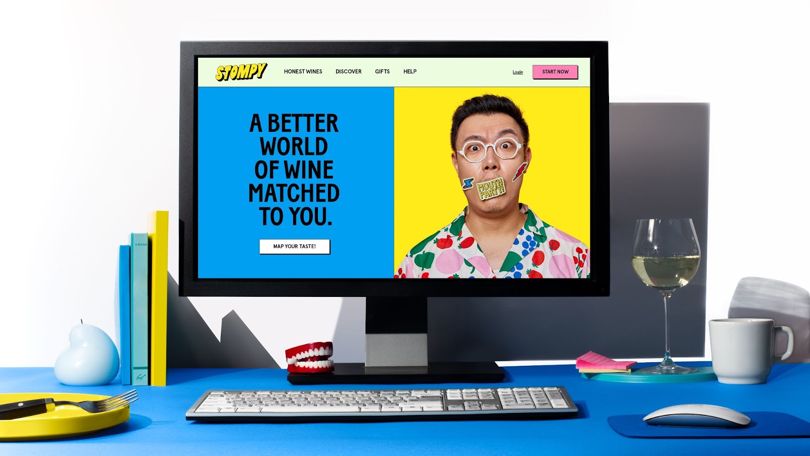
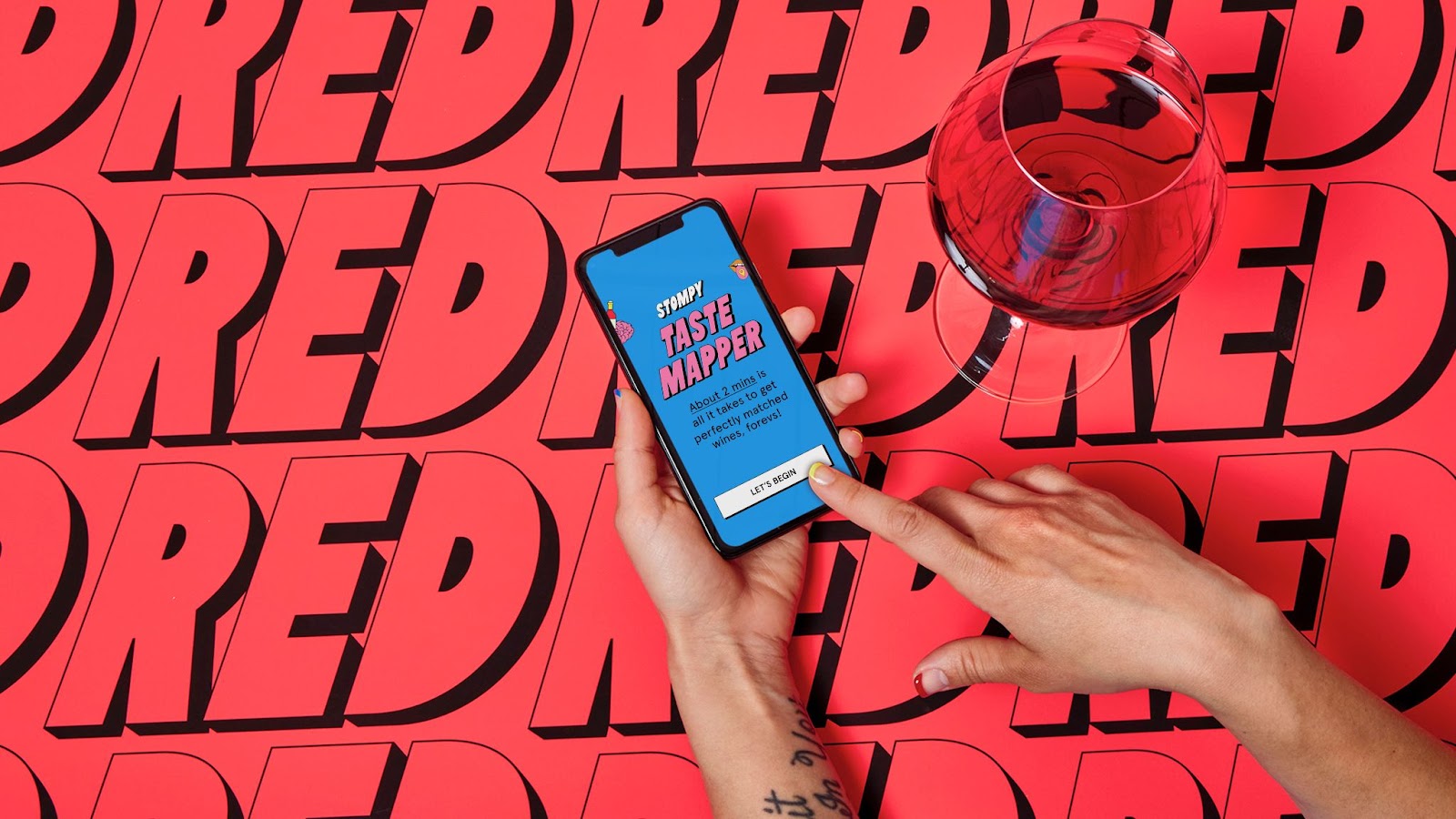
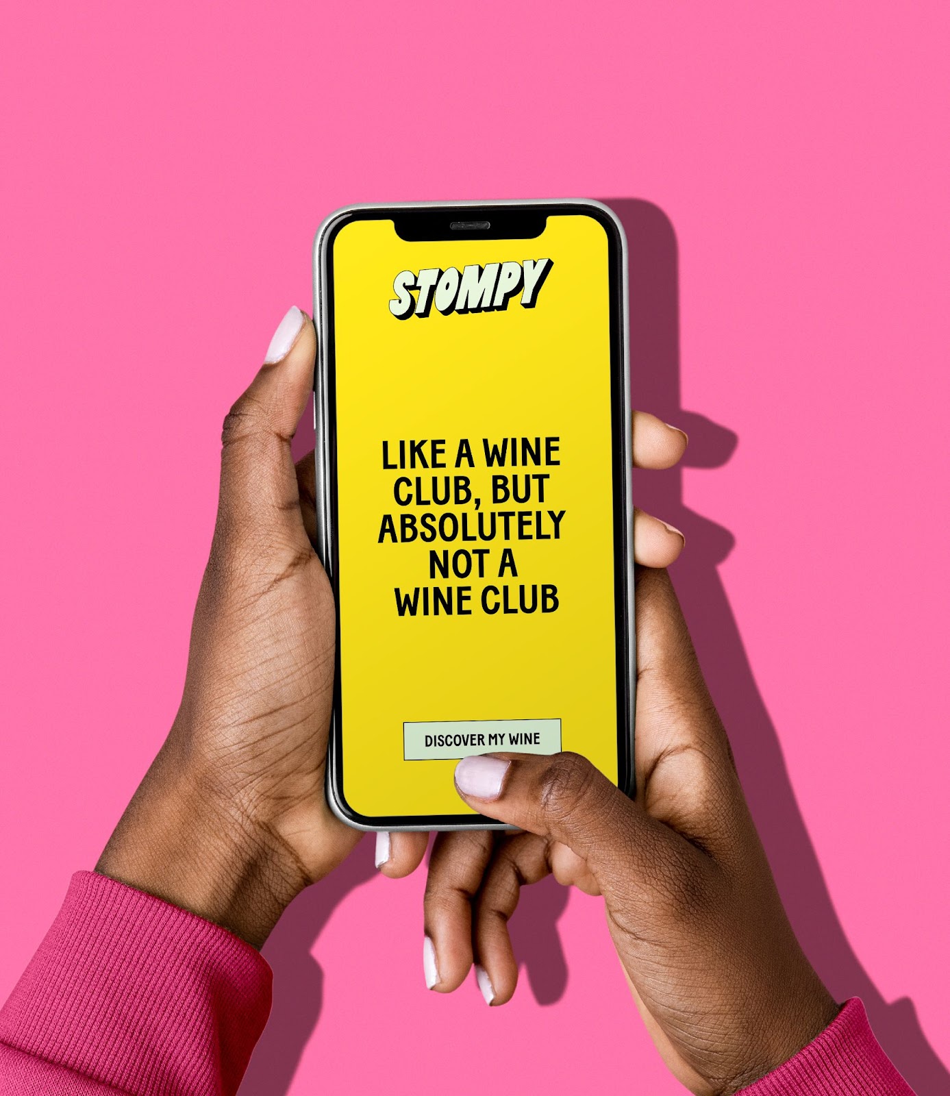
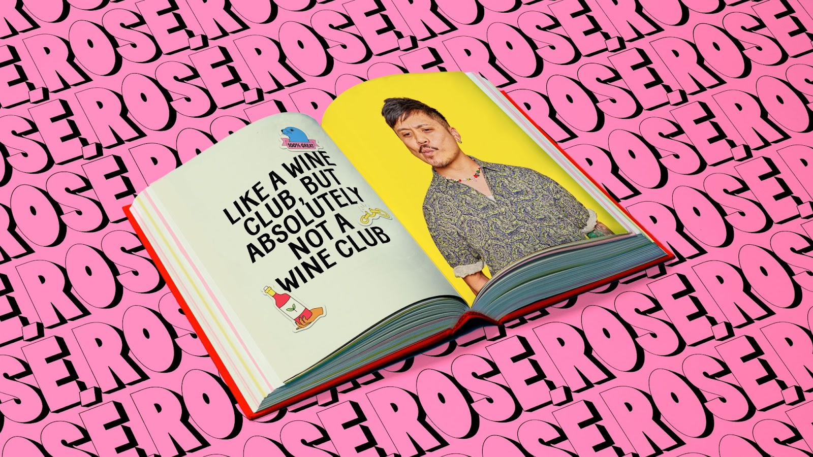
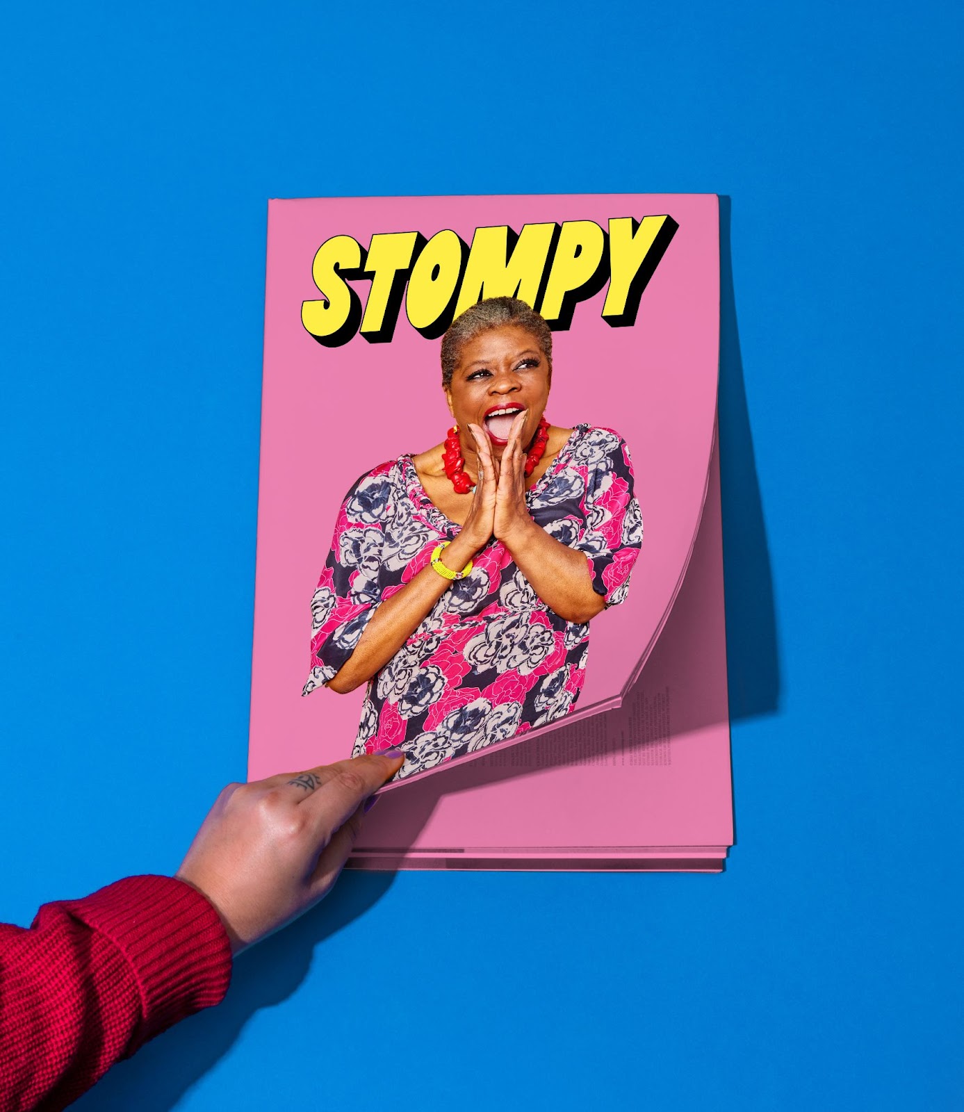
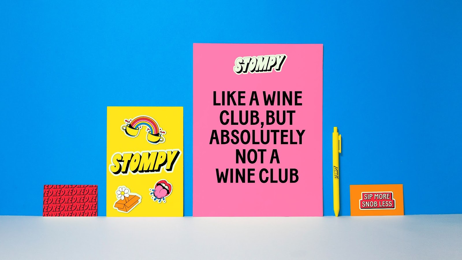
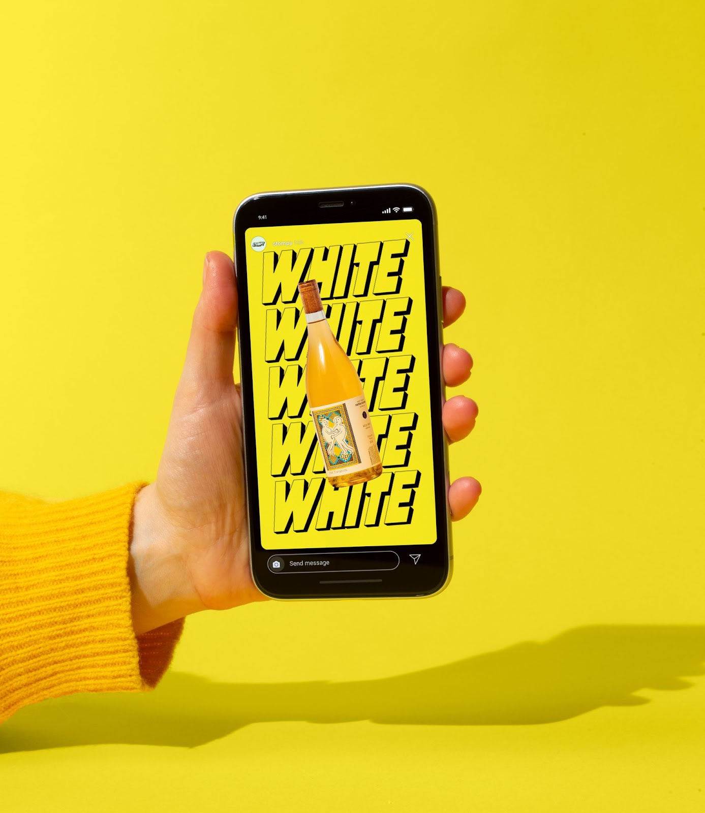
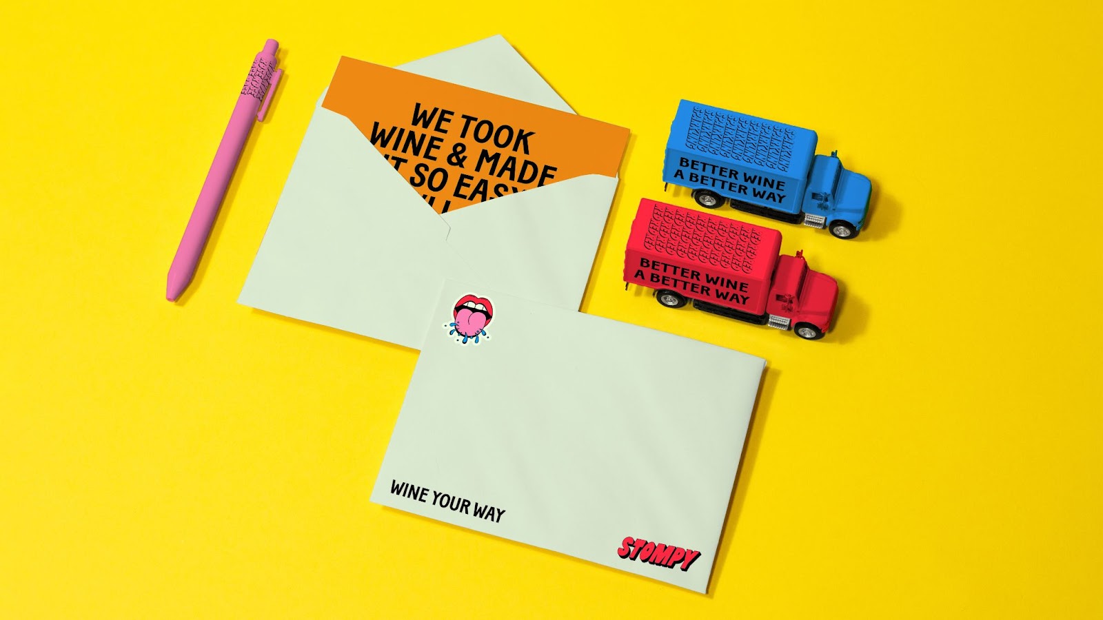
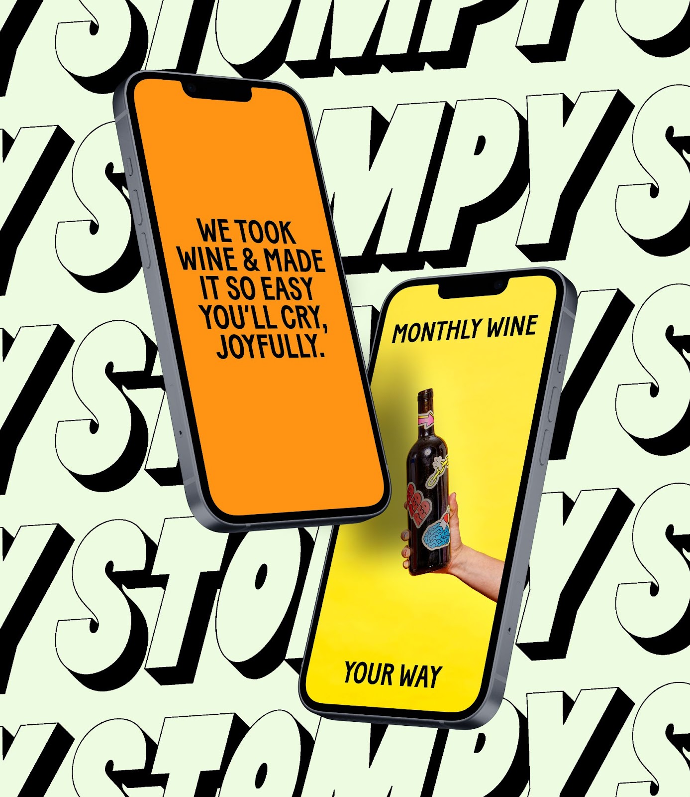
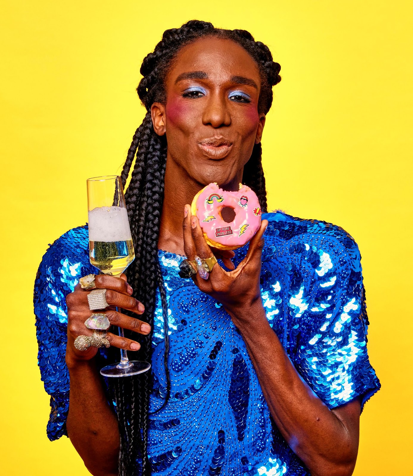
Stompy is a wine subscription that intelligently tailors & expertly curates sustainable wine selections to your taste buds. When developing the brand identity for Stompy, we were tasked with creating a brand that could bring wine to a more modern audience. After all, buying wine does not have to be a scary experience full of weird etiquette and plagued with complicated rules! In the brand direction, we explored visual cues that challenge the stuffy, snobby stereotypes surrounding wine and instead open up great wine to more great people. Through bold type, bright colors, and humorous illustrations, we aim to inspire wine noobies (and aficionados) to sip more and snob less!
Key Brand Elements:
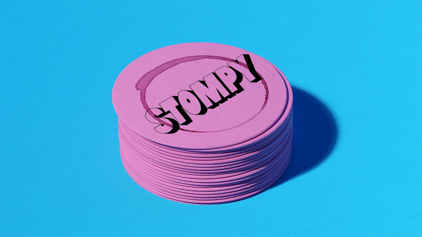
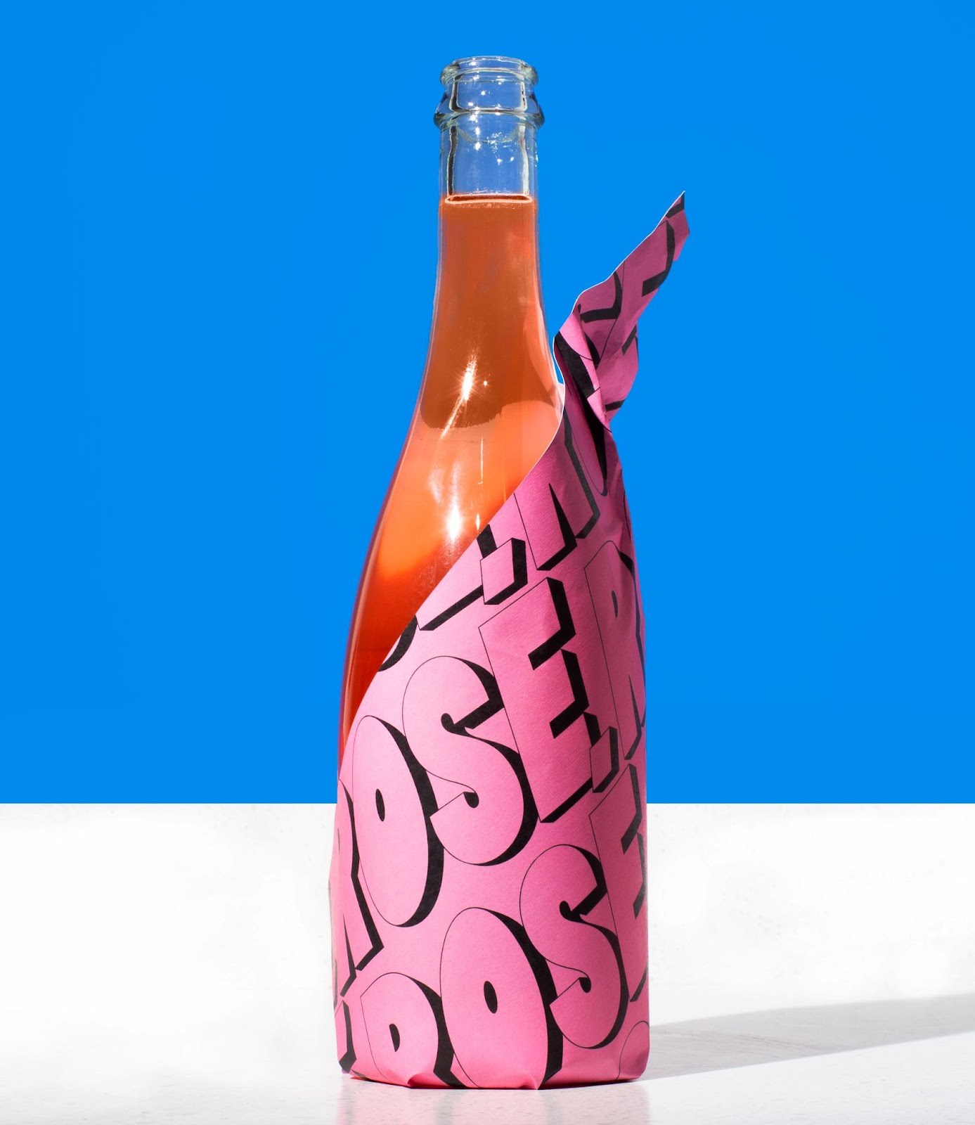
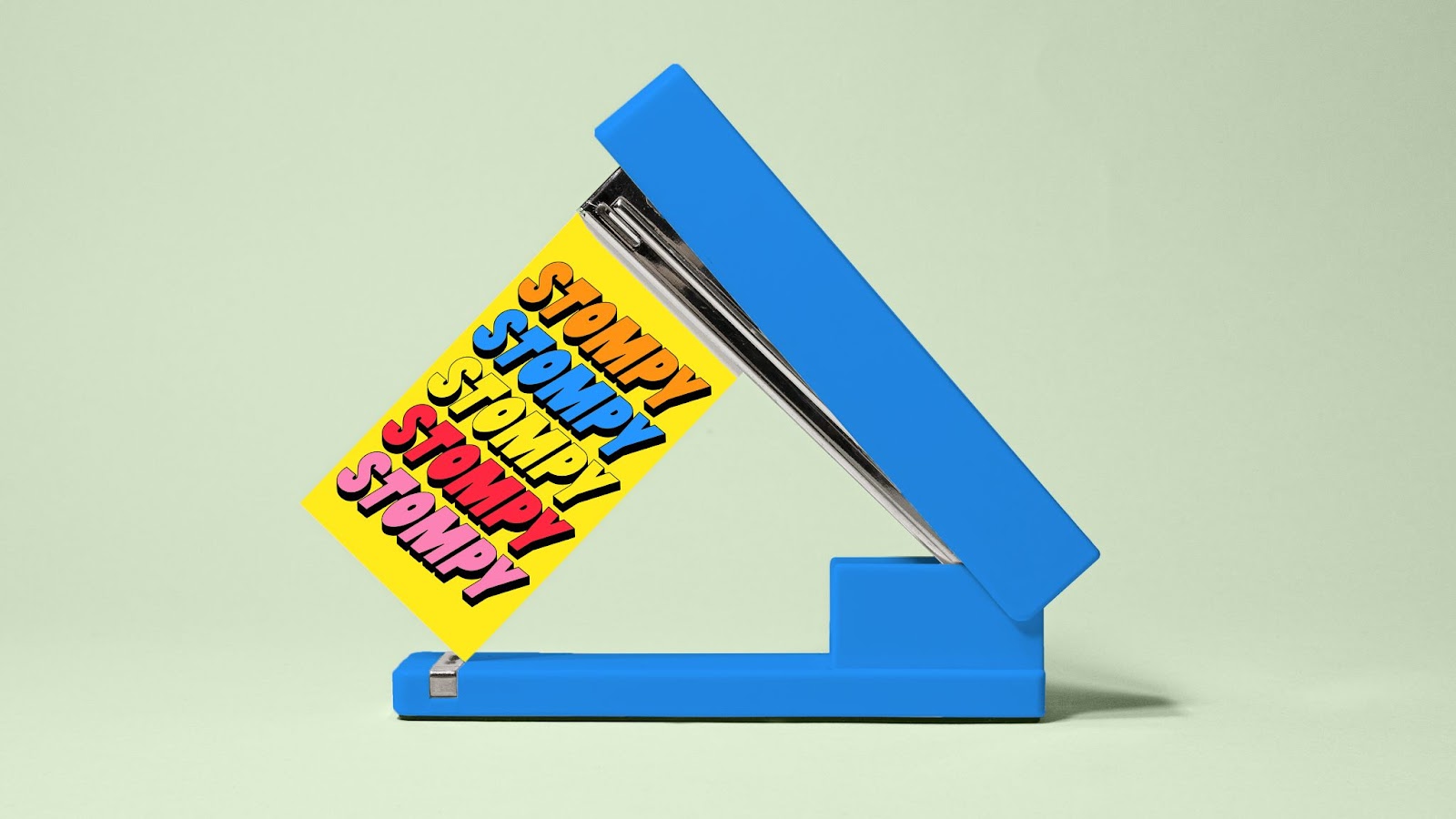
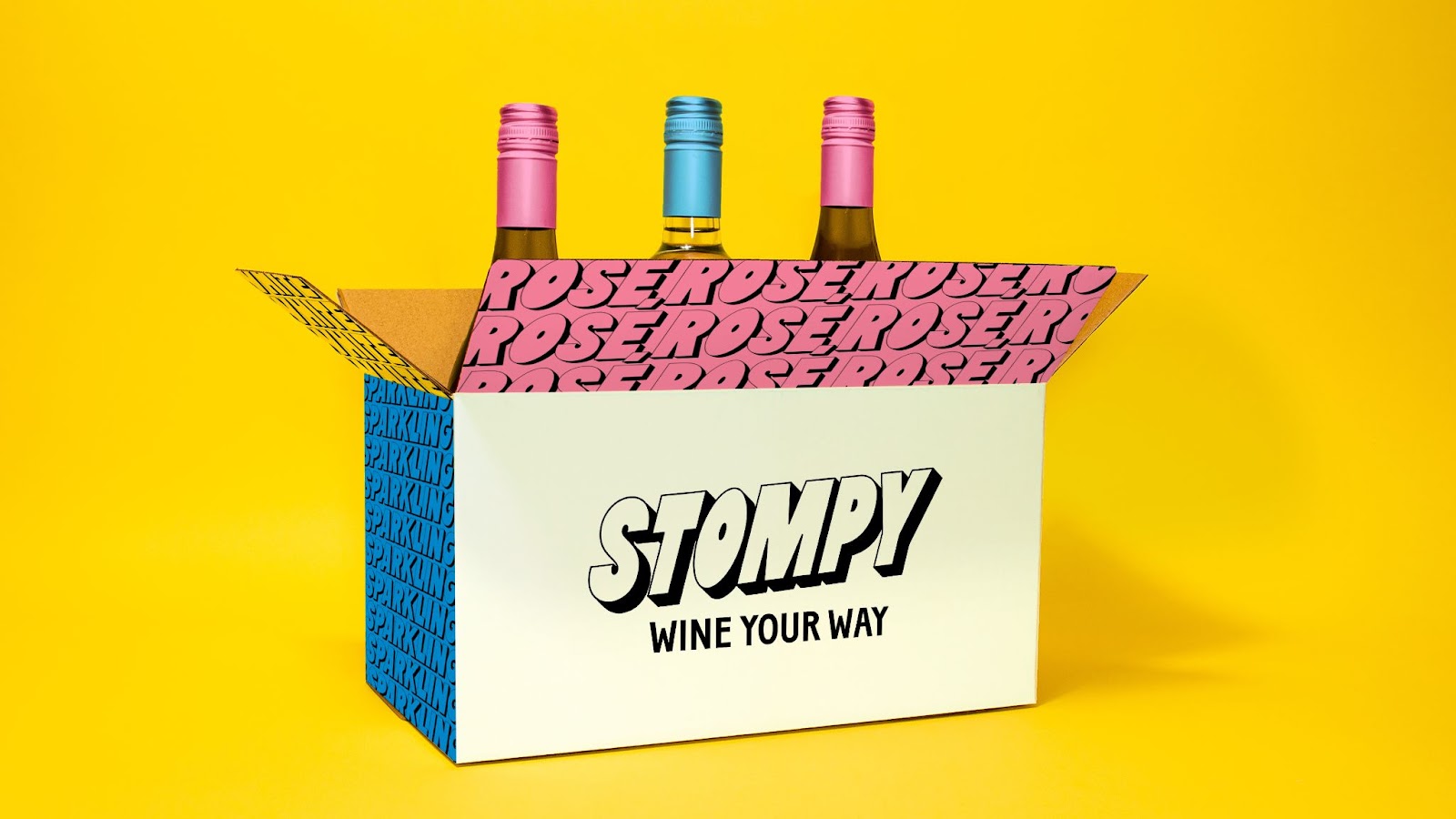
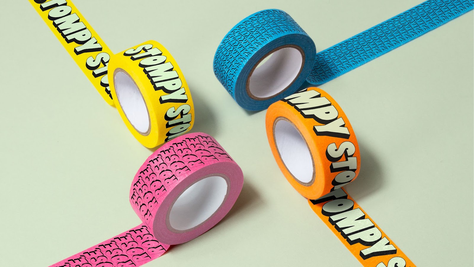
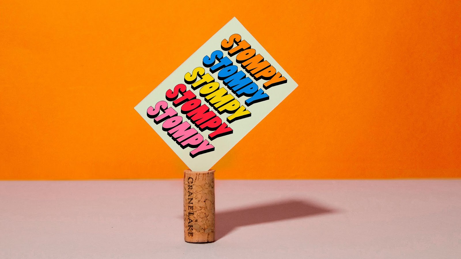
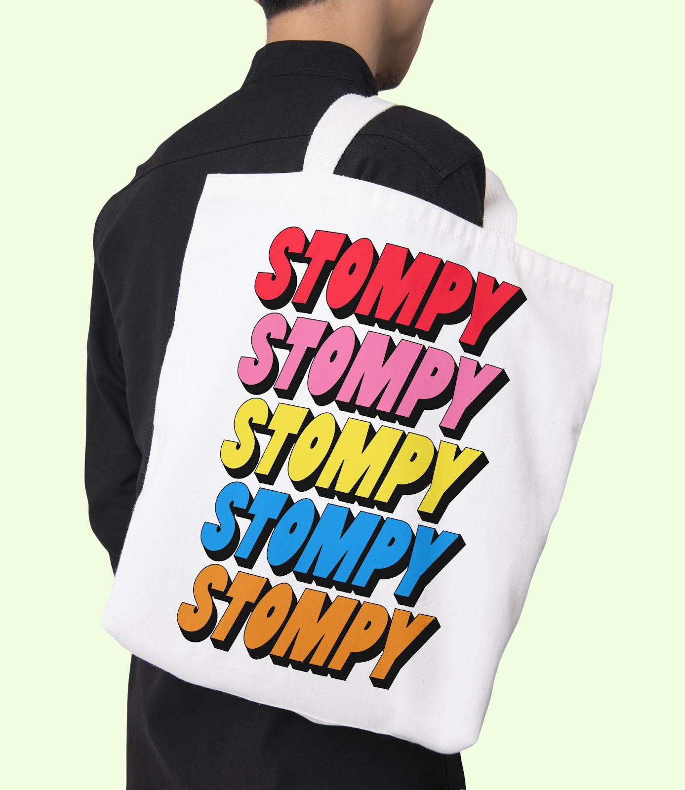
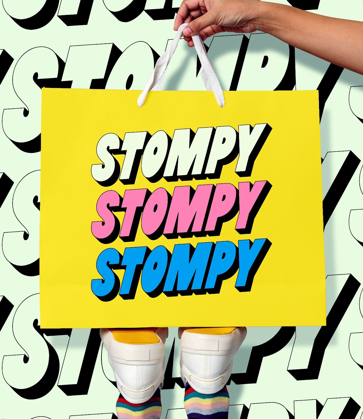
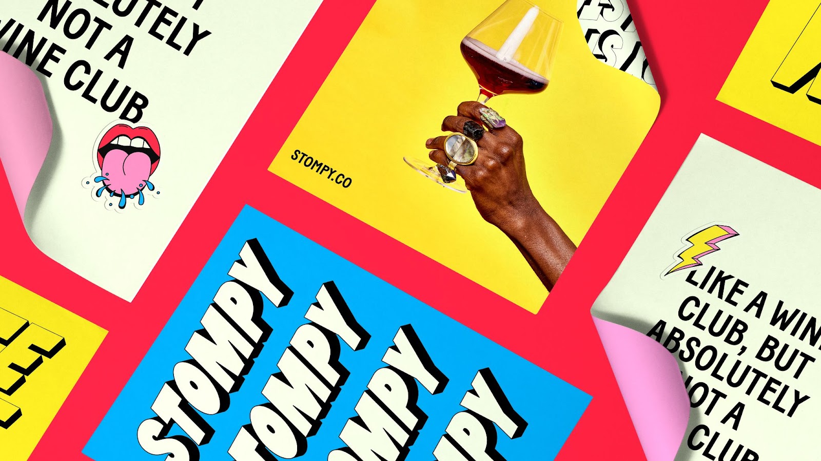
- Logo: The name Stompy refers to the art of grape stomping. We illustrated this concept through extruding type and playful repetition throughout the brand identity.
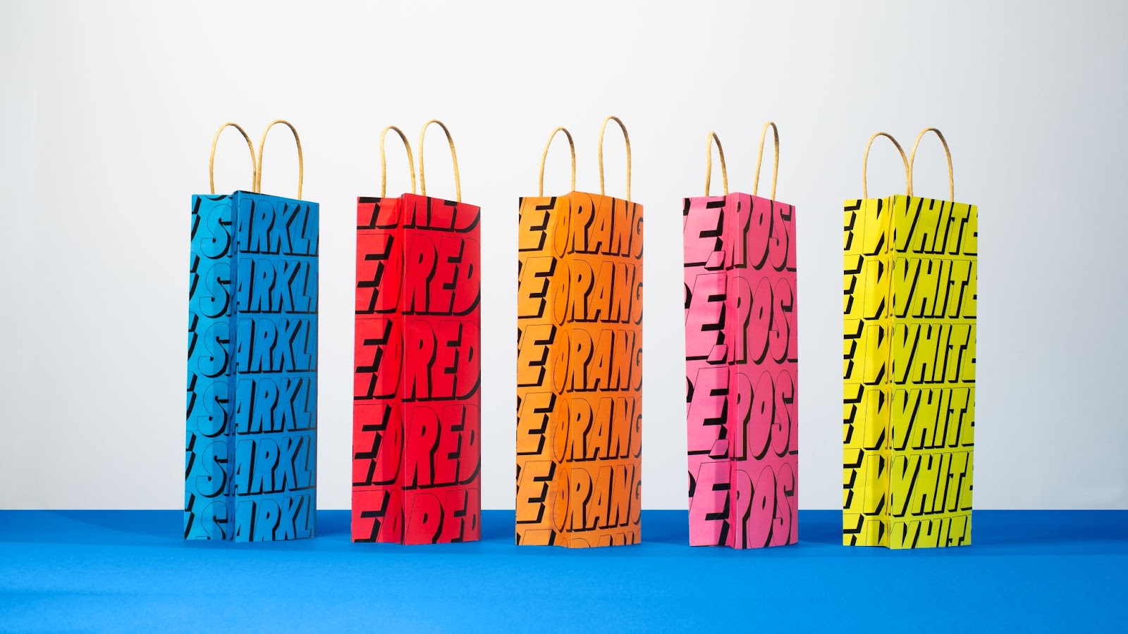
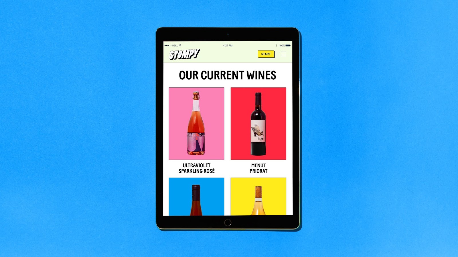
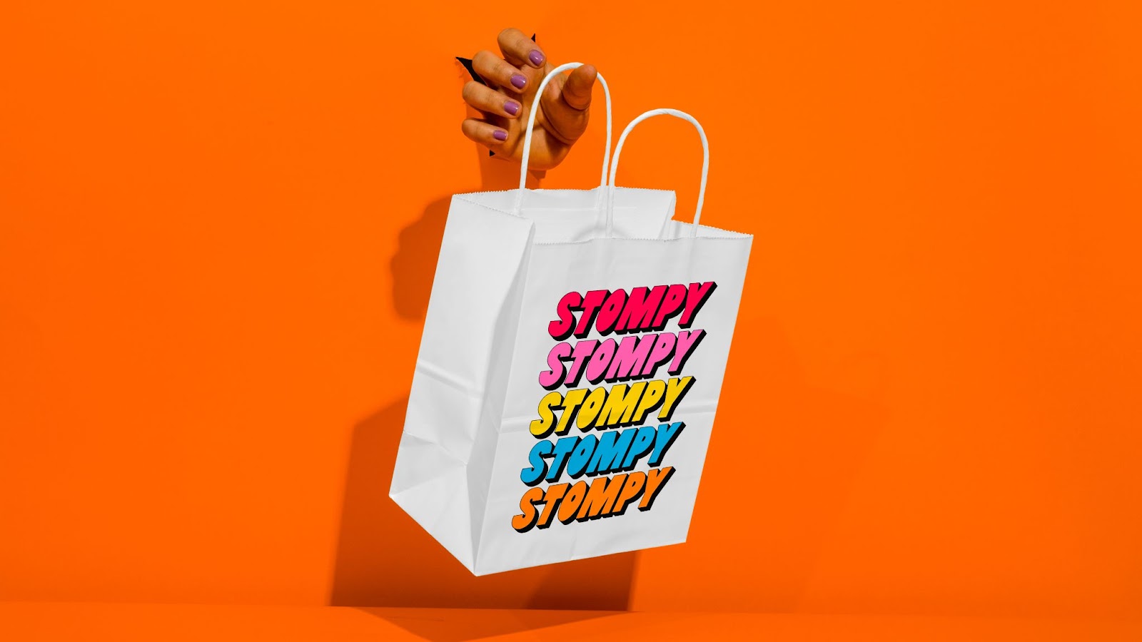
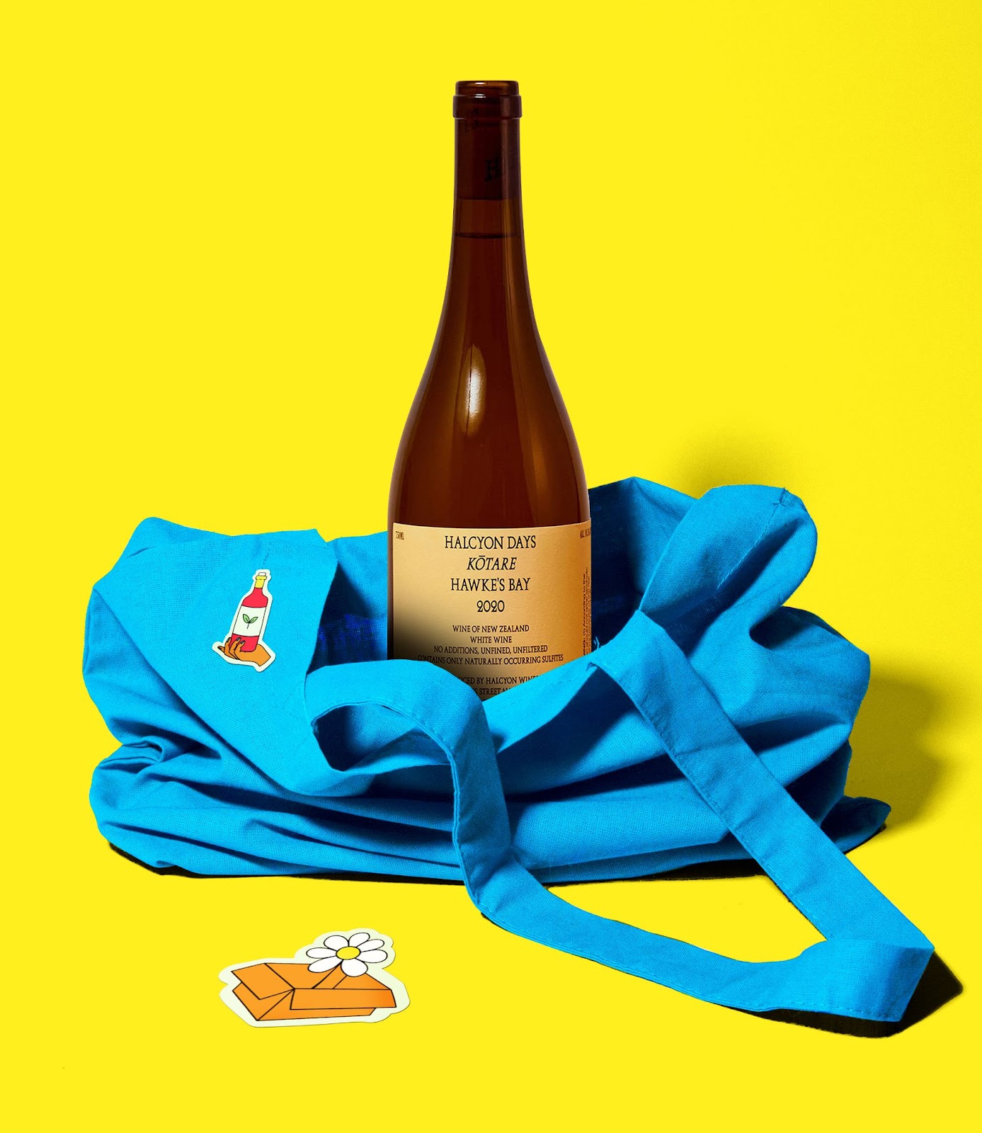
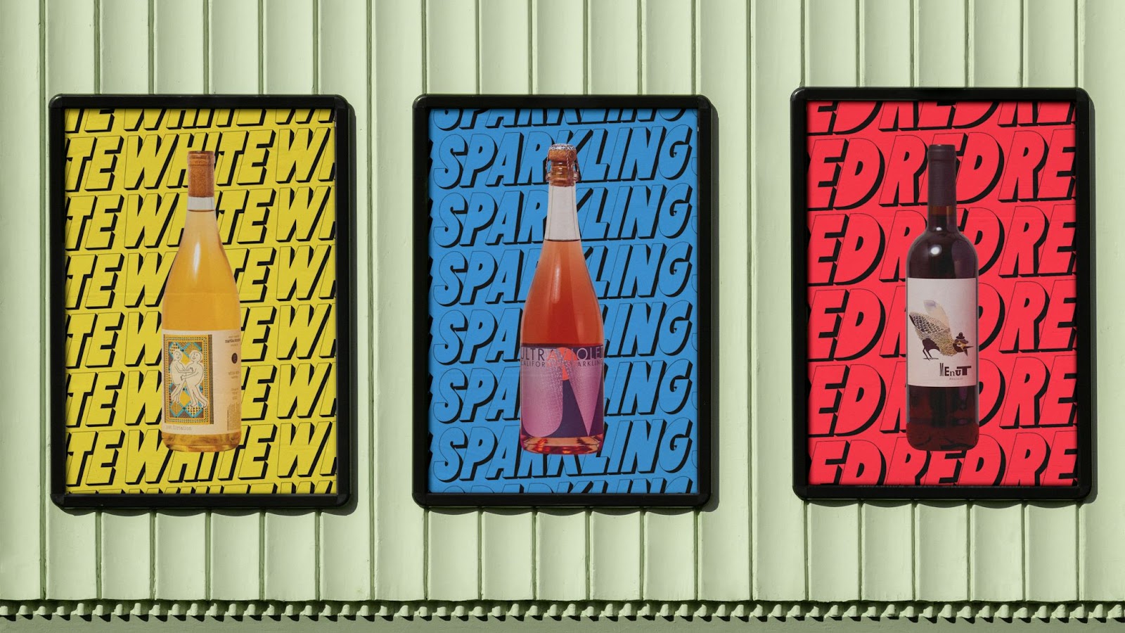
- Patterns: We extended the use of repetition to Stompy’s different categories of wine, which serve as useful patterns within their e-commerce photography. These patterns help orient wine buyers, allowing them to quickly identify the type of wine they are browsing.
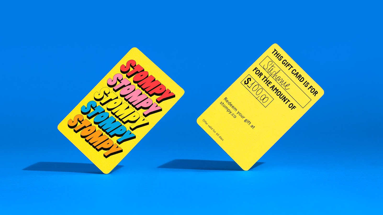
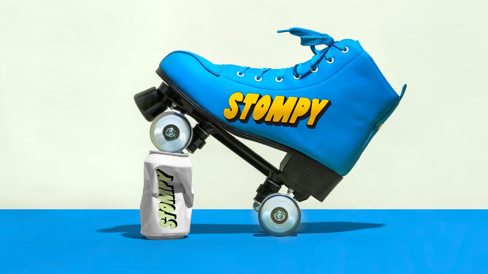
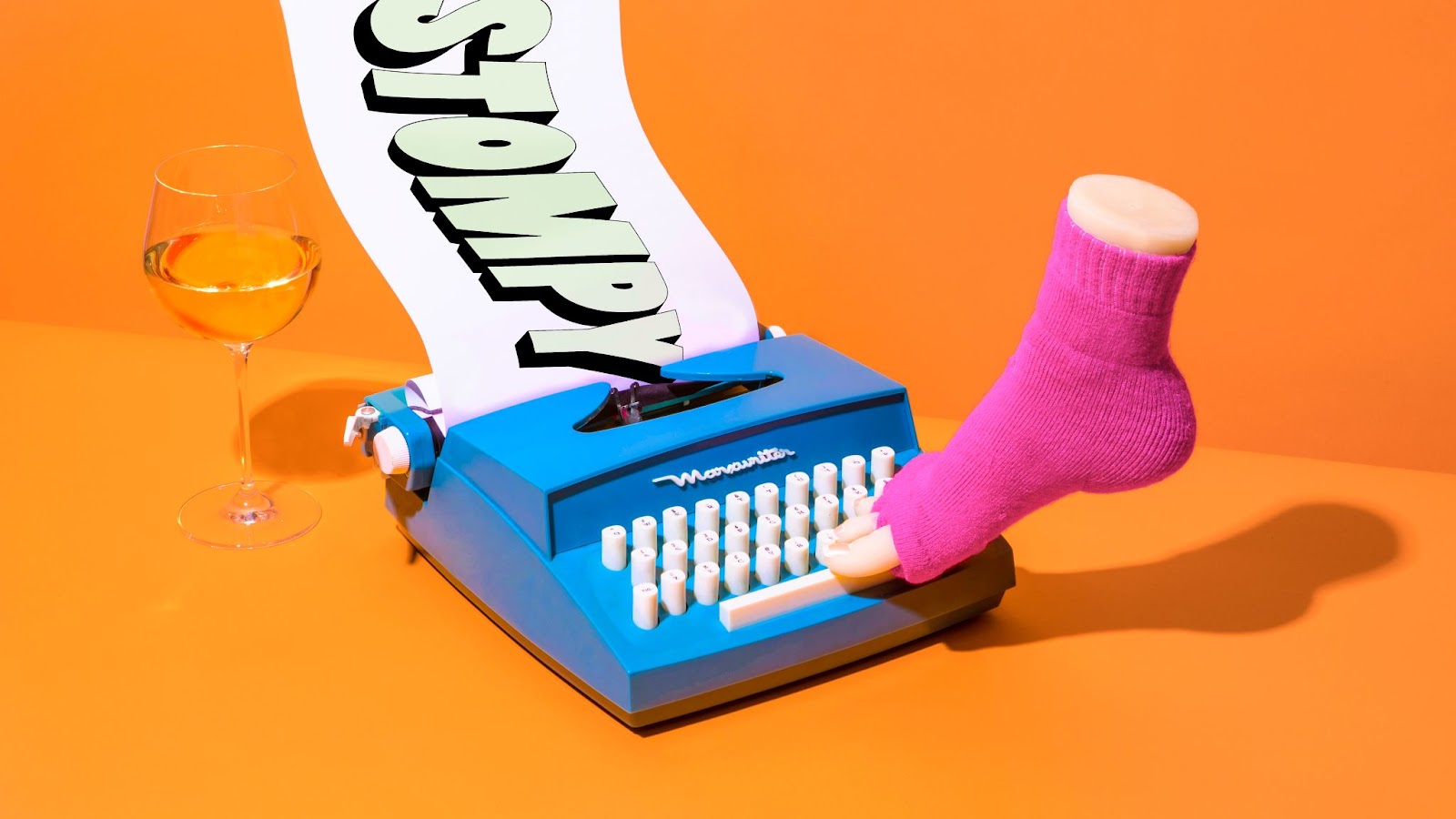
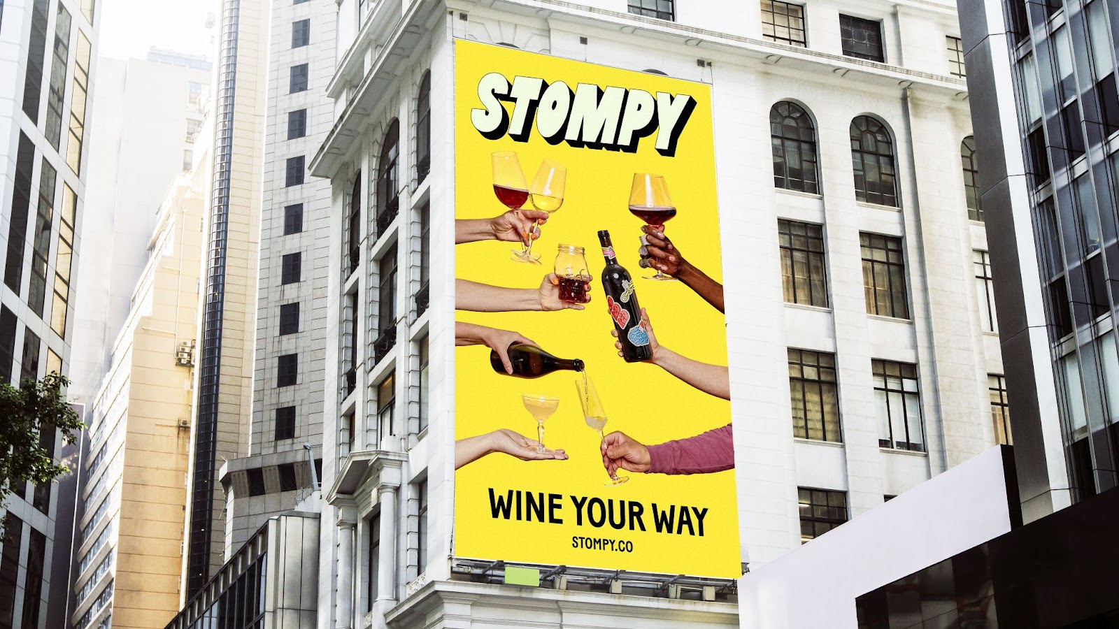
- Brand Imagery: Whether it be out of a solo cup or a fancy wine glass, the vessel doesn’t matter—the brand's imagery encourages everyone to wine the way they want to.

-
&Walsh brands Stompy, a personalized wine subscription service
-
The identity aims to challenge the stuffy nature of the wine buying experience
-
Inspired by the idea of doing wine your way, &Walsh uses bold type, bright colors & humorous illustrations to make buying wine as joyful as drinking it!
-
The extruding type in the logo is inspired by the art of grape stomping - executed in a playful manner
For more information make sure to check out &Walsh website