by abduzeedo
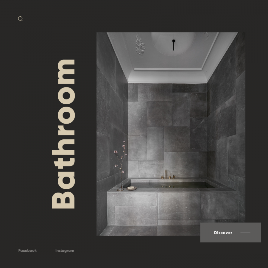
Andriy Bata shared a very stylish web design concept for the National Geographic web site. It features pretty trendy style, with a clear grid system and very minimal. The imagery provided by the topics that National Geographic covers makes things a bit easier. Overall it's a nice study of web design, but in my opinion it fails on very important aspects, especially accessibility. Some texts feel just too small and with very little contrast from the background. I think any web designer out there should have the duty to create experiences for all and if you take in consideration that the tools and technology allow us to do that, we should not sacrifice function for the form.
Web design concept

