by abduzeedo
Yahoo Mail’s new approach to UX brings a calmer inbox through cleaner UI, better spacing, and AI that quietly reduces cognitive load.
We recently caught up with Yahoo Mail GM Kyle Miller about Yahoo Mail’s latest UX approach, and the headline is simple: the team is rethinking the inbox with a cleaner UI, smarter AI, and a few new features designed to make email feel calmer, not busier.
Email is one of those tools we all rely on, yet few of us would describe our inbox as peaceful. Over time, layers of features, notifications, and visual noise have turned a simple utility into a constant source of cognitive clutter. With this update, Yahoo Mail is taking a different stance: instead of doing more, it’s doing better.
A lighter visual language
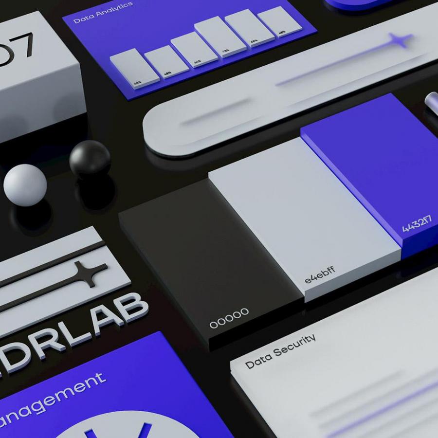
At the heart of the update is a refreshed visual system that prioritizes clarity and ease. The interface feels lighter, with improved spacing, more deliberate typography, and a cohesive design language that brings consistency across the experience.
“Yahoo Mail’s visual system brings more clarity and calm, by refining the core design language across typography, spacing, color, and iconography. We know our users do not want a completely new experience—just a cleaner, less cluttered one—so we’re focused on improving readability, increasing breathing room, and creating a more cohesive, modern aesthetic.”
— Kyle Miller, GM of Yahoo Mail
The result is an inbox that feels less dense and more breathable. Nothing shouts for attention. Instead, hierarchy and restraint do the heavy lifting, allowing familiar workflows to remain intact while quietly elevating the overall experience.
AI that stays out of the way
AI is now a given in most product updates, but Yahoo Mail’s approach is refreshingly restrained. Rather than adding shiny tools for the sake of it, the team focused on reducing cognitive load by addressing real pain points: scanning for what matters, remembering follow-ups, and triaging messages efficiently.
As Miller put it, the goal is to ground AI decisions in research and real workflows, focusing on the high-frequency tasks that create the most friction. The emphasis is on keeping users in control, showing clear value fast, and integrating help directly into existing flows so it supports you quietly instead of asking for more attention.
Catch up, without catching stress
One feature with real potential to shift behavior is Catch Up. Instead of forcing users to plow through unread messages one tiny decision at a time, Catch Up turns inbox clearing into a faster, more intuitive flow.
Miller sees it as a meaningful break from traditional inbox conventions by reducing decision fatigue and turning cleanup into something lightweight and even a little satisfying. Inbox maintenance, but with fewer mental tabs open.
Why it matters
Yahoo Mail’s latest approach is a reminder that good design doesn’t always mean adding more. Sometimes it’s about editing, simplifying, and trusting that calm is a feature. In a digital landscape that constantly competes for attention, this update shows how thoughtful UI, paired with well-integrated AI, can make everyday tools feel more human again.
In short: Yahoo Mail isn’t trying to make email exciting. It’s trying to make it manageable. And honestly, we’ll take that.
