by abduzeedo
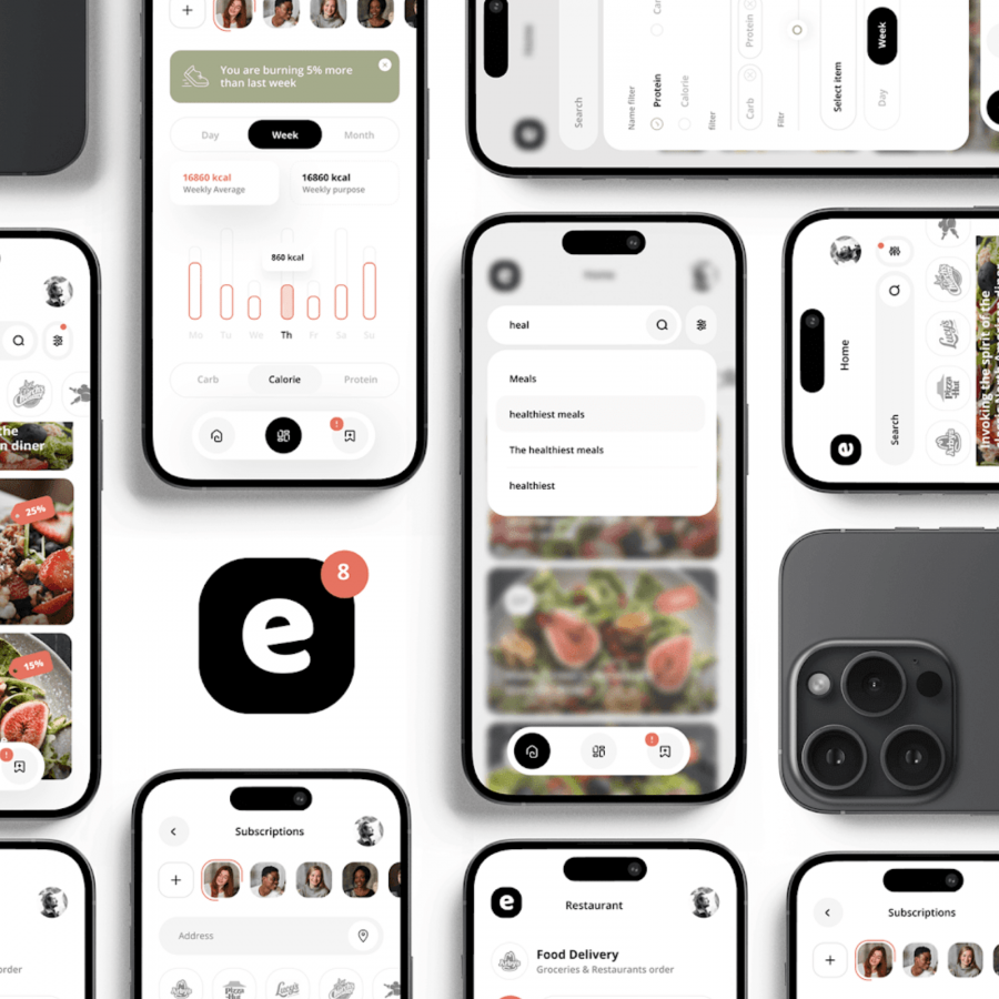
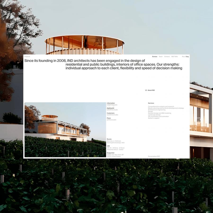
Hrvoje Grubisic shared a UX project for a mobile layout system for a Travel Guide app. The system features a beautiful typography with a Swiss style for lack of better description and smart use of a grid. I know there might be some issues related to accessibility and color contrast, especially for the small text over images, but those can be resolved, the point is that the overall look and feel is great.
For more information make sure to check out Hrvoje Grubisic on:
